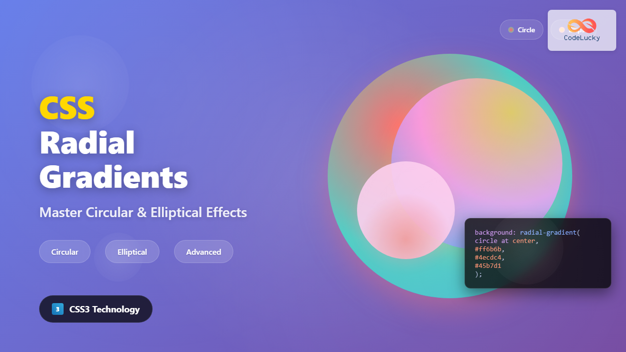
CSS radial gradients create stunning visual effects by transitioning colors in a circular or elliptical pattern radiating from a central point. Unlike linear gradients that flow in straight lines, radial gradients emanate outward in all directions, making them perfect for creating backgrounds, buttons, and decorative elements that need a dimensional appearance.
Understanding CSS Radial-Gradient Syntax
The radial-gradient() function creates smooth transitions between multiple colors arranged in a circular or elliptical pattern. The basic syntax follows this structure:
background: radial-gradient([shape size at position], color-stop1, color-stop2, ...);Each parameter serves a specific purpose in defining how the gradient appears and behaves on your elements.
Basic Radial Gradient Example
Let’s start with a simple radial gradient that transitions from blue in the center to red at the edges:
.basic-radial {
  background: radial-gradient(circle, #3498db, #e74c3c);
  height: 200px;
}
Shape Parameter: Circle vs Ellipse
The shape parameter determines whether your gradient forms a perfect circle or an ellipse. This choice significantly impacts the visual outcome of your gradient.
Circle Gradients
Circle gradients maintain equal radius in all directions, creating perfectly round transitions:
.circle-gradient {
  background: radial-gradient(circle, #f39c12, #8e44ad, #2c3e50);
}
Ellipse Gradients
Ellipse gradients stretch to fill the container’s dimensions, creating oval-shaped transitions:
.ellipse-gradient {
  background: radial-gradient(ellipse, #e67e22, #9b59b6, #34495e);
  width: 300px;
  height: 150px;
}
Size Keywords for Gradient Control
CSS provides several size keywords that control how far the gradient extends. These keywords determine the gradient’s final boundary based on the container’s geometry.
Closest-Side
The gradient ends at the closest side of the container:
Farthest-Side
The gradient extends to the farthest side of the container:
Closest-Corner and Farthest-Corner
These keywords determine the gradient’s reach based on corner distances:
.closest-corner { background: radial-gradient(circle closest-corner, #f1c40f, #8e44ad); }
.farthest-corner { background: radial-gradient(circle farthest-corner, #3498db, #e67e22); }
Positioning Your Radial Gradient
The position parameter controls where the gradient’s center point is located within the container. You can use keywords, percentages, or specific length units.
Keyword Positioning
Percentage and Pixel Positioning
For precise control, use percentages or pixel values to position the gradient center:
.positioned-gradient {
  background: radial-gradient(circle at 75% 25%, #ff6b6b, #4ecdc4, #45b7d1);
}
Working with Color Stops
Color stops define where each color appears in the gradient transition. You can specify multiple colors and control their positions for complex effects.
Multiple Color Stops
.multi-color-gradient {
  background: radial-gradient(circle,
    #ff6b6b 0%,
    #feca57 25%,
    #48dbfb 50%,
    #ff9ff3 75%,
    #54a0ff 100%
  );
}
Sharp Color Transitions
Create sharp boundaries between colors by placing color stops at the same position:
.sharp-gradient {
  background: radial-gradient(circle,
    #e74c3c 40%,
    #f1c40f 40%, #f1c40f 60%,
    #2ecc71 60%, #2ecc71 80%,
    #3498db 80%
  );
}
Advanced Radial Gradient Techniques
Repeating Radial Gradients
The repeating-radial-gradient() function creates patterns by repeating the gradient:
.repeating-gradient {
  background: repeating-radial-gradient(circle,
    #3498db 0px, #3498db 20px,
    #e74c3c 20px, #e74c3c 40px
  );
}
Combining Multiple Gradients
Layer multiple gradients for complex effects:
Layered Gradients
.layered-gradient {
  background:
    radial-gradient(circle at 20% 20%, rgba(255,255,255,0.3) 0%, transparent 50%),
    radial-gradient(circle at 80% 80%, rgba(255,255,255,0.2) 0%, transparent 50%),
    radial-gradient(circle, #667eea 0%, #764ba2 100%);
}
Interactive Gradient Customizer
Experiment with different radial gradient settings using this interactive tool:
Practical Applications and Use Cases
Modern Button Design
Create attractive buttons with depth using radial gradients:
.gradient-button {
  background: radial-gradient(ellipse at top, #667eea, #764ba2);
  color: white;
  border: none;
  padding: 15px 30px;
  border-radius: 25px;
  box-shadow: 0 4px 15px rgba(102, 126, 234, 0.4);
}
Hero Section Background
Create engaging hero sections with subtle gradient overlays:
Welcome to Our Site
Beautiful gradients make everything better
Card Hover Effects
Enhance user interaction with gradient hover effects:
Hover Card
Hover to see the gradient effect
Browser Support and Performance
CSS radial gradients enjoy excellent browser support across all modern browsers. However, consider these optimization tips for better performance:
- Use hardware acceleration: Apply
transform: translateZ(0)to elements with complex gradients - Limit gradient complexity: Too many color stops can impact rendering performance
- Consider fallbacks: Provide solid color fallbacks for older browsers
- Optimize for mobile: Test gradient performance on mobile devices, especially with animations
Common Pitfalls and Solutions
Gradient Banding
To avoid visible color bands in gradients, use more color stops or adjust color transitions:
/* Instead of abrupt transitions */
.poor-gradient { background: radial-gradient(circle, #ff0000, #0000ff); }

/* Use intermediate colors */
.smooth-gradient {
  background: radial-gradient(circle, #ff0000, #ff4444, #4444ff, #0000ff);
}
Performance Issues
Complex gradients can slow down rendering. Optimize by reducing color stops and avoiding excessive layering:
/* Avoid too many layers */
.heavy-gradient {
  background:
    radial-gradient(...),
    radial-gradient(...),
    radial-gradient(...),
    radial-gradient(...); /* Too many layers */
}

/* Keep it simple */
.optimized-gradient {
  background: radial-gradient(circle, #start, #middle, #end);
}
Conclusion
CSS radial gradients offer powerful creative possibilities for modern web design. From simple color transitions to complex layered effects, mastering these techniques allows you to create visually stunning interfaces that engage users and enhance the overall design aesthetic.
Remember to experiment with different shapes, sizes, positions, and color combinations to discover unique effects that match your design vision. The interactive examples and techniques covered in this guide provide a solid foundation for incorporating radial gradients into your projects effectively.

