
The CSS prefers-color-scheme media query has revolutionized how we implement dark mode and light mode themes on websites. This powerful feature allows developers to automatically detect user preferences and adapt their designs accordingly, creating a seamless user experience that respects system-level theme settings.
What is CSS Prefers-Color-Scheme?
The prefers-color-scheme CSS media feature detects whether a user has requested light or dark color themes through their operating system or user agent settings. It’s part of the CSS Media Queries Level 5 specification and provides three possible values:
- light – User prefers a light color scheme
- dark – User prefers a dark color scheme
- no-preference – User has no specific preference
Browser Support and Compatibility
The prefers-color-scheme media query enjoys excellent browser support across modern browsers:
- Chrome 76+
- Firefox 67+
- Safari 12.1+
- Edge 79+
- iOS Safari 13+
- Android Chrome 76+
For older browsers that don’t support this feature, the media query is simply ignored, making it a perfect progressive enhancement.
Basic Implementation
Let’s start with a simple example of implementing dark mode detection:
/* Default light mode styles */
body {
    background-color: #ffffff;
    color: #333333;
}

/* Dark mode styles */
@media (prefers-color-scheme: dark) {
    body {
        background-color: #1a1a1a;
        color: #ffffff;
    }
}
This basic implementation automatically switches between light and dark themes based on the user’s system preference.
Advanced Color Scheme Management
For more sophisticated implementations, you can use CSS custom properties (variables) to manage your color schemes efficiently:
:root {
    /* Light mode colors (default) */
    --bg-primary: #ffffff;
    --bg-secondary: #f8f9fa;
    --text-primary: #212529;
    --text-secondary: #6c757d;
    --border-color: #dee2e6;
    --shadow: rgba(0, 0, 0, 0.1);
}

@media (prefers-color-scheme: dark) {
    :root {
        /* Dark mode colors */
        --bg-primary: #121212;
        --bg-secondary: #1e1e1e;
        --text-primary: #ffffff;
        --text-secondary: #b3b3b3;
        --border-color: #333333;
        --shadow: rgba(255, 255, 255, 0.1);
    }
}

/* Apply the variables */
body {
    background-color: var(--bg-primary);
    color: var(--text-primary);
    transition: background-color 0.3s ease, color 0.3s ease;
}

.card {
    background-color: var(--bg-secondary);
    border: 1px solid var(--border-color);
    box-shadow: 0 4px 6px var(--shadow);
    padding: 1.5rem;
    border-radius: 8px;
}
Interactive Demo
Here’s a complete interactive example that demonstrates the prefers-color-scheme functionality:
Adaptive Theme Demo
This demo automatically adapts to your system’s color scheme preference
🌞 Light Mode
Clean, bright interface with high contrast for optimal readability in well-lit environments.
🌙 Dark Mode
Easy on the eyes with reduced eye strain, perfect for low-light conditions and extended use.
JavaScript Integration
You can also detect color scheme preferences using JavaScript for more dynamic implementations:
// Check if user prefers dark mode
function prefersDarkMode() {
    return window.matchMedia &&
           window.matchMedia('(prefers-color-scheme: dark)').matches;
}

// Check if user prefers light mode
function prefersLightMode() {
    return window.matchMedia &&
           window.matchMedia('(prefers-color-scheme: light)').matches;
}

// Listen for changes in color scheme preference
if (window.matchMedia) {
    const mediaQuery = window.matchMedia('(prefers-color-scheme: dark)');

    mediaQuery.addEventListener('change', (e) => {
        if (e.matches) {
            console.log('User switched to dark mode');
            // Apply dark mode styles or logic
        } else {
            console.log('User switched to light mode');
            // Apply light mode styles or logic
        }
    });
}
Best Practices for Implementation
1. Start with Light Mode as Default
Always define your light mode styles as the default, then override them for dark mode. This ensures compatibility with browsers that don’t support the media query.
2. Use Smooth Transitions
Add CSS transitions to create smooth color changes when users switch between themes:
* {
    transition: background-color 0.3s ease, color 0.3s ease, border-color 0.3s ease;
}

/* Disable transitions for users who prefer reduced motion */
@media (prefers-reduced-motion: reduce) {
    * {
        transition: none !important;
    }
}
3. Consider All UI Elements
Don’t forget to style all elements that could be affected by theme changes:
@media (prefers-color-scheme: dark) {
    /* Text inputs */
    input[type="text"],
    input[type="email"],
    textarea {
        background-color: var(--bg-secondary);
        color: var(--text-primary);
        border-color: var(--border-color);
    }

    /* Images and media */
    img {
        opacity: 0.8;
    }

    /* Code blocks */
    pre, code {
        background-color: #2d2d2d;
        color: #f8f8f2;
    }

    /* Links */
    a {
        color: #4dabf7;
    }

    a:hover {
        color: #74c0fc;
    }
}
Advanced Techniques
Color Scheme Meta Tag
Add the color-scheme meta tag to help browsers apply appropriate default styles:
<meta name="color-scheme" content="light dark">You can also use the CSS color-scheme property:
:root {
    color-scheme: light dark;
}
Image Handling for Different Themes
Use different images for light and dark themes:
/* Light mode image */
.logo {
    content: url('logo-light.png');
}

/* Dark mode image */
@media (prefers-color-scheme: dark) {
    .logo {
        content: url('logo-dark.png');
    }
}
Testing Your Implementation
To test your dark mode implementation:
- System Settings: Change your operating system’s theme settings
- Browser DevTools: Use Chrome DevTools to emulate different color schemes
- Firefox: Use the Web Developer Tools to toggle between themes
- Safari: Use the Develop menu to simulate different appearances
Performance Considerations
When implementing prefers-color-scheme, keep these performance tips in mind:
- Use CSS custom properties to avoid code duplication
- Minimize the number of style recalculations by grouping related properties
- Consider loading critical theme styles inline to prevent flash of unstyled content
- Use efficient selectors to avoid unnecessary style computations
Accessibility and User Experience
Dark mode isn’t just about aesthetics – it’s also about accessibility and user comfort:
- Eye Strain Reduction: Dark themes can reduce eye strain in low-light conditions
- Battery Life: On OLED displays, dark pixels consume less power
- Visual Impairments: Some users with visual sensitivities prefer dark themes
- Personal Preference: Many users simply prefer the aesthetic of dark interfaces
Common Pitfalls to Avoid
1. Poor Contrast Ratios
Always ensure sufficient contrast between text and background colors. Use tools like WebAIM’s contrast checker to verify accessibility compliance.
2. Forgetting Form Elements
Don’t forget to style form inputs, buttons, and other interactive elements for both themes.
3. Inconsistent Styling
Maintain consistency across all pages and components. Use a systematic approach with CSS variables.
4. Not Testing Thoroughly
Test your implementation across different devices, browsers, and system settings.
Real-World Example: Complete Website Theme
Here’s a comprehensive example showing how to implement a complete website theme:
:root {
    /* Light theme (default) */
    --color-primary: #007bff;
    --color-secondary: #6c757d;
    --color-success: #28a745;
    --color-warning: #ffc107;
    --color-danger: #dc3545;

    --bg-body: #ffffff;
    --bg-surface: #f8f9fa;
    --bg-elevated: #ffffff;

    --text-primary: #212529;
    --text-secondary: #6c757d;
    --text-muted: #adb5bd;

    --border-color: #dee2e6;
    --shadow-sm: 0 0.125rem 0.25rem rgba(0, 0, 0, 0.075);
    --shadow-md: 0 0.5rem 1rem rgba(0, 0, 0, 0.15);
}

@media (prefers-color-scheme: dark) {
    :root {
        /* Dark theme */
        --color-primary: #4dabf7;
        --color-secondary: #adb5bd;
        --color-success: #51cf66;
        --color-warning: #ffd43b;
        --color-danger: #ff6b6b;

        --bg-body: #121212;
        --bg-surface: #1e1e1e;
        --bg-elevated: #2d2d2d;

        --text-primary: #ffffff;
        --text-secondary: #b3b3b3;
        --text-muted: #6c757d;

        --border-color: #404040;
        --shadow-sm: 0 0.125rem 0.25rem rgba(0, 0, 0, 0.3);
        --shadow-md: 0 0.5rem 1rem rgba(0, 0, 0, 0.4);
    }
}

/* Global styles */
body {
    background-color: var(--bg-body);
    color: var(--text-primary);
    transition: background-color 0.3s ease, color 0.3s ease;
}

.card {
    background-color: var(--bg-surface);
    border: 1px solid var(--border-color);
    box-shadow: var(--shadow-sm);
}

.btn-primary {
    background-color: var(--color-primary);
    border-color: var(--color-primary);
}

.text-muted {
    color: var(--text-muted) !important;
}
Future of Color Scheme Detection
The CSS Working Group continues to evolve color scheme detection capabilities. Future enhancements may include:
- More granular preference detection (high contrast, reduced transparency)
- Automatic color palette generation
- Better integration with system accent colors
- Enhanced accessibility features
Conclusion
The CSS prefers-color-scheme media query is a powerful tool for creating responsive, user-friendly interfaces that adapt to user preferences automatically. By implementing proper dark and light mode support, you’re not just following modern design trends – you’re creating more accessible and comfortable experiences for your users.
Remember to start with a solid foundation using CSS custom properties, test thoroughly across different devices and browsers, and always prioritize accessibility and user experience. With these techniques and best practices, you’ll be able to create beautiful, adaptive themes that enhance your website’s usability and appeal.
Start implementing prefers-color-scheme in your projects today, and give your users the theme experience they prefer automatically, without any manual intervention required.
Related Posts
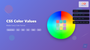
CSS Color Values: Complete Guide to Named Colors, Hex, RGB, HSL, RGBA, HSLA
Colors are fundamental to web design, breathing life into otherwise plain HTML elements. CSS provides multiple ways to define colors,...
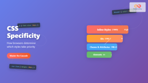
CSS Specificity: Complete Guide to Style Priority and Cascade Resolution
CSS specificity is one of the most crucial concepts every web developer must master. It determines which styles the browser...
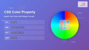
CSS Style color Property: CSS Color
Understanding the CSS color Property: A Comprehensive Guide The CSS color property is fundamental for styling web pages. It specifies...
CSS Prefers-Reduced-Motion: Building Accessible Web Animations for All Users
Web animations can enhance user experience, but they can also cause serious problems for users with vestibular disorders, motion sensitivity,...
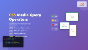
CSS Media Query Operators: Complete Guide to and, or, not, only Keywords
CSS media query operators are essential tools for creating responsive web designs that adapt to different devices and screen conditions....
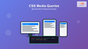
CSS Media Queries: Complete Guide to @media Rule for Responsive Web Design
What Are CSS Media Queries? CSS Media Queries are a fundamental feature of modern web development that allow you to...
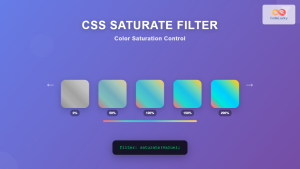
CSS Saturate Filter: Complete Guide to Color Saturation Control
The CSS saturate() filter function is a powerful tool that allows you to control the color saturation of HTML elements....
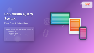
CSS Media Query Syntax: Complete Guide to Media Types and Features
CSS media queries are the cornerstone of responsive web design, allowing developers to apply different styles based on device characteristics...
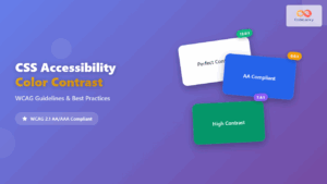
CSS Accessibility: Complete Guide to WCAG Color Contrast Requirements
Web accessibility is not just a legal requirement—it's a fundamental principle of inclusive design that ensures your website can be...
CSS Color Property: Complete Guide to Text Colors with Hex, RGB, HSL Values
The CSS color property is one of the most fundamental styling properties in web development, allowing you to control the...

CSS Syntax: Complete Guide to Rules, Selectors, Properties and Values
CSS (Cascading Style Sheets) is the cornerstone of web design, transforming plain HTML into visually stunning websites. Understanding CSS syntax...
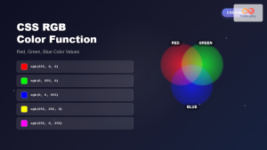
CSS RGB Color Function: Complete Guide to Red, Green, Blue Color Values
The CSS RGB color function is one of the most fundamental and widely-used methods for defining colors in web development....


