
What is CSS Perspective Property?
The CSS perspective property is a powerful tool that defines the distance between the user and the z=0 plane, giving 3D-positioned elements a realistic sense of depth. When you apply 3D transforms to elements, the perspective property determines how pronounced the 3D effect appears to viewers.
Think of perspective as the viewing distance from which you observe a 3D scene. A smaller perspective value creates a more dramatic 3D effect (like standing close to an object), while a larger value produces a subtler effect (like viewing from far away).
CSS Perspective Syntax and Values
The perspective property accepts the following values:
/* Length values */
perspective: 100px;
perspective: 500px;
perspective: 1000px;

/* Keyword values */
perspective: none;

/* Global values */
perspective: inherit;
perspective: initial;
perspective: revert;
perspective: unset;
Value Breakdown
- Length values (px, em, rem, etc.): Defines the distance from the viewer to the z=0 plane. Smaller values create more dramatic effects.
- none: No perspective transformation is applied (default value).
- Global values: Standard CSS inheritance and reset values.
How CSS Perspective Works
Perspective works by establishing a 3D rendering context for child elements. When you apply 3D transforms like rotateX(), rotateY(), or translateZ() to child elements, the perspective property on the parent container determines how these transformations appear.
Basic Perspective Example
This card is rotated 45 degrees on the Y-axis with a perspective of 400px applied to its container.
Perspective vs Perspective-Origin
While perspective sets the viewing distance, perspective-origin determines the vanishing point of the 3D scene. By default, the perspective origin is at the center (50% 50%) of the element.
Perspective Origin Comparison
Center Origin (Default)
Top Left Origin
Practical Examples and Use Cases
1. 3D Card Flip Effect
One of the most popular uses of perspective is creating card flip animations:
Hover over the card to see the 3D flip effect in action.
2. 3D Cube Animation
Create complex 3D shapes using perspective and multiple transforms:
This 3D cube rotates continuously, demonstrating how perspective affects complex 3D shapes.
Perspective Value Impact
The perspective value dramatically affects how 3D transforms appear. Here’s a comparison of different perspective values:
Perspective Value Comparison
150px (Close)
500px (Medium)
1000px (Far)
None
Interactive Perspective Demo
Experiment with different perspective values and see the effects in real-time:
Use the sliders above to see how perspective and rotation values affect the 3D appearance.
Browser Support and Compatibility
The CSS perspective property has excellent browser support across modern browsers:
- Chrome: Full support since version 36
- Firefox: Full support since version 16
- Safari: Full support since version 9
- Edge: Full support since version 12
- Internet Explorer: Partial support in IE 10-11 with vendor prefixes
For legacy browser support, you may need to include vendor prefixes:
/* Vendor prefixes for older browsers */
-webkit-perspective: 1000px;
-moz-perspective: 1000px;
-ms-perspective: 1000px;
perspective: 1000px;
Best Practices and Tips
1. Choose Appropriate Perspective Values
- 100-300px: Dramatic, close-up effects
- 500-800px: Balanced, realistic depth
- 1000px+: Subtle, distant perspective
2. Use Transform-Style: Preserve-3D
When creating complex 3D scenes with nested elements, always use transform-style: preserve-3d on parent containers to maintain 3D positioning through the hierarchy.
3. Consider Performance
3D transforms can be hardware-accelerated, but complex animations with many elements may impact performance on lower-end devices. Test your effects across different devices and consider providing fallbacks.
4. Accessibility Considerations
Some users may experience motion sensitivity. Consider using the prefers-reduced-motion media query to provide alternative experiences:
@media (prefers-reduced-motion: reduce) {
  .animated-element {
    animation: none;
    transform: none;
  }
}
Common Issues and Solutions
Elements Appearing Flat
Problem: 3D transforms not showing depth effect.
Solution: Ensure the perspective property is applied to the parent container, not the transformed element itself.
Flickering or Visual Artifacts
Problem: Elements flickering during animations.
Solution: Add backface-visibility: hidden and ensure proper z-index stacking.
Perspective Not Working on Mobile
Problem: 3D effects not rendering on mobile devices.
Solution: Some older mobile browsers have limited 3D support. Test thoroughly and provide 2D fallbacks when necessary.
Advanced Techniques
Combining Multiple Perspectives
You can create complex 3D scenes by nesting multiple perspective containers:
This example shows nested perspective containers creating a compound 3D effect.
Conclusion
The CSS perspective property is an essential tool for creating engaging 3D web experiences. By understanding how perspective values affect depth perception and combining it with 3D transforms, you can create everything from subtle depth effects to complex interactive 3D interfaces.
Remember to consider browser compatibility, performance implications, and accessibility when implementing 3D effects. Start with simple examples and gradually build complexity as you become more comfortable with the concepts.
Experiment with different perspective values, combine them with various transforms, and don’t forget to test your creations across different devices and browsers to ensure a consistent user experience.
Related Posts

CSS perspective Property: CSS Perspective
Understanding the CSS perspective Property The CSS perspective property allows you to give a 3D-positioned element some perspective. It defines...

CSS Style perspectiveOrigin Property: CSS Perspective Origin
CSS perspective-origin Property: A Comprehensive Guide The perspective-origin property in CSS is used to set the vanishing point for 3D...
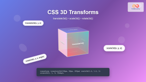
CSS 3D Transforms: Complete Guide to Translate3d, Scale3d, and Rotate3d Functions
CSS 3D transforms revolutionize how we create interactive and visually stunning web interfaces. By utilizing the power of translate3d(), scale3d(),...
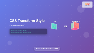
CSS Transform-Style: Complete Guide to Flat vs Preserve-3d for 3D Transformations
The CSS transform-style property is a powerful tool that controls how child elements are rendered in 3D space when their...
CSS Style transform Property: CSS Transform
CSS transform Property: A Comprehensive Guide The CSS transform property is a powerful tool that allows you to modify the...
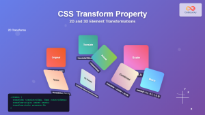
CSS Transform Property: Complete Guide to 2D and 3D Element Transformations
The CSS transform property is one of the most powerful tools in modern web development, allowing developers to manipulate HTML...
CSS Style transformOrigin Property: CSS Transform Origin
CSS transformOrigin Property: Mastering Element Transformation Origins The transformOrigin property in CSS is a fundamental tool for controlling how transformations...

CSS backface-visibility Property: CSS Backface Visibility
CSS backface-visibility Property: Controlling the Back Face in 3D Transforms The backface-visibility property in CSS determines whether the back face...
CSS Z-Index: Complete Guide to Controlling Element Stacking Order
The CSS z-index property is one of the most powerful yet misunderstood features in web development. It controls the stacking...
JavaScript Screen colorDepth Property: Color Depth
JavaScript Screen colorDepth Property: Understanding Color Depth The colorDepth property of the JavaScript screen object returns the color depth of...

CSS Style maxHeight Property: CSS Max Height
Understanding the CSS max-height Property The CSS max-height property is a fundamental tool for controlling the maximum height of an...

CSS Style filter Property: CSS Filter
CSS filter Property: Enhance Your Web Graphics The CSS filter property provides powerful visual effects to elements like images, backgrounds,...


