
Website performance directly impacts user experience, search rankings, and conversion rates. CSS plays a crucial role in three critical performance metrics that Google uses to evaluate web pages: Cumulative Layout Shift (CLS), First Contentful Paint (FCP), and Largest Contentful Paint (LCP). Understanding and optimizing these Core Web Vitals can significantly improve your website’s performance and user satisfaction.
Understanding Core Web Vitals Performance Metrics
Core Web Vitals are a set of real-world, user-centered metrics that quantify key aspects of the user experience. These metrics measure loading performance, interactivity, and visual stability of web pages. CSS optimization plays a vital role in achieving good scores across all three metrics.
- FCP: Time until first content appears (Good: <1.8s)
- LCP: Time until largest content loads (Good: <2.5s)
- CLS: Visual stability score (Good: <0.1)
First Contentful Paint (FCP): Optimizing Initial Rendering
First Contentful Paint measures the time from when the page starts loading to when any part of the page’s content is rendered on the screen. FCP is crucial for perceived performance, as users see visual feedback that the page is loading.
CSS Factors Affecting FCP
Several CSS-related factors can significantly impact FCP performance:
1. Render-Blocking CSS
CSS files in the document head block rendering until they’re fully downloaded and parsed. Here’s how to optimize:
❌ Poor FCP Practice:
<head>
  <link rel="stylesheet" href="styles.css">
  <link rel="stylesheet" href="bootstrap.css">
  <link rel="stylesheet" href="fonts.css">
</head>
✅ Optimized FCP Approach:
<head>
  <!-- Critical CSS inlined -->
  <style>
    body { font-family: Arial, sans-serif; margin: 0; }
    .header { background: #333; color: white; padding: 1rem; }
    .main-content { max-width: 1200px; margin: 0 auto; }
  </style>

  <!-- Non-critical CSS loaded asynchronously -->
  <link rel="preload" href="styles.css" as="style" onload="this.onload=null;this.rel='stylesheet'">
  <noscript><link rel="stylesheet" href="styles.css"></noscript>
</head>
2. Critical CSS Inlining
Inlining critical CSS ensures above-the-fold content renders immediately:
<style>
/* Critical CSS for above-the-fold content */
.hero-section {
  height: 100vh;
  background: linear-gradient(135deg, #667eea 0%, #764ba2 100%);
  display: flex;
  align-items: center;
  justify-content: center;
  color: white;
  text-align: center;
}

.hero-title {
  font-size: 3rem;
  font-weight: bold;
  margin-bottom: 1rem;
}

.hero-subtitle {
  font-size: 1.2rem;
  opacity: 0.9;
}
</style>
Interactive FCP Optimization Demo
FCP Simulation
Click the buttons below to see how different CSS loading strategies affect FCP:
Largest Contentful Paint (LCP): Optimizing Main Content Loading
Largest Contentful Paint measures the time it takes for the largest content element in the viewport to become visible. This is typically a hero image, video, or large text block.
CSS Strategies for LCP Optimization
1. Image Optimization and CSS
Images are often the LCP element. Proper CSS can significantly improve their loading performance:
/* Optimized image CSS for LCP */
.hero-image {
  width: 100%;
  height: 400px;
  object-fit: cover;
  /* Prevent layout shift during loading */
  aspect-ratio: 16/9;
  /* Optimize for loading */
  content-visibility: auto;
  contain-intrinsic-size: 800px 450px;
}

/* Progressive image loading */
.hero-image[loading] {
  background: linear-gradient(90deg, #f0f0f0 25%, #f8f8f8 50%, #f0f0f0 75%);
  background-size: 200% 100%;
  animation: loading 1.5s infinite;
}

@keyframes loading {
  0% { background-position: 200% 0; }
  100% { background-position: -200% 0; }
}
2. Font Loading Optimization
Web fonts can be LCP elements when they’re large or prominently displayed:
/* Optimize font loading for LCP */
@font-face {
  font-family: 'CustomFont';
  src: url('font.woff2') format('woff2');
  font-display: swap; /* Show fallback font immediately */
  /* Preload critical font weights */
  font-weight: 400 700;
}

.large-headline {
  font-family: 'CustomFont', Arial, sans-serif;
  /* Ensure consistent sizing during font swap */
  size-adjust: 100%;
  /* Prevent invisible text during font load */
  font-display: swap;
}
LCP Visual Demonstration
LCP Element Simulation
This demo shows how different elements can affect LCP timing:
Cumulative Layout Shift (CLS): Preventing Visual Instability
Cumulative Layout Shift measures the visual stability of a page by quantifying how much visible content shifts during the loading process. CLS is crucial for user experience, as unexpected layout shifts can cause users to click wrong elements or lose their reading position.
Common CSS Causes of Layout Shift
1. Images Without Dimensions
❌ Causes Layout Shift:
<img src="hero.jpg" alt="Hero image">✅ Prevents Layout Shift:
<img src="hero.jpg" alt="Hero image" width="800" height="400">

/* Or using CSS aspect-ratio */
.responsive-image {
  width: 100%;
  aspect-ratio: 16/9;
  object-fit: cover;
}
2. Dynamic Content Injection
Reserve space for dynamically loaded content to prevent shifts:
/* Reserve space for dynamic content */
.ad-container {
  min-height: 250px; /* Reserve space for ad */
  display: flex;
  align-items: center;
  justify-content: center;
  background: #f8f9fa;
  border: 2px dashed #dee2e6;
}

.loading-placeholder {
  width: 100%;
  height: 200px;
  background: linear-gradient(90deg, #f0f0f0 25%, #f8f8f8 50%, #f0f0f0 75%);
  background-size: 200% 100%;
  animation: shimmer 1.5s infinite;
  border-radius: 4px;
}

@keyframes shimmer {
  0% { background-position: 200% 0; }
  100% { background-position: -200% 0; }
}
Interactive CLS Demonstration
Layout Shift Simulator
Experience how different loading strategies affect visual stability:
Sample Article
This is sample content that demonstrates layout shift behavior. When poorly implemented,
content can suddenly jump when images or ads load, creating a poor user experience.
Notice how the content moves when new elements are inserted without proper space reservation.
Advanced CSS Performance Optimization Techniques
1. CSS Containment for Performance
CSS containment helps browsers optimize rendering by limiting the scope of style and layout calculations:
/* Optimize rendering performance */
.widget {
  contain: layout style paint;
  /* Isolates this component's rendering */
}

.article-list {
  contain: layout;
  /* Prevents child layout changes from affecting parent */
}

.sidebar {
  contain: style;
  /* Isolates style calculations */
}
2. Content Visibility for Lazy Rendering
The content-visibility property allows browsers to skip rendering of off-screen content:
/* Skip rendering of off-screen sections */
.article-section {
  content-visibility: auto;
  contain-intrinsic-size: 1000px; /* Estimated size for scrollbar */
}

/* For elements that should always be visible */
.critical-content {
  content-visibility: visible;
}

/* For elements that should never render unless needed */
.hidden-content {
  content-visibility: hidden;
}
3. Optimizing CSS Animations for Performance
Poorly optimized animations can negatively impact all three Core Web Vitals:
/* GPU-accelerated animations */
.smooth-animation {
  /* Use transform and opacity for smooth animations */
  transform: translateX(0);
  opacity: 1;
  transition: transform 0.3s ease, opacity 0.3s ease;
  /* Force GPU acceleration */
  will-change: transform, opacity;
}

/* Avoid layout-triggering properties */
.avoid-layout-animations {
  /* ❌ These trigger layout recalculation */
  /* width: 100px; */
  /* height: 100px; */
  /* top: 10px; */

  /* ✅ These are optimized for performance */
  transform: scale(1.1);
  opacity: 0.8;
}
Measuring and Monitoring Performance
Tools for Performance Analysis
Several tools can help you measure and monitor your CSS performance metrics:
Essential Performance Tools
- Chrome DevTools: Real-time performance monitoring and debugging
- Lighthouse: Automated auditing for Core Web Vitals
- PageSpeed Insights: Google’s performance analysis tool
- WebPageTest: Detailed performance testing from multiple locations
- Chrome UX Report: Real user metrics from Chrome users
CSS Performance Checklist
✅ FCP Optimization Checklist
- Inline critical CSS for above-the-fold content
- Load non-critical CSS asynchronously
- Minimize CSS file sizes and combine when possible
- Use efficient CSS selectors
- Optimize web font loading with
font-display: swap
✅ LCP Optimization Checklist
- Optimize images with proper sizing and modern formats
- Preload important resources
- Use efficient CSS for large content elements
- Minimize server response times
- Implement proper caching strategies
✅ CLS Prevention Checklist
- Always specify image dimensions
- Reserve space for ads and dynamic content
- Use CSS aspect-ratio for responsive images
- Avoid inserting content above existing content
- Use CSS transforms for animations instead of layout properties
Real-World Implementation Example
Here’s a complete example showing how to implement all three performance optimizations in a typical webpage:
<!DOCTYPE html>
<html lang="en">
<head>
  <meta charset="UTF-8">
  <meta name="viewport" content="width=device-width, initial-scale=1.0">

  <!-- Critical CSS inlined for FCP -->
  <style>
    /* Critical styles for above-the-fold content */
    body {
      font-family: -apple-system, BlinkMacSystemFont, 'Segoe UI', sans-serif;
      margin: 0;
      line-height: 1.6;
    }

    .header {
      background: #333;
      color: white;
      padding: 1rem;
      position: sticky;
      top: 0;
      z-index: 100;
    }

    .hero {
      height: 100vh;
      background: linear-gradient(135deg, #667eea 0%, #764ba2 100%);
      display: flex;
      align-items: center;
      justify-content: center;
      color: white;
      text-align: center;
    }

    /* Reserve space for images to prevent CLS */
    .hero-image {
      width: 100%;
      max-width: 800px;
      aspect-ratio: 16/9;
      object-fit: cover;
      border-radius: 8px;
    }

    /* Optimize rendering with containment */
    .content-section {
      contain: layout style;
      content-visibility: auto;
      contain-intrinsic-size: 500px;
    }
  </style>

  <!-- Preload critical resources for LCP -->
  <link rel="preload" href="hero-image.jpg" as="image">

  <!-- Load non-critical CSS asynchronously -->
Related Posts
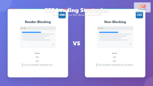
CSS Loading Strategies: Complete Guide to Render-Blocking and Non-Blocking Performance Optimization
CSS loading strategies are fundamental to web performance optimization, directly impacting user experience and search engine rankings. Understanding how different...

CSS Critical Path: Complete Guide to Above-Fold Optimization and Performance
The critical rendering path represents the sequence of steps browsers take to convert HTML, CSS, and JavaScript into pixels on...

HTML CSS: Styling Your Web Pages with Selectors, Properties, and the Cascade
Introduction Ever wondered how websites go from plain text to visually stunning experiences? The magic lies in CSS (Cascading Style...
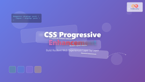
CSS Progressive Enhancement: Build Resilient Web Experiences Layer by Layer
Progressive enhancement in CSS is a fundamental approach that ensures your web applications remain functional and accessible across all devices,...

CSS Purge: Ultimate Guide to Removing Unused CSS for Lightning-Fast Performance
Website performance is crucial for user experience and SEO rankings. One of the most effective ways to improve loading times...

CSS Specificity: Complete Guide to Style Priority and Cascade Resolution
CSS specificity is one of the most crucial concepts every web developer must master. It determines which styles the browser...

HTML Styles: Mastering Inline, Internal, and External CSS
Introduction Have you ever looked at a website and wondered how all the elements are so beautifully arranged and styled?...
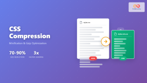
CSS Compression: Complete Guide to Minification and Gzip Optimization for Faster Websites
Website performance is crucial for user experience and SEO rankings. One of the most effective ways to improve loading times...
CSS Introduction: Complete Guide to Styling HTML with Cascading Style Sheets
CSS (Cascading Style Sheets) is the cornerstone technology that transforms plain HTML documents into visually stunning, professional websites. While HTML...

CSS Future: Complete Guide to Upcoming CSS Features and Specifications 2025
The future of CSS is incredibly exciting, with numerous groundbreaking features and specifications currently in development that promise to revolutionize...

CSS Graceful Degradation: Essential Fallback Strategies for Modern Web Development
CSS graceful degradation is a fundamental web development strategy that ensures your website remains functional and accessible across all browsers,...

CSS Containment: Mastering the contain Property for Optimal Web Performance
CSS containment is a powerful performance optimization technique that allows developers to isolate parts of the DOM tree, preventing unnecessary...


