
What Are CSS Media Queries?
CSS Media Queries are a fundamental feature of modern web development that allow you to apply different styles based on device characteristics like screen size, resolution, orientation, and more. The @media rule is the cornerstone of responsive web design, enabling websites to adapt seamlessly across desktop computers, tablets, and mobile devices.
Media queries work by testing one or more conditions about the user’s device or browser, and only applying the enclosed CSS rules when those conditions are met. This conditional approach to styling is what makes responsive design possible.
Basic Syntax and Structure
The basic syntax of a CSS media query follows this pattern:
@media media-type and (media-feature) {
  /* CSS rules go here */
}
Here’s a simple example that changes the background color on screens smaller than 768px:
@media screen and (max-width: 768px) {
  body {
    background-color: lightblue;
  }
}
Interactive Example: Basic Media Query
Resize your browser window to see the effect!
Current width: Loading…
Media Types
CSS supports several media types, though most modern development focuses on screen:
- screen – For computer screens, tablets, and smartphones
- print – For printed pages and print preview
- speech – For screen readers and speech synthesizers
- all – Suitable for all devices (default if omitted)
Print Media Query Example
@media print {
  .no-print {
    display: none;
  }

  body {
    font-size: 12pt;
    color: black;
    background: white;
  }
}
Essential Media Features
Width-Based Queries
Width-based media queries are the most commonly used for responsive design:
/* Exact width */
@media (width: 768px) { /* styles */ }

/* Maximum width */
@media (max-width: 767px) { /* styles */ }

/* Minimum width */
@media (min-width: 768px) { /* styles */ }

/* Width range */
@media (min-width: 768px) and (max-width: 1023px) { /* styles */ }
Height-Based Queries
/* For short screens */
@media (max-height: 600px) {
  .tall-content {
    display: none;
  }
}

/* For tall screens */
@media (min-height: 800px) {
  .extra-content {
    display: block;
  }
}
Orientation Queries
/* Portrait orientation (height > width) */
@media (orientation: portrait) {
  .landscape-only {
    display: none;
  }
}

/* Landscape orientation (width > height) */
@media (orientation: landscape) {
  .portrait-only {
    display: none;
  }
}
Interactive Example: Orientation Detection
Current orientation: Loading…
Try rotating your device or resizing the window!
Common Responsive Breakpoints
While breakpoints should ideally be based on your content, here are industry-standard breakpoints that work well for most projects:
/* Mobile First Approach */
/* Small devices (phones) */
@media (min-width: 576px) { /* styles */ }

/* Medium devices (tablets) */
@media (min-width: 768px) { /* styles */ }

/* Large devices (desktops) */
@media (min-width: 992px) { /* styles */ }

/* Extra large devices (large desktops) */
@media (min-width: 1200px) { /* styles */ }
Complete Responsive Grid Example
Responsive Grid Demo
Resize your browser to see the grid adapt!
Advanced Media Query Techniques
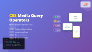
Combining Multiple Conditions
You can combine multiple media features using logical operators:
/* AND operator */
@media screen and (min-width: 768px) and (max-width: 1023px) {
/* Styles for tablets only */
}
/* OR operator (comma-separated) */
@media (max-width: 767px), (orientation: portrait) {
/* Styles for mobile OR portrait orientation */
}
/* NOT operator */
@media not screen and (max-width: 767px) {
/* Styles for everything except mobile screens */
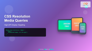
}High-DPI and Retina Displays
/* Standard resolution */
@media (resolution: 1dppx) {
  .logo {
    background-image: url('logo.png');
  }
}

/* High-DPI displays */
@media (min-resolution: 2dppx) {
  .logo {
    background-image: url('[email protected]');
    background-size: 100px 50px;
  }
}

/* Alternative syntax for retina */
@media (-webkit-min-device-pixel-ratio: 2) {
  .retina-image {
    background-image: url('[email protected]');
  }
}
Dark Mode Support
/* Light mode (default) */
:root {
  --bg-color: white;
  --text-color: black;
}

/* Dark mode */
@media (prefers-color-scheme: dark) {
  :root {
    --bg-color: #1a1a1a;
    --text-color: white;
  }
}

body {
  background-color: var(--bg-color);
  color: var(--text-color);
}
Dark Mode Demo
This demo adapts to your system’s color scheme preference.
Performance Considerations
Mobile-First vs Desktop-First
The mobile-first approach is generally recommended for performance:
/* Mobile-First (Recommended) */
/* Base styles for mobile */
.container {
  width: 100%;
  padding: 10px;
}

/* Enhance for larger screens */
@media (min-width: 768px) {
  .container {
    max-width: 750px;
    margin: 0 auto;
    padding: 20px;
  }
}

/* Desktop-First (Less optimal) */
/* Base styles for desktop */
.container {
  max-width: 1200px;
  margin: 0 auto;
  padding: 30px;
}

/* Override for smaller screens */
@media (max-width: 767px) {
  .container {
    width: 100%;
    padding: 10px;
  }
}
Optimizing Media Query Performance
- Group related styles within the same media query
- Use specific breakpoints rather than overlapping ranges
- Minimize the number of media queries
- Place media queries at the end of your CSS for better organization
Practical Implementation Examples
Responsive Navigation Menu
Responsive Navigation Demo
Responsive Typography
/* Fluid typography using media queries */
body {
  font-size: 16px;
  line-height: 1.5;
}

@media (min-width: 768px) {
  body {
    font-size: 18px;
  }
}

@media (min-width: 1200px) {
  body {
    font-size: 20px;
  }
}

/* Responsive headings */
h1 {
  font-size: 2rem;
}

@media (min-width: 768px) {
  h1 {
    font-size: 2.5rem;
  }
}

@media (min-width: 1200px) {
  h1 {
    font-size: 3rem;
  }
}
Testing and Debugging Media Queries
Browser Developer Tools
Modern browsers provide excellent tools for testing responsive designs:
- Chrome DevTools: Press F12, click the device toggle icon, and test various screen sizes
- Firefox Responsive Design Mode: Press Ctrl+Shift+M to activate
- Safari Web Inspector: Enable responsive design mode from the Develop menu
Testing Checklist
- Test all major breakpoints
- Verify content readability at all sizes
- Check touch target sizes on mobile (minimum 44x44px)
- Test orientation changes
- Verify print styles
- Test on real devices when possible
Common Pitfalls and Best Practices
Avoid These Common Mistakes
- Overlapping breakpoints: Use consistent min/max values
- Too many breakpoints: Start with 3-4 main breakpoints
- Forgetting the viewport meta tag: Always include it in your HTML
- Testing only in browser: Test on real devices
Essential Viewport Meta Tag
<meta name="viewport" content="width=device-width, initial-scale=1.0">Best Practices Summary
- Use mobile-first approach for better performance
- Choose breakpoints based on content, not devices
- Keep media queries organized and well-commented
- Test extensively across different devices and browsers
- Use relative units (em, rem, %) for better scalability
- Consider accessibility in all responsive designs
Future of Media Queries
CSS Media Queries continue to evolve with new features being added:
- Container Queries: Style elements based on their parent container size
- New media features: hover, pointer, reduced-motion for enhanced accessibility
- Environment variables: Safe area insets for notched devices
/* Modern accessibility-aware media queries */
@media (prefers-reduced-motion: reduce) {
  * {
    animation-duration: 0.01ms !important;
    animation-iteration-count: 1 !important;
    transition-duration: 0.01ms !important;
  }
}

@media (hover: hover) {
  .button:hover {
    background-color: #0056b3;
  }
}

@media (pointer: coarse) {
  .touch-target {
    min-height: 44px;
    min-width: 44px;
  }
}
CSS Media Queries and the @media rule are essential tools for creating responsive, accessible, and user-friendly websites. By mastering these techniques and following best practices, you can ensure your websites provide optimal experiences across all devices and user preferences. Remember to always test thoroughly and prioritize performance and accessibility in your responsive designs.
Related Posts
CSS Media Query Syntax: Complete Guide to Media Types and Features
CSS media queries are the cornerstone of responsive web design, allowing developers to apply different styles based on device characteristics...
CSS Screen Media Queries: Complete Guide to Responsive Monitor and Device Targeting
CSS screen media queries are the cornerstone of responsive web design, enabling developers to create websites that adapt seamlessly across...
CSS Media Query Operators: Complete Guide to and, or, not, only Keywords
CSS media query operators are essential tools for creating responsive web designs that adapt to different devices and screen conditions....
CSS Resolution Media Queries: Complete Guide to High-DPI Display Targeting
Understanding CSS Resolution Media Queries CSS resolution media queries allow developers to target specific display densities and create optimized experiences...
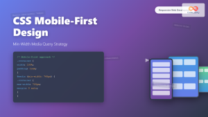
CSS Mobile-First Design: Complete Min-Width Media Query Guide for Responsive Web Development
What is Mobile-First Design? Mobile-first design is a progressive enhancement approach where you start designing and coding for the smallest...
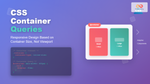
CSS Container Queries: Complete Guide to @container Rule and Containment Context
CSS Container Queries represent a revolutionary approach to responsive web design, allowing elements to respond to their container's size rather...
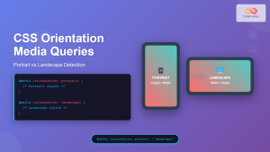
CSS Orientation Media Queries: Complete Guide to Portrait vs Landscape Detection
CSS orientation media queries are essential tools for creating responsive web designs that adapt seamlessly to different device orientations. Whether...
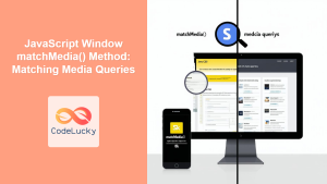
JavaScript Window matchMedia() Method: Matching Media Queries
JavaScript Window matchMedia() Method: Matching Media Queries The window.matchMedia() method in JavaScript is a powerful tool that enables developers to...
HTML Responsive Web Design: Crafting Websites for Every Device
Introduction In today's digital landscape, users access the internet through a plethora of devices, from large desktop monitors to small...
CSS Desktop-First Design: Master Max-Width Media Queries for Responsive Web Development
Desktop-first design is a responsive web development approach where you design for larger screens first, then progressively adapt your layout...
HTML Source media Property: Source Media Query
HTML Source media Property: Source Media Query The HTML <source> element is used within <picture> and <video> elements to provide...
CSS Future: Complete Guide to Upcoming CSS Features and Specifications 2025
The future of CSS is incredibly exciting, with numerous groundbreaking features and specifications currently in development that promise to revolutionize...


