
When building responsive websites, controlling element widths is crucial for creating layouts that work across all devices. CSS provides two powerful properties—max-width and min-width—that allow you to set boundaries on how wide elements can become. These properties are essential for modern web development and responsive design.
Understanding CSS Width Constraints
Width constraint properties in CSS work by setting limits on an element’s width rather than defining exact dimensions. This approach creates more flexible layouts that adapt to different screen sizes and content requirements.
The max-width Property
The max-width property sets the maximum width an element can reach. When the content or parent container would make the element wider than this value, the element stops growing and maintains the maximum width instead.
Basic max-width Syntax:
.element {
  max-width: 600px;
  /* Element will never exceed 600px width */
}
The min-width Property
The min-width property sets the minimum width an element must maintain. Even if the content is smaller or the parent container is narrower, the element will not shrink below this specified width.
Basic min-width Syntax:
.element {
  min-width: 200px;
  /* Element will never be narrower than 200px */
}
Practical Examples and Visual Demonstrations
Max-Width in Action
Let’s see how max-width works with a practical example. Notice how the element respects the maximum width constraint:
This container has a maximum width of 400px. Try resizing your browser – it won’t grow beyond this limit!
.container {
  background: linear-gradient(135deg, #667eea 0%, #764ba2 100%);
  color: white;
  padding: 20px;
  max-width: 400px;
  margin: 0 auto;
  text-align: center;
}
Min-Width in Action
Here’s how min-width ensures elements maintain a minimum size:
Short text
.min-width-demo {
  background: linear-gradient(135deg, #ff6b6b 0%, #ee5a24 100%);
  color: white;
  padding: 15px;
  min-width: 250px;
  width: fit-content;
}
Interactive Example: Combining Both Properties
The real power comes from combining both properties. Here’s an interactive demonstration:
Min-width: 200px | Max-width: 500px
Current width: 300px
.flexible-container {
  background: linear-gradient(135deg, #48bb78 0%, #38a169 100%);
  color: white;
  padding: 20px;
  min-width: 200px;    /* Won't shrink below 200px */
  max-width: 500px;    /* Won't grow beyond 500px */
  width: 300px;        /* Preferred width */
  transition: width 0.3s ease;
}
Value Types and Units
Both max-width and min-width accept various value types:
Absolute Units
- Pixels (px): Fixed size regardless of screen or parent element
- Points (pt): Primarily used for print media
- Inches (in), Centimeters (cm): Physical measurements
Relative Units
- Percentages (%): Relative to parent element’s width
- Em (em): Relative to element’s font size
- Rem (rem): Relative to root element’s font size
- Viewport units (vw, vh): Relative to viewport dimensions
Special Keywords
- none: No width constraint (default for max-width)
- initial: Reset to default value
- inherit: Inherit from parent element
- auto: Browser calculates the value
Examples of Different Units:
.container-1 { max-width: 800px; }        /* Fixed pixel width */
.container-2 { max-width: 80%; }          /* 80% of parent width */
.container-3 { max-width: 50em; }         /* 50 times the font size */
.container-4 { max-width: 90vw; }         /* 90% of viewport width */
.container-5 { min-width: 20rem; }        /* 20 times root font size */
Common Use Cases and Best Practices
1. Responsive Container Design
Creating containers that scale appropriately across devices:
.main-content {
  max-width: 1200px;     /* Prevent overly wide content on large screens */
  min-width: 320px;      /* Ensure readability on small screens */
  width: 100%;           /* Fill available space */
  margin: 0 auto;        /* Center the container */
  padding: 0 20px;       /* Add side padding */
}
2. Image Responsiveness
Preventing images from breaking layouts:
.responsive-image {
  max-width: 100%;       /* Never exceed container width */
  height: auto;          /* Maintain aspect ratio */
  min-width: 0;          /* Allow shrinking when necessary */
}
3. Navigation Menu Items
Ensuring consistent navigation appearance:
.nav-item {
  min-width: 100px;      /* Consistent minimum button size */
  max-width: 200px;      /* Prevent overly long buttons */
  padding: 10px 15px;
  text-align: center;
}
4. Form Input Fields
Creating usable form controls:
.form-input {
  min-width: 200px;      /* Ensure adequate input space */
  max-width: 400px;      /* Prevent excessive width */
  width: 100%;           /* Fill available container space */
}
CSS Grid and Flexbox Integration
Width constraints work seamlessly with modern layout systems:
With CSS Flexbox
.flex-container {
  display: flex;
  gap: 20px;
}

.flex-item {
  flex: 1;               /* Grow to fill space */
  min-width: 200px;      /* Don't shrink too small */
  max-width: 400px;      /* Don't grow too large */
}
With CSS Grid
.grid-container {
  display: grid;
  grid-template-columns: repeat(auto-fit, minmax(250px, 1fr));
  gap: 20px;
  max-width: 1200px;     /* Container constraint */
}
Browser Support and Compatibility
Both max-width and min-width have excellent browser support:
✅ Browser Support
- Chrome: Full support since version 1
- Firefox: Full support since version 1
- Safari: Full support since version 1
- Internet Explorer: Full support since IE 7
- Edge: Full support since version 12
Common Pitfalls and Troubleshooting
1. Box Model Considerations
Remember that width constraints apply to the content box by default:
⚠️ Common Issue
.problematic {
  max-width: 300px;
  padding: 20px;        /* Adds 40px to total width */
  border: 2px solid;    /* Adds 4px to total width */
  /* Total rendered width: 344px, not 300px! */
}
Solution: Use box-sizing: border-box to include padding and borders in width calculations:
.fixed {
  max-width: 300px;
  padding: 20px;
  border: 2px solid;
  box-sizing: border-box;  /* Now total width is exactly 300px */
}
2. Conflicting Width Properties
Understanding property precedence prevents layout issues:
/* Property precedence (highest to lowest): */
/* 1. min-width (always wins) */
/* 2. max-width */
/* 3. width */

.element {
  width: 400px;          /* Desired width */
  min-width: 500px;      /* Forces minimum 500px */
  max-width: 300px;      /* Would limit to 300px, but min-width wins */
  /* Actual width: 500px */
}
Advanced Techniques
Creating Fluid Typography Containers
Combine width constraints with viewport units for responsive design:
.fluid-container {
  width: 90vw;           /* 90% of viewport width */
  min-width: 320px;      /* Minimum for mobile readability */
  max-width: 1200px;     /* Maximum for desktop readability */
  margin: 0 auto;
}
Multi-Column Layouts with Constraints
Create flexible column systems:
.column-layout {
  display: flex;
  gap: 20px;
  max-width: 1000px;
  margin: 0 auto;
}

.main-column {
  flex: 2;
  min-width: 300px;      /* Ensure readable main content */
}

.sidebar {
  flex: 1;
  min-width: 200px;      /* Minimum sidebar width */
  max-width: 300px;      /* Prevent oversized sidebar */
}
Performance Considerations
Width constraints generally have minimal performance impact, but consider these points:
- Reflow Optimization: Prefer percentage-based constraints over fixed pixels for responsive designs
- Animation Performance: Animating width can trigger layout recalculations; consider transform-based alternatives
- Container Queries: Modern browsers support container queries for more efficient responsive behavior
Conclusion
CSS max-width and min-width properties are fundamental tools for creating flexible, responsive web layouts. They provide essential control over element sizing while maintaining the adaptability needed for modern web design. By understanding their behavior, value types, and best practices, you can create layouts that work beautifully across all devices and screen sizes.
Key takeaways:
- Use
max-widthto prevent elements from becoming too wide on larger screens - Use
min-widthto ensure elements remain usable on smaller screens - Combine both properties for flexible containers that adapt within defined boundaries
- Consider the box model when setting width constraints
- Test your implementations across different screen sizes and devices
These width constraint properties, when used effectively, form the foundation of responsive web design and help create user experiences that work seamlessly across the ever-expanding landscape of devices and screen sizes.
Related Posts

CSS Style maxWidth Property: CSS Max Width
Understanding the CSS maxWidth Property The CSS maxWidth property is a fundamental tool in web development for controlling the maximum...

CSS Width and Height: Complete Guide to Element Dimensions
Understanding how to control element dimensions is fundamental to creating well-structured web layouts. CSS width and height properties give you...
CSS Style minWidth Property: CSS Min Width
CSS min-width Property: Controlling Element Size The CSS min-width property sets the minimum width of an element. It prevents the...

CSS Aspect-Ratio Property: Complete Guide to Maintaining Perfect Width/Height Ratios
The CSS aspect-ratio property revolutionizes how we maintain consistent width-to-height ratios in responsive web design. Instead of relying on complex...

CSS Width Property: Mastering Element Width in CSS
CSS Width Property: Mastering Element Width The width property in CSS defines the width of an element's content area. It's...

CSS Max-Height and Min-Height: Complete Guide to Constraining Element Height
Understanding how to control element height is crucial for creating responsive and visually appealing web layouts. CSS provides powerful properties...

CSS Breakpoints: Complete Guide to Responsive Design Screen Sizes
CSS breakpoints are the foundation of responsive web design, defining specific screen widths where your website's layout adapts to different...
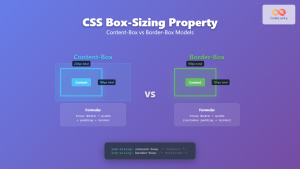
CSS Box-Sizing Property: Master Content-Box vs Border-Box for Perfect Layouts
The CSS box-sizing property is one of the most crucial yet often misunderstood concepts in web development. It determines how...
CSS Style maxHeight Property: CSS Max Height
Understanding the CSS max-height Property The CSS max-height property is a fundamental tool for controlling the maximum height of an...
CSS minHeight Property: CSS Min Height
Understanding the CSS minHeight Property The CSS minHeight property sets the minimum height of an element. It prevents the element's...

CSS Desktop-First Design: Master Max-Width Media Queries for Responsive Web Development
Desktop-first design is a responsive web development approach where you design for larger screens first, then progressively adapt your layout...

CSS Percentage Units: Complete Guide to Parent-Relative Sizing
CSS percentage units are fundamental building blocks for creating responsive, flexible layouts that adapt to different screen sizes and container...


