
CSS logical properties revolutionize how we approach layout and spacing in modern web development. Unlike traditional physical properties that rely on fixed directions (top, right, bottom, left), logical properties adapt to different writing modes and text directions, making your layouts truly international and accessible.
Understanding Physical vs Logical Properties
Traditional CSS uses physical properties based on the screen’s physical dimensions. These work well for left-to-right, top-to-bottom languages like English, but become problematic when dealing with different writing modes or right-to-left languages.
Physical Properties (Traditional)
margin-top,margin-right,margin-bottom,margin-leftpadding-top,padding-right,padding-bottom,padding-leftborder-top,border-right,border-bottom,border-lefttop,right,bottom,left
Logical Properties (Modern)
margin-block-start,margin-inline-end,margin-block-end,margin-inline-startpadding-block-start,padding-inline-end,padding-block-end,padding-inline-startborder-block-start,border-inline-end,border-block-end,border-inline-startinset-block-start,inset-inline-end,inset-block-end,inset-inline-start
The Four Logical Directions Explained
CSS logical properties are based on two axes that adapt to the writing mode:
Block Axis
Block-Start: Beginning of the block flow (usually top)
Block-End: End of the block flow (usually bottom)
Inline Axis
Inline-Start: Beginning of the inline flow (usually left)
Inline-End: End of the inline flow (usually right)
Visual Demonstration: Writing Modes in Action
Let’s see how logical properties adapt to different writing modes with an interactive example:
Interactive Writing Mode Demo
Logical Properties Box
Green: block-start, Red: inline-end
Yellow: block-end, Purple: inline-start
CSS Code:
.logical-box {
  margin-block-start: 20px;
  margin-inline-end: 15px;
  margin-block-end: 20px;
  margin-inline-start: 15px;

  padding-block-start: 10px;
  padding-inline-end: 10px;
  padding-block-end: 10px;
  padding-inline-start: 10px;

  border-block-start: 3px solid #28a745;
  border-inline-end: 3px solid #dc3545;
  border-block-end: 3px solid #ffc107;
  border-inline-start: 3px solid #6f42c1;
}
Practical Examples and Use Cases
1. Margin and Padding with Logical Properties
Here’s how to replace physical properties with logical equivalents:
❌ Physical Properties
.card {
  margin-top: 20px;
  margin-right: 15px;
  margin-bottom: 20px;
  margin-left: 15px;

  padding-top: 10px;
  padding-right: 12px;
  padding-bottom: 10px;
  padding-left: 12px;
}
✅ Logical Properties
.card {
  margin-block: 20px;
  margin-inline: 15px;

  padding-block: 10px;
  padding-inline: 12px;
}
2. Border Properties
Logical Border Example
This box uses logical border properties. Notice how the borders adapt to different writing modes.
.border-example {
  border-block-start: 4px solid #007bff;
  border-inline-end: 2px solid #28a745;
  border-block-end: 1px solid #ffc107;
  border-inline-start: 3px solid #dc3545;
}
3. Positioning with Logical Properties
Logical positioning properties use the inset keyword:
Positioned with logical properties
.positioned-element {
  position: absolute;
  inset-block-start: 20px;    /* Instead of top: 20px */
  inset-inline-end: 20px;     /* Instead of right: 20px */
}
Shorthand Properties
Logical properties offer convenient shorthand syntax similar to physical properties:
Margin Shorthand
/* Two values: block-start/end, inline-start/end */
margin-block: 20px;
margin-inline: 15px;

/* Four values: block-start, inline-end, block-end, inline-start */
margin: 20px 15px 10px 5px; /* Still works */

/* Logical equivalent */
margin-block-start: 20px;
margin-inline-end: 15px;
margin-block-end: 10px;
margin-inline-start: 5px;
Padding Shorthand
/* Logical padding shorthand */
padding-block: 20px 10px;    /* block-start: 20px, block-end: 10px */
padding-inline: 15px;        /* inline-start: 15px, inline-end: 15px */
Real-World Application: Internationalization
Here’s a practical example showing how logical properties benefit international websites:
Multi-Language Navigation
CSS Code:
.nav-item {
  margin-inline-end: 30px;
  padding-inline: 15px;
  border-inline-end: 1px solid #ddd;
}
Browser Support and Fallbacks
CSS logical properties have excellent modern browser support, but here’s how to provide fallbacks for older browsers:
Progressive Enhancement Approach
.element {
  /* Fallback for older browsers */
  margin-top: 20px;
  margin-right: 15px;
  margin-bottom: 20px;
  margin-left: 15px;

  /* Modern logical properties */
  margin-block: 20px;
  margin-inline: 15px;
}
Common Logical Properties Reference
Advanced Techniques and Tips
1. Combining with CSS Grid
.grid-container {
  display: grid;
  gap: 20px;
  padding-block: 30px;
  padding-inline: 20px;
}

.grid-item {
  border-block-start: 3px solid #007bff;
  padding-block: 15px;
  padding-inline: 20px;
}
2. Responsive Design with Logical Properties
@media (max-width: 768px) {
  .responsive-element {
    margin-block: 15px;
    margin-inline: 10px;
    padding-block: 12px;
    padding-inline: 15px;
  }
}

@media (min-width: 1200px) {
  .responsive-element {
    margin-block: 25px;
    margin-inline: 30px;
    padding-block: 20px;
    padding-inline: 25px;
  }
}
Performance and Best Practices
✅ Best Practices
- Use logical properties for new projects to future-proof your CSS
- Start with shorthand properties (
margin-block,padding-inline) for cleaner code - Combine logical properties with CSS Grid and Flexbox for truly flexible layouts
- Test your layouts in different writing modes during development
- Use feature detection for critical fallbacks
❌ Common Mistakes
- Mixing physical and logical properties inconsistently
- Forgetting to test with RTL languages
- Not providing fallbacks for older browsers when needed
- Overcomplicating simple layouts that don’t need internationalization
Conclusion
CSS logical properties represent a fundamental shift toward more inclusive and flexible web design. By thinking in terms of block and inline flow rather than fixed physical directions, you create layouts that naturally adapt to different languages, cultures, and writing systems.
While the transition from physical to logical properties might seem daunting initially, the benefits become clear when building modern, international web applications. Start incorporating logical properties in your next project, and you’ll discover how they simplify responsive design while making your CSS more semantic and maintainable.
The future of CSS is logical, and mastering these properties now will position you at the forefront of modern web development practices. Whether you’re building a simple blog or a complex web application, logical properties provide the foundation for truly universal design.
Related Posts
CSS Style left Property: CSS Left
CSS left Property: A Comprehensive Guide The CSS left property is a fundamental tool for web developers, enabling precise horizontal...
CSS Text-Align: Complete Guide to Left, Right, Center and Justify Text Alignment
Text alignment is a fundamental aspect of web design that significantly impacts readability and visual hierarchy. The CSS text-align property...

CSS Style right Property: CSS Right
Understanding the CSS right Property The CSS right property plays a crucial role in positioning elements within a web page....
CSS Absolute Positioning: Master Element Placement with Containing Blocks
CSS absolute positioning is one of the most powerful tools for creating precise layouts and complex designs. Understanding how absolutely...
CSS Style marginRight Property: CSS Margin Right
Understanding the CSS marginRight Property The marginRight property in CSS is used to set the right margin of an element....
HTML Block and Inline Elements: Understanding Display Properties
Introduction Have you ever wondered why some HTML elements stack vertically while others flow horizontally? Understanding the difference between block-level...
CSS Style direction Property: CSS Direction
Understanding the CSS direction Property The CSS direction property specifies the text direction/writing direction. It is used to set the...
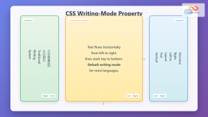
CSS Writing-Mode Property: Master Horizontal and Vertical Text Direction Control
The CSS writing-mode property is a powerful tool that controls the direction and orientation of text flow on web pages....
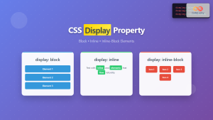
CSS Display Property: Complete Guide to Block, Inline, and Inline-Block Elements
The CSS display property is one of the most fundamental concepts in web development, controlling how elements are rendered and...
CSS Style paddingRight Property: CSS Padding Right
Understanding the CSS padding-right Property The padding-right property in CSS is used to set the amount of space between the...
CSS Text-Indent: Complete Guide to First Line Paragraph Indentation
The CSS text-indent property is a fundamental typography tool that controls the indentation of the first line in a block...
CSS Direction Property: Complete Guide to LTR and RTL Text Direction
Introduction to CSS Direction Property The CSS direction property is a fundamental tool for controlling text flow and layout direction...


