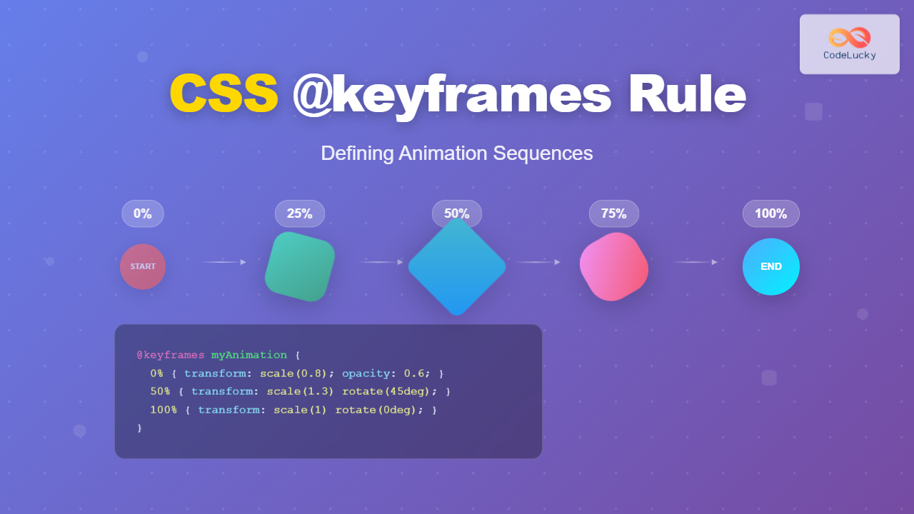
CSS animations bring life to web interfaces, and the @keyframes rule is the foundation that makes complex animation sequences possible. This powerful CSS feature allows developers to define precise animation steps, creating smooth transitions and engaging user experiences that were once only possible with JavaScript.
What is the CSS @keyframes Rule?
The @keyframes rule defines the animation sequence by specifying CSS styles at various points during the animation timeline. Think of it as creating a storyboard for your animation, where each keyframe represents a specific moment in time with defined styles.
Unlike simple CSS transitions that only animate between two states, keyframes allow you to create multi-step animations with precise control over timing, easing, and style changes throughout the entire animation duration.
Basic @keyframes Syntax
The fundamental syntax for defining keyframes follows this structure:
@keyframes animation-name {
  0% {
    /* Starting styles */
  }
  50% {
    /* Midpoint styles */
  }
  100% {
    /* Ending styles */
  }
}
You can also use the keywords from and to as alternatives to 0% and 100%:
@keyframes fadeIn {
  from {
    opacity: 0;
  }
  to {
    opacity: 1;
  }
}
Applying Keyframe Animations
After defining your keyframes, apply the animation using the animation property or its individual sub-properties:
.animated-element {
  animation-name: fadeIn;
  animation-duration: 2s;
  animation-timing-function: ease-in-out;
  animation-delay: 0.5s;
  animation-iteration-count: infinite;
  animation-direction: alternate;
}
The shorthand syntax combines all animation properties:
.animated-element {
  animation: fadeIn 2s ease-in-out 0.5s infinite alternate;
}
Essential Animation Properties
Animation Duration
Controls how long the animation takes to complete one cycle. Values can be specified in seconds (s) or milliseconds (ms).
Animation Timing Function
Defines the acceleration curve of the animation. Common values include:
linear– Constant speed throughoutease– Slow start, fast middle, slow end (default)ease-in– Slow start, accelerating endease-out– Fast start, decelerating endease-in-out– Slow start and endcubic-bezier()– Custom timing function
Animation Iteration Count
Specifies how many times the animation should repeat. Use infinite for continuous animation or a specific number.
Animation Direction
Controls the direction of animation playback:
normal– Forward direction (default)reverse– Backward directionalternate– Forward, then backwardalternate-reverse– Backward, then forward
Practical Animation Examples
Simple Fade In Animation
Fade In Animation
This element fades in with a subtle upward movement
@keyframes fadeIn {
  from {
    opacity: 0;
    transform: translateY(20px);
  }
  to {
    opacity: 1;
    transform: translateY(0);
  }
}

.fade-example {
  animation: fadeIn 2s ease-out;
}
Bouncing Ball Animation
@keyframes bounce {
  0%, 20%, 50%, 80%, 100% {
    transform: translateY(0);
  }
  40% {
    transform: translateY(-30px);
  }
  60% {
    transform: translateY(-15px);
  }
}

.bounce-ball {
  animation: bounce 2s infinite;
}
Loading Spinner Animation
Loading…
@keyframes spin {
  0% {
    transform: rotate(0deg);
  }
  100% {
    transform: rotate(360deg);
  }
}

.spinner {
  animation: spin 1s linear infinite;
}
Advanced Keyframe Techniques
Multiple Properties Animation
You can animate multiple CSS properties simultaneously within the same keyframe sequence:
@keyframes morphBox {
  0% {
    width: 100px;
    height: 100px;
    background: #ff6b6b;
    border-radius: 0;
    transform: rotate(0deg);
  }
  50% {
    width: 150px;
    height: 80px;
    background: #4ecdc4;
    border-radius: 50%;
    transform: rotate(180deg);
  }
  100% {
    width: 120px;
    height: 120px;
    background: #45b7d1;
    border-radius: 20px;
    transform: rotate(360deg);
  }
}
Complex Multi-Step Animations
Create sophisticated animations by defining multiple keyframe stops with precise timing:
@keyframes complexMove {
  0% {
    transform: translateX(0) translateY(0) scale(1);
    opacity: 1;
  }
  25% {
    transform: translateX(100px) translateY(-50px) scale(1.2);
    opacity: 0.8;
  }
  50% {
    transform: translateX(100px) translateY(50px) scale(0.8);
    opacity: 0.6;
  }
  75% {
    transform: translateX(-50px) translateY(25px) scale(1.1);
    opacity: 0.9;
  }
  100% {
    transform: translateX(0) translateY(0) scale(1);
    opacity: 1;
  }
}
Interactive Animation Controls
Combine CSS animations with user interactions for dynamic experiences:
@keyframes pulse {
  0% {
    transform: scale(1);
    box-shadow: 0 0 0 0 rgba(74, 144, 226, 0.7);
  }
  70% {
    transform: scale(1.05);
    box-shadow: 0 0 0 10px rgba(74, 144, 226, 0);
  }
  100% {
    transform: scale(1);
    box-shadow: 0 0 0 0 rgba(74, 144, 226, 0);
  }
}

.interactive-button:hover {
  animation: pulse 1.5s infinite;
}
Animation Performance Optimization
Hardware Acceleration
Use CSS properties that trigger hardware acceleration for smoother animations:
transform– Scale, rotate, translate, skewopacity– Fade effectsfilter– Visual effects
Avoid animating properties that trigger layout recalculations like width, height, top, or left.
will-change Property
Hint to the browser which properties will be animated:
.optimized-animation {
  will-change: transform, opacity;
  animation: slideIn 1s ease-out;
}
Browser Compatibility and Vendor Prefixes
Modern browsers fully support CSS animations, but for older browsers, include vendor prefixes:
@-webkit-keyframes slideIn {
  from { transform: translateX(-100%); }
  to { transform: translateX(0); }
}

@keyframes slideIn {
  from { transform: translateX(-100%); }
  to { transform: translateX(0); }
}

.element {
  -webkit-animation: slideIn 1s ease-out;
  animation: slideIn 1s ease-out;
}
Common Animation Patterns
Entrance Animations
Perfect for revealing content as users scroll or navigate:
@keyframes slideInUp {
  from {
    opacity: 0;
    transform: translate3d(0, 100%, 0);
  }
  to {
    opacity: 1;
    transform: translate3d(0, 0, 0);
  }
}
Attention Seekers
Draw user attention to important elements:
@keyframes shake {
  0%, 100% { transform: translateX(0); }
  10%, 30%, 50%, 70%, 90% { transform: translateX(-10px); }
  20%, 40%, 60%, 80% { transform: translateX(10px); }
}
Loading Indicators
Provide visual feedback during loading states:
@keyframes dots {
  0%, 20% { opacity: 0; }
  50% { opacity: 1; }
  100% { opacity: 0; }
}

.loading-dots span:nth-child(1) { animation-delay: 0s; }
.loading-dots span:nth-child(2) { animation-delay: 0.2s; }
.loading-dots span:nth-child(3) { animation-delay: 0.4s; }
Best Practices for CSS Animations
Performance Guidelines
- Limit concurrent animations to avoid performance issues
- Use
transformandopacityfor smooth animations - Keep animation durations reasonable (0.2s – 2s for most cases)
- Test animations on various devices and browsers
Accessibility Considerations
Respect user preferences for reduced motion:
@media (prefers-reduced-motion: reduce) {
  .animated-element {
    animation: none;
  }
}
Meaningful Animations
- Use animations to guide user attention and improve UX
- Maintain consistency in animation timing and easing
- Avoid overusing animations that may distract from content
Debugging Animation Issues
Common Problems and Solutions
Animation not playing: Check animation name spelling and ensure keyframes are properly defined.
Choppy animations: Use hardware-accelerated properties and avoid animating layout-triggering properties.
Animation resets suddenly: Set animation-fill-mode: forwards to maintain final state.
Developer Tools
Use browser developer tools to inspect and debug animations:
- Chrome DevTools Animation Inspector
- Firefox Developer Tools Animations panel
- Safari Web Inspector Timelines
Conclusion
The CSS @keyframes rule provides powerful capabilities for creating engaging web animations. From simple fade effects to complex multi-step sequences, mastering keyframe animations enables you to enhance user experience with smooth, performant visual feedback.
Remember to balance visual appeal with performance, always considering accessibility and user preferences. With practice and attention to these best practices, you’ll create animations that not only look great but also contribute meaningfully to your web application’s user interface.
Start experimenting with the examples provided, and gradually build more complex animations as you become comfortable with the syntax and timing principles. The key to great web animations lies in understanding both the technical implementation and the user experience impact of your creative choices.
- What is the CSS @keyframes Rule?
- Basic @keyframes Syntax
- Applying Keyframe Animations
- Essential Animation Properties
- Practical Animation Examples
- Advanced Keyframe Techniques
- Interactive Animation Controls
- Animation Performance Optimization
- Browser Compatibility and Vendor Prefixes
- Common Animation Patterns
- Best Practices for CSS Animations
- Debugging Animation Issues
- Conclusion


