
The justify-self property in CSS is a powerful alignment tool that allows you to control how individual items align themselves along the inline axis (horizontal direction in most cases) within their container. Unlike justify-items which affects all items in a container, justify-self gives you granular control over each item’s alignment.
Understanding CSS Justify-Self
The justify-self property works primarily with CSS Grid Layout and is used to align a single grid item along the inline axis within its grid area. This property overrides the justify-items value set on the grid container for that specific item.
Syntax and Values
The basic syntax for justify-self is straightforward:
justify-self: auto | normal | stretch | start | end | center | flex-start | flex-end | self-start | self-end | left | right | baseline | first-baseline | last-baseline;Common Values Explained
- auto: Uses the parent’s
justify-itemsvalue (default) - stretch: Stretches the item to fill the entire grid area
- start: Aligns to the start of the inline axis
- end: Aligns to the end of the inline axis
- center: Centers the item along the inline axis
Basic Grid Example
Let’s start with a simple grid layout to demonstrate how justify-self works:
.grid-container {
  display: grid;
  grid-template-columns: repeat(3, 1fr);
  gap: 10px;
}

.item-start { justify-self: start; }
.item-center { justify-self: center; }
.item-end { justify-self: end; }
Justify-Self vs Justify-Items
Understanding the difference between justify-self and justify-items is crucial:
justify-items: Applied to the grid container, affects all grid itemsjustify-self: Applied to individual grid items, overrides the container’sjustify-items
justify-items: center (container)
Individual justify-self override
Interactive Justify-Self Demo
Experiment with different justify-self values using this interactive demo:
(justify-self applied)
Working with Flexbox
While justify-self is primarily designed for CSS Grid, it has limited support in Flexbox. In flex containers, justify-self is generally ignored, and you should use align-self for cross-axis alignment or margin auto for individual item positioning.
Flexbox Alternative: Using margin auto
.flex-container {
  display: flex;
  gap: 10px;
}

.push-right {
  margin-left: auto; /* Pushes item to the right */
}
Advanced Use Cases
Responsive Grid Alignment
You can combine justify-self with media queries for responsive alignment:
Resize your browser to see the alignment change on smaller screens
.grid-item {
  justify-self: center; /* Centered on larger screens */
}

@media (max-width: 600px) {
  .grid-item {
    justify-self: stretch; /* Full width on mobile */
  }
}
Card Layout with Mixed Alignments
Create visually interesting layouts by applying different justify-self values to different items:
Left Aligned
This card uses justify-self: start to align to the left side of its grid area.
Center Aligned
This card uses justify-self: center to align to the center of its grid area.
Right Aligned
This card uses justify-self: end to align to the right side of its grid area.
Browser Support and Best Practices
Browser Compatibility
The justify-self property has excellent browser support for CSS Grid:
- Chrome/Edge: Supported since version 57
- Firefox: Supported since version 45
- Safari: Supported since version 10.1
- Internet Explorer: Not supported
Best Practices
- Use with Grid Layout:
justify-selfworks best with CSS Grid. For Flexbox, consider alternatives likemargin: auto - Combine with align-self: Use both
justify-selfandalign-selffor complete control over item positioning - Consider responsive design: Different alignments may work better on different screen sizes
- Test thoroughly: Always test your layouts across different browsers and devices
Common Pitfalls to Avoid
1. Using justify-self with Flexbox
Remember that justify-self doesn’t work as expected in Flexbox containers. Use align-self or margin: auto instead.
2. Forgetting Grid Area Boundaries
justify-self aligns items within their grid area, not the entire grid container. Make sure you understand where your grid areas are positioned.
3. Overusing Individual Alignment
While justify-self gives you granular control, sometimes it’s better to adjust the overall grid layout or use justify-items on the container for consistency.
Conclusion
The justify-self property is a powerful tool for fine-tuning the alignment of individual grid items along the inline axis. By understanding its values and behavior, you can create more flexible and visually appealing layouts.
Key takeaways:
justify-selfworks primarily with CSS Grid Layout- It overrides the container’s
justify-itemssetting for individual items - Common values include
start,center,end, andstretch - Combine with responsive design techniques for optimal results
- Always test across different browsers and devices
Start experimenting with justify-self in your next CSS Grid project to create more dynamic and engaging layouts that provide better user experiences across all devices.
Related Posts
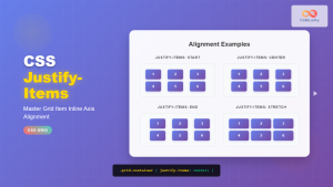
CSS Justify-Items: Complete Guide to Grid Item Inline Axis Alignment
The justify-items property is a powerful CSS Grid feature that controls how grid items are aligned along the inline axis...

CSS Justify-Content: Master Grid Container Inline Axis Alignment with Examples
The justify-content property is a powerful CSS tool for controlling how grid items are aligned along the inline axis (horizontal...
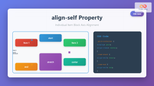
CSS Align-Self: Master Individual Grid Item Block Axis Alignment
The CSS align-self property provides granular control over individual grid items' alignment along the block axis (vertical direction in horizontal...
CSS Align-Items: Complete Guide to Grid Item Block Axis Alignment
Understanding CSS Align-Items in Grid Context The CSS align-items property is a powerful tool for controlling how grid items align...
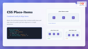
CSS Place-Items: Master Combined Justify and Align Items in One Property
The CSS place-items property is a powerful shorthand that combines justify-items and align-items into a single declaration. This property revolutionizes...
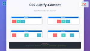
CSS Justify-Content: Complete Guide to Flexbox Main Axis Alignment
The justify-content property is one of the most powerful tools in CSS Flexbox for controlling how flex items are distributed...

CSS Align-Content: Master Grid Container Block Axis Alignment
The CSS align-content property is a powerful tool for controlling how grid items are distributed along the block axis (typically...
CSS Style justifyContent Property: CSS Justify Content
CSS justifyContent Property: Mastering Content Alignment The CSS justifyContent property defines how the browser distributes space between and around content...
CSS Place-Content: Complete Guide to Combined Justify and Align Content Properties
The place-content property in CSS is a powerful shorthand that combines both justify-content and align-content properties into a single declaration....
CSS Place-Self: Master Grid and Flexbox Item Positioning with One Property
The CSS place-self property is a powerful shorthand that combines justify-self and align-self into a single declaration, making it easier...
CSS Style alignItems Property: CSS Align Items
Understanding the CSS align-items Property The align-items property in CSS is a powerful tool that defines how items are aligned...

CSS Align-Items: Master Cross-Axis Alignment in Flexbox and Grid
The CSS align-items property is a fundamental tool for controlling cross-axis alignment in both flexbox and CSS Grid layouts. Understanding...


