
The justify-content property is a powerful CSS tool for controlling how grid items are aligned along the inline axis (horizontal direction in most writing modes) within their grid container. This property becomes essential when your grid container is larger than the total size of all grid tracks, allowing you to distribute the extra space effectively.
Understanding CSS Justify-Content in Grid Context
When working with CSS Grid Layout, justify-content aligns the entire grid within the grid container along the inline axis. Unlike justify-items which aligns individual grid items within their grid areas, justify-content moves the entire grid structure as a unit.
The property only has a visible effect when the grid container is wider than the total width of all grid columns combined, creating extra space that can be distributed according to your alignment preferences.
CSS Justify-Content Values and Their Effects
Basic Alignment Values
The justify-content property accepts several keyword values that determine how the grid is positioned within its container:
1. start (default)
Aligns the grid to the start of the container’s inline axis.
.grid-container {
  display: grid;
  grid-template-columns: 80px 80px 80px;
  gap: 10px;
  justify-content: start;
}
2. center
Centers the grid within the container.
.grid-container {
  display: grid;
  grid-template-columns: 80px 80px 80px;
  gap: 10px;
  justify-content: center;
}
3. end
Aligns the grid to the end of the container’s inline axis.
.grid-container {
  display: grid;
  grid-template-columns: 80px 80px 80px;
  gap: 10px;
  justify-content: end;
}
Space Distribution Values
These values distribute the extra space between and around grid tracks:
4. space-between
Distributes items evenly with the first item at the start and the last item at the end.
.grid-container {
  display: grid;
  grid-template-columns: 80px 80px 80px;
  justify-content: space-between;
}
5. space-around
Distributes items evenly with equal space around each item.
.grid-container {
  display: grid;
  grid-template-columns: 80px 80px 80px;
  justify-content: space-around;
}
6. space-evenly
Distributes items evenly with equal space between and around all items.
.grid-container {
  display: grid;
  grid-template-columns: 80px 80px 80px;
  justify-content: space-evenly;
}
Interactive Justify-Content Demo
Experiment with different justify-content values using this interactive demonstration:
Current value: center
Practical Use Cases and Examples
Responsive Navigation Bar
One common use case for justify-content in grid layouts is creating responsive navigation bars:
.navbar {
  display: grid;
  grid-template-columns: repeat(auto-fit, minmax(100px, 1fr));
  justify-content: center;
  gap: 15px;
  background: #2c3e50;
  padding: 15px;
}
Card Layout with Centering
Another practical application is centering a collection of cards when there’s extra horizontal space:
.card-container {
  display: grid;
  grid-template-columns: repeat(3, 200px);
  justify-content: center;
  gap: 20px;
}
Common Mistakes and Best Practices
Mistake 1: Confusing justify-content with justify-items
A common mistake is confusing justify-content with justify-items. Remember:
justify-content: Aligns the entire grid within the grid containerjustify-items: Aligns individual grid items within their grid areas
justify-content when you want to position the entire grid structure, and justify-items when you want to align content within individual grid cells.
Mistake 2: Not Considering Container Width
justify-content only has a visible effect when the grid container is wider than the total width of all grid columns. If your grid fills the entire container width, you won’t see any alignment changes.
Best Practice: Responsive Design Considerations
When using justify-content in responsive designs, consider how the alignment will look on different screen sizes:
/* Mobile-first approach */
.grid-container {
  display: grid;
  grid-template-columns: repeat(auto-fit, minmax(250px, 1fr));
  justify-content: center;
  gap: 20px;
}

/* Large screens */
@media (min-width: 1200px) {
  .grid-container {
    grid-template-columns: repeat(4, 250px);
    justify-content: space-between;
  }
}
Browser Support and Compatibility
The justify-content property for CSS Grid is well-supported across modern browsers:
- Chrome: Version 57+
- Firefox: Version 52+
- Safari: Version 10.1+
- Edge: Version 16+
- Internet Explorer: Version 11+ (with -ms- prefix for older grid syntax)
For older browser support, you can provide fallbacks using flexbox or traditional layout methods.
Advanced Techniques and Tips
Combining with Other Grid Properties
You can combine justify-content with align-content for complete grid positioning control:
.centered-grid {
  display: grid;
  grid-template-columns: 80px 80px;
  grid-template-rows: 60px 60px;
  justify-content: center;
  align-content: center;
  gap: 10px;
  height: 200px;
}
Dynamic Content Adaptation
Use justify-content with CSS custom properties for dynamic layouts:
:root {
  --grid-justify: center;
}

.adaptive-grid {
  display: grid;
  grid-template-columns: repeat(auto-fit, minmax(200px, 1fr));
  justify-content: var(--grid-justify);
  gap: 20px;
}

/* JavaScript can update the custom property */
.adaptive-grid.spread {
  --grid-justify: space-between;
}

.adaptive-grid.packed {
  --grid-justify: start;
}
Conclusion
The justify-content property is an essential tool for creating well-aligned grid layouts. By understanding how it distributes space along the inline axis, you can create more visually appealing and responsive designs. Whether you’re centering a navigation bar, distributing cards evenly, or creating complex responsive layouts, mastering justify-content will significantly improve your CSS Grid skills.
Remember to consider the total width of your grid tracks relative to the container width, choose the appropriate distribution method for your design goals, and test your layouts across different screen sizes to ensure optimal responsive behavior.
Practice with different values and combinations to fully understand how justify-content can enhance your grid-based layouts and create more professional, well-structured web interfaces.
Related Posts

CSS Justify-Self: Master Individual Item Inline Axis Alignment
The justify-self property in CSS is a powerful alignment tool that allows you to control how individual items align themselves...
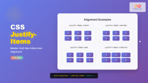
CSS Justify-Items: Complete Guide to Grid Item Inline Axis Alignment
The justify-items property is a powerful CSS Grid feature that controls how grid items are aligned along the inline axis...
CSS Style justifyContent Property: CSS Justify Content
CSS justifyContent Property: Mastering Content Alignment The CSS justifyContent property defines how the browser distributes space between and around content...

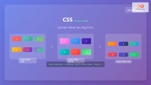
CSS Align-Content: Master Grid Container Block Axis Alignment
The CSS align-content property is a powerful tool for controlling how grid items are distributed along the block axis (typically...
CSS Align-Items: Complete Guide to Grid Item Block Axis Alignment
Understanding CSS Align-Items in Grid Context The CSS align-items property is a powerful tool for controlling how grid items align...
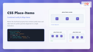
CSS Place-Items: Master Combined Justify and Align Items in One Property
The CSS place-items property is a powerful shorthand that combines justify-items and align-items into a single declaration. This property revolutionizes...
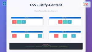
CSS Justify-Content: Complete Guide to Flexbox Main Axis Alignment
The justify-content property is one of the most powerful tools in CSS Flexbox for controlling how flex items are distributed...
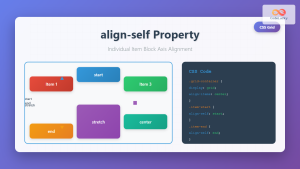
CSS Align-Self: Master Individual Grid Item Block Axis Alignment
The CSS align-self property provides granular control over individual grid items' alignment along the block axis (vertical direction in horizontal...
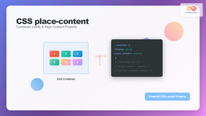
CSS Place-Content: Complete Guide to Combined Justify and Align Content Properties
The place-content property in CSS is a powerful shorthand that combines both justify-content and align-content properties into a single declaration....
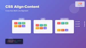
CSS Align-Content: Complete Guide to Cross-Axis Multi-Line Alignment
The align-content property is a powerful CSS tool that controls how multiple lines of content are distributed along the cross-axis...
CSS Place-Self: Master Grid and Flexbox Item Positioning with One Property
The CSS place-self property is a powerful shorthand that combines justify-self and align-self into a single declaration, making it easier...

CSS align-content Property: CSS Align Content
CSS align-content Property: Mastering Content Alignment in Flexbox and Grid Layouts The CSS align-content property is a powerful tool for...


