
The justify-content property is one of the most powerful tools in CSS Flexbox for controlling how flex items are distributed along the main axis of a flex container. Whether you’re centering content, creating equal spacing, or aligning items to specific edges, mastering this property is essential for modern web layouts.
What is CSS Justify-Content?
The justify-content property defines how flex items are aligned and distributed along the main axis of a flex container. The main axis is determined by the flex-direction property – it’s horizontal when flex-direction is row (default) and vertical when it’s column.
Key Concepts:
- Main Axis: The primary axis along which flex items are laid out
- Cross Axis: The axis perpendicular to the main axis
- Flex Container: The parent element with
display: flex - Flex Items: The child elements inside the flex container
Syntax and Values
The basic syntax for justify-content is straightforward:
.flex-container {
  display: flex;
  justify-content: value;
}
The property accepts the following values:
flex-start– Items align to the start of the main axis (default)flex-end– Items align to the end of the main axiscenter– Items are centered along the main axisspace-between– Equal space between items, no space at edgesspace-around– Equal space around items, half space at edgesspace-evenly– Equal space between and around items
Interactive Examples
Try Different Justify-Content Values
Click the buttons below to see how each value affects the layout:
Current value: flex-start
Detailed Breakdown of Each Value
1. flex-start (Default)
Items are packed toward the start of the main axis. This is the default behavior.
.container {
  display: flex;
  justify-content: flex-start; /* default */
}
2. flex-end
Items are packed toward the end of the main axis.
.container {
  display: flex;
  justify-content: flex-end;
}
3. center
Items are centered along the main axis. Perfect for creating centered layouts.
.container {
  display: flex;
  justify-content: center;
}
4. space-between
Items are evenly distributed with the first item at the start and the last item at the end. Equal space is placed between items, but not at the edges.
.container {
  display: flex;
  justify-content: space-between;
}
5. space-around
Items are evenly distributed with equal space around them. The space at the edges is half the space between items.
.container {
  display: flex;
  justify-content: space-around;
}
6. space-evenly
Items are evenly distributed with equal space between and around them. The space at the edges equals the space between items.
.container {
  display: flex;
  justify-content: space-evenly;
}
Real-World Use Cases
Navigation Bar
Create a responsive navigation bar with evenly spaced menu items:
.navbar {
  display: flex;
  justify-content: space-between;
  align-items: center;
  background: #343a40;
  padding: 15px;
}

.nav-links {
  display: flex;
  justify-content: space-evenly;
  flex: 1;
  max-width: 400px;
}
Button Groups
Center action buttons in a card or modal:
Confirm Action
Are you sure you want to delete this item?
.button-group {
  display: flex;
  justify-content: center;
  gap: 10px;
  margin-top: 20px;
}
Card Layout
Distribute cards evenly across a container:
Feature 1
Description of the first feature and its benefits.
Feature 2
Description of the second feature and its benefits.
Feature 3
Description of the third feature and its benefits.
.card-container {
  display: flex;
  justify-content: space-between;
  gap: 15px;
  flex-wrap: wrap;
}

.card {
  flex: 1;
  min-width: 200px;
  background: white;
  border: 1px solid #dee2e6;
  border-radius: 8px;
  padding: 20px;
}
Working with Different Flex Directions
The justify-content property works differently depending on the flex-direction:
Column Direction
When flex-direction: column, the main axis becomes vertical:
flex-direction: row (default)
flex-direction: column
/* Horizontal centering */
.container-row {
  display: flex;
  flex-direction: row; /* default */
  justify-content: center;
}

/* Vertical centering */
.container-column {
  display: flex;
  flex-direction: column;
  justify-content: center;
  min-height: 200px;
}
Browser Support and Compatibility
Excellent Browser Support
The justify-content property has excellent browser support:
- Chrome: 21+ (full support)
- Firefox: 28+ (full support)
- Safari: 9+ (full support)
- Edge: 12+ (full support)
- Internet Explorer: 11+ (partial support)
Note: space-evenly has slightly less support (not supported in IE11).
Common Mistakes and Best Practices
⚠️ Common Mistakes
- Forgetting display: flex:
justify-contentonly works on flex containers - Confusing main and cross axis: Remember that
justify-contentaffects the main axis only - Using with block elements: Convert to flex container first
- Overriding with margins: Large margins can interfere with space distribution
✅ Best Practices
- Use semantic HTML: Maintain proper HTML structure while applying flexbox
- Consider responsive design: Test how your layout behaves on different screen sizes
- Combine with align-items: Use both properties for complete control over item positioning
- Test across browsers: Ensure consistent behavior across different browsers
Advanced Techniques
Combining with CSS Grid
Use justify-content within grid items that are also flex containers:
Grid Item 1
Grid Item 2
.grid-container {
  display: grid;
  grid-template-columns: repeat(auto-fit, minmax(250px, 1fr));
  gap: 20px;
}

.grid-item {
  background: #f8f9fa;
  padding: 20px;
}

.button-container {
  display: flex;
  justify-content: space-between; /* or center, etc. */
  margin-top: 15px;
}
Responsive Justify-Content
Change alignment based on screen size using media queries:
.responsive-container {
  display: flex;
  justify-content: center; /* Center on larger screens */
}

@media (max-width: 768px) {
  .responsive-container {
    justify-content: space-between; /* Space between on mobile */
  }
}

@media (max-width: 480px) {
  .responsive-container {
    flex-direction: column; /* Stack vertically on small screens */
    justify-content: flex-start;
  }
}
Performance Considerations
The justify-content property is highly optimized and has minimal performance impact. However, consider these points:
- Avoid excessive nesting: Deep flex container hierarchies can impact rendering performance
- Use transform for animations: When animating position changes, prefer CSS transforms over changing justify-content values
- Consider container queries: For complex responsive layouts, container queries might be more efficient than media queries
Conclusion
The justify-content property is an essential tool for creating flexible, responsive layouts with CSS Flexbox. By understanding how each value works and when to use them, you can create professional-looking layouts that adapt to different screen sizes and content amounts.
Key takeaways:
justify-contentcontrols alignment along the main axis of flex containers- Six main values provide different spacing and alignment options
- Works differently with
flex-direction: columnvsflex-direction: row - Excellent browser support makes it safe to use in production
- Combines well with other flexbox properties for complete layout control
Practice with the interactive examples above and experiment with different combinations to master this powerful CSS property. The flexibility and control it provides will significantly improve your ability to create modern, responsive web layouts.
Related Posts
CSS Style justifyContent Property: CSS Justify Content
CSS justifyContent Property: Mastering Content Alignment The CSS justifyContent property defines how the browser distributes space between and around content...
CSS Justify-Self: Master Individual Item Inline Axis Alignment
The justify-self property in CSS is a powerful alignment tool that allows you to control how individual items align themselves...
CSS Place-Content: Complete Guide to Combined Justify and Align Content Properties
The place-content property in CSS is a powerful shorthand that combines both justify-content and align-content properties into a single declaration....
CSS Flex-Direction: Complete Guide to Row, Column, Row-Reverse & Column-Reverse
The flex-direction property is one of the most fundamental aspects of CSS Flexbox, determining how flex items are arranged within...
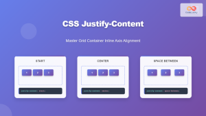
CSS Justify-Content: Master Grid Container Inline Axis Alignment with Examples
The justify-content property is a powerful CSS tool for controlling how grid items are aligned along the inline axis (horizontal...

CSS Align-Items: Master Cross-Axis Alignment in Flexbox and Grid
The CSS align-items property is a fundamental tool for controlling cross-axis alignment in both flexbox and CSS Grid layouts. Understanding...
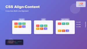
CSS Align-Content: Complete Guide to Cross-Axis Multi-Line Alignment
The align-content property is a powerful CSS tool that controls how multiple lines of content are distributed along the cross-axis...
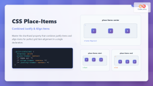
CSS Place-Items: Master Combined Justify and Align Items in One Property
The CSS place-items property is a powerful shorthand that combines justify-items and align-items into a single declaration. This property revolutionizes...
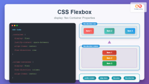
CSS Flexbox: Complete Guide to display: flex Container Properties and Layout Control
CSS Flexbox revolutionized web layout by providing a powerful, flexible way to arrange elements within containers. The display: flex property...
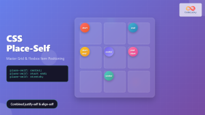
CSS Place-Self: Master Grid and Flexbox Item Positioning with One Property
The CSS place-self property is a powerful shorthand that combines justify-self and align-self into a single declaration, making it easier...
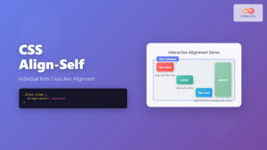
CSS Align-Self: Master Individual Flexbox Item Alignment
The CSS align-self property is a powerful flexbox feature that allows you to override the default cross-axis alignment for individual...
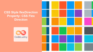
CSS Style flexDirection Property: CSS Flex Direction
CSS flexDirection Property: Mastering Flex Item Arrangement The CSS flexDirection property is a crucial aspect of Flexbox layout, determining the...


