
The CSS invert() filter is a powerful visual effect that reverses the colors of HTML elements, creating striking contrast and unique design possibilities. Whether you’re building dark mode toggles, creating artistic effects, or enhancing user interface elements, understanding how to properly use the invert filter can significantly enhance your web design toolkit.
What is CSS Invert Filter?
The CSS invert() filter function inverts the color samples in an element. It’s part of the CSS Filter Effects specification and works by converting each color to its opposite value on the RGB color spectrum. When you apply invert(1) or invert(100%), white becomes black, black becomes white, and all other colors are transformed to their complementary values.
CSS Invert Filter Syntax
The basic syntax for the invert filter is straightforward:
filter: invert(amount);The amount parameter accepts values in two formats:
- Number: Values from 0 to 1 (e.g., 0.5)
- Percentage: Values from 0% to 100% (e.g., 50%)
Interactive Invert Filter Demo
Understanding Invert Filter Values
The invert filter accepts different values that produce varying levels of color inversion:
Common Invert Values
invert(0)
Original colors
invert(0.25)
25% inverted
invert(0.5)
50% inverted
invert(1)
Fully inverted
Practical Examples of CSS Invert Filter
1. Creating a Dark Mode Toggle
One of the most popular uses of the invert filter is creating quick dark mode effects:
.dark-mode {
  filter: invert(1) hue-rotate(180deg);
}

/* Prevent double inversion on images */
.dark-mode img {
  filter: invert(1) hue-rotate(180deg);
}
Dark Mode Demo
Sample Content
This is a sample paragraph with some text content.
2. Hover Effects with Invert Filter
Create engaging hover effects using the invert filter:
.invert-hover {
  transition: filter 0.3s ease;
}

.invert-hover:hover {
  filter: invert(1);
}
3. Inverting Icons and SVGs
The invert filter is particularly useful for inverting monochromatic icons:
.icon-invert {
  filter: invert(1);
}

/* For white icons on dark backgrounds */
.white-icon {
  filter: invert(0) brightness(0) saturate(100%) invert(100%);
}
Icon Inversion Demo
Original
Inverted
Combining Invert with Other CSS Filters
The invert filter can be combined with other CSS filters to create more complex effects:
Invert + Hue-Rotate
filter: invert(1) hue-rotate(180deg);Invert + Brightness + Contrast
filter: invert(0.8) brightness(1.2) contrast(1.1);Multiple Filter Effects Demo
Original
invert(1)
invert(1) hue-rotate(180deg)
invert(0.7) brightness(1.3)
Browser Support and Performance
The CSS invert filter enjoys excellent browser support across modern browsers:
- Chrome: 18+ (with -webkit- prefix), 53+ (unprefixed)
- Firefox: 35+
- Safari: 6+ (with -webkit- prefix), 9.1+ (unprefixed)
- Edge: 12+
- Internet Explorer: Not supported
Performance Considerations
While CSS filters are hardware-accelerated in most modern browsers, there are some performance considerations:
- Avoid applying filters to elements that change frequently
- Use
transform3d(0,0,0)orwill-change: filterto promote elements to their own layer - Test performance on lower-end devices
- Consider using CSS transitions for smooth filter changes
Common Use Cases and Best Practices
1. Image Galleries with Hover Effects
.gallery-item {
  transition: filter 0.3s cubic-bezier(0.4, 0, 0.2, 1);
}

.gallery-item:hover {
  filter: invert(0.15) brightness(1.1);
}
2. Creating Night Mode for Reading
.night-mode {
  filter: invert(1) hue-rotate(180deg);
  background: #1a1a1a !important;
}

.night-mode img,
.night-mode video {
  filter: invert(1) hue-rotate(180deg);
}
3. Button State Indicators
.button-active {
  filter: invert(1);
  transition: filter 0.2s ease;
}
Troubleshooting Common Issues
Double Inversion Problem
When applying invert to a container, child elements (especially images) may need counter-inversion:
.inverted-container {
  filter: invert(1);
}

.inverted-container img {
  filter: invert(1); /* Counter the parent inversion */
}
Text Readability Issues
Sometimes inversion can make text hard to read. Combine with other filters:
.readable-invert {
  filter: invert(0.9) contrast(1.2) brightness(1.1);
}
Advanced Techniques
CSS Custom Properties for Dynamic Inversion
:root {
  --invert-amount: 0;
}

.dynamic-invert {
  filter: invert(var(--invert-amount));
  transition: filter 0.3s ease;
}

/* JavaScript can update --invert-amount */
Media Query-Based Inversion
@media (prefers-color-scheme: dark) {
  .auto-invert {
    filter: invert(1) hue-rotate(180deg);
  }
}
Accessibility Considerations
When using invert filters, consider accessibility implications:
- Respect the
prefers-reduced-motionmedia query - Ensure sufficient color contrast after inversion
- Provide alternatives for users with color vision deficiencies
- Test with screen readers to ensure content remains accessible
@media (prefers-reduced-motion: reduce) {
  .invert-transition {
    transition: none;
  }
}
Conclusion
The CSS invert filter is a versatile tool for creating visual effects, implementing dark modes, and enhancing user interfaces. By understanding its syntax, values, and practical applications, you can leverage this powerful filter to create engaging and accessible web experiences. Remember to consider performance implications and accessibility requirements when implementing invert effects in your projects.
Whether you’re building a simple hover effect or a complex dark mode system, the invert filter provides an elegant solution for color manipulation in modern web development. Experiment with different values and combinations to discover unique effects that enhance your design aesthetic.
Related Posts
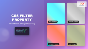
CSS Filter Property: Complete Guide to Visual Effects and Image Processing
The CSS filter property is a powerful tool that allows developers to apply visual effects and image processing techniques directly...
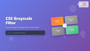
CSS Grayscale Filter: Master Black and White Image Effects with Complete Guide
The CSS grayscale filter is a powerful tool that transforms colorful images into elegant black and white versions. This filter...
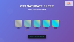
CSS Saturate Filter: Complete Guide to Color Saturation Control
The CSS saturate() filter function is a powerful tool that allows you to control the color saturation of HTML elements....
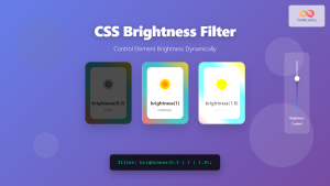
CSS Brightness Filter: Complete Guide to Adjusting Element Brightness
The CSS brightness() filter function is a powerful tool that allows developers to adjust the brightness of HTML elements dynamically....
CSS Style filter Property: CSS Filter
CSS filter Property: Enhance Your Web Graphics The CSS filter property provides powerful visual effects to elements like images, backgrounds,...
CSS Contrast Filter: Complete Guide to Adjusting Element Contrast for Better Visual Impact
The CSS contrast() filter function is a powerful tool that allows web developers to dynamically adjust the contrast of HTML...
CSS RGB Color Function: Complete Guide to Red, Green, Blue Color Values
The CSS RGB color function is one of the most fundamental and widely-used methods for defining colors in web development....
CSS Hue-Rotate Filter: Complete Guide to Dynamic Color Shifting
The CSS hue-rotate filter is a powerful tool that allows web developers to dynamically shift the hue values of any...
CSS Style color Property: CSS Color
Understanding the CSS color Property: A Comprehensive Guide The CSS color property is fundamental for styling web pages. It specifies...
CSS Blur Filter: Complete Guide to Gaussian Blur Effects and Visual Applications
The CSS blur filter is one of the most versatile and visually appealing effects in modern web design. This powerful...
CSS Backdrop-Filter: Complete Guide to Background Blur and Visual Effects
What is CSS Backdrop-Filter? The backdrop-filter property in CSS allows you to apply graphical effects like blur, brightness, contrast, and...
CSS Color Property: Complete Guide to Text Colors with Hex, RGB, HSL Values
The CSS color property is one of the most fundamental styling properties in web development, allowing you to control the...


