
The CSS grid-template shorthand property is a powerful tool that allows you to define your grid’s structure in a single declaration. Instead of writing separate properties for rows, columns, and areas, you can combine them all into one efficient statement.
Understanding Grid Template Shorthand
The grid-template property is a shorthand for three individual properties:
- grid-template-rows – Defines the height of grid rows
- grid-template-columns – Defines the width of grid columns
- grid-template-areas – Creates named grid areas
This shorthand helps you create complex layouts with cleaner, more maintainable code while reducing repetition.
Basic Syntax and Structure
The grid-template property follows this syntax pattern:
/* OR */
grid-template: [grid-template-rows] / [grid-template-columns];
When using named areas, the syntax becomes:
“area1 area2” row-size
“area3 area4” row-size
/ column-size column-size;
Simple Grid Template Examples
Let’s start with a basic example to understand how the shorthand works:
Example 1: Basic 2×2 Grid
display: grid;
grid-template: 100px 100px / 200px 200px;
gap: 10px;
}
Explanation: This creates a 2×2 grid with rows of 100px height and columns of 200px width.
Working with Named Grid Areas
Named grid areas make your layouts more semantic and easier to understand. Here’s how to use them with the shorthand:
Example 2: Website Layout with Named Areas
display: grid;
grid-template:
“header header header” 80px
“sidebar main main” 300px
“footer footer footer” 60px
/ 200px 1fr 1fr;
gap: 15px;
min-height: 100vh;
}
.header { grid-area: header; }
.sidebar { grid-area: sidebar; }
.main { grid-area: main; }
.footer { grid-area: footer; }
Key Features:
- Three-column layout with semantic area names
- Fixed sidebar width (200px) with flexible main content
- Fixed header and footer heights
- Responsive main content area
Advanced Grid Template Patterns
Let’s explore more complex patterns that demonstrate the full power of the shorthand property:
Example 3: Dashboard Layout
display: grid;
grid-template:
“nav nav nav nav” 60px
“stats stats stats stats” 120px
“chart1 chart1 chart2 chart2” 200px
“table table table table” 180px
/ 1fr 1fr 1fr 1fr;
gap: 20px;
padding: 20px;
}
Layout Benefits:
- Consistent four-column grid structure
- Flexible row heights for different content types
- Clear visual hierarchy with named areas
- Easy to modify and maintain
Using Fractional Units and Mixed Sizing
The fr unit is particularly powerful in grid layouts, allowing you to create flexible, responsive designs:
Example 4: Flexible Content Layout
display: grid;
grid-template:
“header header header” auto
“sidebar content aside” 1fr
“footer footer footer” 50px
/ 250px 2fr 1fr;
gap: 20px;
min-height: 400px;
}
(250px)
(2fr – twice as wide)
(1fr)
Sizing Breakdown:
- Columns: 250px (fixed) + 2fr (flexible) + 1fr (flexible)
- Rows: auto (content-based) + 1fr (fills space) + 50px (fixed)
- The main content area is twice as wide as the aside due to the 2fr:1fr ratio
Interactive Grid Template Builder
Here’s an interactive example where you can see how different grid template values affect the layout:
Interactive Grid Template Demo
Common Patterns and Best Practices
Here are some proven patterns and best practices when working with grid template shorthand:
1. Responsive Grid Patterns
.responsive-grid {
display: grid;
grid-template: repeat(4, auto) / 1fr;
gap: 15px;
}
/* Tablet */
@media (min-width: 768px) {
.responsive-grid {
grid-template:
“header header” auto
“content sidebar” 1fr
“footer footer” auto
/ 2fr 1fr;
}
}
/* Desktop */
@media (min-width: 1024px) {
.responsive-grid {
grid-template:
“header header header” 80px
“nav content sidebar” 1fr
“footer footer footer” 60px
/ 200px 2fr 1fr;
}
}
2. Card Grid Layouts
display: grid;
grid-template: repeat(auto-fit, 250px) / repeat(auto-fit, minmax(300px, 1fr));
gap: 20px;
padding: 20px;
}
3. Form Layouts
display: grid;
grid-template:
“title title” auto
“fname lname” auto
“email email” auto
“message message” 1fr
“submit submit” auto
/ 1fr 1fr;
gap: 15px;
}
Performance Considerations and Browser Support
The grid-template shorthand property is well-supported across modern browsers, but there are some performance considerations to keep in mind:
Browser Support
- Chrome: Full support since version 57
- Firefox: Full support since version 52
- Safari: Full support since version 10.1
- Edge: Full support since version 16
Performance Tips
- Use
frunits instead of percentages for better performance - Avoid complex nested grids when possible
- Consider using
minmax()for responsive designs - Cache grid calculations by avoiding frequent template changes
Debugging Grid Templates
When working with complex grid templates, debugging can be challenging. Here are some helpful techniques:
.debug-grid {
display: grid;
grid-template: your-template-here;
gap: 1px;
background: #ccc; /* Shows grid gaps */
}
.debug-grid > * {
background: white;
border: 1px solid red; /* Shows item boundaries */
min-height: 50px;
}
You can also use browser developer tools to inspect grid layouts. Most modern browsers provide excellent grid debugging tools that highlight grid lines and areas.
Conclusion
The CSS grid-template shorthand property is an essential tool for creating efficient, maintainable layouts. By combining rows, columns, and areas into a single declaration, you can create complex responsive designs with clean, readable code.
Key takeaways for mastering grid template shorthand:
- Start with simple layouts and gradually increase complexity
- Use named grid areas for better code semantics
- Combine fixed sizes with flexible units (fr) for responsive designs
- Test your layouts across different screen sizes
- Use browser developer tools for debugging
Practice with these examples and experiment with different combinations to become proficient with CSS Grid’s powerful layout capabilities. The grid template shorthand will help you create professional, responsive layouts with less code and better maintainability.
Related Posts

CSS Grid Shorthand: Template and Auto Properties Combined for Efficient Layouts
CSS Grid has revolutionized web layout design, offering powerful tools for creating complex, responsive layouts. Among its most valuable features...
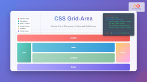
CSS Grid-Area: Master Item Placement in Named Grid Areas
What is CSS Grid-Area? The grid-area property in CSS is a powerful shorthand that allows you to place grid items...
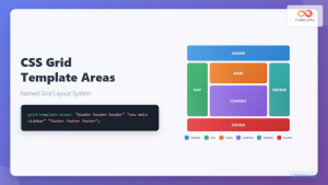
CSS Grid Template Areas: Master Named Grid Layouts with Visual Examples
CSS Grid revolutionized web layout design, and one of its most powerful features is grid-template-areas. This property allows you to...

CSS Style grid Property: CSS Grid Layout
CSS grid Property: Mastering CSS Grid Layout The CSS grid property is a powerful tool for creating two-dimensional layouts on...
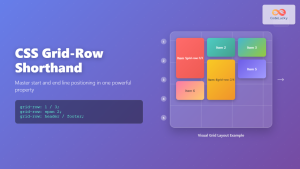
CSS Grid-Row Shorthand: Master Start and End Line Positioning in One Property
The CSS grid-row shorthand property is a powerful tool that allows you to define both the starting and ending positions...
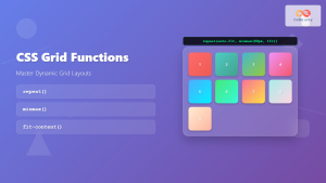
CSS Grid Functions: Complete Guide to repeat(), minmax(), and fit-content()
CSS Grid has revolutionized web layout design, offering developers unprecedented control over two-dimensional layouts. Among its most powerful features are...
CSS Grid-Gap Shorthand: Master Combined Row and Column Spacing
CSS Grid has revolutionized how we create layouts on the web, and one of its most useful features is the...
CSS Grid-Column Shorthand: Master Start and End Line Positioning
The CSS grid-column shorthand property is a powerful tool that allows you to position grid items across multiple columns in...
CSS Grid-Template-Rows: Master Row Track Sizing with Complete Examples
The grid-template-rows property is a fundamental building block of CSS Grid Layout that allows you to define the size of...

CSS Grid: Display Grid Container Property – Complete Guide with Examples
CSS Grid revolutionized web layout design by providing a two-dimensional grid system that allows developers to create complex, responsive layouts...
CSS Grid-Column-Start and Grid-Column-End: Complete Guide to Precise Item Column Placement
CSS Grid revolutionized web layout by providing precise control over both rows and columns. Among its most powerful features are...
CSS Grid-Row-Start and Grid-Row-End: Complete Guide to Item Row Placement
Understanding CSS Grid Row Placement CSS Grid provides powerful tools for controlling the placement of grid items within your layout....


