
The CSS grid-column shorthand property is a powerful tool that allows you to position grid items across multiple columns in a CSS Grid layout. This property combines grid-column-start and grid-column-end into a single, efficient declaration that streamlines your grid positioning code.
Understanding CSS Grid-Column Syntax
The grid-column property uses the following syntax:
grid-column: <start-line> / <end-line>;Where:
- start-line: Specifies which grid line the item should start from
- end-line: Specifies which grid line the item should end at
- The forward slash (
/) separates the start and end values
Basic Grid-Column Examples
Let’s explore practical examples to understand how grid-column works in real scenarios.
Simple Column Spanning
.container {
  display: grid;
  grid-template-columns: repeat(4, 1fr);
  gap: 10px;
}

.item-span {
  grid-column: 2 / 4; /* Starts at line 2, ends at line 4 */
}
Using Span Keyword
The span keyword provides an alternative way to specify column spanning by indicating how many columns an item should occupy:
.span-example {
  grid-column: span 3; /* Spans across 3 columns from current position */
}
Advanced Grid-Column Techniques
Named Grid Lines
CSS Grid allows you to name grid lines for more semantic and maintainable code:
.container {
  display: grid;
  grid-template-columns: [start] 1fr [content-start] 2fr [content-end] 1fr [end];
}

.main-content {
  grid-column: content-start / content-end;
}
Negative Line Numbers
You can use negative numbers to count grid lines from the end of the grid, which is particularly useful for responsive layouts:
.full-width {
  grid-column: 1 / -1; /* From first line to last line */
}

.last-two {
  grid-column: -3 / -1; /* Last two columns */
}
Interactive Grid-Column Demo
Experiment with different grid-column values in this interactive example:
grid-column: 2 / 4;
Common Grid-Column Patterns
Responsive Grid Layout
Create responsive layouts that adapt to different screen sizes using grid-column with media queries:
.container {
  display: grid;
  grid-template-columns: repeat(12, 1fr);
}

.header { grid-column: 1 / -1; }
.sidebar { grid-column: 1 / 4; }
.main { grid-column: 4 / 10; }
.aside { grid-column: 10 / -1; }
.footer { grid-column: 1 / -1; }

@media (max-width: 768px) {
  .sidebar,
  .main,
  .aside {
    grid-column: 1 / -1; /* Full width on mobile */
  }
}
Grid-Column vs Individual Properties
Understanding when to use the shorthand versus individual properties can improve code readability and maintenance:
Comparison
| Method | Code | Use Case |
|---|---|---|
| Shorthand | grid-column: 2 / 5; |
When setting both start and end |
| Individual | grid-column-start: 2; |
When setting properties separately or conditionally |
| Span Only | grid-column: span 3; |
When you only care about width, not position |
Best Practices and Tips
- Use semantic naming: When possible, use named grid lines instead of numbers for better code maintainability
- Consider mobile-first: Design your grid to work on smaller screens first, then enhance for larger screens
- Avoid overlaps: Unless intentional, ensure grid items don’t overlap by carefully planning your column assignments
- Test responsiveness: Always test your grid layouts across different screen sizes and devices
- Use developer tools: Browser dev tools provide excellent visual debugging for CSS Grid layouts
Browser Support and Fallbacks
CSS Grid, including the grid-column property, enjoys excellent modern browser support. However, for legacy browser support, consider these fallback strategies:
/* Fallback for older browsers */
.item {
  float: left;
  width: 50%;
}

/* Modern browsers with Grid support */
@supports (display: grid) {
  .container {
    display: grid;
    grid-template-columns: repeat(4, 1fr);
  }

  .item {
    float: none;
    width: auto;
    grid-column: 2 / 4;
  }
}
Common Mistakes to Avoid
- Forgetting the slash: Always use
/to separate start and end values - Confusing line numbers: Remember that grid lines are numbered starting from 1, not 0
- Overlapping content: Be careful when manually positioning items to avoid unintended overlaps
- Not testing responsive behavior: Always check how your grid behaves at different screen sizes
Conclusion
The CSS grid-column shorthand property is an essential tool for creating sophisticated grid layouts. By combining grid-column-start and grid-column-end into a single declaration, it streamlines your CSS and makes grid positioning more intuitive. Whether you’re building simple card layouts or complex responsive designs, mastering grid-column will significantly enhance your CSS Grid skills.
Practice with the examples provided, experiment with different values, and remember to test your layouts across various devices. With consistent use, grid-column will become an indispensable part of your CSS toolkit for creating modern, responsive web layouts.
Related Posts
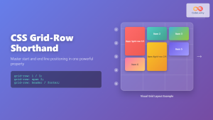
CSS Grid-Row Shorthand: Master Start and End Line Positioning in One Property
The CSS grid-row shorthand property is a powerful tool that allows you to define both the starting and ending positions...
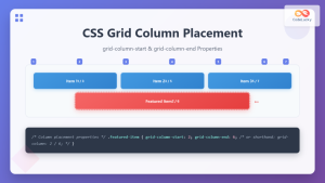
CSS Grid-Column-Start and Grid-Column-End: Complete Guide to Precise Item Column Placement
CSS Grid revolutionized web layout by providing precise control over both rows and columns. Among its most powerful features are...
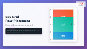
CSS Grid-Row-Start and Grid-Row-End: Complete Guide to Item Row Placement
Understanding CSS Grid Row Placement CSS Grid provides powerful tools for controlling the placement of grid items within your layout....
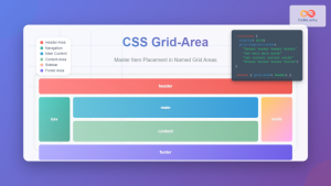
CSS Grid-Area: Master Item Placement in Named Grid Areas
What is CSS Grid-Area? The grid-area property in CSS is a powerful shorthand that allows you to place grid items...

CSS Grid Shorthand: Template and Auto Properties Combined for Efficient Layouts
CSS Grid has revolutionized web layout design, offering powerful tools for creating complex, responsive layouts. Among its most valuable features...

CSS Align-Content: Master Grid Container Block Axis Alignment
The CSS align-content property is a powerful tool for controlling how grid items are distributed along the block axis (typically...
CSS Grid-Gap Shorthand: Master Combined Row and Column Spacing
CSS Grid has revolutionized how we create layouts on the web, and one of its most useful features is the...
CSS Grid Template Shorthand: Master Rows, Columns, and Areas in One Property
The CSS grid-template shorthand property is a powerful tool that allows you to define your grid's structure in a single...

CSS Style grid Property: CSS Grid Layout
CSS grid Property: Mastering CSS Grid Layout The CSS grid property is a powerful tool for creating two-dimensional layouts on...
CSS Grid Auto Flow: Master Item Placement Algorithm Control for Responsive Layouts
Understanding CSS Grid Auto Flow The grid-auto-flow property is a powerful CSS Grid feature that controls how auto-placed items are...
CSS Grid Template Areas: Master Named Grid Layouts with Visual Examples
CSS Grid revolutionized web layout design, and one of its most powerful features is grid-template-areas. This property allows you to...
CSS Place-Items: Master Combined Justify and Align Items in One Property
The CSS place-items property is a powerful shorthand that combines justify-items and align-items into a single declaration. This property revolutionizes...


