
CSS Grid revolutionized web layout design, and one of its most powerful features is grid-template-areas. This property allows you to create intuitive, maintainable grid layouts by naming specific areas of your grid. Instead of working with complex line numbers, you can design layouts using meaningful names that make your code more readable and easier to manage.
What is CSS Grid Template Areas?
The grid-template-areas property defines named grid areas within a grid container. Each area is represented by a string containing space-separated names, where each name corresponds to a grid cell. This creates a visual representation of your layout directly in your CSS code.
.grid-container {
  display: grid;
  grid-template-areas:
    "header header header"
    "sidebar main main"
    "footer footer footer";
}
Basic Syntax and Structure
The syntax for grid-template-areas follows a specific pattern:
- Each string represents a grid row
- Each name within a string represents a grid cell
- Identical names create spanning areas
- Dots (.) represent empty cells
grid-template-areas:
  "area1 area2 area3"
  "area1 area4 area4"
  ". area5 area5";
Creating Your First Named Grid Layout
Let’s start with a simple three-column layout to understand the fundamentals:
Example 1: Basic Three-Column Layout
/* CSS */
.grid-container {
  display: grid;
  grid-template-areas:
    "header header header"
    "nav main aside"
    "footer footer footer";
  grid-template-rows: 60px 1fr 50px;
  grid-template-columns: 200px 1fr 200px;
  gap: 10px;
}

.header { grid-area: header; }
.nav { grid-area: nav; }
.main { grid-area: main; }
.aside { grid-area: aside; }
.footer { grid-area: footer; }
Advanced Grid Template Areas Techniques
Using Empty Cells with Dots
Sometimes you need empty spaces in your grid. Use dots (.) to represent empty cells:
Example 2: Layout with Empty Cells
grid-template-areas:
  "logo . . search"
  "nav nav nav nav"
  "content content . sidebar"
  "footer footer footer footer";
Complex Spanning Patterns
Create sophisticated layouts by spanning areas across multiple rows and columns:
Example 3: Magazine-Style Layout
Responsive Design with Grid Template Areas
One of the most powerful aspects of grid-template-areas is how easily you can create responsive layouts by redefining the grid structure at different breakpoints:
Example 4: Responsive Layout
/* Mobile First */
.grid-container {
  display: grid;
  grid-template-areas:
    "header"
    "nav"
    "main"
    "aside"
    "footer";
}

/* Tablet */
@media (min-width: 768px) {
  .grid-container {
    grid-template-areas:
      "header header"
      "nav main"
      "aside main"
      "footer footer";
    grid-template-columns: 200px 1fr;
  }
}

/* Desktop */
@media (min-width: 1024px) {
  .grid-container {
    grid-template-areas:
      "header header header"
      "nav main aside"
      "footer footer footer";
    grid-template-columns: 200px 1fr 200px;
  }
}
Interactive Grid Layout Builder
Here’s an interactive example where you can modify the grid template areas in real-time:
Interactive Grid Template Areas Demo
Choose a Layout:
“header header header”
“sidebar main main”
“footer footer footer”;
Common Patterns and Best Practices
Naming Conventions
Use descriptive, semantic names for your grid areas:
/* Good */
grid-template-areas:
  "header header header"
  "nav content sidebar"
  "footer footer footer";

/* Avoid */
grid-template-areas:
  "a a a"
  "b c d"
  "e e e";
Maintaining Consistency
Ensure each row has the same number of area names:
/* Correct */
grid-template-areas:
  "header header sidebar"
  "main main sidebar"
  "footer footer footer";

/* Incorrect - inconsistent column count */
grid-template-areas:
  "header header"
  "main main sidebar"
  "footer footer footer";
Browser Support and Fallbacks
CSS Grid Template Areas has excellent browser support in modern browsers. For older browsers, you can provide fallbacks:
/* Fallback for older browsers */
.grid-item {
  float: left;
  width: 33.33%;
}

/* Modern browsers with CSS Grid support */
@supports (display: grid) {
  .grid-container {
    display: grid;
    grid-template-areas:
      "header header header"
      "nav main sidebar"
      "footer footer footer";
  }

  .grid-item {
    float: none;
    width: auto;
  }
}
Performance Considerations
Grid Template Areas is highly performant, but keep these tips in mind:
- Minimize layout recalculations by avoiding frequent changes to grid-template-areas
- Use CSS custom properties for dynamic grid layouts
- Combine with other grid properties like grid-template-rows and grid-template-columns for optimal performance
Debugging Grid Template Areas
Modern browser developer tools provide excellent support for debugging CSS Grid layouts:
- Firefox: Grid Inspector shows named areas and grid lines
- Chrome: Grid overlay displays area names and boundaries
- Safari: Web Inspector highlights grid areas and tracks
Advanced Use Cases
Dynamic Grid Areas with CSS Custom Properties
:root {
  --mobile-areas:
    "header"
    "nav"
    "main"
    "sidebar"
    "footer";
  --desktop-areas:
    "header header header"
    "nav main sidebar"
    "footer footer footer";
}

.grid-container {
  display: grid;
  grid-template-areas: var(--mobile-areas);
}

@media (min-width: 768px) {
  .grid-container {
    grid-template-areas: var(--desktop-areas);
  }
}
Combining with Subgrid
When subgrid is supported, you can create nested grid layouts:
.main-grid {
  display: grid;
  grid-template-areas:
    "header header"
    "content sidebar";
}

.content-area {
  grid-area: content;
  display: grid;
  grid-template-areas:
    "article ads"
    "comments ads";
  grid: subgrid / subgrid;
}
Common Pitfalls and Solutions
Invalid Area Shapes
Grid areas must form rectangles. This won’t work:
/* Invalid - creates L-shape */
grid-template-areas:
  "header header sidebar"
  "main main sidebar"
  "main footer footer";
Mismatched Area Names
Ensure your CSS selectors match the area names exactly:
/* Grid definition */
grid-template-areas: "main-content sidebar";

/* CSS selector must match exactly */
.main-content { grid-area: main-content; }
/* Not: .main_content or .mainContent */
Conclusion
CSS Grid Template Areas provides an intuitive, maintainable way to create complex layouts. By using meaningful names instead of line numbers, you can create self-documenting CSS that’s easy to understand and modify. The visual representation in your CSS code makes it simple to see exactly how your layout will appear, and the responsive capabilities make it perfect for modern web development.
Whether you’re building simple three-column layouts or complex magazine-style designs, grid template areas offers the flexibility and clarity you need. Combined with other CSS Grid properties, it forms the foundation of modern web layout techniques that are both powerful and accessible.
Start incorporating grid template areas into your projects today, and experience the clarity and maintainability it brings to your CSS layouts. Your future self (and your team) will thank you for the readable, semantic code structure it provides.
Related Posts
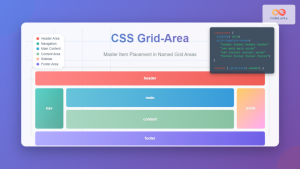
CSS Grid-Area: Master Item Placement in Named Grid Areas
What is CSS Grid-Area? The grid-area property in CSS is a powerful shorthand that allows you to place grid items...
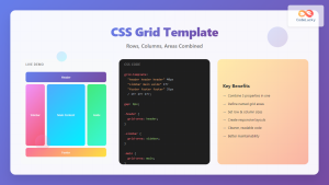
CSS Grid Template Shorthand: Master Rows, Columns, and Areas in One Property
The CSS grid-template shorthand property is a powerful tool that allows you to define your grid's structure in a single...

CSS Style grid Property: CSS Grid Layout
CSS grid Property: Mastering CSS Grid Layout The CSS grid property is a powerful tool for creating two-dimensional layouts on...
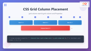
CSS Grid-Column-Start and Grid-Column-End: Complete Guide to Precise Item Column Placement
CSS Grid revolutionized web layout by providing precise control over both rows and columns. Among its most powerful features are...

CSS Grid Functions: Complete Guide to repeat(), minmax(), and fit-content()
CSS Grid has revolutionized web layout design, offering developers unprecedented control over two-dimensional layouts. Among its most powerful features are...
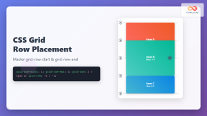
CSS Grid-Row-Start and Grid-Row-End: Complete Guide to Item Row Placement
Understanding CSS Grid Row Placement CSS Grid provides powerful tools for controlling the placement of grid items within your layout....

CSS Grid Shorthand: Template and Auto Properties Combined for Efficient Layouts
CSS Grid has revolutionized web layout design, offering powerful tools for creating complex, responsive layouts. Among its most valuable features...

CSS Grid: Display Grid Container Property – Complete Guide with Examples
CSS Grid revolutionized web layout design by providing a two-dimensional grid system that allows developers to create complex, responsive layouts...
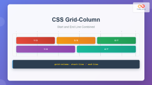
CSS Grid-Column Shorthand: Master Start and End Line Positioning
The CSS grid-column shorthand property is a powerful tool that allows you to position grid items across multiple columns in...
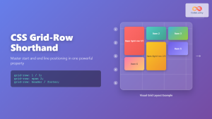
CSS Grid-Row Shorthand: Master Start and End Line Positioning in One Property
The CSS grid-row shorthand property is a powerful tool that allows you to define both the starting and ending positions...
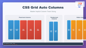
CSS Grid Auto Columns: Master Implicit Column Track Sizing for Dynamic Layouts
CSS Grid Layout revolutionized web design by providing a powerful two-dimensional layout system. While explicit grid tracks defined with grid-template-columns...
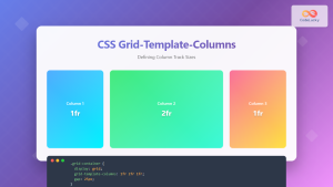
CSS Grid-Template-Columns: Complete Guide to Defining Column Track Sizes
The grid-template-columns property is one of the most fundamental aspects of CSS Grid Layout, allowing developers to define the size...


