
CSS Grid has revolutionized web layout design, offering powerful tools for creating complex, responsive layouts. Among its most valuable features are shorthand properties that allow developers to combine multiple grid properties into concise, readable declarations. This comprehensive guide explores CSS Grid shorthand properties, focusing on how template and auto properties work together to create efficient, maintainable layouts.
Understanding CSS Grid Shorthand Properties
CSS Grid shorthand properties provide a way to set multiple related properties in a single declaration. The main shorthand properties we’ll cover include:
grid-template– Combines row, column, and area definitionsgrid-auto– Not a real shorthand, but auto-related properties work togethergrid– The ultimate shorthand combining template and auto properties
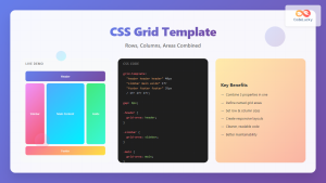
The grid-template Shorthand Property
The grid-template shorthand combines three fundamental grid properties:
grid-template-rowsgrid-template-columnsgrid-template-areas
Basic grid-template Syntax
The grid-template property can be used in several ways:
/* Method 1: rows / columns */
grid-template: 100px 200px / 1fr 2fr;

/* Method 2: areas with implicit sizing */
grid-template:
  "header header"
  "sidebar main"
  "footer footer";

/* Method 3: areas with explicit sizing */
grid-template:
  "header header" 80px
  "sidebar main" 1fr
  "footer footer" 60px
  / 200px 1fr;
Practical Example: Basic Layout with grid-template
Example: Website Layout
.layout {
  display: grid;
  grid-template:
    "header header" 80px
    "sidebar main" 300px
    "footer footer" 60px
    / 200px 1fr;
  gap: 10px;
}
Auto Properties in CSS Grid
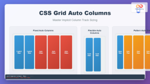
CSS Grid’s auto properties handle content that doesn’t fit into explicitly defined template areas. The key auto properties include:
grid-auto-rows– Sets the size of implicitly created rowsgrid-auto-columns– Sets the size of implicitly created columnsgrid-auto-flow– Controls how auto-placed items flow
Understanding grid-auto-flow
The grid-auto-flow property determines how grid items are automatically placed:
row(default) – Items fill rows firstcolumn– Items fill columns firstdense– Attempts to fill gaps in the grid
Auto Properties Example
Example: Auto-Generated Grid
.auto-grid {
  display: grid;
  grid-template-columns: repeat(3, 1fr);
  grid-auto-rows: 80px;
  grid-auto-flow: row dense;
  gap: 10px;
}
The Ultimate grid Shorthand
The grid shorthand is the most comprehensive, combining both template and auto properties. Its syntax can be complex, but it offers maximum control:
/* Syntax patterns */
grid: <grid-template>;
grid: <grid-template-rows> / <grid-auto-flow> <grid-auto-columns>;
grid: <grid-auto-flow> <grid-auto-rows> / <grid-template-columns>;
Complex Layout with grid Shorthand
Example: Magazine-Style Layout
.magazine-layout {
  display: grid;
  grid:
    "hero hero hero" 200px
    "article1 article2 sidebar" minmax(150px, auto)
    "article3 article3 sidebar" minmax(150px, auto)
    / 1fr 1fr 200px;
  gap: 15px;
}
Combining Template and Auto Properties
The real power of CSS Grid shorthand emerges when combining template properties with auto properties for flexible, responsive designs.
Interactive Example: Dynamic Grid
Example: Responsive Card Grid
.responsive-cards {
  display: grid;
  grid: auto-flow dense / repeat(auto-fit, minmax(200px, 1fr));
  grid-auto-rows: minmax(120px, auto);
  gap: 15px;
}
Advanced Shorthand Techniques
Implicit Grid Handling
When using shorthand properties, understanding how implicit grid tracks are created is crucial:
/* Explicit template with auto fallback */
.grid-container {
  grid:
    "header header" 100px
    "main aside" 1fr
    / 2fr 1fr;
  grid-auto-rows: minmax(100px, auto);
  grid-auto-flow: row;
}
Responsive Design with Shorthand
Example: Responsive Layout
Resize your browser window to see the responsive behavior!
/* Mobile First Approach */
.responsive-grid {
  display: grid;
  gap: 20px;
}

@media (max-width: 768px) {
  .responsive-grid {
    grid:
      "header" auto
      "main" 1fr
      "sidebar" auto
      "footer" auto
      / 1fr;
  }
}

@media (min-width: 769px) {
  .responsive-grid {
    grid:
      "header header" auto
      "main sidebar" 1fr
      "footer footer" auto
      / 2fr 1fr;
  }
}
Performance and Best Practices
Shorthand vs. Individual Properties
While shorthand properties are convenient, consider these best practices:
- Readability: Use shorthand for simple layouts, individual properties for complex ones
- Maintenance: Individual properties are easier to modify selectively
- Performance: No significant performance difference between approaches
- Browser Support: Shorthand properties have the same support as individual properties
Common Pitfalls and Solutions
⚠️ Common Mistakes
- Syntax Order: Remember that
grid-templateuses rows / columns syntax - Area Names: Grid area names must be valid CSS identifiers
- Implicit vs. Explicit: Understand when tracks are created implicitly
- Shorthand Reset: Shorthand properties reset all related individual properties
Browser Support and Fallbacks
CSS Grid shorthand properties enjoy excellent modern browser support. For legacy browser support, consider these approaches:
/* Progressive Enhancement */
.layout {
  /* Flexbox fallback */
  display: flex;
  flex-wrap: wrap;
}

@supports (display: grid) {
  .layout {
    display: grid;
    grid:
      "header header" auto
      "main sidebar" 1fr
      / 2fr 1fr;
  }
}
Debugging Grid Layouts
Modern browser developer tools provide excellent CSS Grid debugging capabilities:
- Firefox: Grid Inspector with overlay visualization
- Chrome: Grid badge and overlay tools
- Safari: Web Inspector grid visualization
Conclusion
CSS Grid shorthand properties offer powerful ways to create complex, responsive layouts with minimal code. By combining template properties with auto properties, developers can create flexible designs that adapt to content and viewport changes. The grid-template shorthand excels at defining explicit layout structures, while auto properties handle overflow content gracefully.
Master these shorthand techniques to write more maintainable CSS and create sophisticated grid layouts efficiently. Remember to balance the convenience of shorthand properties with the clarity of individual properties based on your project’s complexity and team requirements.
As you continue developing with CSS Grid, experiment with different combinations of template and auto properties to discover the most effective patterns for your specific use cases. The flexibility of CSS Grid shorthand properties makes them invaluable tools for modern web development.
Related Posts
CSS Grid Template Shorthand: Master Rows, Columns, and Areas in One Property
The CSS grid-template shorthand property is a powerful tool that allows you to define your grid's structure in a single...

CSS Style grid Property: CSS Grid Layout
CSS grid Property: Mastering CSS Grid Layout The CSS grid property is a powerful tool for creating two-dimensional layouts on...

CSS Grid-Area: Master Item Placement in Named Grid Areas
What is CSS Grid-Area? The grid-area property in CSS is a powerful shorthand that allows you to place grid items...

CSS Grid-Row Shorthand: Master Start and End Line Positioning in One Property
The CSS grid-row shorthand property is a powerful tool that allows you to define both the starting and ending positions...

CSS Grid-Column Shorthand: Master Start and End Line Positioning
The CSS grid-column shorthand property is a powerful tool that allows you to position grid items across multiple columns in...

CSS Grid Template Areas: Master Named Grid Layouts with Visual Examples
CSS Grid revolutionized web layout design, and one of its most powerful features is grid-template-areas. This property allows you to...

CSS Grid Functions: Complete Guide to repeat(), minmax(), and fit-content()
CSS Grid has revolutionized web layout design, offering developers unprecedented control over two-dimensional layouts. Among its most powerful features are...
CSS Grid-Gap Shorthand: Master Combined Row and Column Spacing
CSS Grid has revolutionized how we create layouts on the web, and one of its most useful features is the...
CSS Grid Auto Columns: Master Implicit Column Track Sizing for Dynamic Layouts
CSS Grid Layout revolutionized web design by providing a powerful two-dimensional layout system. While explicit grid tracks defined with grid-template-columns...

CSS Grid: Display Grid Container Property – Complete Guide with Examples
CSS Grid revolutionized web layout design by providing a two-dimensional grid system that allows developers to create complex, responsive layouts...
CSS Grid Auto Rows: Master Implicit Row Track Sizing for Dynamic Layouts
CSS Grid revolutionized web layout design, offering unprecedented control over both rows and columns. While you explicitly define grid tracks...
CSS Flex Shorthand: Master Grow, Shrink, and Basis in One Property
The CSS flex shorthand property is one of the most powerful tools in flexbox layouts, combining three essential properties into...


