
The CSS flex shorthand property is one of the most powerful tools in flexbox layouts, combining three essential properties into a single declaration. This comprehensive guide will teach you how to master flex-grow, flex-shrink, and flex-basis through the convenient flex shorthand.
What is the CSS Flex Shorthand Property?
The flex shorthand property is a combination of three individual flexbox properties:
- flex-grow: Defines how much a flex item should grow
- flex-shrink: Defines how much a flex item should shrink
- flex-basis: Defines the initial main size of a flex item
Instead of writing three separate properties, you can use the flex shorthand to set all three values in one declaration:
.flex-item {
  flex: [flex-grow] [flex-shrink] [flex-basis];
}
Understanding Each Component
Flex-Grow
The flex-grow property determines how much available space a flex item should take up. It accepts a unitless number that serves as a proportion.
Example: Basic Flex-Grow
.item1 { flex-grow: 1; }
.item2 { flex-grow: 2; }
.item3 { flex-grow: 1; }
Flex-Shrink
The flex-shrink property defines how much a flex item should shrink when there isn’t enough space. Higher values mean the item will shrink more.
Example: Flex-Shrink Behavior
.container { width: 300px; }
.item1 { flex-basis: 150px; flex-shrink: 1; }
.item2 { flex-basis: 150px; flex-shrink: 3; }
.item3 { flex-basis: 150px; flex-shrink: 1; }
Flex-Basis
The flex-basis property sets the initial size of a flex item before free space is distributed. It can be a length value (px, em, %) or keywords like auto or content.
Example: Different Flex-Basis Values
.item1 { flex-basis: 100px; }
.item2 { flex-basis: 200px; }
.item3 { flex-basis: auto; }
Flex Shorthand Syntax
The flex shorthand can be written in several ways:
Three Values (Complete Syntax)
flex: [flex-grow] [flex-shrink] [flex-basis];Two Values
/* flex-grow and flex-shrink */
flex: 1 2;

/* flex-grow and flex-basis */
flex: 1 200px;
One Value
/* flex-grow only */
flex: 2;

/* flex-basis only */
flex: 200px;
Common Flex Shorthand Values
flex: 1
Equivalent to flex: 1 1 0%. Items grow and shrink equally, ignoring their content size.
.item { flex: 1; }flex: auto
Equivalent to flex: 1 1 auto. Items grow and shrink based on their content size.
.item { flex: auto; }flex: none
Equivalent to flex: 0 0 auto. Items don’t grow or shrink, maintaining their natural size.
.fixed { flex: none; }
.flexible { flex: 1; }
Interactive Example: Flex Shorthand Playground
Flex Property Demonstrator
Practical Use Cases
Equal Width Columns
Create equal-width columns that adapt to different screen sizes:
.column { flex: 1; }Sidebar Layout
Create a flexible sidebar layout with fixed sidebar and flexible main content:
Fixed 200px
Flexible
.sidebar { flex: 0 0 200px; }
.main { flex: 1; }
Button Group
Create responsive button groups where one button takes priority:
.btn-cancel, .btn-help { flex: 0 0 auto; }
.btn-primary { flex: 1; }
Best Practices and Tips
Default Values
When you don’t specify all three values, CSS uses these defaults:
- flex-grow: 0
- flex-shrink: 1
- flex-basis: auto
Performance Considerations
Using the flex shorthand is more efficient than setting individual properties:
/* Preferred */
.item { flex: 1 0 200px; }

/* Less efficient */
.item {
  flex-grow: 1;
  flex-shrink: 0;
  flex-basis: 200px;
}
Common Mistakes to Avoid
- Forgetting flex-basis: Always consider the initial size of your items
- Using percentage with flex-basis: Be careful with percentage values in nested flex containers
- Ignoring content overflow: Use
min-width: 0to prevent flex items from overflowing
Browser Support
The flex shorthand property has excellent browser support:
- Chrome: 29+
- Firefox: 28+
- Safari: 9+
- Edge: 12+
- IE: 11+ (with -ms- prefix)
Advanced Techniques
Responsive Flex Items
Combine flex with media queries for responsive behavior:
@media (min-width: 768px) {
  .item { flex: 1 1 250px; }
}

@media (max-width: 767px) {
  .item { flex: 1 1 100%; }
}
Nested Flex Containers
Use flex shorthand in nested flex containers for complex layouts:
.container { display: flex; }
.sidebar { flex: 1; display: flex; flex-direction: column; }
.main { flex: 2; }
.header { flex: 1; }
.content { flex: 2; }
.footer { flex: 1; }
Conclusion
The CSS flex shorthand property is an essential tool for modern web development. By combining flex-grow, flex-shrink, and flex-basis into a single property, you can create flexible, responsive layouts with minimal code. Remember to consider the default values, use common patterns like flex: 1 for equal distribution, and combine with other CSS properties for advanced layouts.
Practice with different values and combinations to master this powerful CSS property. The interactive examples in this guide provide a foundation for understanding how each component affects your layout behavior.
Related Posts
CSS Style flex Property: CSS Flex
Understanding the CSS flex Property: A Comprehensive Guide The CSS flex property is a shorthand property used to set the...
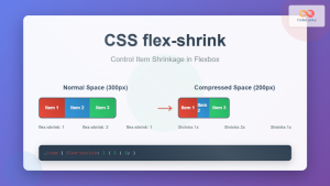
CSS Flex-Shrink: Complete Guide to Flexible Item Shrinkage Control
The CSS flex-shrink property is a fundamental component of the flexbox layout system that determines how flex items shrink when...

CSS Flex-Basis: Complete Guide to Initial Item Sizing in Flexbox
The flex-basis property is a fundamental component of CSS Flexbox that defines the initial main size of a flex item...
CSS flexShrink Property: CSS Flex Shrink
CSS flexShrink Property: Controlling the Shrink Factor of Flex Items The CSS flexShrink property is a crucial component of the...

CSS Style flexFlow Property: CSS Flex Flow
CSS flex-flow Property: A Comprehensive Guide The CSS flex-flow property is a shorthand property for setting both the flex-direction and...

CSS Flex-Grow: Complete Guide to Flexible Item Growth Properties
The CSS flex-grow property is a fundamental component of the flexbox layout model that controls how flex items grow to...
CSS Flexbox: Complete Guide to display: flex Container Properties and Layout Control
CSS Flexbox revolutionized web layout by providing a powerful, flexible way to arrange elements within containers. The display: flex property...
CSS Style flexDirection Property: CSS Flex Direction
CSS flexDirection Property: Mastering Flex Item Arrangement The CSS flexDirection property is a crucial aspect of Flexbox layout, determining the...

CSS Grid Shorthand: Template and Auto Properties Combined for Efficient Layouts
CSS Grid has revolutionized web layout design, offering powerful tools for creating complex, responsive layouts. Among its most valuable features...
CSS Flex-Flow: Master Direction and Wrap Properties in One Line
The flex-flow property is a powerful CSS shorthand that combines two fundamental flexbox properties: flex-direction and flex-wrap. This single property...
CSS Resize Property: Controlling Element Resizability
Understanding the CSS Resize Property: Controlling Element Resizability The resize property in CSS allows you to control whether (and how)...

CSS Place-Self: Master Grid and Flexbox Item Positioning with One Property
The CSS place-self property is a powerful shorthand that combines justify-self and align-self into a single declaration, making it easier...


