
The CSS grid-row shorthand property is a powerful tool that allows you to define both the starting and ending positions of a grid item within the grid container’s row axis. Instead of writing separate grid-row-start and grid-row-end properties, you can combine them into a single, more efficient declaration.
Understanding CSS Grid-Row Shorthand Syntax
The grid-row property follows this syntax structure:
grid-row: <grid-row-start> / <grid-row-end>;The forward slash (/) acts as a separator between the start and end values. You can use various types of values including line numbers, named grid lines, and the span keyword.
Basic Value Types
- Line Numbers: Integers representing grid line positions (1, 2, 3, etc.)
- Named Lines: Custom names assigned to grid lines
- Span Keyword: Defines how many tracks the item should span
- Auto: Automatic placement based on grid flow
Basic Grid-Row Examples
Let’s start with fundamental examples to understand how grid-row shorthand works:
Example 1: Line Number Positioning
(rows 1-3)
(rows 2-4)
.grid-container {
  display: grid;
  grid-template-rows: repeat(4, 60px);
  grid-template-columns: repeat(3, 1fr);
  gap: 10px;
}

.item-1 {
  grid-row: 1 / 3; /* Spans from row line 1 to 3 */
}

.item-4 {
  grid-row: 2 / 4; /* Spans from row line 2 to 4 */
}
Using the Span Keyword
The span keyword provides an alternative way to define grid item placement by specifying how many tracks an item should occupy:
Example 2: Span-Based Positioning
.span-item-1 {
grid-row: span 2; /* Spans 2 rows from auto-placement */
}
.span-item-2 {
grid-row: 2 / span 3; /* Starts at row 2, spans 3 rows */
}
.span-item-3 {
grid-row: span 2 / 4; /* Spans 2 rows, ends at row 4 */
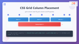
}Interactive Grid-Row Demo
Interactive Example: Try Different Grid-Row Values
1 / 2
Named Grid Lines with Grid-Row
You can create more semantic and maintainable grid layouts by using named grid lines with the grid-row shorthand:
Example 3: Named Grid Lines
.layout-grid {
  display: grid;
  grid-template-rows:
    [header-start] 80px [header-end main-start]
    1fr [main-end footer-start]
    60px [footer-end];
  grid-template-columns: repeat(3, 1fr);
}

.header {
  grid-row: header-start / header-end;
  grid-column: 1 / -1;
}

.sidebar {
  grid-row: main-start / main-end;
}

.main-content {
  grid-row: main-start / main-end;
  grid-column: 2 / -1;
}

.footer {
  grid-row: footer-start / footer-end;
  grid-column: 1 / -1;
}
Advanced Grid-Row Techniques
Negative Line Numbers
You can use negative numbers to count grid lines from the end of the grid, which is particularly useful for creating flexible layouts:
Example 4: Negative Line Numbers
(1 to -1)
(-3 to -1)
.full-height-item {
  grid-row: 1 / -1; /* From first to last row line */
}

.bottom-section {
  grid-row: -3 / -1; /* Last 2 rows */
}
Auto-Placement with Grid-Row
The auto keyword allows for flexible positioning while still controlling specific aspects of item placement:
.auto-start {
  grid-row: auto / span 2; /* Auto start, span 2 rows */
}

.auto-end {
  grid-row: 2 / auto; /* Start at row 2, auto end */
}
Common Grid-Row Patterns and Use Cases
Card Layouts with Variable Heights
Grid-row shorthand is excellent for creating card layouts where some cards need to span multiple rows:
Example 5: Card Layout
(2 rows)
(3 rows)
.card-grid {
  display: grid;
  grid-template-rows: repeat(auto-fit, 80px);
  grid-template-columns: repeat(auto-fit, minmax(200px, 1fr));
  gap: 15px;
}

.featured-card {
  grid-row: span 2; /* Spans 2 rows */
}

.hero-card {
  grid-row: span 3; /* Spans 3 rows */
}
Browser Support and Considerations
The CSS grid-row shorthand property enjoys excellent browser support across all modern browsers. It’s supported in:
- Chrome: 57+ (March 2017)
- Firefox: 52+ (March 2017)
- Safari: 10.1+ (March 2017)
- Edge: 16+ (October 2017)
Best Practices
When working with grid-row shorthand, consider these best practices:
- Use meaningful names: Named grid lines make your code more readable and maintainable
- Plan your grid structure: Define your grid template rows before positioning items
- Consider responsive design: Use media queries to adjust grid-row values for different screen sizes
- Test thoroughly: Ensure your grid layouts work across different content lengths and viewport sizes
Responsive Grid-Row Layouts
Grid-row shorthand works seamlessly with responsive design principles. Here’s how to adapt grid positioning for different screen sizes:
/* Mobile-first approach */
.responsive-item {
  grid-row: span 1; /* Single row on mobile */
}

/* Tablet and up */
@media (min-width: 768px) {
  .responsive-item {
    grid-row: span 2; /* Span 2 rows on tablets */
  }
}

/* Desktop and up */
@media (min-width: 1024px) {
  .responsive-item {
    grid-row: 1 / span 3; /* Specific positioning on desktop */
  }
}
Conclusion
The CSS grid-row shorthand property is an essential tool for creating sophisticated grid layouts efficiently. By combining grid-row-start and grid-row-end into a single property, you can write cleaner, more maintainable CSS while achieving precise control over your grid item positioning.
Whether you’re using line numbers, named grid lines, or the span keyword, mastering grid-row shorthand will significantly improve your CSS Grid workflow. Practice with the interactive examples above and experiment with different combinations to fully understand the power and flexibility this property provides.
Remember to always consider responsive design principles and browser support when implementing grid-row in your projects. With its excellent cross-browser compatibility and intuitive syntax, grid-row shorthand is a reliable choice for modern web development.
Related Posts
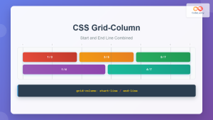
CSS Grid-Column Shorthand: Master Start and End Line Positioning
The CSS grid-column shorthand property is a powerful tool that allows you to position grid items across multiple columns in...
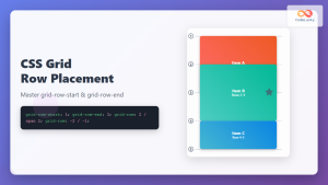
CSS Grid-Row-Start and Grid-Row-End: Complete Guide to Item Row Placement
Understanding CSS Grid Row Placement CSS Grid provides powerful tools for controlling the placement of grid items within your layout....
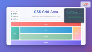
CSS Grid-Area: Master Item Placement in Named Grid Areas
What is CSS Grid-Area? The grid-area property in CSS is a powerful shorthand that allows you to place grid items...
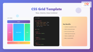
CSS Grid Template Shorthand: Master Rows, Columns, and Areas in One Property
The CSS grid-template shorthand property is a powerful tool that allows you to define your grid's structure in a single...
CSS Grid-Gap Shorthand: Master Combined Row and Column Spacing
CSS Grid has revolutionized how we create layouts on the web, and one of its most useful features is the...

CSS Grid Shorthand: Template and Auto Properties Combined for Efficient Layouts
CSS Grid has revolutionized web layout design, offering powerful tools for creating complex, responsive layouts. Among its most valuable features...
CSS Grid-Column-Start and Grid-Column-End: Complete Guide to Precise Item Column Placement
CSS Grid revolutionized web layout by providing precise control over both rows and columns. Among its most powerful features are...
CSS Grid Template Areas: Master Named Grid Layouts with Visual Examples
CSS Grid revolutionized web layout design, and one of its most powerful features is grid-template-areas. This property allows you to...

CSS Align-Content: Master Grid Container Block Axis Alignment
The CSS align-content property is a powerful tool for controlling how grid items are distributed along the block axis (typically...
CSS Grid-Column-Gap and Grid-Row-Gap: Complete Guide to Track Spacing
CSS Grid has revolutionized how we create layouts on the web, and one of its most powerful features is the...

CSS Style grid Property: CSS Grid Layout
CSS grid Property: Mastering CSS Grid Layout The CSS grid property is a powerful tool for creating two-dimensional layouts on...
CSS Grid Auto Rows: Master Implicit Row Track Sizing for Dynamic Layouts
CSS Grid revolutionized web layout design, offering unprecedented control over both rows and columns. While you explicitly define grid tracks...


