
CSS Grid revolutionized web layout by providing precise control over both rows and columns. Among its most powerful features are the grid-column-start and grid-column-end properties, which allow you to position grid items exactly where you want them across columns. This comprehensive guide will teach you everything you need to know about these essential grid properties.
Understanding Grid Column Lines
Before diving into grid-column-start and grid-column-end, it’s crucial to understand how CSS Grid defines column lines. In a grid container, column lines are the invisible vertical lines that separate columns.
Basic Grid Column Lines Visualization
CSS Grid-Column-Start Property
The grid-column-start property specifies which column line a grid item should start from. This property accepts several types of values:
- Line numbers: Positive integers (1, 2, 3, etc.)
- Negative line numbers: Count from the end (-1, -2, -3, etc.)
- Named lines: Custom names you define
- Span keyword: Combined with a number to span columns
Basic Syntax
.grid-item {
  grid-column-start: 2; /* Start from column line 2 */
}
Grid-Column-Start Example
.item-2 {
  grid-column-start: 3;
}
CSS Grid-Column-End Property
The grid-column-end property specifies which column line a grid item should end at. Like grid-column-start, it accepts line numbers, negative numbers, named lines, and the span keyword.
Basic Syntax
.grid-item {
  grid-column-end: 4; /* End at column line 4 */
}
Grid-Column-End Example
.spanning-item {
grid-column-start: 1;
grid-column-end: 3;
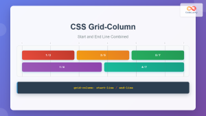
}Using Both Properties Together
When you combine grid-column-start and grid-column-end, you gain precise control over both where an item starts and where it ends, allowing you to create items that span multiple columns.
Combined Properties Example
.header {
  grid-column-start: 1;
  grid-column-end: 3;
}

.main-content {
  grid-column-start: 3;
  grid-column-end: 6;
}

.sidebar {
  grid-column-start: 2;
  grid-column-end: 4;
}
Negative Line Numbers
Negative line numbers count from the end of the grid, making them particularly useful for responsive layouts where you want items to align with the end of the grid regardless of the total number of columns.
Negative Line Numbers Example
.end-aligned-item {
  grid-column-start: -3; /* Third line from end */
  grid-column-end: -1;   /* Last line */
}
The Span Keyword
The span keyword provides an alternative way to specify how many columns an item should occupy. You can use it with either grid-column-start or grid-column-end.
Span Syntaxes
/* Start at line 2 and span 3 columns */
.item {
  grid-column-start: 2;
  grid-column-end: span 3;
}

/* Span 2 columns and end at line 4 */
.item {
  grid-column-start: span 2;
  grid-column-end: 4;
}
Span Keyword Examples
.span-from-start {
  grid-column-start: 1;
  grid-column-end: span 2;
}

.span-to-end {
  grid-column-start: span 3;
  grid-column-end: -1;
}
Grid-Column Shorthand Property
CSS provides a shorthand property grid-column that combines both grid-column-start and grid-column-end in a single declaration.
Shorthand Syntax
/* grid-column: start / end */
.item {
  grid-column: 2 / 5;        /* Start at 2, end at 5 */
  grid-column: 1 / span 3;   /* Start at 1, span 3 columns */
  grid-column: span 2 / -1;  /* Span 2, end at last line */
}
Grid-Column Shorthand Examples
.item-1 { grid-column: 1 / 3; }
.item-2 { grid-column: 3 / span 2; }
.item-3 { grid-column: span 3 / -1; }
Named Grid Lines
Instead of using numbers, you can name your grid lines for more semantic and maintainable code. Named lines are defined in the grid-template-columns property and used in column placement properties.
Named Grid Lines Example
.container {
  grid-template-columns:
    [sidebar-start] 200px
    [sidebar-end main-start] 1fr
    [main-end aside-start] 150px
    [aside-end];
}

.sidebar { grid-column: sidebar-start / sidebar-end; }
.main { grid-column: main-start / main-end; }
.aside { grid-column: aside-start / aside-end; }
Practical Layout Examples
Holy Grail Layout
The classic Holy Grail layout demonstrates how column placement properties create complex layouts with minimal code.
Holy Grail Layout
.holy-grail {
  display: grid;
  grid-template-columns: 200px 1fr 150px;
  grid-template-rows: auto 1fr auto;
}

.header, .footer {
  grid-column: 1 / -1; /* Span full width */
}
Card Grid with Featured Items
Create dynamic card layouts where some items span multiple columns for emphasis.
Featured Card Layout
.card-grid {
  display: grid;
  grid-template-columns: repeat(4, 1fr);
  gap: 15px;
}

.featured {
  grid-column: 1 / 3; /* Span 2 columns */
}

.special {
  grid-column: 3 / -1; /* Span to end */
}
Interactive Demo: Column Placement Playground
Try Different Column Placements
grid-column-end: 3;
Common Patterns and Best Practices
Auto-Placement with Strategic Positioning
Combine auto-placement with strategic positioning for flexible layouts that adapt to content changes.
Responsive Column Placement
Use media queries to adjust column placement for different screen sizes.
/* Mobile: full width */
.feature-item {
  grid-column: 1 / -1;
}

/* Tablet: half width */
@media (min-width: 768px) {
  .feature-item {
    grid-column: 1 / 3;
  }
}

/* Desktop: specific placement */
@media (min-width: 1024px) {
  .feature-item {
    grid-column: 2 / 4;
  }
}
Browser Support and Fallbacks
CSS Grid has excellent browser support in modern browsers. For older browsers, consider these fallback strategies:
- Feature Queries: Use
@supportsto provide alternative layouts - Flexbox Fallback: Implement basic layouts with flexbox for unsupported browsers
- Progressive Enhancement: Start with a basic layout and enhance with grid
/* Flexbox fallback */
.container {
  display: flex;
  flex-wrap: wrap;
}

/* Grid enhancement */
@supports (display: grid) {
  .container {
    display: grid;
    grid-template-columns: repeat(4, 1fr);
  }

  .item {
    grid-column: 2 / 4;
  }
}
Debugging Grid Column Placement
Use browser developer tools to visualize and debug your grid layouts:
- Firefox Grid Inspector: Provides excellent grid visualization tools
- Chrome DevTools: Shows grid lines and item placement
- CSS Grid debugging: Add temporary borders or backgrounds to visualize placement
outline: 2px solid red; to grid items temporarily to visualize their exact placement and size.
Performance Considerations
CSS Grid column placement is highly performant, but keep these points in mind:
- Avoid excessive repositioning: Minimize dynamic changes to grid placement in JavaScript
- Use implicit grids wisely: Let the browser create additional columns when needed
- Optimize for reflow: Changes to column placement can trigger layout recalculation
Conclusion
CSS grid-column-start and grid-column-end properties provide powerful control over item placement in grid layouts. By mastering these properties, you can create sophisticated, responsive layouts with minimal code. Whether you’re building simple card grids or complex application interfaces, understanding column placement is essential for modern web development.
Remember to start with auto-placement for most items and use explicit positioning strategically for key elements. Combine these properties with responsive design principles and progressive enhancement for robust, accessible layouts that work across all devices and browsers.
- Grid column lines are numbered from 1, with negative numbers counting from the end
- Use the shorthand
grid-columnproperty for cleaner code - Combine auto-placement with strategic positioning for flexible layouts
- Named grid lines improve code readability and maintainability
- Always test your layouts across different screen sizes and browsers
Related Posts
CSS Grid-Column Shorthand: Master Start and End Line Positioning
The CSS grid-column shorthand property is a powerful tool that allows you to position grid items across multiple columns in...
CSS Grid-Row-Start and Grid-Row-End: Complete Guide to Item Row Placement
Understanding CSS Grid Row Placement CSS Grid provides powerful tools for controlling the placement of grid items within your layout....
CSS Grid-Template-Columns: Complete Guide to Defining Column Track Sizes
The grid-template-columns property is one of the most fundamental aspects of CSS Grid Layout, allowing developers to define the size...

CSS Style grid Property: CSS Grid Layout
CSS grid Property: Mastering CSS Grid Layout The CSS grid property is a powerful tool for creating two-dimensional layouts on...
CSS Grid-Area: Master Item Placement in Named Grid Areas
What is CSS Grid-Area? The grid-area property in CSS is a powerful shorthand that allows you to place grid items...
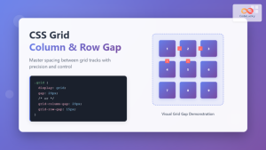
CSS Grid-Column-Gap and Grid-Row-Gap: Complete Guide to Track Spacing
CSS Grid has revolutionized how we create layouts on the web, and one of its most powerful features is the...
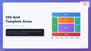
CSS Grid Template Areas: Master Named Grid Layouts with Visual Examples
CSS Grid revolutionized web layout design, and one of its most powerful features is grid-template-areas. This property allows you to...

CSS Align-Content: Master Grid Container Block Axis Alignment
The CSS align-content property is a powerful tool for controlling how grid items are distributed along the block axis (typically...
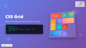
CSS Grid: Display Grid Container Property – Complete Guide with Examples
CSS Grid revolutionized web layout design by providing a two-dimensional grid system that allows developers to create complex, responsive layouts...
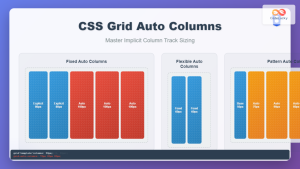
CSS Grid Auto Columns: Master Implicit Column Track Sizing for Dynamic Layouts
CSS Grid Layout revolutionized web design by providing a powerful two-dimensional layout system. While explicit grid tracks defined with grid-template-columns...
CSS Grid Auto Flow: Master Item Placement Algorithm Control for Responsive Layouts
Understanding CSS Grid Auto Flow The grid-auto-flow property is a powerful CSS Grid feature that controls how auto-placed items are...
CSS Grid Functions: Complete Guide to repeat(), minmax(), and fit-content()
CSS Grid has revolutionized web layout design, offering developers unprecedented control over two-dimensional layouts. Among its most powerful features are...


