
Understanding CSS Grid Auto Flow
The grid-auto-flow property is a powerful CSS Grid feature that controls how auto-placed items are inserted into the grid container. When you don’t explicitly position grid items, this property determines the algorithm used to automatically place them, significantly impacting your layout’s behavior and visual appearance.
This property becomes essential when working with dynamic content where you can’t predict the exact number of grid items or when you want to let CSS handle the placement logic automatically.
Grid Auto Flow Syntax and Values
The grid-auto-flow property accepts several values that control the placement direction and packing algorithm:
grid-auto-flow: row | column | row dense | column dense | dense;Available Values Explained
- row (default): Items are placed by filling each row in turn, adding new rows as necessary
- column: Items are placed by filling each column in turn, adding new columns as necessary
- dense: Attempts to fill holes in the grid by placing smaller items in available spaces
- row dense: Combines row flow with dense packing algorithm
- column dense: Combines column flow with dense packing algorithm
Default Behavior: Row Flow
By default, grid items flow in rows from left to right, then top to bottom. This mimics the natural reading flow in most languages and provides predictable item placement.
Example: Default Row Flow
.grid-container {
  display: grid;
  grid-template-columns: repeat(3, 100px);
  grid-auto-flow: row; /* default value */
  gap: 10px;
}
Column Flow Direction
Setting grid-auto-flow: column changes the placement algorithm to fill columns first, then move to the next column. This is particularly useful for vertical layouts or when you want to prioritize column-based organization.
Example: Column Flow
.grid-container {
  display: grid;
  grid-template-rows: repeat(3, 60px);
  grid-auto-flow: column;
  gap: 10px;
}
Dense Packing Algorithm
The dense keyword activates an intelligent packing algorithm that attempts to fill gaps in the grid. This is particularly useful when grid items have different sizes and you want to minimize empty spaces.
Understanding Dense Packing Behavior
When dense packing is enabled, the browser looks for smaller items that can fit into gaps left by larger items. This can change the visual order of items, so use it carefully when source order matters for accessibility.
Example: Dense Packing Comparison
Without Dense Packing:
With Dense Packing:
/* Without dense packing */
.grid-normal {
  display: grid;
  grid-template-columns: repeat(4, 80px);
  grid-auto-flow: row;
}

/* With dense packing */
.grid-dense {
  display: grid;
  grid-template-columns: repeat(4, 80px);
  grid-auto-flow: row dense;
}
Interactive Demo: Grid Auto Flow Explorer
Try Different Grid Auto Flow Values
Practical Use Cases
Image Gallery with Mixed Sizes
Dense packing is excellent for image galleries where photos have different aspect ratios. It helps create a more compact, magazine-style layout.
Photo Gallery Example
.photo-gallery {
  display: grid;
  grid-template-columns: repeat(auto-fit, minmax(100px, 1fr));
  grid-auto-flow: row dense;
  gap: 8px;
}

.photo-large {
  grid-column: span 2;
}

.photo-tall {
  grid-row: span 2;
}
Card Layout with Varying Content
For card-based layouts where content length varies, dense packing ensures optimal space utilization.
Dynamic Card Layout
Short Card
Brief content here.
Extended Card
This card has much more content, including multiple paragraphs and detailed information that makes it taller than other cards in the layout.
Additional content continues here with more details.
Medium Card
Moderate amount of content that fits comfortably.
Another Card
Standard content length.
Performance and Accessibility Considerations
Performance Impact
Dense packing requires additional computation as the browser must analyze available spaces and find suitable items to fill them. For large grids with hundreds of items, this can impact performance. Consider the trade-off between visual compactness and rendering speed.
Accessibility Concerns
Dense packing can change the visual order of items, potentially creating confusion for users relying on screen readers or keyboard navigation. The source order in HTML remains unchanged, but the visual presentation differs. Always test with assistive technologies when using dense packing.
/* Consider providing a toggle for users who prefer source order */
@media (prefers-reduced-motion: reduce) {
  .grid-container {
    grid-auto-flow: row; /* Disable dense packing for some users */
  }
}
Browser Support and Fallbacks
CSS Grid and grid-auto-flow enjoy excellent modern browser support. However, for older browsers, provide appropriate fallbacks:
/* Fallback for older browsers */
.grid-container {
  display: flex;
  flex-wrap: wrap;
}

/* Modern browsers with grid support */
@supports (display: grid) {
  .grid-container {
    display: grid;
    grid-template-columns: repeat(auto-fit, minmax(200px, 1fr));
    grid-auto-flow: row dense;
  }
}
Advanced Techniques
Combining with Auto-Placement
Grid auto-flow works seamlessly with other CSS Grid features like auto-sizing and implicit grid creation:
.responsive-grid {
  display: grid;
  grid-template-columns: repeat(auto-fit, minmax(250px, 1fr));
  grid-auto-rows: minmax(200px, auto);
  grid-auto-flow: row dense;
  gap: 20px;
}
Dynamic Content Integration
When working with JavaScript-generated content, grid auto-flow automatically handles new items without requiring manual positioning:
// JavaScript can add items dynamically
function addGridItem(content) {
  const item = document.createElement('div');
  item.textContent = content;
  item.className = 'grid-item';
  gridContainer.appendChild(item);
  // No positioning needed - grid-auto-flow handles it
}
Debugging Grid Auto Flow
Modern browser developer tools provide excellent grid debugging capabilities. Use Firefox Grid Inspector or Chrome’s Grid overlay to visualize how auto-flow affects item placement.
💡 Pro Tip
Enable grid line numbers in your browser’s developer tools to see exactly how the auto-flow algorithm places items in implicit grid tracks.
Common Mistakes to Avoid
- Overusing dense packing: Not every layout benefits from dense packing. Use it purposefully when space optimization matters more than source order.
- Ignoring responsive behavior: Test how auto-flow behaves at different viewport sizes, especially with auto-fit and auto-fill.
- Forgetting implicit tracks: Auto-flow creates implicit grid tracks that might not match your explicit track sizing.
- Accessibility oversight: Always verify that visual reordering doesn’t break logical tab order or screen reader navigation.
Best Practices Summary
To make the most of CSS Grid auto-flow, follow these guidelines:
- Use
rowflow for traditional left-to-right, top-to-bottom layouts - Choose
columnflow for vertical-priority designs like timelines or sidebars - Apply
densepacking for image galleries, card layouts, and dashboard widgets - Test thoroughly across devices and with accessibility tools
- Provide fallbacks for older browsers when necessary
- Monitor performance with large datasets
CSS Grid auto-flow gives you powerful control over automatic item placement, enabling more flexible and efficient layouts. By understanding when and how to use each value, you can create sophisticated grid systems that adapt beautifully to varying content while maintaining excellent user experience.
Related Posts
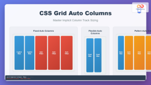
CSS Grid Auto Columns: Master Implicit Column Track Sizing for Dynamic Layouts
CSS Grid Layout revolutionized web design by providing a powerful two-dimensional layout system. While explicit grid tracks defined with grid-template-columns...
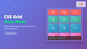
CSS Grid Auto Rows: Master Implicit Row Track Sizing for Dynamic Layouts
CSS Grid revolutionized web layout design, offering unprecedented control over both rows and columns. While you explicitly define grid tracks...
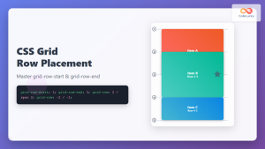
CSS Grid-Row-Start and Grid-Row-End: Complete Guide to Item Row Placement
Understanding CSS Grid Row Placement CSS Grid provides powerful tools for controlling the placement of grid items within your layout....
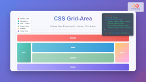
CSS Grid-Area: Master Item Placement in Named Grid Areas
What is CSS Grid-Area? The grid-area property in CSS is a powerful shorthand that allows you to place grid items...

CSS Align-Content: Master Grid Container Block Axis Alignment
The CSS align-content property is a powerful tool for controlling how grid items are distributed along the block axis (typically...
CSS Grid-Column-Start and Grid-Column-End: Complete Guide to Precise Item Column Placement
CSS Grid revolutionized web layout by providing precise control over both rows and columns. Among its most powerful features are...
CSS Grid auto-fit vs auto-fill: Master Dynamic Responsive Layouts
CSS Grid's auto-fit and auto-fill are two powerful keywords that enable dynamic track creation in grid layouts. While they might...

CSS Grid: Display Grid Container Property – Complete Guide with Examples
CSS Grid revolutionized web layout design by providing a two-dimensional grid system that allows developers to create complex, responsive layouts...

CSS Grid-Column Shorthand: Master Start and End Line Positioning
The CSS grid-column shorthand property is a powerful tool that allows you to position grid items across multiple columns in...

CSS Justify-Items: Complete Guide to Grid Item Inline Axis Alignment
The justify-items property is a powerful CSS Grid feature that controls how grid items are aligned along the inline axis...

CSS Align-Self: Master Individual Grid Item Block Axis Alignment
The CSS align-self property provides granular control over individual grid items' alignment along the block axis (vertical direction in horizontal...

CSS Grid Functions: Complete Guide to repeat(), minmax(), and fit-content()
CSS Grid has revolutionized web layout design, offering developers unprecedented control over two-dimensional layouts. Among its most powerful features are...


