
What is CSS Grid-Area?
The grid-area property in CSS is a powerful shorthand that allows you to place grid items into specific named areas of a CSS Grid layout. It’s part of the CSS Grid Layout specification and provides an intuitive way to position elements by referencing named grid areas rather than using line numbers.
This property combines four individual properties: grid-row-start, grid-column-start, grid-row-end, and grid-column-end into a single declaration, making your CSS more readable and maintainable.
CSS Grid-Area Syntax
The grid-area property can be used in two main ways:
1. Named Grid Areas
.grid-item {
  grid-area: area-name;
}
2. Line-based Placement
.grid-item {
  grid-area: row-start / column-start / row-end / column-end;
}
Creating Named Grid Areas
Before using grid-area with named areas, you need to define the grid template using grid-template-areas on the parent container:
.grid-container {
  display: grid;
  grid-template-areas:
    "header header header"
    "sidebar main main"
    "footer footer footer";
  grid-template-columns: 200px 1fr 1fr;
  grid-template-rows: auto 1fr auto;
  gap: 10px;
  height: 400px;
}

.header { grid-area: header; }
.sidebar { grid-area: sidebar; }
.main { grid-area: main; }
.footer { grid-area: footer; }
Interactive Example: Basic Grid Layout
Advanced Grid-Area Techniques
Spanning Multiple Areas
You can create items that span across multiple named areas by repeating the area name in your template:
.advanced-grid {
  display: grid;
  grid-template-areas:
    "header header header header"
    "nav main main aside"
    "nav main main aside"
    "footer footer footer footer";
  grid-template-columns: 100px 1fr 1fr 120px;
  grid-template-rows: 60px 1fr 1fr 60px;
}

.wide-header { grid-area: header; }
.navigation { grid-area: nav; }
.content { grid-area: main; }
.sidebar { grid-area: aside; }
.wide-footer { grid-area: footer; }
Line-Based Grid-Area
When you need more precise control, you can use line numbers instead of named areas:
/* Syntax: row-start / column-start / row-end / column-end */
.grid-item {
  grid-area: 1 / 2 / 3 / 4;
  /* This places the item from row 1 to row 3, column 2 to column 4 */
}
Responsive Grid Areas
One of the most powerful features of named grid areas is how easily they adapt to different screen sizes:
Resize your browser window to see how the layout adapts!
Common Grid-Area Use Cases
1. Holy Grail Layout
The classic three-column layout with header and footer:
.holy-grail {
  display: grid;
  grid-template-areas:
    "header header header"
    "left-sidebar main right-sidebar"
    "footer footer footer";
  grid-template-columns: 200px 1fr 200px;
  grid-template-rows: auto 1fr auto;
  min-height: 100vh;
}

.header { grid-area: header; }
.left-sidebar { grid-area: left-sidebar; }
.main-content { grid-area: main; }
.right-sidebar { grid-area: right-sidebar; }
.footer { grid-area: footer; }
2. Card Layout
Creating complex card layouts with named areas:
Grid Area Card
This card uses named grid areas to create a flexible layout that adapts to different screen sizes while maintaining a clean structure.
Grid-Area Best Practices
1. Use Descriptive Names
Choose meaningful names for your grid areas that describe their content or purpose:
/* Good */
grid-template-areas:
  "site-header site-header"
  "main-navigation page-content"
  "site-footer site-footer";

/* Avoid */
grid-template-areas:
  "a a"
  "b c"
  "d d";
2. Plan for Responsive Design
Design your grid areas with mobile-first approach:
/* Mobile first */
.container {
  grid-template-areas:
    "header"
    "main"
    "sidebar"
    "footer";
}

/* Tablet */
@media (min-width: 768px) {
  .container {
    grid-template-areas:
      "header header"
      "main sidebar"
      "footer footer";
  }
}

/* Desktop */
@media (min-width: 1024px) {
  .container {
    grid-template-areas:
      "header header header"
      "main main sidebar"
      "footer footer footer";
  }
}
3. Handle Missing Areas
Use dots (.) to create empty spaces in your grid:
.asymmetric-grid {
  grid-template-areas:
    "header header header"
    "sidebar main ."
    "footer footer footer";
}
Debugging Grid Areas
Modern browsers provide excellent developer tools for debugging CSS Grid layouts:
- Firefox: Shows grid line numbers and area names
- Chrome: Provides grid overlay and area highlighting
- Safari: Offers grid inspector with area visualization
You can also add temporary background colors to visualize your grid areas during development:
.debug-grid * {
  border: 1px solid rgba(255, 0, 0, 0.3);
  background: rgba(0, 255, 0, 0.1);
}
Browser Support and Fallbacks
CSS Grid and grid-area are well-supported in modern browsers. For older browsers, consider these fallback strategies:
/* Flexbox fallback */
.container {
  display: flex;
  flex-direction: column;
}

/* Grid enhancement */
@supports (display: grid) {
  .container {
    display: grid;
    grid-template-areas:
      "header"
      "main"
      "footer";
  }
}
Performance Considerations
When using grid-area, keep these performance tips in mind:
- Avoid creating overly complex grid templates with many areas
- Use CSS custom properties for dynamic grid layouts
- Consider using
subgridfor nested grid layouts (where supported) - Minimize the number of media queries that restructure grid areas
Conclusion
The grid-area property is a fundamental tool for creating sophisticated, responsive layouts with CSS Grid. By using named grid areas, you can create intuitive, maintainable code that clearly expresses your design intent.
Whether you’re building simple card layouts or complex responsive designs, mastering grid-area will significantly improve your ability to create modern web layouts. The combination of semantic area names and powerful placement capabilities makes it an essential skill for any frontend developer.
Start incorporating grid-area into your projects today, and experience the power of semantic, flexible grid layouts that adapt beautifully across all device sizes.
Related Posts
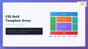
CSS Grid Template Areas: Master Named Grid Layouts with Visual Examples
CSS Grid revolutionized web layout design, and one of its most powerful features is grid-template-areas. This property allows you to...
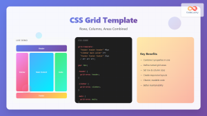
CSS Grid Template Shorthand: Master Rows, Columns, and Areas in One Property
The CSS grid-template shorthand property is a powerful tool that allows you to define your grid's structure in a single...
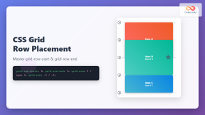
CSS Grid-Row-Start and Grid-Row-End: Complete Guide to Item Row Placement
Understanding CSS Grid Row Placement CSS Grid provides powerful tools for controlling the placement of grid items within your layout....
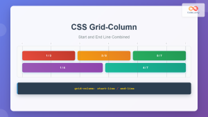
CSS Grid-Column Shorthand: Master Start and End Line Positioning
The CSS grid-column shorthand property is a powerful tool that allows you to position grid items across multiple columns in...
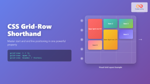
CSS Grid-Row Shorthand: Master Start and End Line Positioning in One Property
The CSS grid-row shorthand property is a powerful tool that allows you to define both the starting and ending positions...

CSS Style grid Property: CSS Grid Layout
CSS grid Property: Mastering CSS Grid Layout The CSS grid property is a powerful tool for creating two-dimensional layouts on...

CSS Grid Shorthand: Template and Auto Properties Combined for Efficient Layouts
CSS Grid has revolutionized web layout design, offering powerful tools for creating complex, responsive layouts. Among its most valuable features...
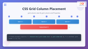
CSS Grid-Column-Start and Grid-Column-End: Complete Guide to Precise Item Column Placement
CSS Grid revolutionized web layout by providing precise control over both rows and columns. Among its most powerful features are...

CSS Grid Auto Flow: Master Item Placement Algorithm Control for Responsive Layouts
Understanding CSS Grid Auto Flow The grid-auto-flow property is a powerful CSS Grid feature that controls how auto-placed items are...
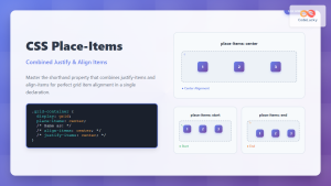
CSS Place-Items: Master Combined Justify and Align Items in One Property
The CSS place-items property is a powerful shorthand that combines justify-items and align-items into a single declaration. This property revolutionizes...

CSS Align-Content: Master Grid Container Block Axis Alignment
The CSS align-content property is a powerful tool for controlling how grid items are distributed along the block axis (typically...
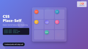
CSS Place-Self: Master Grid and Flexbox Item Positioning with One Property
The CSS place-self property is a powerful shorthand that combines justify-self and align-self into a single declaration, making it easier...


