
The CSS grayscale filter is a powerful tool that transforms colorful images into elegant black and white versions. This filter effect has become increasingly popular in modern web design for creating sophisticated visual hierarchies, hover effects, and artistic presentations.
What is CSS Grayscale Filter?
The CSS grayscale() filter function converts an element’s colors to grayscale values. It’s part of the CSS Filter Effects specification and works by removing color saturation while preserving luminance information. The filter accepts a percentage or decimal value that determines the intensity of the grayscale conversion.
Basic Syntax
filter: grayscale(value);

/* Examples */
filter: grayscale(0);     /* No grayscale effect */
filter: grayscale(50%);   /* 50% grayscale */
filter: grayscale(1);     /* Full grayscale */
filter: grayscale(100%);  /* Full grayscale */
How CSS Grayscale Filter Works
The grayscale filter converts colors using a weighted average of the red, green, and blue color channels. The standard formula used is approximately:
Gray = 0.299 × Red + 0.587 × Green + 0.114 × Blue
This formula accounts for human perception, where green appears brightest to our eyes, followed by red, then blue. The filter maintains the original brightness while removing color information.
Grayscale Filter Values and Effects

grayscale(0%)
Original colors preserved
grayscale(25%)
Subtle desaturation
grayscale(50%)
Half grayscale effect
grayscale(100%)
Complete black and white
Interactive Grayscale Filter Demo
Try It Yourself
0%
100%
filter: grayscale(0%);Practical Examples and Use Cases
1. Image Gallery with Hover Effects
.gallery-item img {
  filter: grayscale(100%);
  transition: filter 0.3s ease, transform 0.3s ease;
}

.gallery-item:hover img {
  filter: grayscale(0%);
  transform: scale(1.05);
}
2. Team Member Profiles
John Doe
Developer
Jane Smith
Designer
.team-member img {
  filter: grayscale(100%);
  transition: filter 0.3s ease;
}

.team-member:hover img {
  filter: grayscale(0%);
}
3. Logo Showcase with Grayscale
.logo-item img {
  filter: grayscale(100%);
  transition: filter 0.3s ease;
  opacity: 0.7;
}

.logo-item:hover img {
  filter: grayscale(0%);
  opacity: 1;
}
Combining Grayscale with Other Filters
The grayscale filter can be combined with other CSS filters to create more complex effects. Here are some popular combinations:
Grayscale + Brightness
grayscale(100%) brightness(1.2)
Grayscale + Contrast
grayscale(100%) contrast(1.5)
Grayscale + Blur
grayscale(100%) blur(1px)
Advanced Filter Combinations
/* Vintage effect */
filter: grayscale(50%) sepia(30%) brightness(0.9) contrast(1.1);

/* High contrast black and white */
filter: grayscale(100%) contrast(1.5) brightness(1.1);

/* Soft grayscale with slight blur */
filter: grayscale(100%) blur(0.5px) brightness(1.05);

/* Film noir effect */
filter: grayscale(100%) contrast(1.3) brightness(0.8);
Animation and Transitions
Grayscale filters work beautifully with CSS transitions and animations. Here’s how to create smooth animated effects:
Smooth Hover Transitions
.image {
  filter: grayscale(100%);
  transition: filter 0.5s ease-in-out;
}

.image:hover {
  filter: grayscale(0%);
}
Keyframe Animation
@keyframes grayscalePulse {
  0%, 100% {
    filter: grayscale(100%);
  }
  50% {
    filter: grayscale(0%);
  }
}

.pulsing-image {
  animation: grayscalePulse 3s ease-in-out infinite;
}
Browser Support and Compatibility
The CSS grayscale filter enjoys excellent browser support across modern browsers. Here’s the current compatibility status:
Browser Support Table
| Browser | Version | Support |
|---|---|---|
| Chrome | 53+ | ✅ Full Support |
| Firefox | 35+ | ✅ Full Support |
| Safari | 9.1+ | ✅ Full Support |
| Edge | 12+ | ✅ Full Support |
| Internet Explorer | 10+ | ⚠️ Partial (with -ms-filter) |
Fallback for Older Browsers
/* Modern browsers */
.grayscale-image {
  filter: grayscale(100%);
}

/* Internet Explorer fallback */
.grayscale-image {
  -ms-filter: "progid:DXImageTransform.Microsoft.BasicImage(grayscale=1)";
}

/* Feature detection with CSS */
@supports (filter: grayscale(100%)) {
  .grayscale-image {
    filter: grayscale(100%);
  }
}
Performance Considerations
While CSS filters are generally performant, there are some considerations when using grayscale effects:
⚡ Performance Tips
- Use transitions wisely: Smooth transitions look great but avoid overly long durations
- Limit simultaneous animations: Too many filtered elements animating at once can impact performance
- Consider will-change property: Use
will-change: filterfor elements that will be animated - Test on mobile devices: Filters can be more resource-intensive on mobile
Optimized CSS for Performance
.optimized-image {
  filter: grayscale(100%);
  transition: filter 0.3s ease;
  will-change: filter; /* Hint to browser for optimization */
}

.optimized-image:hover {
  filter: grayscale(0%);
}
Accessibility Considerations
When implementing grayscale effects, it’s important to consider accessibility and user preferences:
♿ Accessibility Best Practices
- Respect user preferences: Some users prefer reduced motion or high contrast
- Provide alternatives: Don’t rely solely on color to convey information
- Test contrast ratios: Ensure grayscale images maintain sufficient contrast
- Consider cognitive load: Frequent color changes can be distracting for some users
Accessible Implementation
/* Respect user's motion preferences */
@media (prefers-reduced-motion: reduce) {
  .grayscale-image {
    transition: none;
  }
}

/* High contrast mode consideration */
@media (prefers-contrast: high) {
  .grayscale-image {
    filter: grayscale(100%) contrast(1.2);
  }
}
Real-World Design Patterns
1. Magazine-Style Article Headers
.article-header {
  position: relative;
  background-image: url('background.jpg');
  background-size: cover;
}

.article-header::before {
  content: '';
  position: absolute;
  top: 0;
  left: 0;
  right: 0;
  bottom: 0;
  background: inherit;
  filter: grayscale(70%);
  opacity: 0.8;
}
2. Product Showcase with Focus Effect
Product A
Related Posts
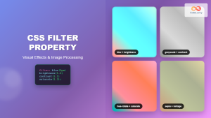
CSS Filter Property: Complete Guide to Visual Effects and Image Processing
The CSS filter property is a powerful tool that allows developers to apply visual effects and image processing techniques directly...
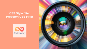
CSS Style filter Property: CSS Filter
CSS filter Property: Enhance Your Web Graphics The CSS filter property provides powerful visual effects to elements like images, backgrounds,...
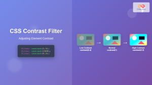
CSS Contrast Filter: Complete Guide to Adjusting Element Contrast for Better Visual Impact
The CSS contrast() filter function is a powerful tool that allows web developers to dynamically adjust the contrast of HTML...

CSS Invert Filter: Complete Guide to Inverting Element Colors and Visual Effects
The CSS invert() filter is a powerful visual effect that reverses the colors of HTML elements, creating striking contrast and...
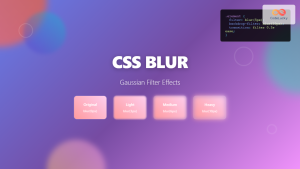
CSS Blur Filter: Complete Guide to Gaussian Blur Effects and Visual Applications
The CSS blur filter is one of the most versatile and visually appealing effects in modern web design. This powerful...
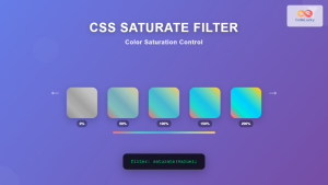
CSS Saturate Filter: Complete Guide to Color Saturation Control
The CSS saturate() filter function is a powerful tool that allows you to control the color saturation of HTML elements....
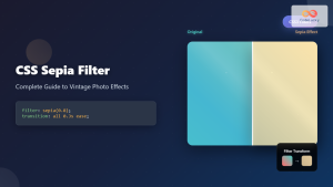
CSS Sepia Filter: Complete Guide to Vintage Photo Effects
The CSS sepia filter is a powerful visual effect that transforms images and elements into vintage, sepia-toned appearances reminiscent of...
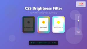
CSS Brightness Filter: Complete Guide to Adjusting Element Brightness
The CSS brightness() filter function is a powerful tool that allows developers to adjust the brightness of HTML elements dynamically....

CSS Backdrop-Filter: Complete Guide to Background Blur and Visual Effects
What is CSS Backdrop-Filter? The backdrop-filter property in CSS allows you to apply graphical effects like blur, brightness, contrast, and...

CSS Drop-Shadow Filter: Complete Guide to Creating Professional Shadow Effects
The CSS drop-shadow() filter function is a powerful tool that allows developers to create realistic shadow effects for any HTML...
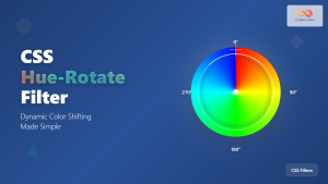
CSS Hue-Rotate Filter: Complete Guide to Dynamic Color Shifting
The CSS hue-rotate filter is a powerful tool that allows web developers to dynamically shift the hue values of any...
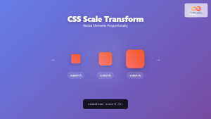
CSS Scale: Master Element Resizing with Transform Property
The CSS scale() function is a powerful transformation tool that allows you to resize elements proportionally without affecting the document...


