
The CSS flex-grow property is a fundamental component of the flexbox layout model that controls how flex items grow to fill available space within their flex container. Understanding this property is essential for creating responsive, flexible layouts that adapt seamlessly to different screen sizes and content requirements.
What is CSS Flex-Grow?
The flex-grow property defines the ability of a flex item to grow if necessary. It accepts a unitless value that serves as a proportion, dictating what amount of available space inside the flex container the item should take up. When set to 0 (default), the item will not grow beyond its natural size. Values greater than 0 allow the item to expand proportionally.
Syntax and Values
.flex-item {
  flex-grow: <number>;
}
Accepted Values:
- 0 (default): Item will not grow
- Positive numbers: Item will grow proportionally to the value
- Negative numbers: Invalid and ignored
How Flex-Grow Works
The flex-grow property works by distributing available extra space among flex items. When a flex container has remaining space after all items reach their natural size, flex-grow determines how this extra space is allocated.
Basic Example
The middle item takes 1 part of available space, while the right item takes 2 parts.
Practical Examples
Equal Distribution
Setting all flex items to flex-grow: 1 creates equal distribution of available space:
.container {
  display: flex;
}

.item {
  flex-grow: 1;
}
Proportional Growth
Different flex-grow values create proportional distribution:
The second item takes 3 parts, third item takes 2 parts, and first item takes 1 part of available space.
Interactive Demonstration
Try adjusting the flex-grow values in this interactive example:
1
2
1
Common Use Cases
Navigation Bars
Create flexible navigation where certain items expand to fill space:
.navbar {
  display: flex;
}

.spacer {
  flex-grow: 1;
}
Card Layouts
Create responsive card grids where cards expand proportionally:
Card 1
This card will grow to fill available space while maintaining a minimum width.
Card 2
Equal growth ensures balanced layout across different screen sizes.
Flex-Grow vs Flex-Basis vs Flex-Shrink
Understanding the relationship between flex properties:
| Property | Purpose | Default |
|---|---|---|
flex-grow |
Controls how items grow when extra space is available | 0 |
flex-shrink |
Controls how items shrink when space is limited | 1 |
flex-basis |
Sets the initial main size before free space is distributed | auto |
Advanced Techniques
Fractional Units
Use decimal values for precise control:
.item-1 { flex-grow: 0.5; }
.item-2 { flex-grow: 1.5; }
.item-3 { flex-grow: 1; }
Combining with Other Flex Properties
The shorthand flex property combines grow, shrink, and basis:
/* flex: grow shrink basis */
.item {
  flex: 1 0 200px; /* grow: 1, shrink: 0, basis: 200px */
}

/* Common shorthand values */
.equal-flex { flex: 1; }        /* 1 1 0% */
.no-grow { flex: 0 1 auto; }    /* 0 1 auto */
.fixed-size { flex: none; }     /* 0 0 auto */
Browser Support and Compatibility
The flex-grow property enjoys excellent browser support:
- Chrome: 29+ (21+ with -webkit- prefix)
- Firefox: 28+ (18+ with -moz- prefix)
- Safari: 9+ (6.1+ with -webkit- prefix)
- Edge: 12+
- Internet Explorer: 11+ (10+ with -ms- prefix)
For maximum compatibility with older browsers, consider using prefixes:
.flex-item {
  -webkit-flex-grow: 1;
  -moz-flex-grow: 1;
  -ms-flex-positive: 1;
  flex-grow: 1;
}
Best Practices and Tips
Performance Considerations
- Avoid excessive nesting: Deep flex container hierarchies can impact performance
- Use integers when possible: Whole numbers are easier to understand and debug
- Test on different screen sizes: Flex-grow behavior varies with container width
Common Pitfalls
- Forgetting min-width: Flex items can shrink below their content size without explicit constraints
- Unexpected inheritance: Flex properties don’t inherit, but may appear to due to nested flex containers
- Mixing units: Be consistent with flex-basis units across items
Debugging Flex-Grow Issues
Use browser developer tools to debug flex layouts:
- Chrome DevTools: Enable “Flexbox” badge in Elements panel
- Firefox DevTools: Use the built-in Flexbox Inspector
- Safari Web Inspector: Check the computed styles for flex properties
Common debugging techniques:
/* Temporarily add borders to visualize layout */
.flex-item {
  border: 1px solid red;
}

/* Check computed flex values */
.flex-item {
  flex: 1; /* Check if this resolves to expected values */
}
Accessibility Considerations
When using flex-grow, maintain accessibility standards:
- Preserve reading order: Visual order should match DOM order for screen readers
- Maintain focus indicators: Ensure focus outlines remain visible after flex adjustments
- Test with zoom: Verify layouts work at 200% zoom level
Conclusion
The CSS flex-grow property is a powerful tool for creating flexible, responsive layouts. By understanding how it distributes available space proportionally among flex items, you can build interfaces that adapt seamlessly to different screen sizes and content requirements. Remember to combine it thoughtfully with other flex properties and always test across different devices and browsers to ensure a consistent user experience.
Master flex-grow by practicing with the interactive examples above, and don’t hesitate to experiment with different values to achieve your desired layout goals. The flexibility it provides makes it an indispensable part of modern CSS layout techniques.
Related Posts

CSS Flex-Basis: Complete Guide to Initial Item Sizing in Flexbox
The flex-basis property is a fundamental component of CSS Flexbox that defines the initial main size of a flex item...
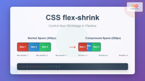
CSS Flex-Shrink: Complete Guide to Flexible Item Shrinkage Control
The CSS flex-shrink property is a fundamental component of the flexbox layout system that determines how flex items shrink when...

CSS flexShrink Property: CSS Flex Shrink
CSS flexShrink Property: Controlling the Shrink Factor of Flex Items The CSS flexShrink property is a crucial component of the...
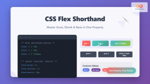
CSS Flex Shorthand: Master Grow, Shrink, and Basis in One Property
The CSS flex shorthand property is one of the most powerful tools in flexbox layouts, combining three essential properties into...
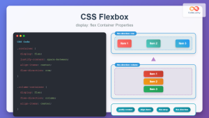
CSS Flexbox: Complete Guide to display: flex Container Properties and Layout Control
CSS Flexbox revolutionized web layout by providing a powerful, flexible way to arrange elements within containers. The display: flex property...
CSS Style flex Property: CSS Flex
Understanding the CSS flex Property: A Comprehensive Guide The CSS flex property is a shorthand property used to set the...

CSS Style flexFlow Property: CSS Flex Flow
CSS flex-flow Property: A Comprehensive Guide The CSS flex-flow property is a shorthand property for setting both the flex-direction and...
CSS Style flexDirection Property: CSS Flex Direction
CSS flexDirection Property: Mastering Flex Item Arrangement The CSS flexDirection property is a crucial aspect of Flexbox layout, determining the...

CSS Justify-Content: Complete Guide to Flexbox Main Axis Alignment
The justify-content property is one of the most powerful tools in CSS Flexbox for controlling how flex items are distributed...
CSS Order Property: Complete Guide to Reordering Flex Items Visually
The CSS order property is a powerful flexbox feature that allows you to change the visual order of flex items...

CSS Percentage Units: Complete Guide to Parent-Relative Sizing
CSS percentage units are fundamental building blocks for creating responsive, flexible layouts that adapt to different screen sizes and container...
CSS minHeight Property: CSS Min Height
Understanding the CSS minHeight Property The CSS minHeight property sets the minimum height of an element. It prevents the element's...


