
The CSS filter property is a powerful tool that allows developers to apply visual effects and image processing techniques directly to HTML elements without requiring external image editing software. This comprehensive guide explores every aspect of CSS filters, from basic implementations to advanced techniques that will transform your web designs.
Understanding CSS Filter Property
CSS filters enable you to apply graphical effects like blur, brightness adjustment, color shifting, and more to any HTML element. The filter property accepts one or more filter functions that process the element’s appearance before it’s rendered on screen.
Basic Syntax
selector {
    filter: filter-function(value);
}
You can also combine multiple filters by separating them with spaces:
selector {
    filter: blur(5px) brightness(0.8) contrast(1.2);
}
Core CSS Filter Functions
Blur Filter
The blur() function applies a Gaussian blur effect to elements. It accepts values in pixels, with higher values creating more pronounced blur effects.
Blur Examples:
Original
blur(2px)
blur(5px)
.blur-light {
    filter: blur(2px);
}

.blur-heavy {
    filter: blur(8px);
}
Brightness Filter
The brightness() function adjusts the brightness of elements. Values below 1 darken the element, while values above 1 brighten it. A value of 0 creates a completely black element.
Brightness Examples:
brightness(0.5)
brightness(1)
brightness(1.5)
.dim {
    filter: brightness(0.7);
}

.bright {
    filter: brightness(1.3);
}
Contrast Filter
The contrast() function adjusts the contrast of elements. Values below 1 decrease contrast, while values above 1 increase it. A value of 0 creates a completely gray element.
Contrast Examples:
contrast(0.5)
contrast(1)
contrast(2)
Grayscale Filter
The grayscale() function converts elements to grayscale. Values range from 0 (no change) to 1 (completely grayscale).
Grayscale Examples:
grayscale(0)
grayscale(0.5)
grayscale(1)
Hue-Rotate Filter
The hue-rotate() function rotates the hue of elements around the color wheel. Values are specified in degrees (0deg to 360deg).
Hue-Rotate Examples:
hue-rotate(0deg)
hue-rotate(90deg)
hue-rotate(180deg)
Saturation Filter
The saturate() function adjusts color saturation. Values below 1 desaturate colors, while values above 1 increase saturation.
Saturation Examples:
saturate(0.3)
saturate(1)
saturate(2)
Advanced Filter Functions
Invert Filter
The invert() function inverts the colors of elements, creating a negative effect. Values range from 0 (no inversion) to 1 (complete inversion).
Invert Examples:
invert(0)
invert(1)
Sepia Filter
The sepia() function applies a sepia tone effect, giving elements a warm, vintage appearance.
Sepia Examples:
sepia(0)
sepia(1)
Drop-Shadow Filter
The drop-shadow() function creates a shadow effect that follows the shape of the element, unlike box-shadow which creates a rectangular shadow.
.drop-shadow-example {
    filter: drop-shadow(5px 5px 10px rgba(0, 0, 0, 0.3));
}
Interactive Filter Demo
Filter Playground
Combining Multiple Filters
One of the most powerful aspects of CSS filters is the ability to combine multiple filter functions to create complex visual effects. When combining filters, they are applied in the order they appear in the declaration.
.complex-filter {
    filter:
        blur(1px)
        brightness(1.2)
        contrast(1.1)
        saturate(1.3)
        hue-rotate(15deg);
}
Combined Filter Examples:
Original
Enhanced
Vintage
Practical Use Cases
Image Hover Effects
CSS filters are perfect for creating engaging hover effects on images and other elements.
.image-hover {
    transition: filter 0.3s ease;
}

.image-hover:hover {
    filter: brightness(1.2) saturate(1.3) contrast(1.1);
}
Hover Effect Demo (hover over the squares):
Dark Mode Implementation
Filters can help implement dark mode themes by inverting colors and adjusting brightness.
/* Dark mode filter */
.dark-mode {
    filter: invert(1) hue-rotate(180deg);
}

/* Prevent double inversion on images */
.dark-mode img {
    filter: invert(1) hue-rotate(180deg);
}
Photo Effects Gallery
Create Instagram-style photo filters using CSS.
/* Vintage filter */
.vintage {
    filter: sepia(0.8) contrast(1.2) brightness(0.9) saturate(1.1);
}

/* Black and white with contrast */
.dramatic {
    filter: grayscale(1) contrast(1.8) brightness(0.9);
}

/* Warm tone */
.warm {
    filter: sepia(0.3) saturate(1.4) hue-rotate(-10deg) brightness(1.1);
}
Photo Filter Effects:
Original
Vintage
Dramatic
Warm
Performance Considerations
While CSS filters are powerful, they can impact performance, especially on mobile devices. Here are key considerations for optimal performance:
Hardware Acceleration
Most modern browsers use GPU acceleration for CSS filters, but complex filter combinations can still cause performance issues. Monitor your application’s performance when using filters extensively.
Transition Optimization
When animating filters, use the will-change property to hint to the browser about upcoming changes:
.filter-animation {
    will-change: filter;
    transition: filter 0.3s ease;
}

.filter-animation:hover {
    filter: brightness(1.2) contrast(1.1);
}
<h
Related Posts
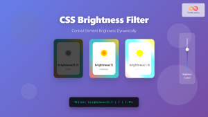
CSS Brightness Filter: Complete Guide to Adjusting Element Brightness
The CSS brightness() filter function is a powerful tool that allows developers to adjust the brightness of HTML elements dynamically....
CSS Style filter Property: CSS Filter
CSS filter Property: Enhance Your Web Graphics The CSS filter property provides powerful visual effects to elements like images, backgrounds,...
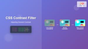
CSS Contrast Filter: Complete Guide to Adjusting Element Contrast for Better Visual Impact
The CSS contrast() filter function is a powerful tool that allows web developers to dynamically adjust the contrast of HTML...
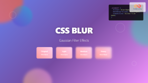
CSS Blur Filter: Complete Guide to Gaussian Blur Effects and Visual Applications
The CSS blur filter is one of the most versatile and visually appealing effects in modern web design. This powerful...

CSS Backdrop-Filter: Complete Guide to Background Blur and Visual Effects
What is CSS Backdrop-Filter? The backdrop-filter property in CSS allows you to apply graphical effects like blur, brightness, contrast, and...
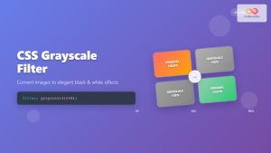
CSS Grayscale Filter: Master Black and White Image Effects with Complete Guide
The CSS grayscale filter is a powerful tool that transforms colorful images into elegant black and white versions. This filter...
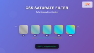
CSS Saturate Filter: Complete Guide to Color Saturation Control
The CSS saturate() filter function is a powerful tool that allows you to control the color saturation of HTML elements....
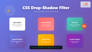
CSS Drop-Shadow Filter: Complete Guide to Creating Professional Shadow Effects
The CSS drop-shadow() filter function is a powerful tool that allows developers to create realistic shadow effects for any HTML...

CSS Invert Filter: Complete Guide to Inverting Element Colors and Visual Effects
The CSS invert() filter is a powerful visual effect that reverses the colors of HTML elements, creating striking contrast and...
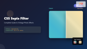
CSS Sepia Filter: Complete Guide to Vintage Photo Effects
The CSS sepia filter is a powerful visual effect that transforms images and elements into vintage, sepia-toned appearances reminiscent of...

CSS Style textShadow Property: CSS Text Shadow
CSS text-shadow Property: Comprehensive Guide The text-shadow property in CSS adds shadows to text, creating depth, emphasis, or visually appealing...
CSS Background-Image: Complete Guide to Adding Images to Element Backgrounds
The CSS background-image property is one of the most powerful tools for creating visually appealing web designs. It allows you...


