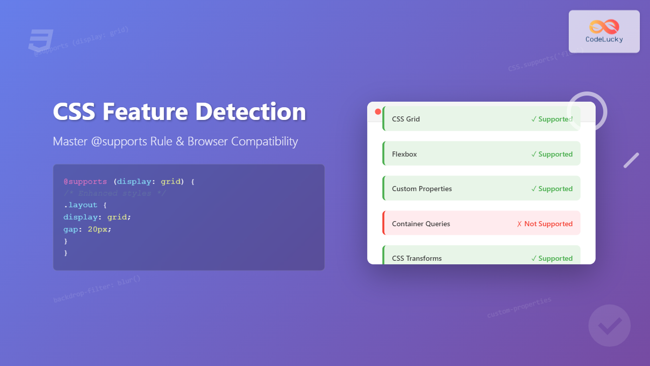
CSS feature detection is a crucial technique that allows developers to write robust, future-proof stylesheets that gracefully handle browser compatibility issues. The @supports rule, introduced in CSS3, provides a native way to test whether a browser supports specific CSS properties and values before applying them.
This comprehensive guide will teach you everything you need to know about CSS feature detection, from basic syntax to advanced implementation strategies that will make your websites more resilient across different browsers and devices.
What is CSS Feature Detection?
CSS feature detection is the practice of testing whether a browser supports a particular CSS feature before using it. Unlike user agent sniffing (detecting specific browsers), feature detection focuses on capabilities rather than browser identity, making it more reliable and future-proof.
The @supports rule acts as a conditional statement in CSS, similar to media queries but for feature support rather than device characteristics.
Why Use Feature Detection?
Modern web development faces several challenges that make feature detection essential:
- Browser Diversity: Different browsers implement CSS features at different rates
- Legacy Support: Older browsers may not support newer CSS properties
- Progressive Enhancement: Provide enhanced experiences for capable browsers while maintaining basic functionality
- Future-Proofing: New CSS features can be safely implemented without breaking older browsers
Basic @supports Syntax
The @supports rule follows a simple conditional syntax:
@supports (property: value) {
  /* CSS rules applied when feature is supported */
}
Here’s a practical example testing for CSS Grid support:
@supports (display: grid) {
  .container {
    display: grid;
    grid-template-columns: repeat(3, 1fr);
    gap: 20px;
  }
}
Interactive Example: Grid Detection
Grid Support Status:
Advanced @supports Operators
The @supports rule supports logical operators that allow for complex feature detection scenarios:
AND Operator
Test multiple features simultaneously:
@supports (display: grid) and (gap: 20px) {
  .layout {
    display: grid;
    gap: 20px;
    grid-template-columns: 1fr 2fr;
  }
}
OR Operator
Apply styles when any of the specified features are supported:
@supports (display: flex) or (display: -webkit-flex) {
  .flex-container {
    display: flex;
    justify-content: space-between;
  }
}
NOT Operator
Apply styles when a feature is NOT supported:
@supports not (display: grid) {
  .fallback-layout {
    float: left;
    width: 33.333%;
  }
}
Complex Combinations
Combine operators for sophisticated feature detection:
@supports (display: grid) and (not (gap: 20px)) {
  .grid-no-gap {
    display: grid;
    grid-template-columns: repeat(3, 1fr);
    /* Use margins instead of gap */
    grid-gap: 0;
  }

  .grid-no-gap > * {
    margin: 10px;
  }
}
Common Use Cases and Examples
CSS Custom Properties (Variables)
Detect support for CSS custom properties and provide fallbacks:
Custom Properties Detection
This box changes color based on CSS custom property support
/* Fallback colors */
.theme-box {
  background-color: #3498db;
  color: white;
}

@supports (--custom: value) {
  .theme-box {
    --primary-color: #e74c3c;
    --text-color: white;
    background-color: var(--primary-color);
    color: var(--text-color);
  }
}
Modern Layout Techniques
Implement progressive enhancement for modern layout methods:
/* Base layout using floats */
.card-layout .card {
  float: left;
  width: 30%;
  margin: 1.5%;
}

/* Enhanced layout with Flexbox */
@supports (display: flex) {
  .card-layout {
    display: flex;
    flex-wrap: wrap;
    gap: 20px;
  }

  .card-layout .card {
    flex: 1 1 calc(33.333% - 20px);
    float: none;
    margin: 0;
  }
}

/* Even better with Grid */
@supports (display: grid) {
  .card-layout {
    display: grid;
    grid-template-columns: repeat(auto-fit, minmax(300px, 1fr));
    gap: 20px;
  }

  .card-layout .card {
    flex: none;
  }
}
Advanced CSS Properties
Test support for cutting-edge CSS features:
@supports (backdrop-filter: blur(10px)) {
  .glass-effect {
    backdrop-filter: blur(10px);
    background: rgba(255, 255, 255, 0.1);
  }
}

@supports (clip-path: polygon(0 0, 100% 0, 100% 100%, 0 100%)) {
  .custom-shape {
    clip-path: polygon(20% 0%, 80% 0%, 100% 100%, 0% 100%);
  }
}
JavaScript Integration
Combine CSS feature detection with JavaScript for enhanced functionality:
JavaScript + CSS Feature Detection
// Check feature support in JavaScript
if (CSS.supports('display', 'grid')) {
  document.body.classList.add('grid-supported');
}

// Multiple property check
if (CSS.supports('display: grid') && CSS.supports('gap: 20px')) {
  // Apply enhanced grid styles
  enableAdvancedGrid();
}

// Complex feature detection
function supportsModernCSS() {
  return CSS.supports('display', 'grid') &&
         CSS.supports('--custom', 'value') &&
         CSS.supports('backdrop-filter', 'blur(10px)');
}
Best Practices for Feature Detection
1. Progressive Enhancement Strategy
Always start with a solid foundation that works everywhere, then enhance:
/* Base styles - work everywhere */
.navigation {
  list-style: none;
  padding: 0;
}

.navigation li {
  display: block;
  border-bottom: 1px solid #ccc;
}

/* Enhanced with Flexbox */
@supports (display: flex) {
  .navigation {
    display: flex;
    border: 1px solid #ccc;
    border-radius: 5px;
  }

  .navigation li {
    flex: 1;
    border-bottom: none;
    border-right: 1px solid #ccc;
  }

  .navigation li:last-child {
    border-right: none;
  }
}
2. Avoid False Positives
Be specific about what you’re testing to avoid false positives:
/* Too broad - might give false positives */
@supports (transform: translateX(0)) {
  .element { transform: translate3d(0, 0, 0); }
}

/* More specific - tests actual feature needed */
@supports (transform: translate3d(0, 0, 0)) {
  .element { transform: translate3d(0, 0, 0); }
}
3. Combine with Media Queries
Use feature detection alongside responsive design:
@media (min-width: 768px) {
  @supports (display: grid) {
    .responsive-grid {
      display: grid;
      grid-template-columns: repeat(auto-fit, minmax(250px, 1fr));
      gap: 20px;
    }
  }
}
Browser Support and Fallbacks
The @supports rule itself has excellent browser support, but here’s how to handle edge cases:
Fallback for @supports
For the rare case where @supports isn’t supported:
/* Default styles for all browsers */
.layout {
  display: block;
}

/* Enhanced styles with feature detection */
@supports (display: flex) {
  .layout {
    display: flex;
  }
}

/* JavaScript fallback for old browsers */
if (!window.CSS || !CSS.supports) {
  // Implement feature detection via JavaScript
  document.documentElement.className += ' no-supports';
}
Testing Vendor Prefixes
@supports (display: -webkit-flex) or (display: flex) {
  .flex-container {
    display: -webkit-flex;
    display: flex;
  }
}
Performance Considerations
While feature detection is powerful, consider these performance implications:
- CSS Parsing: @supports conditions are evaluated during CSS parsing
- Bundle Size: Multiple fallbacks can increase CSS file size
- Maintenance: Keep feature detection code organized and documented
/* Organize feature detection blocks */
/* ======================
   BASE STYLES
   ====================== */
.component { /* base styles */ }

/* ======================
   ENHANCED FEATURES
   ====================== */
@supports (display: grid) {
  .component { /* grid enhancements */ }
}

@supports (backdrop-filter: blur(5px)) {
  .component { /* visual enhancements */ }
}
Debugging Feature Detection
Use browser developer tools to test and debug feature detection:
💡 Debugging Tips
- Use browser DevTools Console:
CSS.supports('display', 'grid') - Test different property/value combinations
- Check computed styles to see which rules are applied
- Use feature detection libraries for complex scenarios
Real-World Implementation Examples
Card Layout with Progressive Enhancement
Progressive Card Layout Loading…
- Card 1: Base styling works in all browsers
- Card 2: Enhanced with Flexbox when supported
- Card 3: Even better with CSS Grid
- Card 4: Graceful degradation ensures functionality
Future of CSS Feature Detection
CSS feature detection continues to evolve with new capabilities:
- Container Queries:
@supports (container-type: inline-size) - Cascade Layers:
@supports (at-rule(@layer)) - CSS Nesting: Testing for native nesting support
- New Color Spaces:
@supports (color: oklch(0.7 0.15 180))
/* Testing future CSS features */
@supports (container-type: inline-size) {
  .responsive-component {
    container-type: inline-size;
  }
}

@supports selector(:has(.child)) {
  .parent:has(.special-child) {
    background: lightblue;
  }
}
Conclusion
CSS feature detection with the @supports rule is an essential tool for modern web development. It enables you to write robust, progressive CSS that works across all browsers while taking advantage of cutting-edge features where available.
Key takeaways for effective feature detection:
- Always start with a solid foundation that works everywhere
- Use progressive enhancement to add advanced features
- Combine CSS feature detection with JavaScript when needed
- Keep your code organized and well-documented
- Test thoroughly across different browsers and devices
By mastering CSS feature detection, you’ll create more resilient websites that provide excellent user experiences regardless of browser capabilities, while still pushing the boundaries of what’s possible with modern CSS.
Start implementing feature detection in your next project and experience the benefits of truly progressive web development. Your users—and your future self—will thank you for writing CSS that gracefully handles the diverse landscape of web browsers.

