
The CSS drop-shadow() filter function is a powerful tool that allows developers to create realistic shadow effects for any HTML element. Unlike the traditional box-shadow property, drop-shadow follows the exact shape of an element, including transparent areas and complex geometries.
Understanding CSS Drop-Shadow Filter
The drop-shadow() filter is part of the CSS Filter Effects specification and creates a shadow that conforms to the alpha channel of an element. This means it works perfectly with PNG images with transparency, SVG graphics, and text with custom shapes.
Basic Syntax
filter: drop-shadow(offset-x offset-y blur-radius color);- offset-x: Horizontal shadow distance (required)
- offset-y: Vertical shadow distance (required)
- blur-radius: Shadow blur amount (optional, defaults to 0)
- color: Shadow color (optional, defaults to currentColor)
Basic Drop-Shadow Examples
Let’s start with simple examples to understand how drop-shadow works:
Example 1: Simple Text Shadow
Shadow Text
.shadow-text {
  filter: drop-shadow(2px 2px 4px rgba(0,0,0,0.3));
}
Example 2: Card with Drop Shadow
.shadow-card {
  filter: drop-shadow(0 4px 8px rgba(0,0,0,0.15));
  background: white;
  border-radius: 12px;
}
Drop-Shadow vs Box-Shadow
Understanding the difference between drop-shadow and box-shadow is crucial for choosing the right technique:
Comparison Example
box-shadow
Rectangular shadow
drop-shadow
Follows element shape
| Feature | box-shadow | drop-shadow |
|---|---|---|
| Shape Following | Rectangle only | Follows element shape |
| Transparency Support | No | Yes |
| Multiple Shadows | Yes | Limited |
| Inset Shadows | Yes | No |
| Performance | Better | Slightly slower |
Advanced Drop-Shadow Techniques
Colored Shadows
Create vibrant, colored shadows to enhance your design aesthetics:
.red-shadow { filter: drop-shadow(0 4px 12px rgba(255,107,107,0.4)); }
.teal-shadow { filter: drop-shadow(0 4px 12px rgba(78,205,196,0.4)); }
.blue-shadow { filter: drop-shadow(0 4px 12px rgba(69,183,209,0.4)); }
Layered Shadow Effects
Combine multiple filters to create complex shadow effects:
Shadows
.layered-shadow {
  filter:
    drop-shadow(0 10px 25px rgba(0,0,0,0.15))
    drop-shadow(0 4px 8px rgba(0,0,0,0.1));
}
Interactive Shadow Effects
Create engaging hover effects using CSS transitions:
.interactive-button {
  filter: drop-shadow(0 4px 8px rgba(108,92,231,0.3));
  transition: all 0.3s ease;
}

.interactive-button:hover {
  filter: drop-shadow(0 8px 25px rgba(108,92,231,0.4));
  transform: translateY(-2px);
}
Working with Images and SVGs
Drop-shadow truly shines when working with transparent images and SVG graphics:
SVG Icon with Drop Shadow
.svg-shadow {
  filter: drop-shadow(2px 4px 8px rgba(0,0,0,0.2));
}
Performance Considerations
While drop-shadow creates beautiful effects, it’s important to consider performance implications:
⚠️ Performance Tips
- Use
will-change: filterfor animated shadows - Avoid complex shadows on many elements simultaneously
- Consider using
transform3d(0,0,0)to trigger hardware acceleration - Test performance on lower-end devices
Browser Support and Fallbacks
CSS drop-shadow has excellent browser support, but it’s good practice to provide fallbacks:
/* Fallback with box-shadow */
.element {
  box-shadow: 0 4px 8px rgba(0,0,0,0.15);
}

/* Enhanced with drop-shadow where supported */
@supports (filter: drop-shadow(0 0 0 black)) {
  .element {
    box-shadow: none;
    filter: drop-shadow(0 4px 8px rgba(0,0,0,0.15));
  }
}
✅ Browser Support
Drop-shadow is supported in all modern browsers including Chrome 18+, Firefox 35+, Safari 6+, and Edge 12+.
Real-World Use Cases
Material Design Cards
Material Card
This card uses layered drop shadows to create a material design elevation effect.
.material-card {
  filter:
    drop-shadow(0 2px 4px rgba(0,0,0,0.1))
    drop-shadow(0 8px 16px rgba(0,0,0,0.1));
}
Floating Action Button
.fab {
  filter:
    drop-shadow(0 4px 8px rgba(255,87,34,0.3))
    drop-shadow(0 1px 3px rgba(0,0,0,0.2));
  transition: all 0.2s ease;
}

.fab:hover {
  filter:
    drop-shadow(0 6px 12px rgba(255,87,34,0.4))
    drop-shadow(0 2px 4px rgba(0,0,0,0.2));
}
Common Pitfalls and Solutions
Shadow Clipping
Shadows can be clipped by parent containers. Ensure adequate padding or use overflow: visible:
.container {
  padding: 20px; /* Provide space for shadows */
  overflow: visible; /* Prevent shadow clipping */
}
Performance with Animations
Animating filters can be expensive. For smooth animations, use transform and opacity where possible:
.animated-shadow {
  filter: drop-shadow(0 4px 8px rgba(0,0,0,0.2));
  transition: transform 0.3s ease, opacity 0.3s ease;
}

.animated-shadow:hover {
  transform: translateY(-4px); /* Cheaper than animating filter */
}
Advanced Techniques and Tips
Combining with Other Filters
Drop-shadow works beautifully with other CSS filters:
.combined-filters {
  filter:
    drop-shadow(0 8px 16px rgba(0,0,0,0.2))
    blur(0.5px)
    saturate(1.2);
}
CSS Custom Properties for Dynamic Shadows
Use CSS custom properties to create flexible, reusable shadow systems:
:root {
  --shadow-color: rgba(0,0,0,0.15);
  --shadow-small: drop-shadow(0 2px 4px var(--shadow-color));
  --shadow-medium: drop-shadow(0 4px 8px var(--shadow-color));
  --shadow-large: drop-shadow(0 8px 16px var(--shadow-color));
}

.card-small { filter: var(--shadow-small); }
.card-medium { filter: var(--shadow-medium); }
.card-large { filter: var(--shadow-large); }
Accessibility Considerations
When implementing drop-shadows, consider accessibility:
- Contrast: Ensure shadows don’t reduce text readability
- Motion sensitivity: Provide reduced motion alternatives
- Color dependency: Don’t rely solely on shadows to convey information
@media (prefers-reduced-motion: reduce) {
  .animated-shadow {
    transition: none;
  }
}
Conclusion
CSS drop-shadow filter is a versatile tool for creating professional shadow effects that follow element shapes precisely. By understanding its syntax, performance implications, and best practices, you can enhance your web designs with realistic, engaging shadow effects. Remember to test across different devices and provide appropriate fallbacks for optimal user experience.
Whether you’re creating material design cards, floating action buttons, or artistic visual effects, mastering drop-shadow will elevate your CSS skills and help you build more polished, professional web interfaces.
Related Posts
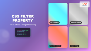
CSS Filter Property: Complete Guide to Visual Effects and Image Processing
The CSS filter property is a powerful tool that allows developers to apply visual effects and image processing techniques directly...
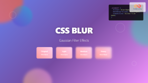
CSS Blur Filter: Complete Guide to Gaussian Blur Effects and Visual Applications
The CSS blur filter is one of the most versatile and visually appealing effects in modern web design. This powerful...

CSS Backdrop-Filter: Complete Guide to Background Blur and Visual Effects
What is CSS Backdrop-Filter? The backdrop-filter property in CSS allows you to apply graphical effects like blur, brightness, contrast, and...
CSS Style boxShadow Property: CSS Box Shadow
Understanding the CSS box-shadow Property The box-shadow property in CSS allows you to add shadow effects around an element's frame....

CSS Style textShadow Property: CSS Text Shadow
CSS text-shadow Property: Comprehensive Guide The text-shadow property in CSS adds shadows to text, creating depth, emphasis, or visually appealing...
CSS Style filter Property: CSS Filter
CSS filter Property: Enhance Your Web Graphics The CSS filter property provides powerful visual effects to elements like images, backgrounds,...
CSS Grayscale Filter: Master Black and White Image Effects with Complete Guide
The CSS grayscale filter is a powerful tool that transforms colorful images into elegant black and white versions. This filter...
HTML Canvas shadowBlur Property: Setting Shadow Blur
HTML Canvas shadowBlur Property: Adding Blur to Shadows The shadowBlur property of the HTML Canvas API allows you to add...
HTML Canvas shadowOffsetY Property: Setting Shadow Offset
HTML Canvas shadowOffsetY Property: Setting Shadow Offset The HTML Canvas shadowOffsetY property is a key tool for controlling the vertical...
CSS Sepia Filter: Complete Guide to Vintage Photo Effects
The CSS sepia filter is a powerful visual effect that transforms images and elements into vintage, sepia-toned appearances reminiscent of...
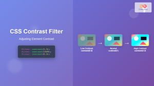
CSS Contrast Filter: Complete Guide to Adjusting Element Contrast for Better Visual Impact
The CSS contrast() filter function is a powerful tool that allows web developers to dynamically adjust the contrast of HTML...
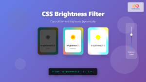
CSS Brightness Filter: Complete Guide to Adjusting Element Brightness
The CSS brightness() filter function is a powerful tool that allows developers to adjust the brightness of HTML elements dynamically....


