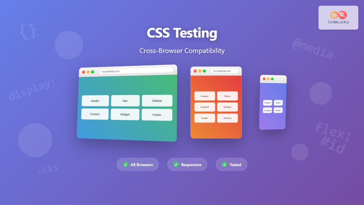
Cross-browser compatibility testing is one of the most critical aspects of modern web development. With users accessing websites through dozens of different browsers, versions, and devices, ensuring your CSS renders consistently across all platforms can make or break user experience. This comprehensive guide will walk you through everything you need to know about CSS cross-browser compatibility testing.
Understanding Cross-Browser Compatibility Challenges
Cross-browser compatibility issues arise because different browsers interpret CSS rules differently. Each browser has its own rendering engine – Chrome uses Blink, Firefox uses Gecko, Safari uses WebKit, and Edge uses Chromium-based Blink. These engines handle CSS properties, vendor prefixes, and new features at varying paces.
Common CSS Compatibility Issues
Before diving into testing strategies, let’s examine the most frequent compatibility problems you’ll encounter:
Flexbox Implementation Differences
Flexbox support varies significantly across browsers, especially older versions. Here’s an example showing how flexbox alignment can differ:
Modern Flexbox (Works in all current browsers):
.flex-container {
  display: flex;
  justify-content: center;
  align-items: center;
  height: 200px;
}

.flex-item {
  flex: 1;
  text-align: center;
}Legacy Flexbox (Older browsers):
.flex-container {
  display: -webkit-box;      /* OLD - iOS 6-, Safari 3.1-6 */
  display: -moz-box;         /* OLD - Firefox 19- */
  display: -ms-flexbox;      /* TWEENER - IE 10 */
  display: -webkit-flex;     /* NEW - Chrome */
  display: flex;             /* NEW, Spec - Opera 12.1, Firefox 20+ */

  -webkit-box-pack: center;
  -moz-box-pack: center;
  -ms-flex-pack: center;
  -webkit-justify-content: center;
  justify-content: center;
}
CSS Grid Browser Support
CSS Grid has excellent modern browser support but requires careful handling for legacy browsers:
/* Modern Grid */
.grid-container {
  display: grid;
  grid-template-columns: repeat(3, 1fr);
  gap: 20px;
}

/* Fallback for older browsers */
.grid-container {
  display: block; /* Fallback */
}

.grid-container > * {
  display: inline-block; /* Fallback */
  width: 30%; /* Fallback */
  margin: 1.5%; /* Fallback */
}

/* Apply grid only if supported */
@supports (display: grid) {
  .grid-container {
    display: grid;
    grid-template-columns: repeat(3, 1fr);
    gap: 20px;
  }

  .grid-container > * {
    width: auto;
    margin: 0;
  }
}Essential Cross-Browser Testing Strategy
1. Define Your Browser Support Matrix
Start by identifying which browsers and versions you need to support based on your audience analytics. A typical support matrix might include:
- Tier 1 (Full Support): Latest 2 versions of Chrome, Firefox, Safari, Edge
- Tier 2 (Core Functionality): Previous 2-3 versions of major browsers
- Tier 3 (Basic Functionality): IE11, older mobile browsers
2. Progressive Enhancement Approach
Build your CSS with progressive enhancement in mind. Start with basic functionality that works everywhere, then layer on advanced features:
/* Base styles - work everywhere */
.button {
  display: inline-block;
  padding: 12px 24px;
  background: #4299e1;
  color: white;
  text-decoration: none;
  border-radius: 4px;
  transition: background-color 0.3s ease;
}

/* Enhanced styles with feature detection */
@supports (display: flex) {
  .button-group {
    display: flex;
    gap: 10px;
  }
}

@supports (backdrop-filter: blur(10px)) {
  .glass-button {
    background: rgba(66, 153, 225, 0.8);
    backdrop-filter: blur(10px);
  }
}Testing Tools and Methodologies
Browser Testing Tools
1. BrowserStack and CrossBrowserTesting
Cloud-based testing platforms that provide access to hundreds of browser and device combinations. These tools offer:
- Real browser testing environments
- Automated screenshot comparisons
- Local testing capabilities
- Mobile device simulation
2. Browser Developer Tools
Modern browsers include built-in tools for compatibility testing:
Chrome DevTools Device Simulation:
/* Test responsive designs with device emulation */
1. Open DevTools (F12)
2. Click device toolbar icon
3. Select different devices and screen sizes
4. Test touch interactions and orientations
Firefox Responsive Design Mode:
/* Access via Ctrl+Shift+M */
- Simulates various screen sizes
- Tests different pixel densities
- Network throttling options
- Screenshot capture tools
Automated Testing Approaches
Visual Regression Testing
Automated visual regression testing catches CSS changes that break layouts across browsers:
// Example using Puppeteer for screenshot comparison
const puppeteer = require('puppeteer');

async function captureScreenshots() {
  const browser = await puppeteer.launch();
  const page = await browser.newPage();

  // Test different viewport sizes
  const viewports = [
    { width: 1920, height: 1080 },
    { width: 768, height: 1024 },
    { width: 375, height: 667 }
  ];

  for (const viewport of viewports) {
    await page.setViewport(viewport);
    await page.goto('https://your-site.com');
    await page.screenshot({
      path: `screenshot-${viewport.width}x${viewport.height}.png`,
      fullPage: true
    });
  }

  await browser.close();
}
CSS Feature Detection and Fallbacks
Using @supports for Feature Queries
Feature queries allow you to apply CSS only when specific features are supported:
/* Gradient fallbacks */
.gradient-button {
  background: #4299e1; /* Fallback */
  background: linear-gradient(45deg, #4299e1, #48bb78);
}

/* Advanced grid with flexbox fallback */
.layout {
  display: flex; /* Fallback */
  flex-wrap: wrap;
}

@supports (display: grid) {
  .layout {
    display: grid;
    grid-template-columns: repeat(auto-fit, minmax(300px, 1fr));
    gap: 20px;
  }
}

/* Custom properties with fallbacks */
.themed-element {
  color: #333; /* Fallback */
  color: var(--text-color, #333);
  background: #f5f5f5; /* Fallback */
  background: var(--bg-color, #f5f5f5);
}Vendor Prefixes Strategy
While many CSS properties no longer require vendor prefixes, some newer features still do:
/* Transforms - mostly stable now */
.transform-element {
  transform: rotate(45deg) scale(1.2);
}

/* Backdrop filter - still needs prefixes */
.backdrop-blur {
  -webkit-backdrop-filter: blur(10px);
  backdrop-filter: blur(10px);
}

/* CSS masks - requires prefixes */
.masked-element {
  -webkit-mask: url(mask.svg);
  mask: url(mask.svg);
  -webkit-mask-size: cover;
  mask-size: cover;
}
Mobile Browser Testing Considerations
Viewport and Touch Interactions
Mobile browsers have unique considerations that require special attention:
/* Proper viewport configuration */
<meta name="viewport" content="width=device-width, initial-scale=1, shrink-to-fit=no">

/* Touch-friendly button sizes */
.touch-button {
  min-height: 44px; /* iOS guideline */
  min-width: 44px;
  padding: 12px 16px;

  /* Improve touch responsiveness */
  touch-action: manipulation;

  /* Prevent blue highlight on tap */
  -webkit-tap-highlight-color: transparent;
}

/* Handle orientation changes */
@media (orientation: landscape) {
  .mobile-nav {
    flex-direction: row;
  }
}

@media (orientation: portrait) {
  .mobile-nav {
    flex-direction: column;
  }
}iOS Safari Specific Issues
iOS Safari has several unique behaviors that require special handling:
/* Fix iOS zoom on input focus */
input, textarea, select {
  font-size: 16px; /* Prevents zoom on focus */
}

/* Handle iOS bounce scrolling */
body {
  -webkit-overflow-scrolling: touch;
  overflow-scrolling: touch;
}

/* Fix iOS button styling */
input[type="submit"],
input[type="button"],
button {
  -webkit-appearance: none;
  appearance: none;
  border-radius: 0; /* Reset iOS default border radius */
}

/* Safe area handling for iPhone X+ */
.safe-area-padding {
  padding-left: env(safe-area-inset-left);
  padding-right: env(safe-area-inset-right);
  padding-top: env(safe-area-inset-top);
  padding-bottom: env(safe-area-inset-bottom);
}
Performance Testing Across Browsers
CSS Performance Optimization
Different browsers handle CSS performance differently. Here are key optimization strategies:
/* Optimize animations for all browsers */
.smooth-animation {
  /* Use transform and opacity for best performance */
  transform: translateX(0);
  opacity: 1;

  /* Enable hardware acceleration */
  will-change: transform, opacity;

  /* Smooth transitions */
  transition: transform 0.3s cubic-bezier(0.4, 0, 0.2, 1),
              opacity 0.3s ease;
}

/* Efficient selectors */
/* Good - specific and fast */
.sidebar .nav-item { }

/* Avoid - slow universal selector */
* .nav-item { }

/* Avoid - expensive attribute selectors */
[class*="nav-"] { }

/* Critical CSS - inline the most important styles */
.above-fold {
  display: block;
  font-family: system-ui, sans-serif;
  font-size: 16px;
  line-height: 1.5;
}
Debugging Cross-Browser Issues
Common Debugging Techniques
When you encounter cross-browser issues, systematic debugging is essential:
1. Isolation Testing
/* Create minimal test cases */
<!DOCTYPE html>
<html>
<head>
  <style>
    .test-element {
      /* Only the problematic CSS */
      display: grid;
      grid-template-columns: 1fr 1fr;
      gap: 20px;
    }
  </style>
</head>
<body>
  <div class="test-element">
    <div>Item 1</div>
    <div>Item 2</div>
  </div>
</body>
</html>
2. Browser Console Inspection
// Check CSS support in browser console
console.log('CSS Grid supported:', CSS.supports('display', 'grid'));
console.log('Flexbox supported:', CSS.supports('display', 'flex'));
console.log('Custom properties supported:', CSS.supports('color', 'var(--test)'));

// Check computed styles
const element = document.querySelector('.test-element');
const styles = window.getComputedStyle(element);
console.log('Display value:', styles.display);
Documentation and Issue Tracking
Maintain detailed records of browser issues and their solutions:
- Issue Description: What doesn’t work and in which browsers
- Expected vs Actual Behavior: Screenshots or recordings
- Solution Applied: Code changes made to fix the issue
- Testing Results: Confirmation that the fix works across all target browsers
Best Practices and Recommendations
Development Workflow Integration
Integrate cross-browser testing into your development workflow:
- Development Phase: Use modern browser for primary development
- Feature Complete: Test in all Tier 1 browsers
- Pre-Production: Full cross-browser testing including mobile
- Staging: Automated visual regression tests
- Production: Monitor for user-reported issues
CSS Architecture for Cross-Browser Support
Structure your CSS for maintainable cross-browser compatibility:
/* 1. Reset/Normalize - Consistent baseline */
* {
  box-sizing: border-box;
  margin: 0;
  padding: 0;
}

/* 2. Base styles - Universal support */
body {
  font-family: system-ui, -apple-system, sans-serif;
  line-height: 1.6;
  color: #333;
}

/* 3. Layout - Progressive enhancement */
.container {
  width: 100%;
  max-width: 1200px;
  margin: 0 auto;
  padding: 0 20px;
}

/* 4. Components - Feature detection */
@supports (display: grid) {
  .grid-layout {
    display: grid;
    grid-template-columns: repeat(auto-fit, minmax(300px, 1fr));
    gap: 2rem;
  }
}

/* 5. Utilities - Browser-specific fixes */
.sr-only {
  position: absolute !important;
  width: 1px !important;
  height: 1px !important;
  padding: 0 !important;
  margin: -1px !important;
  overflow: hidden !important;
  clip: rect(0, 0, 0, 0) !important;
  border: 0 !important;
}
Future-Proofing Your CSS
Staying Updated with Browser Changes
Keep your cross-browser testing strategy current by:
- Following browser release notes and changelogs
- Monitoring Can I Use for feature support updates
- Using modern CSS with appropriate fallbacks
- Regular testing of your sites on new browser versions
- Participating in web standards discussions and feedback
Modern CSS Approaches
Embrace modern CSS patterns that improve cross-browser compatibility:
/* Use logical properties for internationalization */
.text-content {
  margin-block-start: 1rem;
  margin-block-end: 1rem;
  padding-inline-start: 2rem;
  padding-inline-end: 2rem;
}

/* Intrinsic sizing for responsive layouts */
.responsive-grid {
  display: grid;
  grid-template-columns: repeat(auto-fit, minmax(min(250px, 100%), 1fr));
  gap: 1rem;
}

/* Container queries for component-based responsive design */
@container (min-width: 400px) {
  .card {
    display: flex;
    align-items: center;
  }
}
Conclusion
Cross-browser compatibility testing is an ongoing process that requires systematic approach, proper tools, and continuous vigilance. By implementing progressive enhancement strategies, using feature detection, maintaining proper fallbacks, and integrating testing into your development workflow, you can ensure your CSS works reliably across all browsers and devices.
Remember that perfect pixel-perfect consistency across all browsers isn’t always necessary or cost-effective. Focus on delivering functional, accessible experiences that degrade gracefully on older browsers while taking advantage of modern features where supported.
Regular testing, documentation of issues and solutions, and staying updated with browser developments will help you maintain robust cross-browser compatibility for your web projects. The investment in proper cross-browser testing pays dividends in user satisfaction, reduced support costs, and broader audience reach.

