
The CSS clip-path property is a powerful tool that allows you to create visually stunning effects by clipping elements into custom shapes. Whether you want to create geometric designs, unique layouts, or eye-catching animations, mastering clip-path opens up a world of creative possibilities in modern web design.
What is the CSS Clip-Path Property?
The clip-path property defines a clipping region that determines which parts of an element are visible. Any portion of the element outside the clipping path becomes invisible, creating the illusion that the element has been cut into a specific shape.
Unlike traditional rectangular borders, clip-path allows you to create complex shapes including circles, ellipses, polygons, and even custom SVG paths. This makes it an essential tool for modern web designers looking to break free from the constraints of rectangular layouts.
Basic Syntax and Values
The clip-path property accepts several types of values:
/* Basic shapes */
clip-path: circle(50px);
clip-path: ellipse(100px 50px);
clip-path: polygon(50% 0%, 0% 100%, 100% 100%);
clip-path: inset(10px);

/* SVG reference */
clip-path: url(#my-clip);

/* Path function */
clip-path: path('M 0 0 L 100 0 L 50 100 z');

/* Global values */
clip-path: none;
clip-path: inherit;
clip-path: initial;
Circle and Ellipse Clipping
The circle and ellipse functions are perfect for creating rounded elements with precise control over dimensions and positioning.
Circle Example
.circle-clip {
  clip-path: circle(80px at center);
}
Ellipse Example
.ellipse-clip {
  clip-path: ellipse(100px 60px at center);
}
Polygon Clipping for Custom Shapes
The polygon function is incredibly versatile, allowing you to create any shape by defining coordinate points. Each point is specified as a percentage or pixel value from the top-left corner of the element.
Triangle
.triangle {
  clip-path: polygon(50% 0%, 0% 100%, 100% 100%);
}
Hexagon
.hexagon {
  clip-path: polygon(30% 0%, 70% 0%, 100% 50%, 70% 100%, 30% 100%, 0% 50%);
}
Star
.star {
  clip-path: polygon(50% 0%, 61% 35%, 98% 35%, 68% 57%, 79% 91%, 50% 70%, 21% 91%, 32% 57%, 2% 35%, 39% 35%);
}
Inset Function for Rectangular Clipping
The inset function creates rectangular clipping paths with optional rounded corners. It’s particularly useful for creating frames or borders with custom insets.
Basic Inset
.inset-basic {
  clip-path: inset(20px);
}
Inset with Rounded Corners
.inset-rounded {
  clip-path: inset(15px round 25px);
}
Interactive Clip-Path Animation
One of the most exciting aspects of clip-path is its ability to be animated. You can create smooth transitions between different shapes for engaging user interactions.
Hover Me!
.animated-clip {
  clip-path: circle(50px at center);
  transition: clip-path 0.5s ease;
}

.animated-clip:hover {
  clip-path: polygon(0% 0%, 100% 0%, 100% 100%, 0% 100%);
}
Advanced Techniques with SVG Paths
For ultimate flexibility, you can use SVG paths with the path() function or reference external SVG elements. This allows for incredibly complex and precise shapes.
Using SVG Path
.svg-path-clip {
  clip-path: path('M50,10 L90,90 L10,90 Z');
}
Real-World Applications
Clip-path has numerous practical applications in modern web design:
Image Masking and Photo Effects
Creative Layouts and Sections
Angled Section Header
This section uses clip-path to create an angled bottom edge, adding visual interest to the layout.
Browser Support and Fallbacks
CSS clip-path enjoys excellent modern browser support, but it’s important to consider fallbacks for older browsers:
/* Fallback for older browsers */
.clipped-element {
  /* Fallback styles */
  border-radius: 50%;
  overflow: hidden;
}

/* Modern browsers with clip-path support */
@supports (clip-path: circle(50%)) {
  .clipped-element {
    border-radius: 0;
    overflow: visible;
    clip-path: circle(50%);
  }
}
Performance Considerations
While clip-path is powerful, consider these performance tips:
- Use simple paths when possible: Complex polygons with many points can impact performance
- Avoid frequent changes: Constantly updating clip-path values can cause layout thrashing
- Leverage GPU acceleration: Combine with transforms for hardware-accelerated animations
- Test on mobile devices: Ensure smooth performance across different devices
Best Practices and Tips
- Start with basic shapes: Master circles and polygons before moving to complex paths
- Use online tools: Clip-path generators can help visualize and create complex shapes
- Consider accessibility: Ensure clipped content remains readable and navigable
- Combine with other CSS properties: Use alongside transforms, filters, and animations for enhanced effects
- Test thoroughly: Verify appearance across different screen sizes and browsers
Common Pitfalls to Avoid
- Overusing complex shapes: Too many irregular shapes can make layouts feel chaotic
- Ignoring content flow: Ensure clipped elements don’t interfere with text readability
- Forgetting responsive design: Clip-path values may need adjustment for different screen sizes
- Not providing fallbacks: Always consider users on older browsers
Conclusion
The CSS clip-path property is a game-changer for modern web design, offering unprecedented control over element shapes and visual effects. From simple geometric shapes to complex custom paths, clip-path enables designers to break free from rectangular constraints and create truly unique layouts.
Whether you’re creating subtle design accents or bold visual statements, mastering clip-path will significantly expand your CSS toolkit. Start with basic shapes, experiment with animations, and gradually work your way up to more complex implementations. With proper understanding of browser support and performance considerations, clip-path can become an invaluable tool in your web development arsenal.
Remember to always test your implementations across different browsers and devices, and don’t forget to provide appropriate fallbacks for the best user experience. Happy clipping!
Related Posts

CSS Style clip-path Property: CSS Clip
CSS clip-path Property: A Comprehensive Guide The clip-path property in CSS allows you to define a specific region of an...
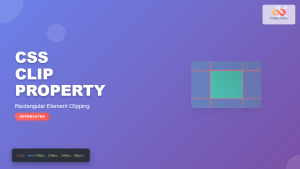
CSS Clip Property: Complete Guide to Rectangular Element Clipping (Deprecated)
The CSS clip property was once a powerful tool for creating rectangular clipping regions on absolutely positioned elements. While now...
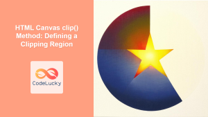
HTML Canvas clip() Method: Defining a Clipping Region
HTML Canvas clip() Method: Defining a Clipping Region The HTML Canvas clip() method is a powerful tool that allows you...
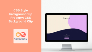
CSS Style backgroundClip Property: CSS Background Clip
CSS background-clip Property: A Comprehensive Guide The CSS background-clip property determines how far the background extends within an element. It...
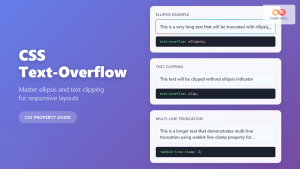
CSS Text-Overflow: Complete Guide to Ellipsis and Text Clipping Techniques
Long text content can break your carefully crafted layouts and create poor user experiences. The CSS text-overflow property provides elegant...
CSS Drop-Shadow Filter: Complete Guide to Creating Professional Shadow Effects
The CSS drop-shadow() filter function is a powerful tool that allows developers to create realistic shadow effects for any HTML...

CSS Border-Radius: Complete Guide to Rounded Corners and Perfect Circles
The CSS border-radius property is one of the most versatile and widely-used styling features in modern web development. It allows...
CSS Outline: Complete Guide to Non-Layout Border Alternative Property
The CSS outline property is a powerful styling tool that creates a visual border around elements without affecting their layout...
CSS Style borderImage Property: CSS Border Image
CSS border-image Property: A Comprehensive Guide The CSS border-image property allows you to use an image as the border of...
CSS borderRadius Property: CSS Border Radius
CSS border-radius Property: Rounding Corners in CSS The border-radius property in CSS is used to round the corners of an...
CSS Style filter Property: CSS Filter
CSS filter Property: Enhance Your Web Graphics The CSS filter property provides powerful visual effects to elements like images, backgrounds,...
CSS overflowX Property: CSS Overflow X Explained with Examples
Understanding the CSS overflowX Property The overflowX property in CSS dictates how the browser handles content that overflows the horizontal...


