
Browser compatibility remains one of the most critical challenges in modern web development. Different browsers implement CSS features at varying speeds, often requiring vendor prefixes during experimental phases. Understanding how to handle these differences ensures your websites look and function consistently across all platforms.
Understanding Vendor Prefixes
Vendor prefixes are browser-specific prefixes that allow browsers to implement experimental or non-standard CSS features. These prefixes help browsers test new features before they become part of the official CSS specification.
Common Vendor Prefixes
- -webkit-: Used by WebKit-based browsers (Chrome, Safari, newer versions of Edge)
- -moz-: Used by Mozilla Firefox
- -ms-: Used by Microsoft Internet Explorer and older Edge versions
- -o-: Used by Opera (legacy versions)
CSS Transform Example with Vendor Prefixes
Let’s examine a practical example using CSS transforms, which required vendor prefixes in earlier browser versions:
.transform-example {
  /* WebKit browsers (Chrome, Safari) */
  -webkit-transform: rotate(45deg) scale(1.2);

  /* Mozilla Firefox */
  -moz-transform: rotate(45deg) scale(1.2);

  /* Microsoft Internet Explorer */
  -ms-transform: rotate(45deg) scale(1.2);

  /* Opera */
  -o-transform: rotate(45deg) scale(1.2);

  /* Standard property (always last) */
  transform: rotate(45deg) scale(1.2);

  /* Additional styling */
  width: 100px;
  height: 100px;
  background: linear-gradient(45deg, #ff6b6b, #4ecdc4);
  margin: 50px auto;
  border-radius: 8px;
  transition: all 0.3s ease;
}

.transform-example:hover {
  -webkit-transform: rotate(90deg) scale(1.5);
  -moz-transform: rotate(90deg) scale(1.5);
  -ms-transform: rotate(90deg) scale(1.5);
  -o-transform: rotate(90deg) scale(1.5);
  transform: rotate(90deg) scale(1.5);
}
Hover over the box to see the transform in action
Modern CSS Grid with Fallbacks
CSS Grid is well-supported in modern browsers, but providing fallbacks ensures compatibility with older versions. Here’s how to implement progressive enhancement:
.grid-container {
  /* Fallback for older browsers */
  display: block;

  /* Flexbox fallback */
  display: -webkit-flex;
  display: -moz-flex;
  display: -ms-flexbox;
  display: flex;
  -webkit-flex-wrap: wrap;
  -moz-flex-wrap: wrap;
  -ms-flex-wrap: wrap;
  flex-wrap: wrap;

  /* Modern CSS Grid */
  display: grid;
  grid-template-columns: repeat(auto-fit, minmax(250px, 1fr));
  grid-gap: 20px;

  padding: 20px;
  max-width: 1200px;
  margin: 0 auto;
}

.grid-item {
  /* Fallback styling */
  width: 100%;
  margin-bottom: 20px;

  /* Flexbox fallback */
  -webkit-flex: 1 1 250px;
  -moz-flex: 1 1 250px;
  -ms-flex: 1 1 250px;
  flex: 1 1 250px;
  margin: 10px;

  /* Grid styling */
  background: #fff;
  border: 1px solid #ddd;
  border-radius: 8px;
  padding: 20px;
  box-shadow: 0 2px 10px rgba(0,0,0,0.1);

  /* Remove margins in grid context */
  margin: 0;
}

/* Feature detection using @supports */
@supports (display: grid) {
  .grid-item {
    margin: 0; /* Remove flex margins when grid is supported */
  }
}
Grid Item 1
This layout uses CSS Grid with Flexbox fallback for maximum compatibility.
Grid Item 2
Older browsers will see a flexbox layout, while modern browsers display the grid.
Grid Item 3
This approach ensures your layout works everywhere while taking advantage of modern features.
CSS Custom Properties (Variables) with Fallbacks
CSS custom properties provide powerful theming capabilities, but older browsers need fallback values:
:root {
  --primary-color: #007cba;
  --secondary-color: #28a745;
  --text-color: #333;
  --border-radius: 8px;
  --box-shadow: 0 2px 10px rgba(0,0,0,0.1);
}

.modern-card {
  /* Fallback values for older browsers */
  background-color: #007cba;
  color: #333;
  border-radius: 8px;
  box-shadow: 0 2px 10px rgba(0,0,0,0.1);

  /* Modern CSS custom properties */
  background-color: var(--primary-color, #007cba);
  color: var(--text-color, #333);
  border-radius: var(--border-radius, 8px);
  box-shadow: var(--box-shadow, 0 2px 10px rgba(0,0,0,0.1));

  padding: 20px;
  margin: 20px 0;
  transition: all 0.3s ease;
}

.modern-card:hover {
  background-color: var(--secondary-color, #28a745);
  transform: translateY(-2px);
}

/* Theme variations */
.dark-theme {
  --primary-color: #1a1a1a;
  --text-color: #fff;
  --box-shadow: 0 2px 20px rgba(255,255,255,0.1);
}
Interactive CSS Variables Example
This card uses CSS custom properties with fallbacks. Hover to see the theme change!
Feature Detection with @supports
The @supports rule allows you to apply styles only when a browser supports specific CSS features, providing a clean way to implement progressive enhancement:
/* Base styles for all browsers */
.feature-detection-example {
  width: 300px;
  height: 200px;
  background: #f0f0f0;
  border: 2px solid #ccc;
  margin: 20px auto;
  display: flex;
  align-items: center;
  justify-content: center;
  text-align: center;
}

/* Enhanced styles for browsers supporting CSS Grid */
@supports (display: grid) {
  .feature-detection-example {
    background: linear-gradient(45deg, #667eea 0%, #764ba2 100%);
    border: none;
    border-radius: 12px;
    color: white;
    box-shadow: 0 10px 30px rgba(0,0,0,0.3);
  }

  .feature-detection-example::before {
    content: "✓ CSS Grid Supported";
    font-weight: bold;
  }
}

/* Fallback message for browsers without CSS Grid */
@supports not (display: grid) {
  .feature-detection-example::before {
    content: "Basic Layout (No CSS Grid)";
    color: #666;
  }
}

/* Feature detection for CSS custom properties */
@supports (--custom: property) {
  .supports-variables {
    --accent-color: #ff6b6b;
    border-left: 4px solid var(--accent-color);
    background: rgba(255, 107, 107, 0.1);
  }
}

@supports not (--custom: property) {
  .supports-variables {
    border-left: 4px solid #ff6b6b;
    background: rgba(255, 107, 107, 0.1);
  }
}
Autoprefixer and Modern Tooling
Manual vendor prefixing is tedious and error-prone. Modern development workflows use tools like Autoprefixer to automatically add necessary prefixes based on your browser support requirements.
Setting Up Autoprefixer
/* Before Autoprefixer - Write clean CSS */
.modern-element {
  display: flex;
  transform: translateX(100px);
  transition: all 0.3s ease;
  user-select: none;
}

/* After Autoprefixer - Automatically prefixed */
.modern-element {
  display: -webkit-box;
  display: -ms-flexbox;
  display: flex;
  -webkit-transform: translateX(100px);
  -ms-transform: translateX(100px);
  transform: translateX(100px);
  -webkit-transition: all 0.3s ease;
  -o-transition: all 0.3s ease;
  transition: all 0.3s ease;
  -webkit-user-select: none;
  -moz-user-select: none;
  -ms-user-select: none;
  user-select: none;
}
Common CSS Properties Requiring Prefixes
Here’s a comprehensive guide to CSS properties that commonly require vendor prefixes:
CSS Flexbox Cross-Browser Example
Flexbox requires careful handling for older browsers, especially Internet Explorer:
.flex-container {
  /* Old flexbox syntax for older WebKit */
  display: -webkit-box;
  -webkit-box-orient: horizontal;
  -webkit-box-pack: center;
  -webkit-box-align: center;

  /* IE10 */
  display: -ms-flexbox;
  -ms-flex-pack: center;
  -ms-flex-align: center;

  /* Modern flexbox */
  display: -webkit-flex;
  display: flex;
  -webkit-justify-content: center;
  justify-content: center;
  -webkit-align-items: center;
  align-items: center;

  min-height: 200px;
  background: #f8f9fa;
  border: 2px dashed #007cba;
  border-radius: 8px;
  margin: 20px 0;
}

.flex-item {
  /* IE10 fallback */
  -ms-flex: 1;

  /* Modern flex */
  -webkit-flex: 1;
  flex: 1;

  max-width: 200px;
  padding: 20px;
  margin: 10px;
  background: white;
  border-radius: 6px;
  box-shadow: 0 2px 8px rgba(0,0,0,0.1);
  text-align: center;
}
Centered with flexbox
Works across browsers
Testing Browser Compatibility
Ensuring your CSS works across different browsers requires thorough testing. Here are essential strategies:
Browser Testing Tools
- Can I Use: Check feature support across browsers
- BrowserStack: Test on real devices and browsers
- CrossBrowserTesting: Automated cross-browser testing
- Browser DevTools: Test different user agents and device modes
Progressive Enhancement Strategy
- Start with basic, functional styles that work everywhere
- Layer on enhancements for browsers that support them
- Use feature detection to apply advanced features
- Test thoroughly across your target browsers
CSS Animation with Fallbacks
CSS animations require careful handling for cross-browser compatibility:
/* Keyframes with vendor prefixes */
@-webkit-keyframes slideIn {
  from {
    -webkit-transform: translateX(-100%);
    opacity: 0;
  }
  to {
    -webkit-transform: translateX(0);
    opacity: 1;
  }
}

@-moz-keyframes slideIn {
  from {
    -moz-transform: translateX(-100%);
    opacity: 0;
  }
  to {
    -moz-transform: translateX(0);
    opacity: 1;
  }
}

@keyframes slideIn {
  from {
    transform: translateX(-100%);
    opacity: 0;
  }
  to {
    transform: translateX(0);
    opacity: 1;
  }
}

.animated-element {
  /* Fallback for browsers without animation support */
  opacity: 1;

  /* Animation with prefixes */
  -webkit-animation: slideIn 0.5s ease-out;
  -moz-animation: slideIn 0.5s ease-out;
  animation: slideIn 0.5s ease-out;
}

/* Reduced motion preference */
@media (prefers-reduced-motion: reduce) {
  .animated-element {
    -webkit-animation: none;
    -moz-animation: none;
    animation: none;
  }
}
Animated Element
This element slides in from the left with proper fallbacks for older browsers.
Best Practices for Browser Compatibility
1. Use a CSS Reset or Normalize
Different browsers have different default styles. Use a CSS reset or normalize.css to ensure consistency:
/* Simple CSS Reset */
* {
  box-sizing: border-box;
  margin: 0;
  padding: 0;
}

/* Or use a more comprehensive solution like normalize.css */
2. Mobile-First Responsive Design
Design for mobile devices first, then enhance for larger screens:
/* Mobile-first approach */
.responsive-element {
  width: 100%;
  padding: 10px;
  font-size: 14px;
}

/* Tablet and up */
@media (min-width: 768px) {
  .responsive-element {
    width: 50%;
    padding: 20px;
    font-size: 16px;
  }
}

/* Desktop and up */
@media (min-width: 1024px) {
  .responsive-element {
    width: 33.333%;
    padding: 30px;
    font-size: 18px;
  }
}
3. Graceful Degradation
Ensure your design works even when advanced features aren’t supported:
Conclusion
CSS browser compatibility doesn’t have to be a nightmare. By understanding vendor prefixes, implementing proper fallbacks, and using modern tools like Autoprefixer, you can create websites that work beautifully across all browsers.
Key takeaways for maintaining browser compatibility:
- Always provide fallbacks for experimental features
- Use feature detection with
@supportsfor progressive enhancement - Automate vendor prefixing with tools like Autoprefixer
- Test your designs across multiple browsers and devices
- Follow a mobile-first, progressive enhancement approach
- Stay updated with browser support changes using resources like Can I Use
By following these practices, you’ll create robust, cross-browser compatible CSS that provides an excellent user experience regardless of the browser your visitors use. Remember that perfect pixel-perfect consistency across all browsers isn’t always necessary – focus on functionality and core user experience first.
Related Posts
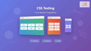
CSS Testing: Complete Guide to Cross-Browser Compatibility Testing
Cross-browser compatibility testing is one of the most critical aspects of modern web development. With users accessing websites through dozens...

CSS Graceful Degradation: Essential Fallback Strategies for Modern Web Development
CSS graceful degradation is a fundamental web development strategy that ensures your website remains functional and accessible across all browsers,...

CSS Feature Detection: Complete Guide to @supports Rule and Browser Compatibility
CSS feature detection is a crucial technique that allows developers to write robust, future-proof stylesheets that gracefully handle browser compatibility...

CSS Reset vs Normalize: Complete Guide to Default Style Standardization
Every web browser comes with its own set of default styles, creating inconsistencies across different platforms. CSS Reset and Normalize.css...
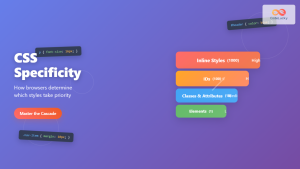
CSS Specificity: Complete Guide to Style Priority and Cascade Resolution
CSS specificity is one of the most crucial concepts every web developer must master. It determines which styles the browser...
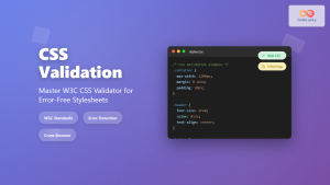
CSS Validation: Complete Guide to W3C CSS Validator for Error-Free Stylesheets
What is CSS Validation? CSS validation is the process of checking your Cascading Style Sheets (CSS) code against the official...

JavaScript Browser Support: Compatibility Across Different Browsers
JavaScript has become an integral part of web development, powering interactive and dynamic websites across the globe. However, as with...

CSS Autoprefixer: Complete Guide to Automatic Vendor Prefix Addition
CSS Autoprefixer is a revolutionary PostCSS plugin that automatically adds vendor prefixes to your CSS properties, ensuring perfect cross-browser compatibility...
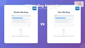
CSS Loading Strategies: Complete Guide to Render-Blocking and Non-Blocking Performance Optimization
CSS loading strategies are fundamental to web performance optimization, directly impacting user experience and search engine rankings. Understanding how different...

CSS Progressive Enhancement: Build Resilient Web Experiences Layer by Layer
Progressive enhancement in CSS is a fundamental approach that ensures your web applications remain functional and accessible across all devices,...

JavaScript Browser Examples: Browser-Specific Feature Implementations
In the ever-evolving landscape of web development, creating a consistent user experience across different browsers remains a significant challenge. JavaScript,...

CSS Debugging: Master Browser DevTools for Efficient Web Development
CSS debugging can be one of the most challenging aspects of web development, especially when dealing with complex layouts, responsive...


