
The CSS blur filter is one of the most versatile and visually appealing effects in modern web design. This powerful CSS property allows developers to apply gaussian blur effects to elements, creating depth, focus, and sophisticated visual hierarchies that enhance user experience.
What is CSS Blur Filter?
The CSS filter: blur() property applies a gaussian blur effect to elements, making them appear out of focus. Unlike simple opacity adjustments, blur filters maintain the element’s visual presence while creating a soft, diffused appearance that’s perfect for backgrounds, overlays, and attention-directing techniques.
Basic CSS Blur Syntax
The blur filter uses a simple syntax structure:
filter: blur(radius);
The radius parameter accepts values in pixels (px), with typical ranges from 0px (no blur) to 20px (heavy blur). Higher values create more pronounced blurring effects.
Practical CSS Blur Examples
Simple Image Blur Effect
Here’s a basic example demonstrating different blur intensities:
Original (no blur)
blur(2px)
blur(5px)
blur(10px)
.blur-light { filter: blur(2px); }
.blur-medium { filter: blur(5px); }
.blur-heavy { filter: blur(10px); }
Interactive Blur Slider Demo
Experiment with different blur values using this interactive demo:
Advanced Blur Techniques
Backdrop Blur for Glass Effects
The backdrop-filter property creates stunning glass-morphism effects by blurring the content behind an element:
.glass-card {
  background: rgba(255, 255, 255, 0.2);
  backdrop-filter: blur(10px);
  border: 1px solid rgba(255, 255, 255, 0.3);
  border-radius: 12px;
}
Hover Effects with Blur Transitions
Create engaging interactions by combining blur with CSS transitions:
.hover-blur {
  filter: blur(5px);
  transition: filter 0.3s ease;
}

.hover-blur:hover {
  filter: blur(0px);
}
Combining Blur with Other CSS Filters
Blur filters can be combined with other CSS filter functions for complex visual effects:
blur + brightness
blur + contrast
blur + hue-rotate
blur + saturate + drop-shadow
/* Combining multiple filters */
.complex-filter {
  filter: blur(3px) brightness(1.2) contrast(1.1);
}

.artistic-blur {
  filter: blur(4px) hue-rotate(90deg) saturate(1.5);
}
Performance Optimization for Blur Effects
While blur filters create beautiful effects, they can impact performance. Here are optimization strategies:
Hardware Acceleration
Force GPU acceleration for smoother animations:
.optimized-blur {
  filter: blur(5px);
  transform: translateZ(0); /* Force hardware acceleration */
  will-change: filter; /* Hint to browser for optimization */
}
Efficient Blur Patterns
Use CSS custom properties for dynamic blur values:
:root {
  --blur-light: 2px;
  --blur-medium: 5px;
  --blur-heavy: 10px;
}

.dynamic-blur {
  filter: blur(var(--blur-light));
  transition: filter 0.3s ease;
}

.dynamic-blur:hover {
  filter: blur(var(--blur-heavy));
}
Browser Support and Fallbacks
CSS blur filters have excellent modern browser support, but always provide fallbacks for older browsers:
/* Fallback for older browsers */
.blur-fallback {
  opacity: 0.8; /* Fallback effect */
}

/* Modern browsers with blur support */
@supports (filter: blur(1px)) {
  .blur-fallback {
    opacity: 1;
    filter: blur(5px);
  }
}
Real-World Applications
Modal Backgrounds
Create focus by blurring background content:
Progressive Image Loading
Use blur effects for smooth image loading experiences:
Loading State
Partially Loaded
Fully Loaded
Accessibility Considerations
When implementing blur effects, consider users with visual impairments and motion sensitivities:
/* Respect user preferences for reduced motion */
@media (prefers-reduced-motion: reduce) {
  .blur-animation {
    animation: none;
    transition: none;
  }
}

/* Provide high contrast alternatives */
@media (prefers-contrast: high) {
  .subtle-blur {
    filter: none;
    border: 2px solid currentColor;
  }
}
Common Pitfalls and Solutions
Text Readability
Avoid applying blur directly to text elements. Instead, blur backgrounds while keeping text sharp:
Performance Impact
Minimize the number of elements with blur filters and avoid animating blur values frequently. Consider using pre-blurred images for static backgrounds.
Conclusion
CSS blur filters offer powerful capabilities for creating sophisticated visual effects in modern web design. From subtle background blurs to dramatic focus effects, mastering these techniques allows developers to create more engaging and visually appealing user interfaces.
Remember to balance visual impact with performance, provide appropriate fallbacks for older browsers, and always consider accessibility when implementing blur effects. With these guidelines, you can effectively leverage CSS blur filters to enhance your web projects while maintaining excellent user experience across all devices and browsers.
Start experimenting with these examples and discover how blur filters can transform your web designs into more polished, professional interfaces that capture and direct user attention exactly where you need it most.
Related Posts
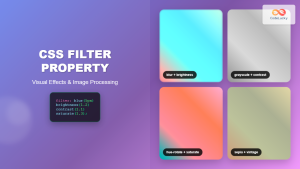
CSS Filter Property: Complete Guide to Visual Effects and Image Processing
The CSS filter property is a powerful tool that allows developers to apply visual effects and image processing techniques directly...

CSS Style filter Property: CSS Filter
CSS filter Property: Enhance Your Web Graphics The CSS filter property provides powerful visual effects to elements like images, backgrounds,...

CSS Backdrop-Filter: Complete Guide to Background Blur and Visual Effects
What is CSS Backdrop-Filter? The backdrop-filter property in CSS allows you to apply graphical effects like blur, brightness, contrast, and...
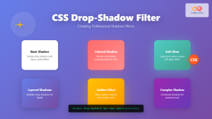
CSS Drop-Shadow Filter: Complete Guide to Creating Professional Shadow Effects
The CSS drop-shadow() filter function is a powerful tool that allows developers to create realistic shadow effects for any HTML...
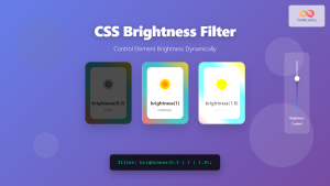
CSS Brightness Filter: Complete Guide to Adjusting Element Brightness
The CSS brightness() filter function is a powerful tool that allows developers to adjust the brightness of HTML elements dynamically....
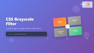
CSS Grayscale Filter: Master Black and White Image Effects with Complete Guide
The CSS grayscale filter is a powerful tool that transforms colorful images into elegant black and white versions. This filter...
CSS Contrast Filter: Complete Guide to Adjusting Element Contrast for Better Visual Impact
The CSS contrast() filter function is a powerful tool that allows web developers to dynamically adjust the contrast of HTML...
CSS Saturate Filter: Complete Guide to Color Saturation Control
The CSS saturate() filter function is a powerful tool that allows you to control the color saturation of HTML elements....
HTML Text blur() Method: Removing Focus
HTML Text blur() Method: Removing Focus The HTML blur() method is a fundamental function in web development that removes focus...

HTML Canvas shadowBlur Property: Setting Shadow Blur
HTML Canvas shadowBlur Property: Adding Blur to Shadows The shadowBlur property of the HTML Canvas API allows you to add...
HTML Range blur() Method: Removing Focus
HTML Range blur() Method: Removing Focus from Range Inputs The HTML Range blur() method is used to remove focus from...
HTML Element blur() Method: Removing Focus
HTML Element blur() Method: Removing Focus The blur() method in HTML is used to remove focus from a specified element....


