
The CSS background-size property is a powerful tool that controls how background images are sized within their containers. Whether you’re building responsive layouts, creating hero sections, or designing image galleries, understanding background-size is essential for modern web development.
In this comprehensive guide, we’ll explore all aspects of the background-size property, from basic syntax to advanced techniques that will help you create stunning visual effects on your websites.
What is CSS Background-Size?
The background-size property specifies the size of background images. It determines how an image should be scaled to fit within its container, giving you precise control over image display without affecting the actual image file dimensions.
Basic Syntax
background-size: value;Background-Size Values Overview
The background-size property accepts several types of values, each serving different purposes:
- Keywords:
cover,contain,auto - Length values: Pixels (px), ems, rems, percentages (%)
- Multiple values: Width and height combinations
Cover: Scaling to Fill the Container
The cover value scales the background image to be as large as possible while ensuring it completely covers the background positioning area. The image maintains its aspect ratio, and some parts may be clipped if the aspect ratios don’t match.
Cover Example
With Cover
.container {
  background-size: cover;
  width: 300px;
  height: 200px;
}
Without Cover (default)
.container {
  /* default behavior */
  width: 300px;
  height: 200px;
}
When to Use Cover
Cover is perfect for:
- Hero sections where you want full background coverage
- Card backgrounds that need to fill the entire container
- Banner images that should never show empty space
Contain: Fitting the Entire Image
The contain value scales the background image to be as large as possible while ensuring the entire image is visible within the background positioning area. The image maintains its aspect ratio, and the container may show empty space if aspect ratios don’t match.
Contain Example
With Contain
.container {
  background-size: contain;
  background-repeat: no-repeat;
  background-position: center;
}
With Cover (comparison)
.container {
  background-size: cover;
  background-position: center;
}
When to Use Contain
Contain is ideal for:
- Logos that must be fully visible
- Product images in galleries
- Icons that shouldn’t be cropped
- Images where the entire content is important
Auto: Maintaining Natural Dimensions
The auto value preserves the background image’s intrinsic dimensions. This is the default behavior and displays the image at its natural size.
Auto Example
.container {
  background-size: auto; /* default value */
  width: 300px;
  height: 200px;
}
Custom Sizing with Length Values
You can specify exact dimensions using length values like pixels, percentages, or other CSS units. This gives you precise control over background image sizing.
Single Value Sizing
When you specify a single value, it sets the width, and the height is automatically calculated to maintain aspect ratio.
Single Value Examples
50% Width
background-size: 50%;100px Width
background-size: 100px;150% Width
background-size: 150%;Two Value Sizing
When you specify two values, the first sets the width and the second sets the height, giving you complete control over both dimensions.
Two Value Examples
200px × 100px
background-size: 200px 100px;50% × 75%
background-size: 50% 75%;100% × 50px
background-size: 100% 50px;Interactive Demo: All Background-Size Values
Try Different Background-Size Values
Click the buttons below to see how different background-size values affect the same background image:
Multiple Background Images
When working with multiple background images, you can specify different background-size values for each image by separating them with commas.
Multiple Backgrounds Example
.multiple-backgrounds {
  background-image:
    linear-gradient(45deg, rgba(255,107,107,0.8), rgba(78,205,196,0.8)),
    repeating-linear-gradient(90deg, transparent, transparent 10px, rgba(255,255,255,0.3) 10px, rgba(255,255,255,0.3) 20px);
  background-size: cover, 40px 40px;
  background-position: center, top left;
}
Responsive Background Sizing
Combining background-size with media queries allows you to create responsive background images that adapt to different screen sizes.
Responsive Example
.responsive-background {
  background-size: cover;
  background-position: center;
}

@media (max-width: 768px) {
  .responsive-background {
    background-size: contain;
  }
}

@media (max-width: 480px) {
  .responsive-background {
    background-size: auto;
  }
}
Common Use Cases and Best Practices
Hero Sections
For hero sections, cover is typically the best choice as it ensures full coverage without empty spaces:
Hero Section
Perfect background coverage with cover value
.hero-section {
  background-image: linear-gradient(rgba(0,0,0,0.4), rgba(0,0,0,0.4)), url('hero-image.jpg');
  background-size: cover;
  background-position: center;
  background-repeat: no-repeat;
  height: 100vh;
}
Card Thumbnails
For card thumbnails, cover ensures consistent sizing across different image aspect ratios:
.card-thumbnail {
  background-size: cover;
  background-position: center;
  background-repeat: no-repeat;
  height: 200px;
}
Performance Considerations
When using background-size, consider these performance tips:
- Image optimization: Use appropriately sized images for your containers
- Format selection: Choose modern formats like WebP for better compression
- Lazy loading: Consider lazy loading for background images below the fold
- Media queries: Serve different image sizes for different screen sizes
Browser Support and Fallbacks
The background-size property has excellent browser support across all modern browsers. For older browsers, you can provide fallbacks:
/* Fallback for older browsers */
.background-container {
  background-image: url('image.jpg');
  background-repeat: no-repeat;
  background-position: center;

  /* Modern browsers */
  background-size: cover;
}
Advanced Techniques
Combining with CSS Grid
Background-size works excellently with CSS Grid for creating complex layouts:
.grid-container {
  display: grid;
  grid-template-columns: 1fr 1fr;
  gap: 10px;
}

.grid-item-1 { background-size: cover; }
.grid-item-2 { background-size: contain; }
.grid-item-3 { background-size: 50%; }
.grid-item-4 { background-size: auto; }
Animation and Transitions
You can animate background-size for interesting hover effects:
.hover-zoom {
  background-size: 100%;
  transition: background-size 0.3s ease;
}

.hover-zoom:hover {
  background-size: 120%;
}
Troubleshooting Common Issues
Image Distortion
If your images appear distorted, check that you’re using the appropriate background-size value for your use case:
- Use
coverto avoid empty spaces (may crop image) - Use
containto show the entire image (may leave empty spaces) - Use specific dimensions only when you need exact control
Performance Issues
Large background images can impact performance. Consider:
- Optimizing image file sizes
- Using appropriate image dimensions
- Implementing lazy loading for below-the-fold images
- Using CSS-only solutions where possible
Conclusion
The CSS background-size property is an essential tool for modern web development, offering precise control over how background images are displayed. Whether you need full coverage with cover, complete visibility with contain, or custom sizing with specific dimensions, understanding these techniques will help you create more polished and responsive web designs.
Remember to consider performance implications, browser support, and user experience when implementing background-size in your projects. With the examples and techniques covered in this guide, you’re well-equipped to handle any background sizing challenge in your web development projects.
Practice with different values and combinations to discover the perfect background-size solution for your specific design needs. The key is understanding when to use each approach and how they interact with other CSS properties to create stunning visual effects.
Related Posts
CSS Style backgroundSize Property: CSS Background Size
CSS background-size Property: Mastering Background Image Scaling The CSS background-size property specifies the size of background images. Controlling the size...
CSS Background-Image: Complete Guide to Adding Images to Element Backgrounds
The CSS background-image property is one of the most powerful tools for creating visually appealing web designs. It allows you...
CSS Background-Position: Complete Guide to Precise Background Image Positioning
The CSS background-position property is a fundamental tool for controlling exactly where background images appear within their containers. Whether you're...
CSS Style backgroundImage Property: CSS Background Image
CSS backgroundImage Property: A Comprehensive Guide The backgroundImage property in CSS is used to set one or more background images...
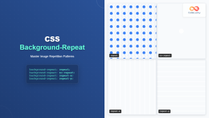
CSS Background-Repeat: Master Image Repetition Patterns and Control
The CSS background-repeat property is a fundamental tool for controlling how background images behave within their containers. Whether you want...
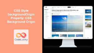
CSS Style backgroundOrigin Property: CSS Background Origin
Understanding the background-origin Property in CSS The background-origin property in CSS specifies where the background image should be positioned within...
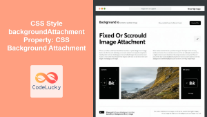
CSS Style backgroundAttachment Property: CSS Background Attachment
Understanding the background-attachment Property in CSS The background-attachment property in CSS determines whether a background image scrolls with the containing...
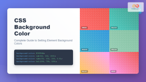
CSS Background-Color: Complete Guide to Setting Element Background Colors
The CSS background-color property is one of the most fundamental styling tools in web development, allowing you to set the...
CSS Multiple Backgrounds: Complete Guide to Layering Images and Colors Like a Pro
CSS multiple backgrounds revolutionized web design by allowing developers to layer multiple background images, colors, and gradients on a single...
CSS Style backgroundPosition Property: CSS Background Position
CSS background-position Property: Mastering Background Image Placement The CSS background-position property allows you to precisely control the initial position of...
CSS Style backgroundRepeat Property: CSS Background Repeat
CSS background-repeat: Mastering Background Image Repetition The CSS background-repeat property is a powerful tool for controlling how background images are...
CSS Box-Sizing Property: Master Content-Box vs Border-Box for Perfect Layouts
The CSS box-sizing property is one of the most crucial yet often misunderstood concepts in web development. It determines how...


