The CSS background-image property is one of the most powerful tools for creating visually appealing web designs. It allows you to add images, gradients, and other visual elements to the background of any HTML element, transforming plain backgrounds into engaging visual experiences.
In this comprehensive guide, you’ll learn everything about CSS background images, from basic implementation to advanced techniques that will elevate your web design skills.
What is CSS Background-Image?
The background-image property sets one or more background images for an element. Unlike the HTML <img> tag, background images are purely decorative and don’t affect the document’s semantic structure. They’re positioned behind the element’s content and can be combined with other background properties for sophisticated visual effects.
Basic Syntax
selector {
  background-image: url('path/to/image.jpg');
}
Basic Background-Image Implementation
Let’s start with the fundamental way to add a background image to an element:
HTML Structure
<div class="hero-section">
  <h2>Welcome to Our Website</h2>
  <p>This is a hero section with a background image</p>
</div>
CSS Implementation
.hero-section {
  background-image: url('https://images.unsplash.com/photo-1506905925346-21bda4d32df4?w=1200');
  height: 300px;
  padding: 40px;
  color: white;
  text-align: center;
  background-size: cover;
  background-position: center;
}
Visual Result:
Welcome to Our Website
This is a hero section with a background image
Understanding Background-Image Values
The background-image property accepts several types of values:
1. URL() Function
The most common way to specify a background image using a file path or URL:
/* Absolute URL */
background-image: url('https://example.com/image.jpg');

/* Relative URL */
background-image: url('../images/background.png');

/* Data URL (Base64) */
background-image: url('data:image/png;base64,iVBORw0KGgoAAAANSUhE...');
2. Linear Gradients
Create smooth color transitions without using image files:
.gradient-background {
  background-image: linear-gradient(45deg, #ff6b6b, #4ecdc4);
  height: 150px;
  border-radius: 8px;
}3. Radial Gradients
Create circular or elliptical gradient patterns:
.radial-gradient {
  background-image: radial-gradient(circle, #667eea 0%, #764ba2 100%);
  height: 150px;
  border-radius: 8px;
}Essential Background Properties
To control how background images behave, you’ll often use these complementary properties:
Background-Size
Controls how the background image is sized within its container:
/* Cover the entire container */
background-size: cover;

/* Fit entire image within container */
background-size: contain;

/* Specific dimensions */
background-size: 300px 200px;

/* Percentages */
background-size: 50% 75%;Background-Position
Determines where the background image is positioned within the element:
/* Keyword values */
background-position: center;
background-position: top right;
background-position: bottom left;

/* Percentage values */
background-position: 25% 75%;

/* Pixel values */
background-position: 10px 20px;Background-Repeat
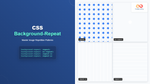
Controls how background images are repeated when they’re smaller than their container:
background-repeat: repeat;      /* Default - repeat both directions */
background-repeat: no-repeat;   /* Don't repeat */
background-repeat: repeat-x;    /* Repeat horizontally only */
background-repeat: repeat-y;    /* Repeat vertically only */
background-repeat: space;       /* Repeat with equal spacing */
background-repeat: round;       /* Repeat and scale to fit */
Multiple Background Images
CSS allows you to layer multiple background images on a single element, creating complex visual effects:
.layered-background {
  background-image:
    linear-gradient(rgba(0,0,0,0.4), rgba(0,0,0,0.4)),
    url('https://images.unsplash.com/photo-1518837695005-2083093ee35b?w=1200');
  background-size: cover, cover;
  background-position: center, center;
  height: 250px;
  color: white;
  display: flex;
  align-items: center;
  justify-content: center;
}Interactive Background-Image Demo
Try this interactive demo to see how different background properties affect the display:
Interactive Demo
Advanced Techniques
Responsive Background Images
Create background images that adapt to different screen sizes:
.responsive-background {
  background-image: url('desktop-image.jpg');
  background-size: cover;
  background-position: center;
  height: 400px;
}

@media (max-width: 768px) {
  .responsive-background {
    background-image: url('mobile-image.jpg');
    height: 250px;
  }
}

@media (max-width: 480px) {
  .responsive-background {
    background-image: url('small-mobile-image.jpg');
    height: 200px;
  }
}
CSS Custom Properties for Dynamic Backgrounds
Use CSS variables to make background images easily customizable:
:root {
  --hero-bg: url('https://images.unsplash.com/photo-1506905925346-21bda4d32df4?w=1200');
  --overlay-opacity: 0.6;
}

.dynamic-hero {
  background-image:
    linear-gradient(rgba(0,0,0,var(--overlay-opacity)), rgba(0,0,0,var(--overlay-opacity))),
    var(--hero-bg);
  background-size: cover;
  background-position: center;
}
Performance Optimization
Optimize background images for better performance:
Best Practices:
- Optimize image sizes: Use appropriate image dimensions and compression
- Choose the right format: WebP for modern browsers, JPEG for photos, PNG for graphics
- Use CSS sprites: Combine multiple small images into one file
- Implement lazy loading: Load background images only when needed
- Consider preloading: Preload critical background images
Common Use Cases and Examples
1. Hero Sections
.hero {
  background-image: linear-gradient(135deg, rgba(74, 144, 226, 0.8), rgba(80, 67, 141, 0.8)),
                    url('hero-background.jpg');
  background-size: cover;
  background-position: center;
  background-attachment: fixed;
  height: 100vh;
  display: flex;
  align-items: center;
  justify-content: center;
  color: white;
  text-align: center;
}
2. Card Backgrounds
.card {
  background-image: url('card-pattern.svg');
  background-size: 100px 100px;
  background-repeat: repeat;
  background-color: #f8f9fa;
  padding: 20px;
  border-radius: 12px;
  box-shadow: 0 4px 6px rgba(0,0,0,0.1);
}
Card with Pattern Background
This card demonstrates a subtle pattern background using SVG data URI.
3. Button Hover Effects
.gradient-button {
  background-image: linear-gradient(45deg, #667eea 0%, #764ba2 100%);
  border: none;
  color: white;
  padding: 12px 24px;
  border-radius: 25px;
  cursor: pointer;
  transition: all 0.3s ease;
}

.gradient-button:hover {
  background-image: linear-gradient(45deg, #764ba2 0%, #667eea 100%);
  transform: translateY(-2px);
  box-shadow: 0 8px 25px rgba(118, 75, 162, 0.4);
}Troubleshooting Common Issues
Background Image Not Showing
Common causes and solutions:
- Incorrect file path: Verify the image URL or path is correct
- Element has no height: Set a specific height or min-height
- Image blocked by CORS: Ensure cross-origin images allow access
- File format not supported: Use web-compatible formats (JPEG, PNG, WebP, SVG)
Performance Issues
Solutions for slow-loading backgrounds:
- Compress images: Use tools like TinyPNG or ImageOptim
- Use appropriate dimensions: Don’t use oversized images
- Implement progressive loading: Show low-quality placeholder first
- Consider using CSS gradients: Instead of gradient images
Browser Support and Fallbacks
CSS background-image has excellent browser support, but modern features like multiple backgrounds require fallbacks for older browsers:
/* Fallback for older browsers */
.element {
  background-color: #333; /* Fallback color */
  background-image: url('background.jpg'); /* Single background */
}

/* Modern browsers with multiple backgrounds */
.element {
  background-image:
    linear-gradient(rgba(0,0,0,0.5), rgba(0,0,0,0.5)),
    url('background.jpg');
}
Accessibility Considerations
When using background images, consider these accessibility guidelines:
- Ensure sufficient contrast: Text over background images should meet WCAG contrast requirements
- Provide alternative content: Don’t rely solely on background images to convey information
- Test with images disabled: Ensure content remains accessible
- Use semantic HTML: For important images, consider using
<img>tags with alt text
Conclusion
CSS background-image is a versatile property that opens up endless possibilities for web design. From simple image backgrounds to complex layered effects with gradients and multiple images, mastering this property is essential for creating visually compelling websites.
Remember to optimize your images for performance, provide appropriate fallbacks for older browsers, and always consider accessibility when implementing background images. With the techniques covered in this guide, you’ll be able to create stunning visual experiences that enhance your web designs while maintaining excellent performance and accessibility standards.
Start experimenting with these examples and techniques to discover how background images can transform your web projects from ordinary to extraordinary.

