
The CSS backface-visibility property is a powerful tool for controlling the visibility of the back face of an element when it’s rotated in 3D space. This property becomes essential when creating flip cards, 3D animations, and interactive elements that transform in three dimensions.
What is CSS Backface-Visibility?
The backface-visibility property determines whether the back face of an element is visible when the element is rotated away from the user. By default, elements show their back face as a mirror image when rotated 180 degrees or more, but this property allows you to hide that back face entirely.
Syntax and Values
The backface-visibility property accepts two main values:
backface-visibility: visible | hidden | inherit | initial;
- visible (default): The back face is visible when rotated
- hidden: The back face is hidden when rotated
- inherit: Inherits the value from the parent element
- initial: Sets the property to its default value
Browser Support
The backface-visibility property enjoys excellent modern browser support. It’s supported in all major browsers including Chrome, Firefox, Safari, and Edge. For older browsers, vendor prefixes may be required:
            -webkit-backface-visibility: hidden;

            -moz-backface-visibility: hidden;

            backface-visibility: hidden;
Basic Example: Understanding the Difference
Let’s start with a simple example to understand how backface-visibility works:
Visible (Default)
Text appears mirrored
Hidden
Element is invisible
.visible-back {

    transform: rotateY(180deg);

    backface-visibility: visible; /* Default */

}
.hidden-back {

    transform: rotateY(180deg);

    backface-visibility: hidden;

}
Practical Use Case: Flip Card Effect
One of the most common applications of backface-visibility is creating flip card effects. Here’s an interactive example:
Click the card above to see the flip effect!
.flip-card {

    width: 250px;

    height: 150px;

    perspective: 1000px;

}
.flip-card-inner {

    position: relative;

    width: 100%;

    height: 100%;

    text-align: center;

    transition: transform 0.6s;

    transform-style: preserve-3d;

}
.flip-card:hover .flip-card-inner {

    transform: rotateY(180deg);

}
.flip-card-front, .flip-card-back {

    position: absolute;

    width: 100%;

    height: 100%;

    backface-visibility: hidden;

}
.flip-card-back {

    transform: rotateY(180deg);

}
Advanced Example: 3D Cube
For more complex 3D effects, backface-visibility becomes crucial. Here’s a rotating 3D cube where we hide back faces for cleaner visuals:
Performance Considerations
Using backface-visibility: hidden can improve performance in certain scenarios:
- Reduced Rendering: Browsers don’t need to render the back face, saving resources
- Smoother Animations: Less complex rendering leads to smoother 3D transitions
- Mobile Optimization: Particularly beneficial on mobile devices with limited GPU resources
Common Pitfalls and Solutions
1. Flickering During Transitions
Sometimes elements may flicker during 3D transitions. This can be solved by ensuring proper transform-style and perspective settings:
            transform-style: preserve-3d;

            perspective: 1000px;

            backface-visibility: hidden;
2. Z-Index Issues
When working with multiple 3D elements, z-index might not work as expected. Use translateZ() instead:
            /* Instead of z-index */

            transform: translateZ(10px);
Real-World Applications
1. Card Hover Effects
Perfect for portfolio items, product showcases, or team member cards where you want to reveal additional information on the back.
2. Image Galleries
Create immersive photo galleries where images flip to show descriptions or metadata.
3. Navigation Menus
Build unique 3D navigation elements that transform when users interact with them.
4. Loading Animations
Design sophisticated loading spinners and progress indicators using 3D transforms.
Accessibility Considerations
When implementing 3D effects with backface-visibility, consider accessibility:
- Motion Sensitivity: Respect
prefers-reduced-motionmedia query - Keyboard Navigation: Ensure flip effects work with keyboard interactions
- Screen Readers: Provide appropriate ARIA labels for both sides of flip elements
@media (prefers-reduced-motion: reduce) {

    .flip-card-inner {

        transition: none;

    }

}
.flip-card:focus-within .flip-card-inner {

    transform: rotateY(180deg);

}
Browser Compatibility and Fallbacks
While modern browsers support backface-visibility well, it’s good practice to include fallbacks:
/* Feature detection */

@supports (backface-visibility: hidden) {

    .flip-card-front,

    .flip-card-back {

        backface-visibility: hidden;

    }

}
/* Fallback for older browsers */

@supports not (backface-visibility: hidden) {

    .flip-card-back {

        opacity: 0;

        pointer-events: none;

    }
    .flip-card:hover .flip-card-back {

        opacity: 1;

        pointer-events: auto;

    }

}
Conclusion
The CSS backface-visibility property is essential for creating polished 3D effects and animations. By understanding when to hide or show the back face of elements, you can create more engaging user interfaces and smoother animations. Remember to consider performance, accessibility, and browser compatibility when implementing these effects in production websites.
Whether you’re building simple flip cards or complex 3D interfaces, mastering backface-visibility will significantly improve the quality and performance of your 3D CSS animations. Practice with the examples provided and experiment with different combinations to discover new creative possibilities.
Related Posts
CSS backface-visibility Property: CSS Backface Visibility
CSS backface-visibility Property: Controlling the Back Face in 3D Transforms The backface-visibility property in CSS determines whether the back face...
CSS Visibility Property: Complete Guide to Showing and Hiding Elements
The CSS visibility property is a fundamental tool for controlling element visibility on web pages. Unlike other hiding methods, it...
CSS Style visibility Property: CSS Visibility
Understanding the CSS visibility Property The visibility property in CSS controls the visibility of an element without affecting the layout...
CSS perspective Property: CSS Perspective
Understanding the CSS perspective Property The CSS perspective property allows you to give a 3D-positioned element some perspective. It defines...

CSS Style opacity Property: CSS Opacity
CSS Opacity Property: A Comprehensive Guide The CSS opacity property is a fundamental tool for controlling the transparency of elements...
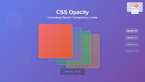
CSS Opacity: Complete Guide to Controlling Element Transparency Levels
Understanding CSS Opacity Property The CSS opacity property is a fundamental styling tool that controls the transparency level of HTML...
CSS Style backgroundPosition Property: CSS Background Position
CSS background-position Property: Mastering Background Image Placement The CSS background-position property allows you to precisely control the initial position of...
CSS Style backgroundImage Property: CSS Background Image
CSS backgroundImage Property: A Comprehensive Guide The backgroundImage property in CSS is used to set one or more background images...
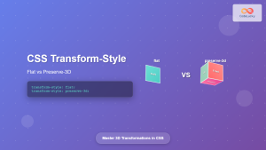
CSS Transform-Style: Complete Guide to Flat vs Preserve-3d for 3D Transformations
The CSS transform-style property is a powerful tool that controls how child elements are rendered in 3D space when their...
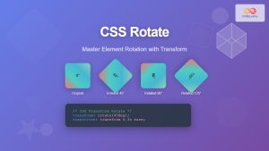
CSS Rotate: Complete Guide to Rotating Elements with Transform
CSS rotation is one of the most powerful and visually striking transformation effects available to web developers. The transform: rotate()...
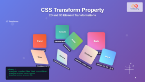
CSS Transform Property: Complete Guide to 2D and 3D Element Transformations
The CSS transform property is one of the most powerful tools in modern web development, allowing developers to manipulate HTML...

CSS Style backgroundAttachment Property: CSS Background Attachment
Understanding the background-attachment Property in CSS The background-attachment property in CSS determines whether a background image scrolls with the containing...


