
The animation-timing-function property in CSS controls how an animation progresses through its duration, determining the acceleration and deceleration patterns that make animations feel natural and engaging. This comprehensive guide explores every aspect of animation timing functions, from basic concepts to advanced custom implementations.
Understanding Animation Timing Functions
Animation timing functions define the rate of change of an animation over time. Instead of animations moving at a constant speed from start to finish, timing functions allow you to create realistic motion that accelerates, decelerates, bounces, or follows custom curves.
Basic Syntax
.element {
  animation-timing-function: ease-in-out;
  /* or */
  animation: myAnimation 2s ease-in-out;
}
Built-in Timing Function Keywords
CSS provides several predefined timing functions that cover most common animation needs:
Linear
The linear timing function creates constant speed throughout the animation duration. It’s perfect for continuous rotations, sliding text, or loading indicators.
@keyframes slideRight {
  from { transform: translateX(0); }
  to { transform: translateX(200px); }
}

.linear-element {
  animation: slideRight 3s linear infinite;
}
Ease
The default ease function starts slowly, accelerates in the middle, then slows down at the end. It’s equivalent to cubic-bezier(0.25, 0.1, 0.25, 1) and works well for general-purpose animations.
Ease-in
The ease-in function starts slowly and accelerates toward the end. It’s ideal for elements entering the viewport or dropdown menus appearing.
Ease-out
The ease-out function starts quickly and decelerates toward the end. Perfect for elements settling into place or notifications sliding in.
Ease-in-out
The ease-in-out function combines both ease-in and ease-out, starting and ending slowly with acceleration in the middle. It’s excellent for hover effects and modal transitions.
Cubic Bezier Functions
For precise control over animation timing, CSS supports custom cubic-bezier functions. These functions use four parameters that define control points on a cubic Bezier curve.
Cubic Bezier Syntax
animation-timing-function: cubic-bezier(x1, y1, x2, y2);- x1, y1: First control point coordinates
- x2, y2: Second control point coordinates
- x values: Must be between 0 and 1
- y values: Can exceed 0-1 range for bounce effects
Popular Custom Bezier Curves
Material Design Curves
Standard: cubic-bezier(0.4, 0.0, 0.2, 1)
Decelerate: cubic-bezier(0.0, 0.0, 0.2, 1)
Accelerate: cubic-bezier(0.4, 0.0, 1, 1)
Step Functions
Step functions create discrete animations that jump between values rather than smoothly transitioning. They’re perfect for sprite animations, digital clock displays, or typewriter effects.
Steps Syntax
animation-timing-function: steps(number, direction);

/* Examples */
steps(4, end)      /* 4 steps, change at end of each step */
steps(4, start)    /* 4 steps, change at start of each step */
step-start         /* Equivalent to steps(1, start) */
step-end           /* Equivalent to steps(1, end) */
Typewriter Effect Example
@keyframes typing {
  from { width: 0; }
  to { width: 100%; }
}

@keyframes blink {
  0%, 50% { border-color: transparent; }
  51%, 100% { border-color: #000; }
}

.typewriter {
  animation:
    typing 4s steps(26, end) infinite,
    blink 1s step-end infinite;
  border-right: 2px solid;
  white-space: nowrap;
  overflow: hidden;
}
Practical Use Cases and Examples
Smooth Button Hover Effects
Create professional button interactions using appropriate timing functions:
.smooth-button {
  transition: all 0.3s cubic-bezier(0.4, 0, 0.2, 1);
}

.smooth-button:hover {
  transform: translateY(-2px);
  box-shadow: 0 4px 12px rgba(49, 130, 206, 0.4);
}

.scale-button {
  transition: all 0.2s ease-out;
}

.scale-button:hover {
  transform: scale(1.05);
}
Loading Spinner with Perfect Timing
Create smooth, continuous rotation for loading indicators:
Loading…
@keyframes spin {
  from { transform: rotate(0deg); }
  to { transform: rotate(360deg); }
}

.loading-spinner {
  width: 40px;
  height: 40px;
  border: 4px solid #e2e8f0;
  border-top: 4px solid #3182ce;
  border-radius: 50%;
  animation: spin 1s linear infinite;
}
Bounce Effect with Custom Bezier
Create engaging bounce animations for notifications or call-to-action elements:
@keyframes bounce {
  0%, 100% { transform: translateY(0); }
  50% { transform: translateY(-30px); }
}

.bounce-element {
  animation: bounce 2s cubic-bezier(0.68, -0.55, 0.265, 1.55) infinite;
}
Advanced Techniques
Multiple Timing Functions
Apply different timing functions to multiple properties within a single animation:
@keyframes complexMove {
  0% {
    transform: translateX(0) scale(1);
    opacity: 1;
  }
  50% {
    transform: translateX(100px) scale(1.2);
    opacity: 0.7;
  }
  100% {
    transform: translateX(200px) scale(1);
    opacity: 1;
  }
}

.complex-animation {
  animation: complexMove 3s ease-in-out infinite;
}
Chaining Animations with Different Timing
Create complex sequences by chaining animations with different timing functions:
@keyframes slideIn {
  from { transform: translateX(-100px); opacity: 0; }
  to { transform: translateX(0); opacity: 1; }
}

@keyframes pulse {
  0%, 100% { transform: scale(1); }
  50% { transform: scale(1.2); }
}

.chained-animation {
  animation:
    slideIn 1s ease-out,
    pulse 0.5s ease-in-out 1s 3;
}
Performance Considerations
When working with animation timing functions, consider these performance best practices:
Optimization Tips
- Use transform and opacity: These properties are GPU-accelerated
- Avoid animating layout properties: width, height, margin can cause reflows
- Prefer will-change: Hint to browsers about upcoming animations
- Use cubic-bezier for smooth curves: More efficient than complex keyframes
/* Good: GPU-accelerated properties */
.optimized-animation {
  will-change: transform, opacity;
  animation: slideAndFade 1s cubic-bezier(0.4, 0, 0.2, 1);
}

@keyframes slideAndFade {
  from {
    transform: translateX(-20px);
    opacity: 0;
  }
  to {
    transform: translateX(0);
    opacity: 1;
  }
}

/* Avoid: Layout-triggering properties */
.avoid-this {
  animation: badAnimation 1s ease;
}

@keyframes badAnimation {
  from { width: 100px; margin-left: 0; }
  to { width: 200px; margin-left: 50px; }
}
Browser Support and Fallbacks
Animation timing functions have excellent browser support, but consider fallbacks for older browsers:
Compatibility Notes
- Modern browsers: Full support for all timing functions
- IE9+: Supports basic keywords and cubic-bezier
- Steps function: IE10+ support
- Custom cubic-bezier: Widely supported since 2012
/* Provide fallbacks for older browsers */
.animation-with-fallback {
  /* Fallback for older browsers */
  animation-timing-function: ease-in-out;

  /* Modern timing function */
  animation-timing-function: cubic-bezier(0.4, 0, 0.2, 1);
}

/* Feature detection with CSS */
@supports (animation-timing-function: steps(1)) {
  .typewriter-effect {
    animation-timing-function: steps(20, end);
  }
}
Interactive Timing Function Playground
Test Different Timing Functions
Conclusion
Mastering CSS animation timing functions is essential for creating engaging, professional web experiences. From the simplicity of linear animations to the sophistication of custom cubic-bezier curves, these tools give you complete control over how your animations feel and perform.
Remember to choose timing functions that match the intended user experience: use ease-out for elements entering the viewport, ease-in for elements leaving, and ease-in-out for reversible interactions. Custom cubic-bezier functions offer unlimited possibilities for creating unique animation personalities that align with your brand and design system.
Practice with different timing functions, experiment with the interactive examples provided, and always test your animations across different devices and browsers to ensure consistent, smooth performance for all users.
Related Posts
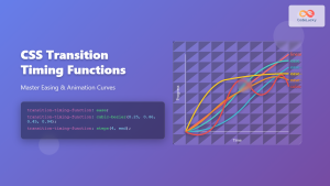
CSS Transition-Timing-Function: Master Easing and Animation Curves for Smooth Web Animations
The transition-timing-function property in CSS is a powerful tool that controls how intermediate values are calculated during a transition. It...
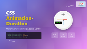
CSS Animation-Duration: Complete Guide to Controlling Animation Timing and Speed
The animation-duration property is a fundamental CSS animation property that controls how long an animation takes to complete one full...
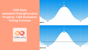
CSS Style animationTimingFunction Property: CSS Animation Timing Function
CSS Style animationTimingFunction Property: A Comprehensive Guide The animation-timing-function property in CSS is a crucial component for controlling the pace...
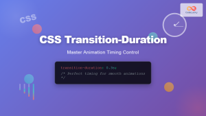
CSS Transition-Duration: Complete Guide to Animation Timing Control
What is CSS Transition-Duration? The transition-duration property in CSS defines how long a transition animation should take to complete. It's...
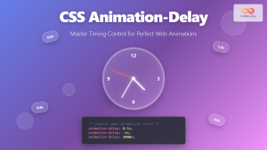
CSS Animation-Delay: Master Timing Control for Perfect Web Animations
What is CSS Animation-Delay? The animation-delay property in CSS controls when an animation starts after it's been applied to an...
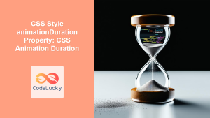
CSS Style animationDuration Property: CSS Animation Duration
Understanding the animationDuration Property in CSS The animationDuration property in CSS specifies the length of time that an animation should...

CSS Style animationDelay Property: CSS Animation Delay
Understanding the CSS animationDelay Property The CSS animationDelay property specifies the amount of time to wait from when the element...
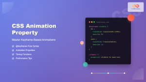
CSS Animation Property: Complete Guide to Keyframe-Based Animations
CSS animations bring life to web pages by allowing elements to transition smoothly between different states over time. The animation...
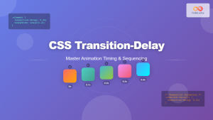
CSS Transition-Delay: Master Animation Timing and Sequencing
The transition-delay property in CSS is a powerful tool that allows you to control when a transition animation begins. Unlike...
CSS Transition Property: Complete Guide to Smooth Animation Effects
CSS transitions enable smooth, visually appealing animations when element properties change, transforming abrupt state changes into fluid motion. This powerful...
JavaScript TransitionEvent elapsedTime Property: Transition Duration
JavaScript TransitionEvent elapsedTime Property: Understanding Transition Durations The elapsedTime property of the JavaScript TransitionEvent interface is a crucial element for...
CSS @keyframes Rule: Complete Guide to Creating Smooth Animation Sequences
CSS animations bring life to web interfaces, and the @keyframes rule is the foundation that makes complex animation sequences possible....


