The animation-direction property in CSS gives you complete control over how your animations play, whether they run forward, backward, or alternate between directions. This powerful property transforms simple animations into sophisticated, engaging user experiences that can captivate your audience.
Understanding CSS Animation-Direction
The animation-direction property determines the direction in which an animation sequence plays. It works in conjunction with other animation properties to create dynamic effects that can run normally, in reverse, or alternate between forward and backward motion.
Syntax and Values
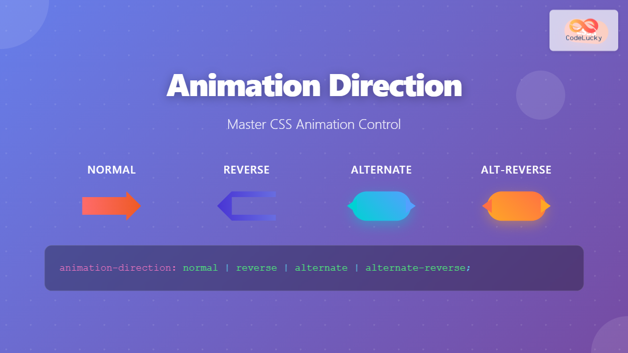
animation-direction: normal | reverse | alternate | alternate-reverse | initial | inherit;Let’s explore each value in detail:
- normal: Animation plays forward (default behavior)
- reverse: Animation plays backward
- alternate: Animation alternates between forward and backward
- alternate-reverse: Animation starts backward, then alternates
Normal Direction – The Default Behavior
The normal value is the default setting, making animations play from start to finish in their natural sequence. This creates the standard animation flow most developers are familiar with.
Example: Normal Direction Animation
.normal-animation {
  width: 100px;
  height: 100px;
  background: linear-gradient(45deg, #ff6b6b, #ee5a24);
  border-radius: 50%;
  animation: moveRight 3s linear infinite;
  animation-direction: normal; /* Default value */
}

@keyframes moveRight {
  0% { transform: translateX(0); }
  100% { transform: translateX(200px); }
}
Reverse Direction – Playing Backwards
The reverse value flips your animation sequence, making it play from the end keyframe back to the beginning. This creates mirror effects and can add unexpected visual interest to your designs.
Example: Reverse Direction Animation
.reverse-animation {
  width: 100px;
  height: 100px;
  background: linear-gradient(45deg, #4834d4, #686de0);
  border-radius: 50%;
  animation: moveRight 3s linear infinite;
  animation-direction: reverse;
}

/* Same keyframes as before, but animation plays in reverse */
Alternate Direction – Back and Forth Motion
The alternate value creates a ping-pong effect, where the animation plays forward on odd iterations and backward on even iterations. This creates smooth, continuous motion that feels natural and engaging.
Example: Alternate Direction Animation
.alternate-animation {
  width: 100px;
  height: 100px;
  background: linear-gradient(45deg, #00d2d3, #54a0ff);
  border-radius: 50%;
  animation: moveRight 2s ease-in-out infinite;
  animation-direction: alternate;
}

/* The animation smoothly moves back and forth */
Alternate-Reverse Direction – Starting Backwards
The alternate-reverse value combines the reverse and alternate behaviors. The animation starts by playing backward, then alternates between backward and forward on subsequent iterations.
Example: Alternate-Reverse Direction Animation
.alternate-reverse-animation {
  width: 100px;
  height: 100px;
  background: linear-gradient(45deg, #ffa726, #ff7043);
  border-radius: 50%;
  animation: moveRight 2s ease-in-out infinite;
  animation-direction: alternate-reverse;
}

/* Starts with reverse motion, then alternates */
Interactive Comparison Demo
Here’s an interactive demonstration showing all four animation-direction values in action:
Animation Direction Comparison
Normal
Reverse
Alternate
Alternate-Reverse
Advanced Techniques and Best Practices
Combining with Animation-Iteration-Count
The animation-direction property works seamlessly with animation-iteration-count to create precise animation sequences:
.limited-alternate {
  animation: slideAnimation 1s ease-in-out 4 alternate;
  /* Plays 4 times total: forward, backward, forward, backward */
}

.infinite-reverse {
  animation: rotateAnimation 2s linear infinite reverse;
  /* Continuously plays in reverse */
}
Complex Multi-Step Animations
For sophisticated effects, combine animation-direction with complex keyframes:
Example: Complex Bouncing Ball
@keyframes complexBounce {
  0% {
    transform: translateX(0) translateY(0) scale(1);
    background: radial-gradient(circle at 30% 30%, #ff6b6b, #ee5a24);
  }
  25% {
    transform: translateX(50px) translateY(-30px) scale(1.1);
    background: radial-gradient(circle at 30% 30%, #4834d4, #686de0);
  }
  50% {
    transform: translateX(100px) translateY(-60px) scale(0.9);
    background: radial-gradient(circle at 30% 30%, #00d2d3, #54a0ff);
  }
  75% {
    transform: translateX(150px) translateY(-30px) scale(1.1);
    background: radial-gradient(circle at 30% 30%, #ffa726, #ff7043);
  }
  100% {
    transform: translateX(200px) translateY(0) scale(1);
    background: radial-gradient(circle at 30% 30%, #2ed573, #7bed9f);
  }
}

.bouncing-ball {
  animation: complexBounce 2s ease-in-out infinite alternate;
}
Performance Considerations
When using animation-direction, keep these performance tips in mind:
- GPU Acceleration: Use
transformandopacityproperties for smooth animations - Will-Change Property: Add
will-change: transformfor complex animations - Reduce Complexity: Limit the number of simultaneously animated elements
- Use Appropriate Timing: Match animation duration to user expectations
💡 Pro Tip
Combine animation-direction: alternate with animation-timing-function: ease-in-out for the most natural-feeling back-and-forth motion. This creates smooth acceleration and deceleration at both ends of the animation.
Browser Support and Compatibility
The animation-direction property enjoys excellent browser support across all modern browsers. Here’s the compatibility breakdown:
- Chrome: Full support since version 43
- Firefox: Full support since version 16
- Safari: Full support since version 9
- Edge: Full support since version 12
- Internet Explorer: Supported in IE 10+
Real-World Use Cases
Loading Animations
Create engaging loading spinners that alternate direction for visual interest:
.loader {
  width: 40px;
  height: 40px;
  border: 4px solid #e0e0e0;
  border-top: 4px solid #4834d4;
  border-radius: 50%;
  animation: spin 1s linear infinite alternate;
}

@keyframes spin {
  0% { transform: rotate(0deg); }
  100% { transform: rotate(180deg); }
}
Hover Effects
Enhance user interactions with directional animations:
.interactive-button {
  padding: 15px 30px;
  background: linear-gradient(45deg, #4834d4, #686de0);
  color: white;
  border-radius: 25px;
  animation: pulse 2s ease-in-out infinite alternate;
  cursor: pointer;
  transition: animation-direction 0.3s ease;
}

.interactive-button:hover {
  animation-direction: reverse;
}

@keyframes pulse {
  0% { transform: scale(1); box-shadow: 0 0 0 0 rgba(72, 52, 212, 0.4); }
  100% { transform: scale(1.05); box-shadow: 0 0 0 20px rgba(72, 52, 212, 0); }
}
Common Mistakes to Avoid
- Overusing Alternate: Not every animation needs to alternate; use it purposefully
- Ignoring Timing Functions: Combine direction changes with appropriate easing for natural motion
- Forgetting Mobile Performance: Test animations on mobile devices for smooth performance
- Missing Fallbacks: Always provide static styles for browsers that don’t support animations
Conclusion
The animation-direction property is a powerful tool for creating sophisticated, engaging animations. Whether you need simple forward motion, dramatic reverse effects, or smooth alternating sequences, understanding how to control animation direction opens up endless creative possibilities.
By mastering the four direction values—normal, reverse, alternate, and alternate-reverse—you can create animations that feel natural, purposeful, and engaging. Remember to combine direction control with appropriate timing functions and consider performance implications for the best user experience.
Start experimenting with these examples in your own projects, and you’ll quickly discover how animation-direction can transform static designs into dynamic, captivating user interfaces that stand out from the crowd.

