What is CSS Animation-Delay?
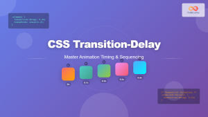
The animation-delay property in CSS controls when an animation starts after it’s been applied to an element. This powerful timing control allows you to create sophisticated animation sequences, stagger effects, and precisely choreograph multiple animations on your webpage.
Unlike animation-duration which controls how long an animation takes to complete, animation-delay determines the waiting period before the animation begins. This delay can be positive (animation starts later) or negative (animation starts partway through its cycle).
CSS Animation-Delay Syntax
The basic syntax for animation-delay is straightforward:
animation-delay: time;Where time can be specified in:
- Seconds (s):
2s,0.5s,3.25s - Milliseconds (ms):
500ms,1200ms,50ms
Multiple Animation Delays
When working with multiple animations, you can specify different delays for each:
animation-delay: 1s, 0.5s, 2s;Positive vs Negative Animation Delays
Positive Delays
Positive values create a waiting period before the animation starts. This is the most common use case for creating sequential or staggered animations.
Example: Positive Delay Animation
.ball {
    animation: bounce 2s infinite ease-in-out;
}

.ball:nth-child(1) { animation-delay: 0s; }
.ball:nth-child(2) { animation-delay: 0.5s; }
.ball:nth-child(3) { animation-delay: 1s; }
.ball:nth-child(4) { animation-delay: 1.5s; }

@keyframes bounce {
    0%, 100% { transform: translateY(0); }
    50% { transform: translateY(-30px); }
}
Negative Delays
Negative values make the animation start immediately but partway through its cycle. This is useful for creating animations that appear to have been running before the page loaded.
Example: Negative Delay Animation
Normal (0s delay)
Negative (-1.5s delay)
.spinner-normal {
    animation: rotate 3s linear infinite;
    animation-delay: 0s; /* Starts from beginning */
}

.spinner-advanced {
    animation: rotate 3s linear infinite;
    animation-delay: -1.5s; /* Starts halfway through */
}
Practical Use Cases for Animation-Delay
1. Sequential Text Animations
Create engaging text reveals by staggering letter or word animations:
O
D
E
L
U
C
K
Y
.letter {
    display: inline-block;
    opacity: 0;
    animation: fadeInUp 0.6s ease-out forwards;
}

.letter:nth-child(1) { animation-delay: 0.1s; }
.letter:nth-child(2) { animation-delay: 0.2s; }
/* ... continue for each letter ... */

@keyframes fadeInUp {
    from {
        opacity: 0;
        transform: translateY(30px);
    }
    to {
        opacity: 1;
        transform: translateY(0);
    }
}
2. Card Entrance Animations
Stagger card animations for smooth, professional-looking interfaces:
HTML
Structure
CSS
Styling
JavaScript
Behavior
React
Framework
.card {
    opacity: 0;
    transform: translateY(20px) scale(0.9);
    animation: cardSlideIn 0.6s ease-out forwards;
}

.card:nth-child(1) { animation-delay: 0.1s; }
.card:nth-child(2) { animation-delay: 0.2s; }
.card:nth-child(3) { animation-delay: 0.3s; }
.card:nth-child(4) { animation-delay: 0.4s; }

@keyframes cardSlideIn {
    to {
        opacity: 1;
        transform: translateY(0) scale(1);
    }
}
3. Loading Animations
Create smooth loading indicators using delayed animations:
.loader-dot {
    animation: pulse 1.4s ease-in-out infinite both;
}

.loader-dot:nth-child(1) { animation-delay: -0.32s; }
.loader-dot:nth-child(2) { animation-delay: -0.16s; }
.loader-dot:nth-child(3) { animation-delay: 0s; }

@keyframes pulse {
    0%, 80%, 100% {
        transform: scale(0.8);
        opacity: 0.5;
    }
    40% {
        transform: scale(1.2);
        opacity: 1;
    }
}
Advanced Techniques and Best Practices
Dynamic Delays with CSS Custom Properties
Use CSS custom properties (variables) to create flexible, maintainable delay systems:
:root {
    --base-delay: 0.1s;
    --delay-increment: 0.1s;
}

.item:nth-child(1) {
    animation-delay: calc(var(--base-delay) * 1);
}
.item:nth-child(2) {
    animation-delay: calc(var(--base-delay) * 2);
}
.item:nth-child(3) {
    animation-delay: calc(var(--base-delay) * 3);
}
JavaScript-Enhanced Delays
Combine CSS animation-delay with JavaScript for dynamic control:
// Dynamically set delays based on element position
const items = document.querySelectorAll('.animated-item');
items.forEach((item, index) => {
    item.style.animationDelay = `${index * 0.1}s`;
});
Performance Considerations
To ensure smooth animations with delays:
- Use transform and opacity: These properties are GPU-accelerated and perform better
- Avoid animating layout properties: width, height, top, left can cause reflows
- Use will-change property:
will-change: transform, opacityfor elements that will animate - Limit concurrent animations: Too many simultaneous animations can impact performance
Interactive Animation Delay Demo
0.2s
Adjust the slider to see how different delay values affect the animation timing!
Browser Compatibility and Fallbacks
The animation-delay property has excellent browser support across modern browsers. For older browser compatibility:
/* Vendor prefixes for older browsers */
-webkit-animation-delay: 0.5s;
-moz-animation-delay: 0.5s;
-o-animation-delay: 0.5s;
animation-delay: 0.5s;
Common Mistakes to Avoid
1. Forgetting Animation Fill Mode
When using delays, elements might flash their initial state. Use animation-fill-mode:
.element {
    opacity: 0; /* Initial state */
    animation: fadeIn 1s ease-out forwards;
    animation-delay: 0.5s;
    animation-fill-mode: both; /* Maintains both start and end states */
}
2. Inconsistent Timing Functions
Ensure your delay values complement your animation duration and easing:
/* Good: Delays are proportional to duration */
.item {
    animation: slideIn 0.6s ease-out;
    animation-delay: calc(var(--index) * 0.1s);
}
3. Overusing Delays
Too many delayed animations can make interfaces feel sluggish. Keep delays short and purposeful.
Conclusion
The CSS animation-delay property is a powerful tool for creating sophisticated, timed animation sequences. Whether you’re building loading animations, staggered card reveals, or complex choreographed sequences, mastering animation delays will significantly enhance your web animation toolkit.
Key takeaways for using animation-delay effectively:
- Use positive delays for sequential animations and staggered effects
- Employ negative delays to start animations mid-cycle
- Combine with
animation-fill-modeto prevent visual flashing - Keep performance in mind by animating GPU-accelerated properties
- Test across different devices to ensure smooth performance
With these techniques and examples, you’re ready to create engaging, professional animations that enhance user experience without overwhelming your audience. Remember to always prioritize accessibility and provide options for users who prefer reduced motion.


