
Web accessibility is not just a legal requirement—it’s a fundamental principle of inclusive design that ensures your website can be used by everyone, regardless of their visual abilities. Among the most critical aspects of web accessibility are the WCAG (Web Content Accessibility Guidelines) color contrast requirements, which define minimum standards for text readability and visual clarity.
In this comprehensive guide, we’ll explore everything you need to know about implementing proper color contrast in your CSS, from understanding the technical requirements to creating beautiful, accessible designs that comply with WCAG standards.
Understanding WCAG Color Contrast Standards
The Web Content Accessibility Guidelines (WCAG) 2.1 establish specific contrast ratios that must be maintained between foreground text and background colors. These standards are divided into different conformance levels:
WCAG Conformance Levels
- Level AA (Standard): The baseline for most accessibility compliance requirements
- Level AAA (Enhanced): The highest level of accessibility, recommended for specialized content
Minimum Contrast Ratios
Here are the specific contrast ratio requirements you need to meet:
Normal Text (18px and below)
- AA Level: 4.5:1 minimum contrast ratio
- AAA Level: 7:1 minimum contrast ratio
Large Text (18px+ or 14px+ bold)
- AA Level: 3:1 minimum contrast ratio
- AAA Level: 4.5:1 minimum contrast ratio
Calculating Color Contrast Ratios
The contrast ratio is calculated using the relative luminance of the foreground and background colors. The formula produces a ratio between 1:1 (no contrast) and 21:1 (maximum contrast).
Understanding the Math
While you don’t need to calculate contrast ratios manually, understanding the concept helps you make better design decisions. The contrast ratio formula is:
Where L1 is the relative luminance of the lighter color and L2 is the relative luminance of the darker color.
Practical CSS Examples for Different Contrast Scenarios
Example 1: AA Compliant Text Combinations
Here are some common color combinations that meet WCAG AA standards:
Contrast Ratio: 12.6:1
color: #333333; background: #ffffff;Contrast Ratio: 8.6:1
color: #ffffff; background: #2563eb;Contrast Ratio: 7.4:1
color: #ffffff; background: #059669;Example 2: Common Accessibility Violations
These combinations fail WCAG standards and should be avoided:
Contrast Ratio: 2.1:1 (Fails AA)
color: #9ca3af; background: #6b7280;Contrast Ratio: 2.8:1 (Fails AA)
color: #60a5fa; background: #3b82f6;Interactive Color Contrast Checker
Use this interactive tool to test color combinations and see real-time contrast ratio calculations:
Color Contrast Testing Tool
Sample text to test contrast ratio
Large heading sample
AA Normal Text: ✓ Pass
AAA Normal Text: ✓ Pass
AA Large Text: ✓ Pass
AAA Large Text: ✓ Pass
CSS Custom Properties for Accessible Color Systems
Creating a systematic approach to color contrast using CSS custom properties ensures consistency across your entire website:
:root {
  /* Base colors with guaranteed contrast */
  --color-text-primary: #1f2937;    /* 16.9:1 on white */
  --color-text-secondary: #4b5563;  /* 7.8:1 on white */
  --color-text-muted: #6b7280;      /* 5.4:1 on white */

  --color-bg-primary: #ffffff;
  --color-bg-secondary: #f9fafb;
  --color-bg-tertiary: #f3f4f6;

  /* Brand colors with accessible variations */
  --color-brand-primary: #2563eb;   /* 8.6:1 with white text */
  --color-brand-secondary: #7c3aed; /* 7.2:1 with white text */

  /* Status colors */
  --color-success: #059669;         /* 7.4:1 with white text */
  --color-warning: #d97706;         /* 5.8:1 with white text */
  --color-danger: #dc2626;          /* 5.9:1 with white text */

  /* High contrast variants for AAA compliance */
  --color-text-aaa: #000000;        /* 21:1 on white */
  --color-brand-aaa: #1d4ed8;       /* 10.1:1 with white text */
}
Implementing the Color System
/* Button styles with guaranteed contrast */
.btn {
  padding: 12px 24px;
  border-radius: 6px;
  font-weight: 600;
  border: none;
  cursor: pointer;
  transition: background-color 0.2s ease;
}

.btn-primary {
  background-color: var(--color-brand-primary);
  color: #ffffff;
}

.btn-primary:hover {
  background-color: #1d4ed8; /* Darker for better contrast */
}

/* Text hierarchy with proper contrast */
.text-primary {
  color: var(--color-text-primary);
}

.text-secondary {
  color: var(--color-text-secondary);
}

.text-muted {
  color: var(--color-text-muted);
  font-size: 18px; /* Larger size compensates for lower contrast */
}
Advanced Techniques for Better Color Accessibility
1. Focus States and Interactive Elements
Focus indicators are crucial for keyboard navigation and must meet contrast requirements:
/* Accessible focus states */
button:focus,
input:focus,
a:focus {
  outline: 3px solid #2563eb;
  outline-offset: 2px;
  /* Ensure 3:1 contrast ratio for focus indicators */
}

/* High contrast focus for dark backgrounds */
.dark-theme button:focus {
  outline-color: #60a5fa; /* Lighter blue for dark themes */
}
2. Responsive Color Adjustments
Consider how colors appear on different screen sizes and orientations:
/* Adjust contrast for mobile devices */
@media (max-width: 768px) {
  .text-secondary {
    color: var(--color-text-primary); /* Use higher contrast on small screens */
  }
}

/* High contrast media query support */
@media (prefers-contrast: high) {
  :root {
    --color-text-secondary: var(--color-text-aaa);
    --color-brand-primary: var(--color-brand-aaa);
  }
}
3. Dark Theme Considerations
Dark themes require careful attention to contrast ratios:
@media (prefers-color-scheme: dark) {
  :root {
    --color-text-primary: #f9fafb;    /* 18.7:1 on dark gray */
    --color-text-secondary: #d1d5db;  /* 11.6:1 on dark gray */
    --color-bg-primary: #111827;
    --color-bg-secondary: #1f2937;

    /* Adjusted brand colors for dark themes */
    --color-brand-primary: #3b82f6;   /* 7.5:1 with dark background */
  }
}
Testing Tools and Resources
Browser DevTools
Modern browsers provide built-in accessibility tools:
- Chrome DevTools: Lighthouse accessibility audit and color picker contrast ratio display
- Firefox DevTools: Accessibility inspector with contrast analysis
- Safari DevTools: Web Inspector accessibility features
Online Testing Tools
Recommended Tools:
- WebAIM Contrast Checker: Simple, accurate contrast ratio calculator
- Colour Contrast Analyser: Desktop application for comprehensive testing
- Stark: Design plugin for Figma, Sketch, and Adobe XD
- axe DevTools: Browser extension for comprehensive accessibility testing
Common Pitfalls and How to Avoid Them
1. Relying Solely on Color
Never use color as the only way to convey information:
❌ Poor Practice
✅ Good Practice
2. Insufficient Testing Across Devices
Always test your color choices on different devices and under various lighting conditions. What looks good on your high-end monitor might fail on a budget smartphone screen.
3. Ignoring User Preferences
Respect system-level accessibility settings:
/* Respect user's motion preferences */
@media (prefers-reduced-motion: reduce) {
  * {
    animation-duration: 0.01ms !important;
    animation-iteration-count: 1 !important;
    transition-duration: 0.01ms !important;
  }
}

/* Honor high contrast preferences */
@media (prefers-contrast: high) {
  .subtle-text {
    color: var(--color-text-primary);
    font-weight: 600;
  }
}
Implementation Checklist
Use this checklist to ensure your CSS meets accessibility standards:
Pre-Launch Accessibility Checklist
Conclusion
Implementing proper color contrast in your CSS is not just about compliance—it’s about creating inclusive digital experiences that work for everyone. By following WCAG guidelines, using systematic color approaches, and testing thoroughly, you can build websites that are both beautiful and accessible.
Remember that accessibility is an ongoing process, not a one-time checklist. As you continue to develop and maintain your websites, keep contrast requirements in mind and regularly test your color choices with both automated tools and real users.
The effort you invest in accessible color design pays dividends in user satisfaction, broader audience reach, and legal compliance. Most importantly, you’re contributing to a more inclusive web where everyone can access and enjoy digital content regardless of their visual abilities.
Key Takeaways
- WCAG AA requires 4.5:1 contrast for normal text, 3:1 for large text
- Use CSS custom properties to create systematic, accessible color schemes
- Test your designs with multiple tools and real users
- Consider dark modes and user preferences in your implementation
- Never rely solely on color to convey important information
Related Posts
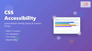
CSS Accessibility: Complete Guide to Screen Reader Friendly Styling and Inclusive Design
Understanding CSS Accessibility and Screen Reader Compatibility CSS accessibility forms the foundation of inclusive web design, ensuring that websites remain...
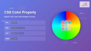
CSS Color Property: Complete Guide to Text Colors with Hex, RGB, HSL Values
The CSS color property is one of the most fundamental styling properties in web development, allowing you to control the...
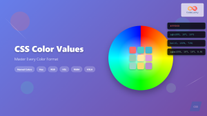
CSS Color Values: Complete Guide to Named Colors, Hex, RGB, HSL, RGBA, HSLA
Colors are fundamental to web design, breathing life into otherwise plain HTML elements. CSS provides multiple ways to define colors,...
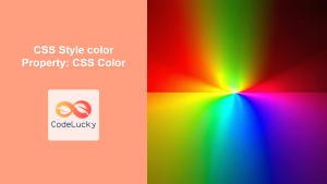
CSS Style color Property: CSS Color
Understanding the CSS color Property: A Comprehensive Guide The CSS color property is fundamental for styling web pages. It specifies...
HTML Colors: A Comprehensive Guide to Using Colors in Web Development
Introduction Colors are the soul of web design. They evoke emotions, guide user attention, and establish brand identity. In web...
CSS Saturate Filter: Complete Guide to Color Saturation Control
The CSS saturate() filter function is a powerful tool that allows you to control the color saturation of HTML elements....
CSS Contrast Filter: Complete Guide to Adjusting Element Contrast for Better Visual Impact
The CSS contrast() filter function is a powerful tool that allows web developers to dynamically adjust the contrast of HTML...
CSS Prefers-Color-Scheme: Complete Guide to Dark Mode and Light Mode Detection
The CSS prefers-color-scheme media query has revolutionized how we implement dark mode and light mode themes on websites. This powerful...
CSS Validation: Complete Guide to W3C CSS Validator for Error-Free Stylesheets
What is CSS Validation? CSS validation is the process of checking your Cascading Style Sheets (CSS) code against the official...

CSS Syntax: Complete Guide to Rules, Selectors, Properties and Values
CSS (Cascading Style Sheets) is the cornerstone of web design, transforming plain HTML into visually stunning websites. Understanding CSS syntax...
CSS Style backgroundColor Property: CSS Background Color
CSS backgroundColor Property: Mastering Background Colors The backgroundColor property in CSS allows you to define the background color of an...
CSS Background-Color: Complete Guide to Setting Element Background Colors
The CSS background-color property is one of the most fundamental styling tools in web development, allowing you to set the...


