CSS Flex Shorthand: Master Grow, Shrink, and Basis in One Property
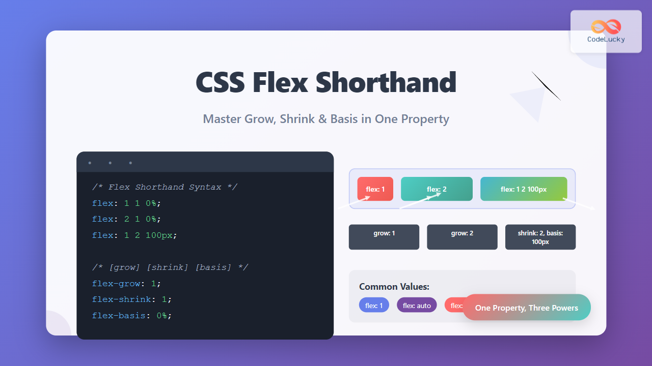
Master the CSS flex shorthand property to control flex-grow, flex-shrink, and flex-basis in one line. Complete guide with examples and interactive demos.
Master the CSS flex shorthand property to control flex-grow, flex-shrink, and flex-basis in one line. Complete guide with examples and interactive demos.
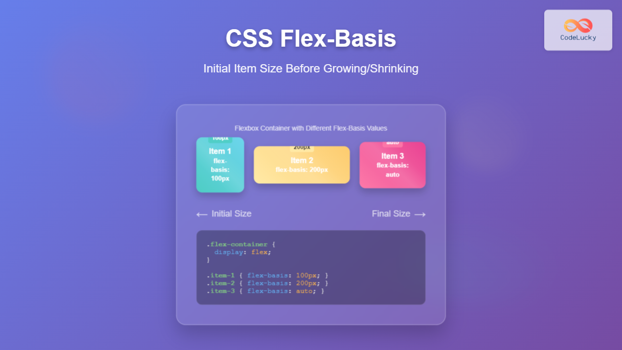
Master CSS flex-basis property to control initial item sizes in flexbox layouts. Learn syntax, values, and practical examples with visual demonstrations.
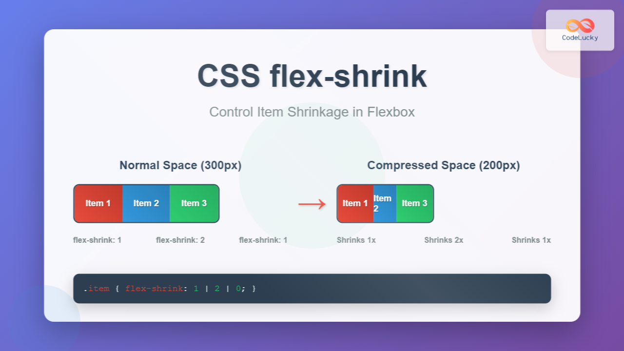
Master CSS flex-shrink property to control how flex items shrink when container space is limited. Learn syntax, values, and practical examples with interactive demos.
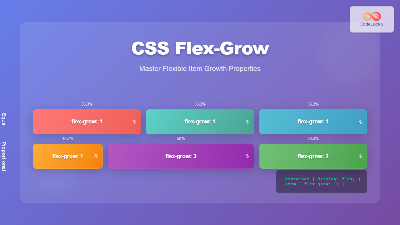
Master CSS flex-grow property with practical examples, visual demonstrations, and interactive code snippets. Learn how to control flexible item growth in flexbox layouts.
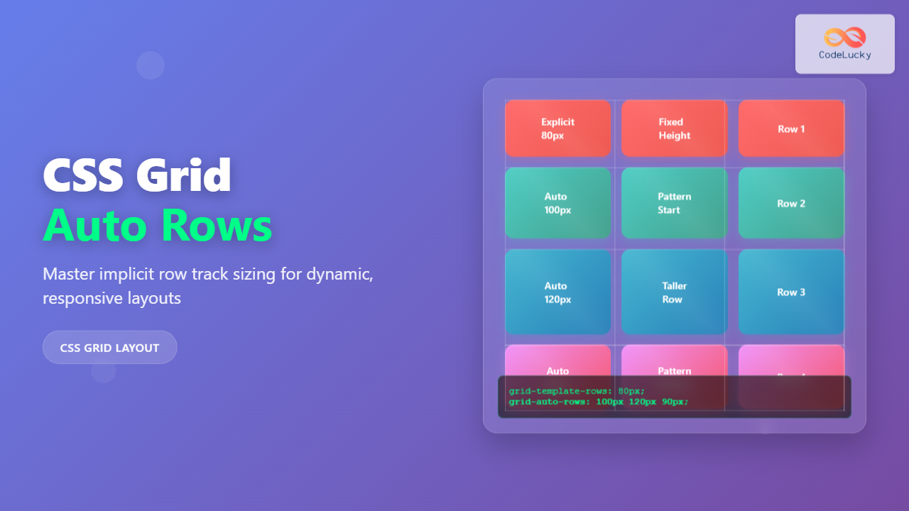
Master CSS grid-auto-rows property to control implicit row sizing in CSS Grid. Learn syntax, values, and practical examples for creating flexible, responsive layouts.
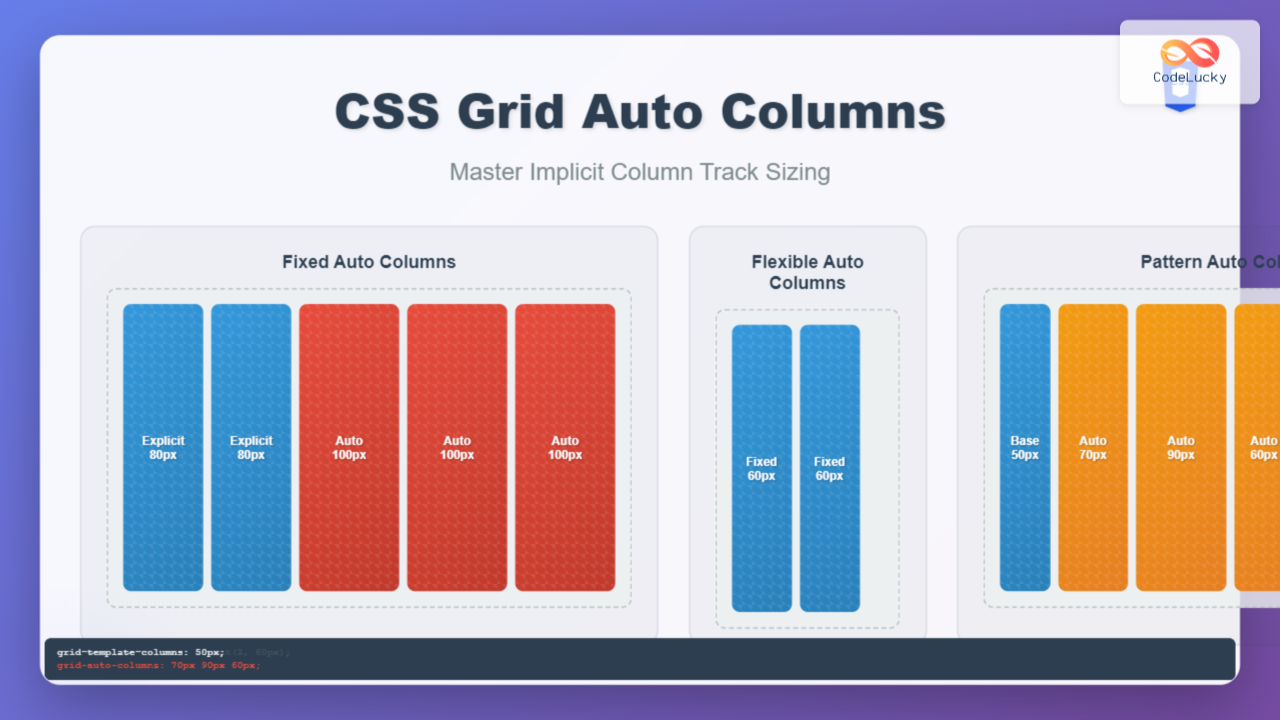
Master CSS grid-auto-columns property to control implicit column sizing. Learn syntax, values, and practical examples for creating dynamic, responsive grid layouts.
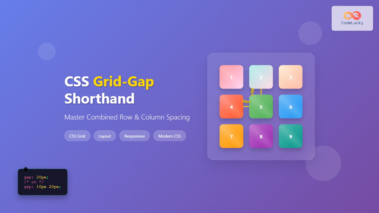
Learn how to use CSS grid-gap shorthand property to control row and column spacing in CSS Grid layouts with practical examples and interactive demos.
Master CSS Grid spacing with grid-column-gap and grid-row-gap properties. Learn syntax, examples, and best practices for perfect grid layouts.
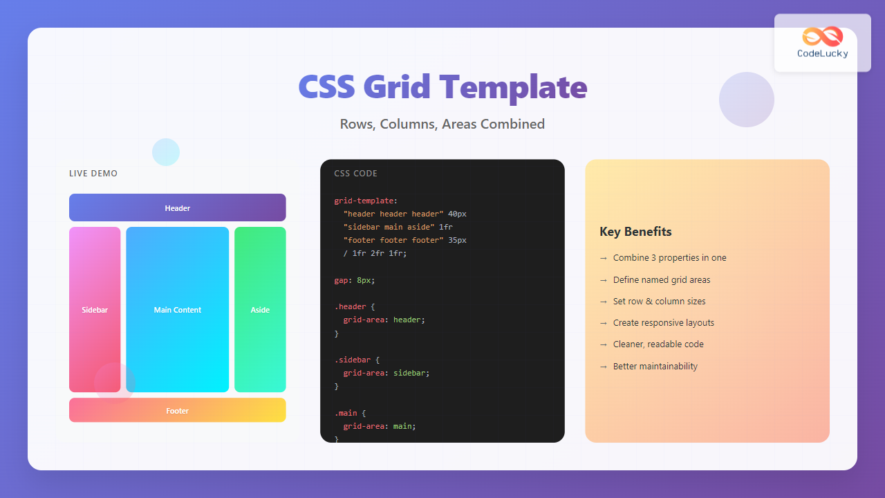
Master CSS grid-template shorthand property to define rows, columns, and areas simultaneously. Complete guide with interactive examples and best practices.
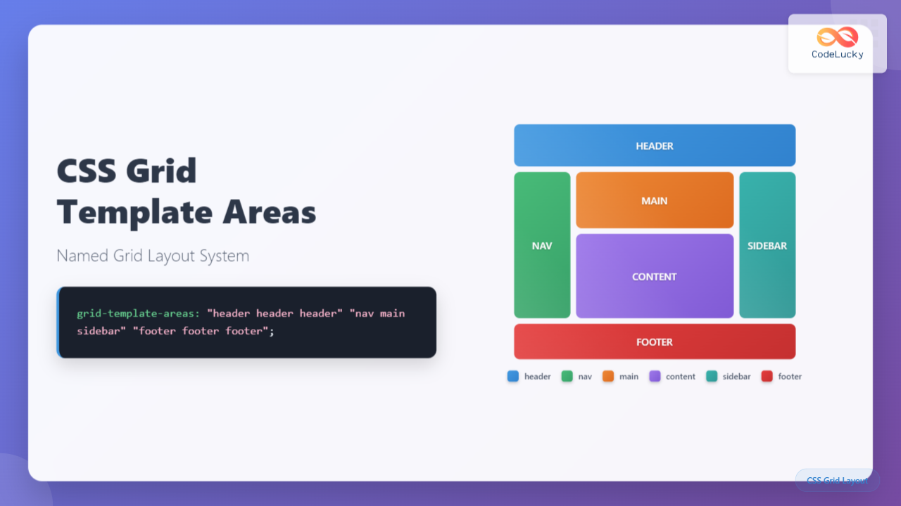
Learn CSS grid-template-areas to create intuitive, maintainable grid layouts using named areas. Complete guide with visual examples and interactive demos.