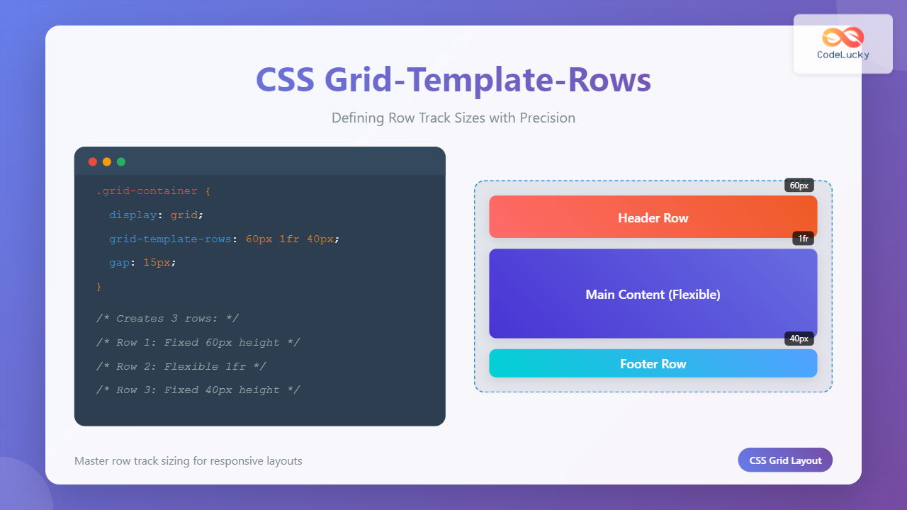
CSS Grid-Template-Rows: Master Row Track Sizing with Complete Examples
Master CSS grid-template-rows property to control row track sizes with fixed values, flexible units, and responsive layouts. Complete guide with interactive examples.
Master CSS grid-template-rows property to control row track sizes with fixed values, flexible units, and responsive layouts. Complete guide with interactive examples.
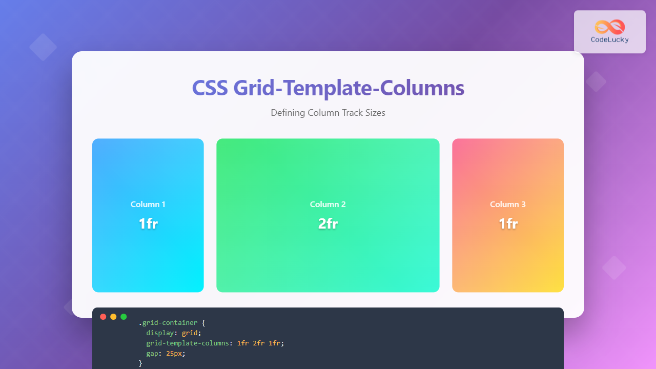
Master CSS grid-template-columns property with comprehensive examples, responsive techniques, and practical implementations for modern web layouts.
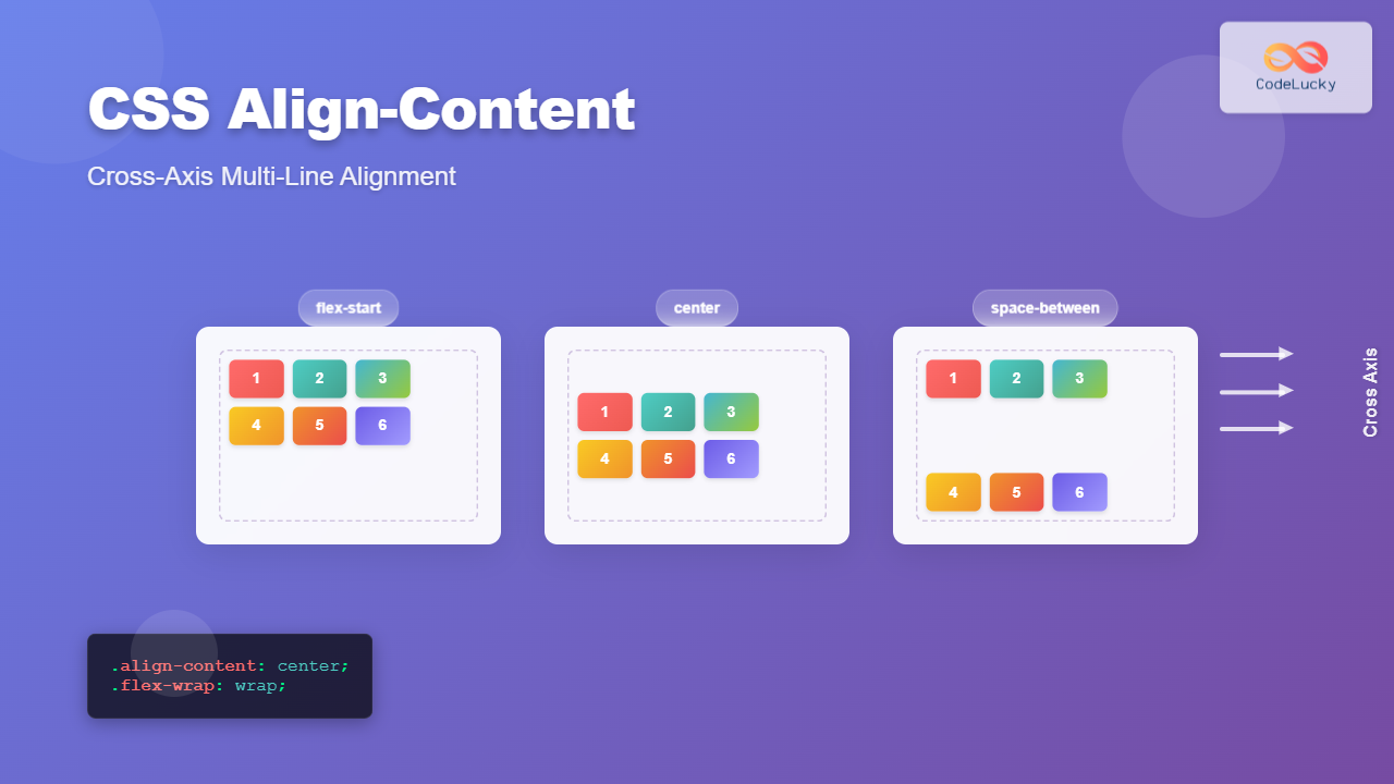
Master CSS align-content property for perfect cross-axis alignment of multiple lines in flexbox and grid layouts. Complete guide with examples and interactive demos.
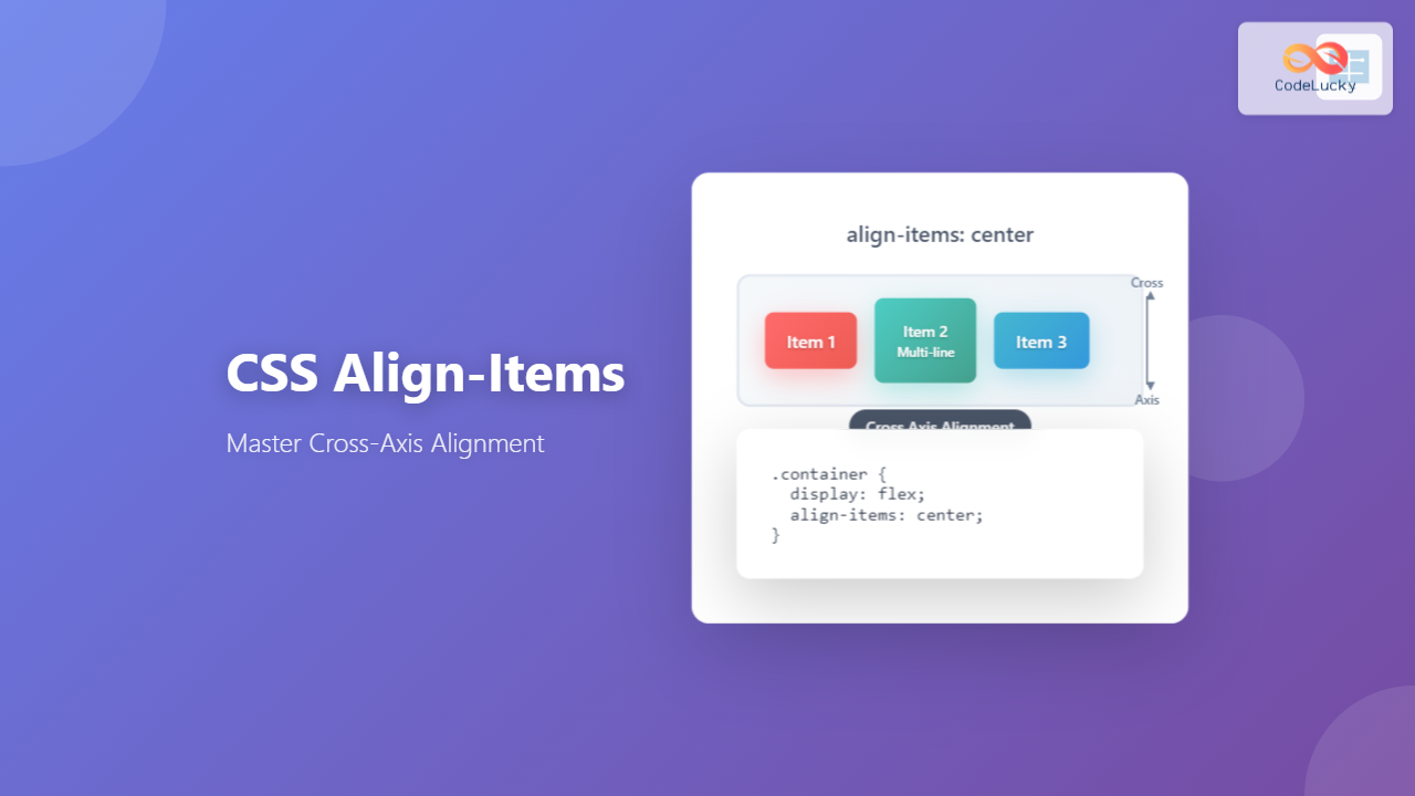
Master CSS align-items property for perfect cross-axis alignment in flexbox and grid layouts. Learn all values with practical examples and interactive demos.
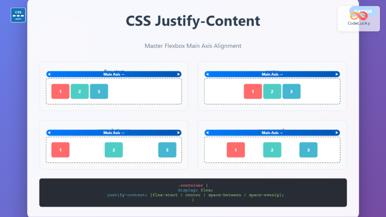
Master CSS justify-content property with comprehensive examples and interactive demos. Learn all alignment values for perfect flexbox layouts.
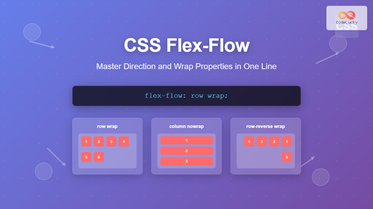
Learn how CSS flex-flow combines flex-direction and flex-wrap into a powerful shorthand property for complete flexbox control with practical examples.
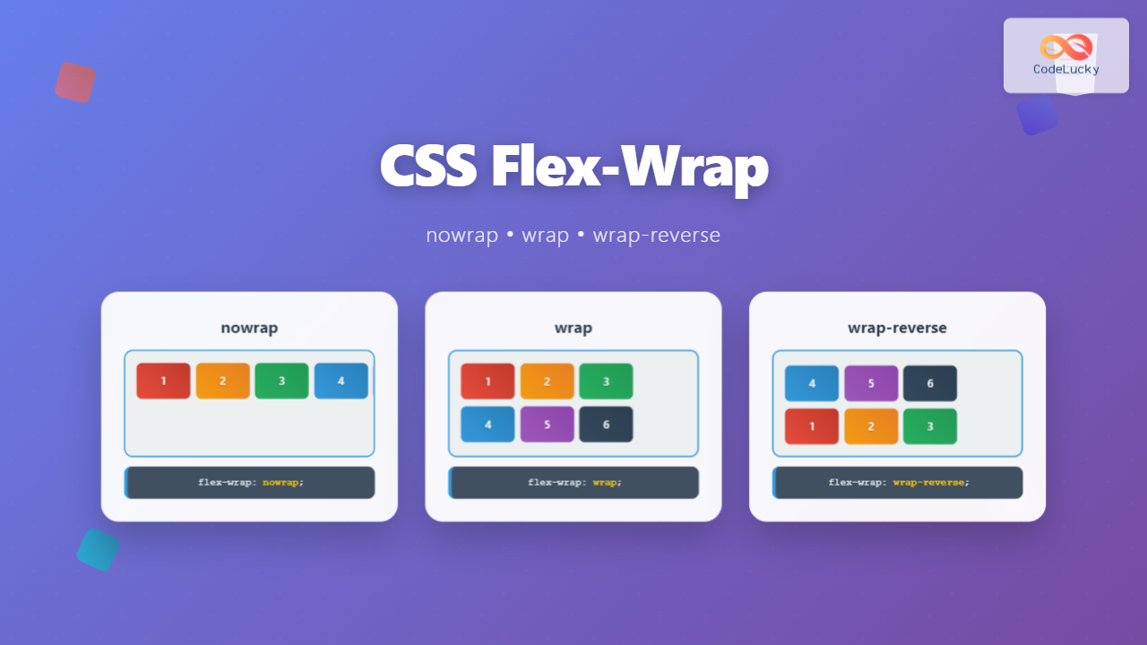
Master CSS flex-wrap property with nowrap, wrap, and wrap-reverse values. Learn through interactive examples and practical use cases for responsive web layouts.
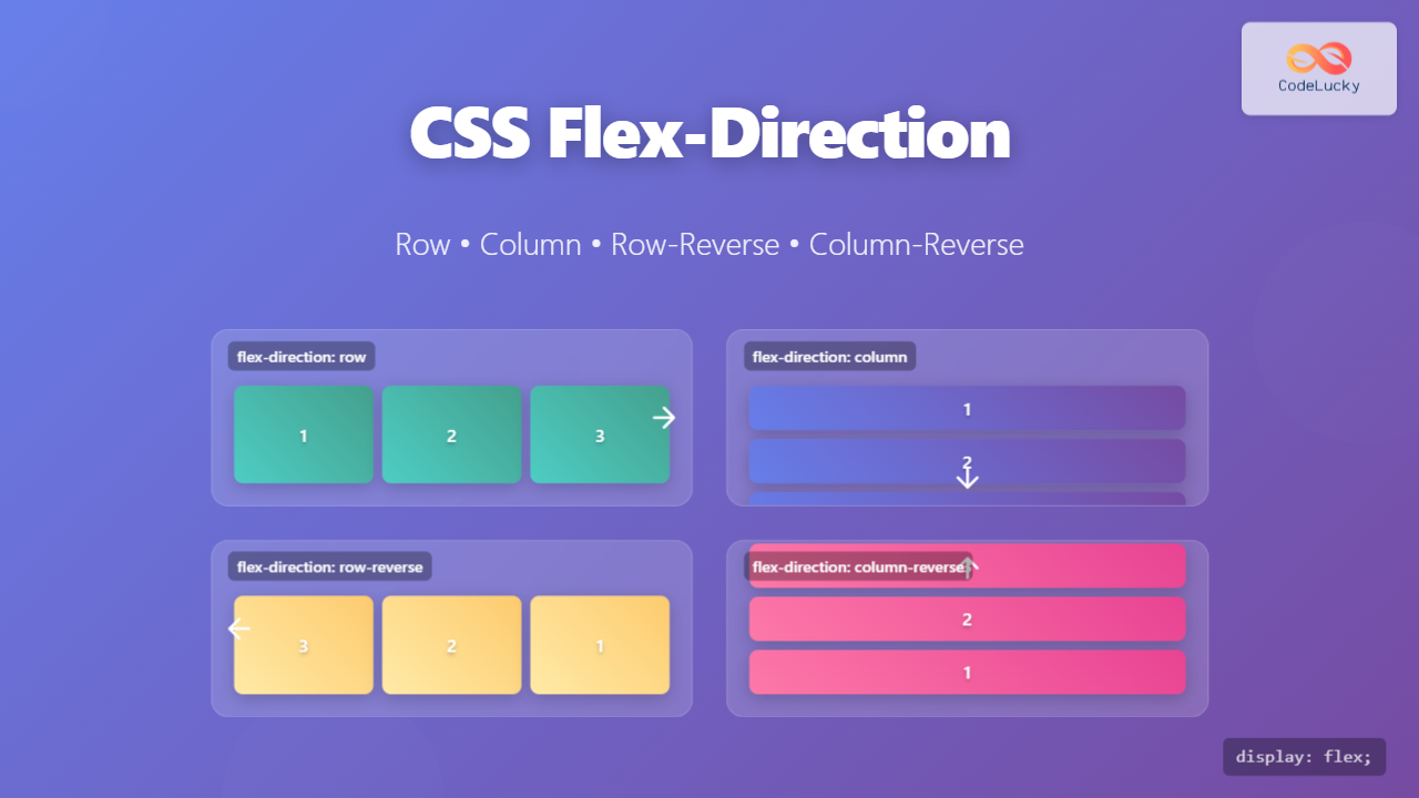
Master CSS flex-direction property with comprehensive examples of row, column, row-reverse, and column-reverse values. Learn flexbox layout control with interactive demonstrations.
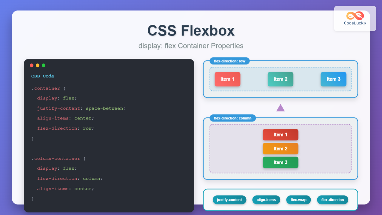
Master CSS Flexbox with our comprehensive guide covering display: flex container properties, practical examples, and interactive demonstrations for modern web layouts.
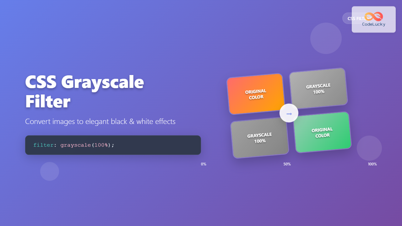
Learn how to use CSS grayscale filter to create stunning black and white effects. Complete guide with examples, browser support, and interactive demos.