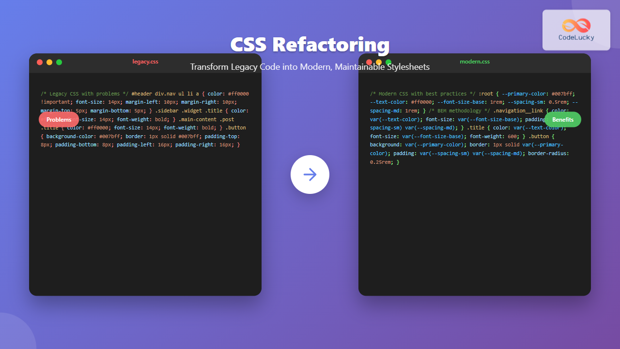
CSS Refactoring: Complete Guide to Modernizing Legacy Stylesheets
Master CSS refactoring with proven strategies to transform legacy stylesheets into maintainable, performant code. Includes practical examples and interactive demonstrations.
Master CSS refactoring with proven strategies to transform legacy stylesheets into maintainable, performant code. Includes practical examples and interactive demonstrations.
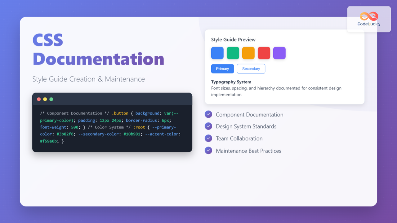
Master CSS documentation with our comprehensive guide to creating and maintaining effective style guides that improve code quality and team productivity.
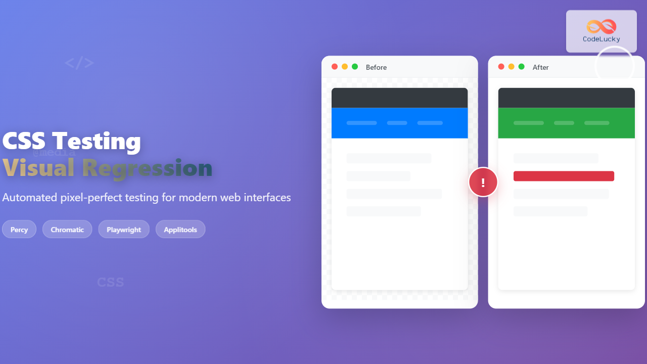
Master CSS visual regression testing with comprehensive guide covering top tools, implementation strategies, and best practices for maintaining pixel-perfect web interfaces.
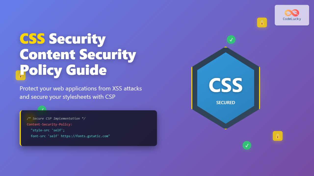
Learn how to secure your CSS with Content Security Policy (CSP). Master CSP directives, inline styles security, and best practices to prevent XSS attacks in modern web development.
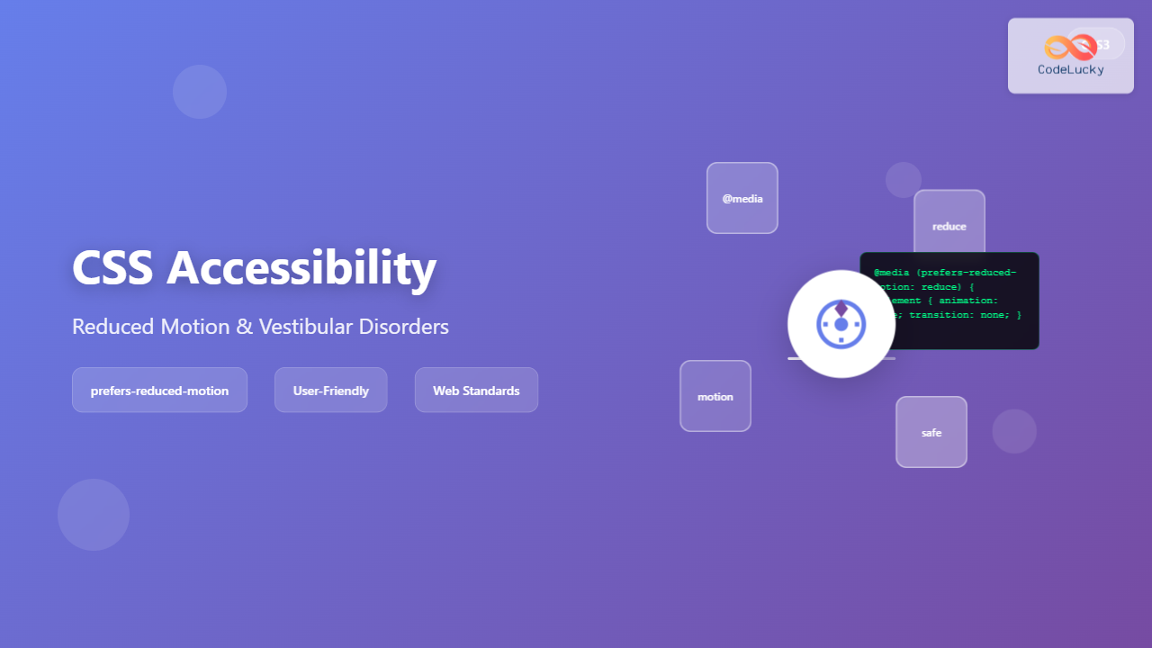
Learn how to create accessible web experiences using CSS prefers-reduced-motion media query to support users with vestibular disorders and motion sensitivities.
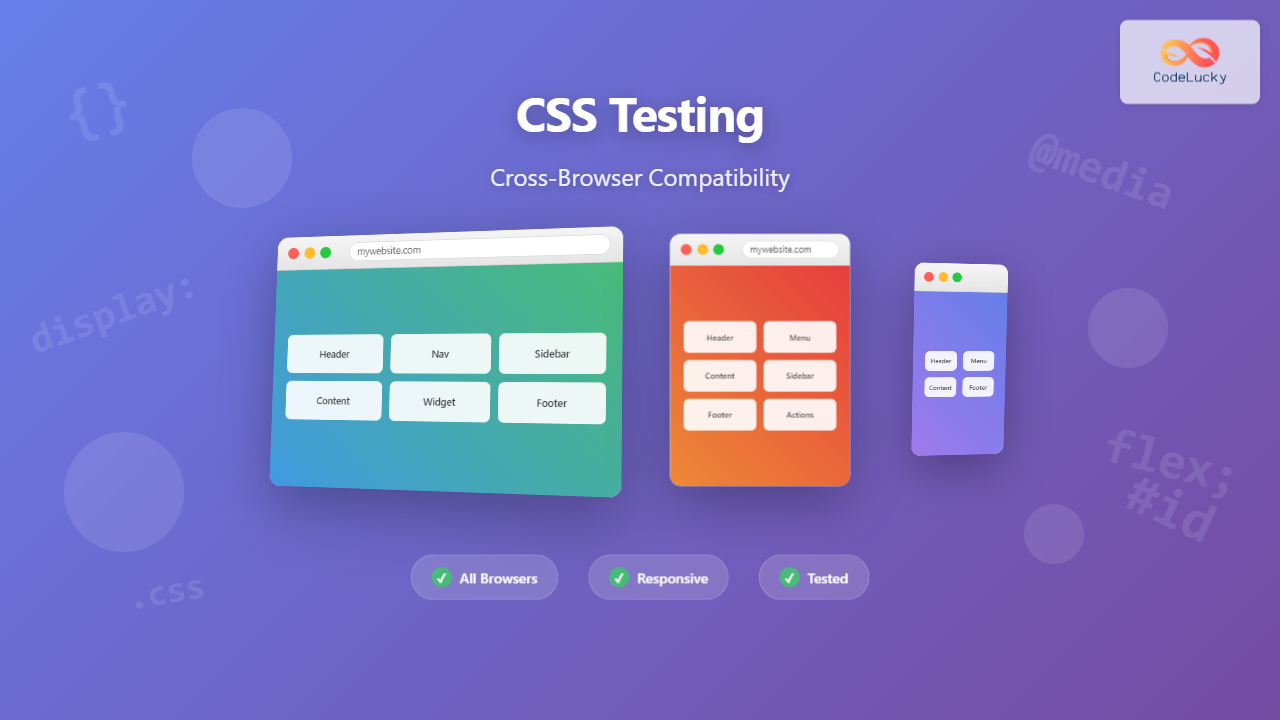
Master CSS cross-browser compatibility testing with proven techniques, tools, and strategies to ensure your websites work flawlessly across all browsers and devices.
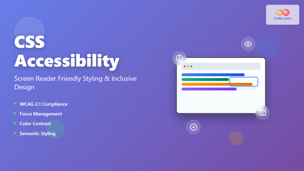
Master CSS accessibility with our comprehensive guide to screen reader friendly styling. Learn WCAG compliance, semantic HTML, focus management, and advanced techniques for inclusive web design.
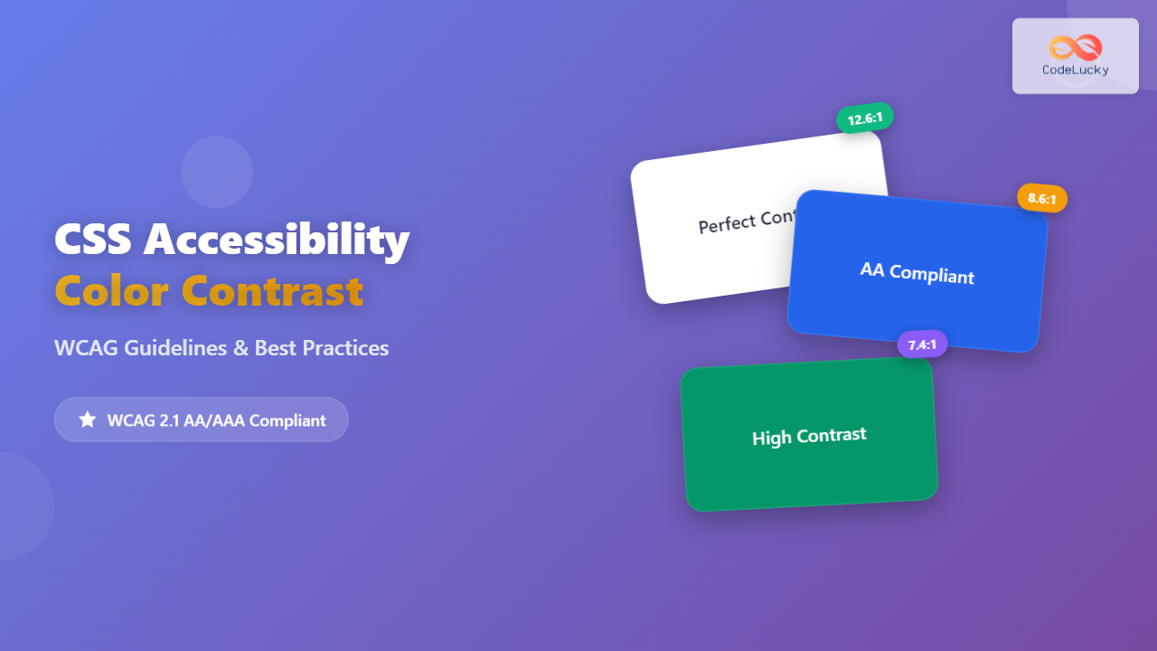
Master CSS accessibility with comprehensive WCAG color contrast requirements, practical examples, and interactive tools for creating inclusive web designs.
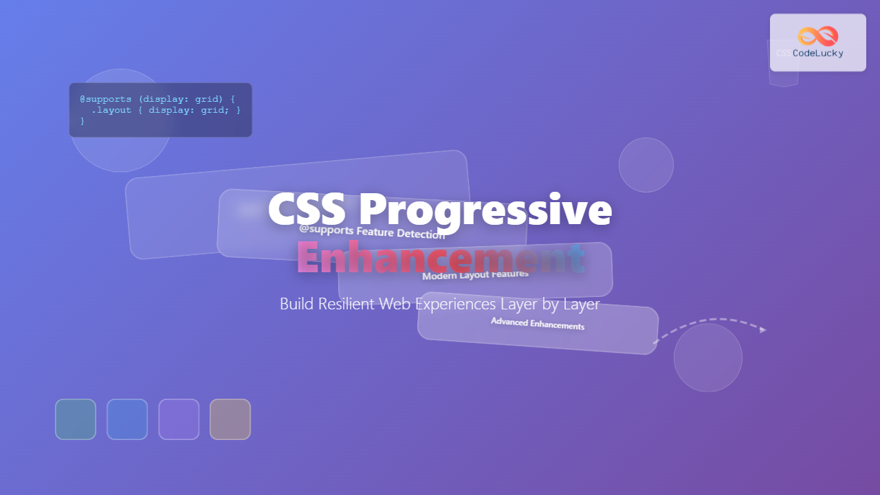
Master CSS progressive enhancement to create resilient, accessible web experiences that work across all devices and browsers with layer-by-layer feature addition.
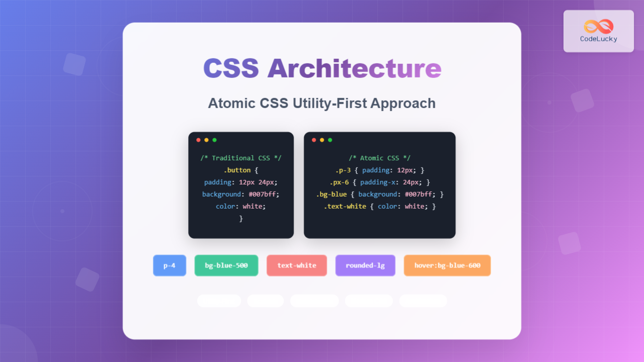
Master Atomic CSS utility-first architecture with this comprehensive guide. Learn how to build scalable, maintainable CSS using utility classes, atomic design principles, and modern best practices.