The Excel FREQUENCY function is a powerful statistical tool that helps analyze data distribution by counting how many values fall within specific ranges or bins. This array function is essential for creating histograms, analyzing data patterns, and performing statistical analysis in Excel.
What is the Excel FREQUENCY Function?
The FREQUENCY function returns a frequency distribution as a vertical array of numbers representing how many values from a data array fall within each specified bin range. It’s particularly useful for statistical analysis, quality control, and data visualization tasks.
FREQUENCY Function Syntax
The basic syntax for the FREQUENCY function is:
=FREQUENCY(data_array, bins_array)Parameters:
- data_array (required): The array or range of values for which you want to count frequencies
- bins_array (required): The array or range of intervals (bins) into which you want to group the values
How the FREQUENCY Function Works
The FREQUENCY function counts values using the following logic:
- Values less than or equal to the first bin value
- Values greater than the previous bin but less than or equal to the current bin
- Values greater than the last bin value (if any)
The function always returns one more value than the number of bins specified, with the extra value representing counts above the highest bin.
Step-by-Step Guide to Using FREQUENCY
Basic FREQUENCY Function Example
Let’s create a simple frequency distribution for test scores:
Sample Data: Test scores: 65, 78, 82, 91, 88, 76, 95, 67, 89, 84
Bins: 70, 80, 90, 100
To use the FREQUENCY function:
- Enter your data in column A (A1:A10)
- Enter your bins in column C (C1:C4)
- Select the range where you want results (D1:D5)
- Type:
=FREQUENCY(A1:A10,C1:C4) - Press Ctrl+Shift+Enter (for older Excel versions) or just Enter (Excel 365)
The results will show:
- 2 values ≤ 70 (scores 65, 67)
- 2 values > 70 and ≤ 80 (scores 78, 76)
- 3 values > 80 and ≤ 90 (scores 82, 88, 89, 84)
- 2 values > 90 and ≤ 100 (scores 91, 95)
- 0 values > 100
Advanced FREQUENCY Function Techniques
Creating Equal-Width Bins
For systematic analysis, create equal-width bins using a formula:
=MIN(data_range)+ROW(A1:A10)*(MAX(data_range)-MIN(data_range))/10This creates 10 equal intervals between your minimum and maximum values.
Dynamic Frequency Analysis
Combine FREQUENCY with other functions for dynamic analysis:
=FREQUENCY(data_range,PERCENTILE(data_range,{0.25;0.5;0.75;1}))This creates frequency distribution based on quartiles.
Common FREQUENCY Function Applications
1. Sales Performance Analysis
Analyze sales team performance by grouping revenue figures into performance brackets:
=FREQUENCY(sales_data,{50000;100000;150000;200000})2. Quality Control Testing
Monitor product quality by analyzing measurement distributions:
=FREQUENCY(measurements,tolerance_limits)3. Customer Age Demographics
Segment customers by age groups for marketing analysis:
=FREQUENCY(customer_ages,{25;35;45;55;65})Troubleshooting FREQUENCY Function Issues
Common Errors and Solutions
#VALUE! Error:
- Ensure data_array contains only numeric values
- Check that bins_array is properly sorted in ascending order
- Verify array dimensions match your selection
Incorrect Results:
- Confirm bins are sorted in ascending order
- Check for empty cells in your data range
- Ensure you’ve selected the correct output range size
Array Formula Issues:
- In older Excel versions, use Ctrl+Shift+Enter
- Select the entire output range before entering the formula
- Don’t edit individual cells in the array result
FREQUENCY vs Other Excel Functions
FREQUENCY vs COUNTIFS
While COUNTIFS can count values in ranges, FREQUENCY offers advantages:
- Single formula for multiple bins
- Faster calculation for large datasets
- Automatic handling of boundary conditions
- Built-in array output format
FREQUENCY vs HISTOGRAM Chart
FREQUENCY provides the underlying data that histogram charts visualize:
- Use FREQUENCY for precise numerical analysis
- Use histogram charts for visual representation
- Combine both for comprehensive analysis
Creating Charts from FREQUENCY Results
Transform FREQUENCY results into visual charts:
- Calculate frequency distribution using FREQUENCY function
- Select both bins and frequency results
- Insert Column Chart or Histogram
- Format chart for better visualization
This creates professional-looking frequency distribution charts for presentations and reports.
Best Practices for FREQUENCY Function
Data Preparation
- Clean data by removing blanks and non-numeric values
- Sort bins in ascending order
- Choose appropriate bin sizes for meaningful analysis
- Consider outliers and their impact on distribution
Performance Optimization
- Use defined names for large data ranges
- Avoid volatile functions in bin calculations
- Consider using tables for dynamic range references
- Test with sample data before applying to large datasets
Real-World FREQUENCY Function Examples
Employee Performance Rating Distribution
=FREQUENCY(performance_scores,{1;2;3;4;5})This analyzes how employees are distributed across performance ratings from 1-5.
Website Response Time Analysis
=FREQUENCY(response_times,{1;2;3;5;10})Categorizes website response times into performance buckets for optimization analysis.
Advanced Tips and Tricks
Combining FREQUENCY with Statistical Functions
Create comprehensive statistical analysis:
=AVERAGE(FREQUENCY(data_range,bins_range))This calculates the average frequency across all bins.
Percentage Distribution Calculation
Convert frequencies to percentages:
=FREQUENCY(data_range,bins_range)/COUNT(data_range)*100This shows the percentage distribution rather than raw counts.
Conclusion
The Excel FREQUENCY function is an invaluable tool for statistical analysis and data visualization. By mastering its syntax, understanding its behavior, and applying best practices, you can create powerful frequency distributions that reveal important patterns in your data. Whether you’re analyzing sales performance, quality control metrics, or demographic data, the FREQUENCY function provides the foundation for data-driven decision making.
Remember to always validate your results, choose appropriate bin sizes, and combine FREQUENCY with visualization tools for maximum impact. With practice, this function becomes an essential part of your Excel data analysis toolkit.
Related Posts
Excel COUNT Function: Complete Guide to Number Counting Formulas
The COUNT function is one of Excel's most fundamental and frequently used statistical functions. Whether you're analyzing sales data, tracking...
Excel ROWS Function: Complete Guide to Count Rows with Formula Syntax Examples
What is the Excel ROWS Function? The ROWS function in Microsoft Excel is a built-in lookup and reference function that...
Excel COLUMNS Function: Master Column Counting with Practical Examples
The Excel COLUMNS function is a powerful built-in tool that counts the number of columns in a specified range or...
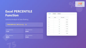
Excel PERCENTILE Function: Complete Guide to Statistical Analysis and Ranking
The Excel PERCENTILE function is a powerful statistical tool that helps you analyze data distribution and identify specific values within...
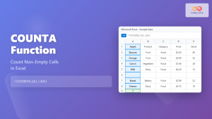
Excel COUNTA Function: Complete Guide to Non-Empty Cell Counting
The COUNTA function is one of Excel's most versatile statistical functions, designed specifically to count non-empty cells within a specified...

Excel MODE Function: Complete Guide to Finding Most Frequent Values
The Excel MODE function is a powerful statistical tool that helps you identify the most frequently occurring value in a...

Excel SIN Function: Complete Guide to Sine Calculations in Spreadsheets
The Excel SIN function is a powerful mathematical tool that calculates the sine of an angle in radians. Whether you're...
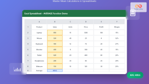
Excel AVERAGE Function: Complete Guide to Mean Calculation with Syntax Examples
The Excel AVERAGE function is one of the most fundamental and widely-used statistical functions in Microsoft Excel. This powerful function...
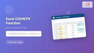
Excel COUNTIF Function: Master Conditional Counting with Advanced Formulas
The Excel COUNTIF function is one of the most powerful and frequently used conditional functions in Microsoft Excel. It allows...
Excel PERMUT Function: Complete Guide to Permutation Calculations
What is the Excel PERMUT Function? The PERMUT function in Microsoft Excel calculates the number of permutations for a given...
Excel DAVERAGE Function: Complete Guide to Database Average Calculations
The DAVERAGE function in Microsoft Excel is a powerful database function that calculates the average of values in a database...

Excel RANDARRAY Function: Complete Guide to Dynamic Random Array Generation
What is the Excel RANDARRAY Function? The RANDARRAY function is a powerful dynamic array function in Microsoft Excel that generates...