
CSS Subgrid is a powerful feature that extends CSS Grid Layout by allowing child grids to inherit the track sizing and positioning from their parent grid. This creates seamless alignment between nested grid containers, solving one of the most challenging aspects of complex grid layouts.
What is CSS Subgrid?
CSS Subgrid enables a grid item to become a grid container that inherits the grid tracks (rows or columns) from its parent grid. Instead of defining its own independent grid tracks, a subgrid aligns its items with the parent grid’s lines, creating perfect alignment across multiple levels of nesting.
Key Benefits:
- Perfect alignment between parent and child grid items
- Consistent spacing across nested layouts
- Simplified responsive design patterns
- Better content organization in complex layouts
Basic Subgrid Syntax
The subgrid feature is activated using the subgrid value for the grid-template-columns or grid-template-rows properties:
.parent-grid {
  display: grid;
  grid-template-columns: 1fr 2fr 1fr;
  grid-template-rows: repeat(3, 100px);
  gap: 20px;
}

.child-subgrid {
  display: grid;
  grid-column: 1 / -1; /* Span entire parent width */
  grid-template-columns: subgrid; /* Inherit parent columns */
  grid-template-rows: subgrid; /* Inherit parent rows */
}
Visual Example: Basic Subgrid Implementation
Notice how the subgrid items (red) align perfectly with the parent grid columns (blue)
Subgrid Direction Options
You can inherit tracks in one or both dimensions:
Column-only Subgrid
.subgrid-columns {
  grid-template-columns: subgrid; /* Inherit parent columns */
  grid-template-rows: repeat(2, 60px); /* Define own rows */
}
Row-only Subgrid
.subgrid-rows {
  grid-template-columns: repeat(3, 1fr); /* Define own columns */
  grid-template-rows: subgrid; /* Inherit parent rows */
}
Full Subgrid
.full-subgrid {
  grid-template-columns: subgrid; /* Inherit parent columns */
  grid-template-rows: subgrid; /* Inherit parent rows */
}
Practical Example: Card Layout with Subgrid
Product Title
This is a short description of the product that fits nicely.
Another Product
A longer description that demonstrates how subgrid helps maintain consistent alignment even with varying content lengths across different cards.
Third Item
Medium length description here.
Notice how all card elements align perfectly despite different content lengths
Interactive Subgrid Demo
Click the buttons above to see different subgrid configurations in action
Advanced Subgrid Patterns
Named Grid Lines Inheritance
Subgrids inherit named grid lines from their parent, making it easier to position items using semantic names:
.parent {
  display: grid;
  grid-template-columns: [start] 1fr [middle] 2fr [end];
  grid-template-rows: [header] 100px [content] 1fr [footer] 50px;
}

.subgrid-child {
  display: grid;
  grid-template-columns: subgrid;
  grid-template-rows: subgrid;
  grid-column: start / end;
  grid-row: content / footer;
}

.nested-item {
  grid-column: start / middle; /* Uses inherited line names */
  grid-row: header; /* Uses inherited line names */
}
Gap Inheritance
Subgrids inherit the gap values from their parent grid, but you can override them:
.parent-with-gap {
  display: grid;
  grid-template-columns: repeat(4, 1fr);
  gap: 20px;
}

.subgrid-custom-gap {
  display: grid;
  grid-template-columns: subgrid;
  grid-column: 1 / -1;
  gap: 10px; /* Override parent gap */
}
Browser Support and Fallbacks
Browser Support Status:
- Firefox: Full support since version 71
- Safari: Support since version 16
- Chrome/Edge: Support since version 117 (September 2023)
Feature Detection and Fallbacks
/* Feature detection */
@supports (grid-template-columns: subgrid) {
  .modern-subgrid {
    display: grid;
    grid-template-columns: subgrid;
  }
}

/* Fallback for browsers without subgrid support */
@supports not (grid-template-columns: subgrid) {
  .fallback-grid {
    display: grid;
    grid-template-columns: repeat(3, 1fr);
  }
}
Common Use Cases
1. Form Layouts
Create consistent form layouts where labels and inputs align perfectly across different sections:
.form-container {
  display: grid;
  grid-template-columns: max-content 1fr;
  gap: 10px 20px;
}

.form-section {
  display: grid;
  grid-template-columns: subgrid;
  grid-column: 1 / -1;
  gap: inherit;
}
2. Card Grids
Ensure card elements align across rows, regardless of content length variations.
3. Complex Page Layouts
Create sophisticated page layouts where nested components maintain alignment with the main grid structure.
Performance Considerations
CSS Subgrid is performant because it doesn’t create additional layout calculations. Instead, it references the parent grid’s already computed track sizes. This makes it more efficient than attempting to manually synchronize multiple independent grids.
Best Practices:
- Use subgrid when you need perfect alignment between nested grid containers
- Consider fallback strategies for older browsers
- Test your layouts across different screen sizes
- Use named grid lines for better maintainability
Troubleshooting Common Issues
Issue: Subgrid Not Working
Solution: Ensure the parent element has display: grid and the child spans across the desired tracks using grid-column or grid-row.
Issue: Unexpected Spacing
Solution: Remember that subgrids inherit gap values. Override with specific gap values if needed.
Issue: Browser Compatibility
Solution: Use @supports queries to provide fallbacks for browsers without subgrid support.
Future of CSS Subgrid
With increasing browser support, CSS Subgrid is becoming a standard tool for complex layout design. It simplifies many layout challenges that previously required complex workarounds or JavaScript solutions. As adoption grows, we can expect to see more sophisticated design patterns and frameworks incorporating subgrid capabilities.
CSS Subgrid represents a significant advancement in web layout capabilities, offering developers the precision and control needed for complex, nested grid layouts while maintaining clean, semantic HTML structures.
Related Posts
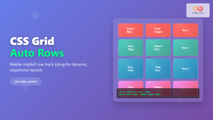
CSS Grid Auto Rows: Master Implicit Row Track Sizing for Dynamic Layouts
CSS Grid revolutionized web layout design, offering unprecedented control over both rows and columns. While you explicitly define grid tracks...
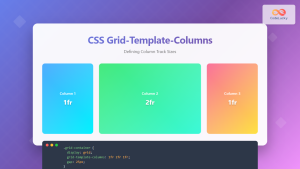
CSS Grid-Template-Columns: Complete Guide to Defining Column Track Sizes
The grid-template-columns property is one of the most fundamental aspects of CSS Grid Layout, allowing developers to define the size...
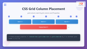
CSS Grid-Column-Start and Grid-Column-End: Complete Guide to Precise Item Column Placement
CSS Grid revolutionized web layout by providing precise control over both rows and columns. Among its most powerful features are...

CSS Align-Content: Master Grid Container Block Axis Alignment
The CSS align-content property is a powerful tool for controlling how grid items are distributed along the block axis (typically...

CSS Grid: Display Grid Container Property – Complete Guide with Examples
CSS Grid revolutionized web layout design by providing a two-dimensional grid system that allows developers to create complex, responsive layouts...
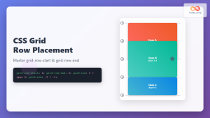
CSS Grid-Row-Start and Grid-Row-End: Complete Guide to Item Row Placement
Understanding CSS Grid Row Placement CSS Grid provides powerful tools for controlling the placement of grid items within your layout....

CSS Grid-Column-Gap and Grid-Row-Gap: Complete Guide to Track Spacing
CSS Grid has revolutionized how we create layouts on the web, and one of its most powerful features is the...
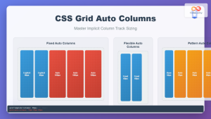
CSS Grid Auto Columns: Master Implicit Column Track Sizing for Dynamic Layouts
CSS Grid Layout revolutionized web design by providing a powerful two-dimensional layout system. While explicit grid tracks defined with grid-template-columns...
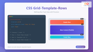
CSS Grid-Template-Rows: Master Row Track Sizing with Complete Examples
The grid-template-rows property is a fundamental building block of CSS Grid Layout that allows you to define the size of...

CSS Style grid Property: CSS Grid Layout
CSS grid Property: Mastering CSS Grid Layout The CSS grid property is a powerful tool for creating two-dimensional layouts on...

CSS Grid Functions: Complete Guide to repeat(), minmax(), and fit-content()
CSS Grid has revolutionized web layout design, offering developers unprecedented control over two-dimensional layouts. Among its most powerful features are...
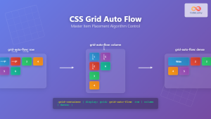
CSS Grid Auto Flow: Master Item Placement Algorithm Control for Responsive Layouts
Understanding CSS Grid Auto Flow The grid-auto-flow property is a powerful CSS Grid feature that controls how auto-placed items are...
- What is CSS Subgrid?
- Basic Subgrid Syntax
- Visual Example: Basic Subgrid Implementation
- Subgrid Direction Options
- Practical Example: Card Layout with Subgrid
- Interactive Subgrid Demo
- Advanced Subgrid Patterns
- Browser Support and Fallbacks
- Common Use Cases
- Performance Considerations
- Troubleshooting Common Issues
- Future of CSS Subgrid


