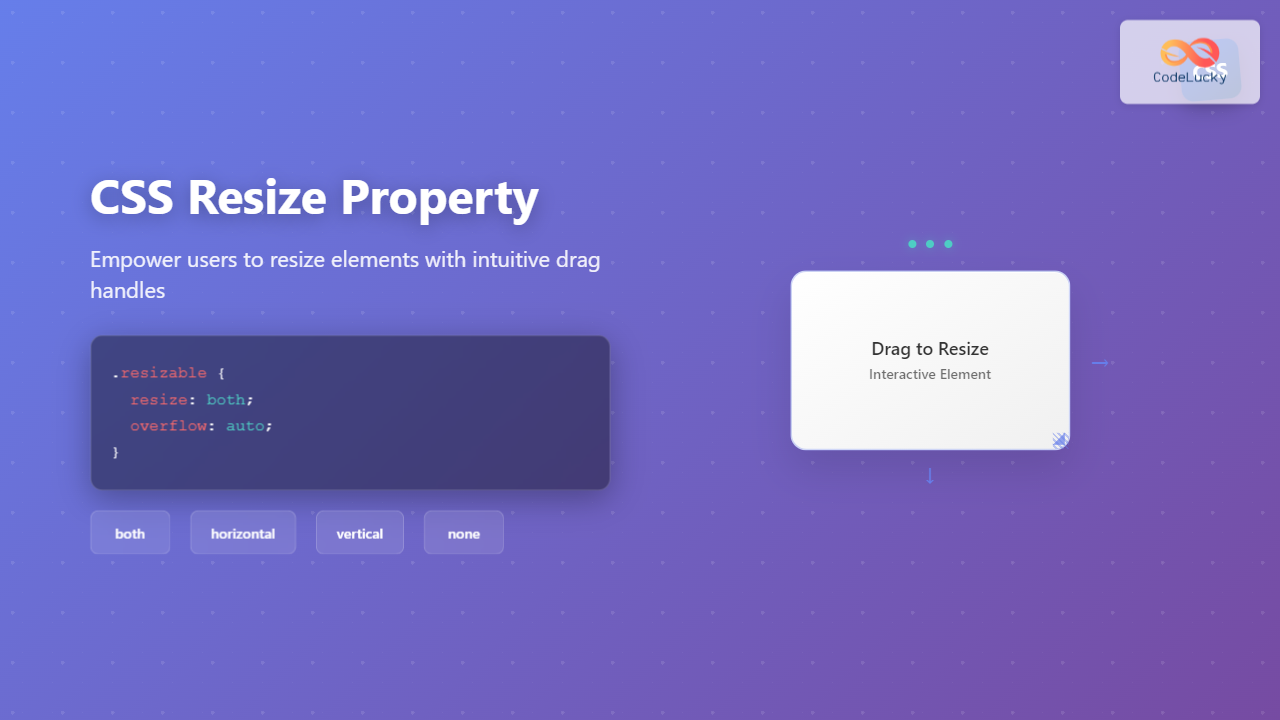
The CSS resize property is a powerful tool that allows users to resize HTML elements by dragging their corners or edges. This property enhances user experience by giving visitors control over element dimensions, particularly useful for textareas, content areas, and interactive components.
What is the CSS Resize Property?
The resize property controls whether an element can be resized by the user and in which directions. When applied, it adds a resize handle (typically in the bottom-right corner) that users can drag to change the element’s dimensions.
CSS Resize Property Syntax
selector {
  resize: value;
}
The property must be used alongside overflow set to something other than visible for most elements (except replaced elements like images).
CSS Resize Property Values
none (Default)
Disables resizing functionality completely.
.no-resize {
  resize: none;
  overflow: auto;
}
both
Allows resizing in both horizontal and vertical directions.
.resize-both {
  resize: both;
  overflow: auto;
}
horizontal
Enables resizing only in the horizontal direction (width).
.resize-horizontal {
  resize: horizontal;
  overflow: auto;
}
vertical
Enables resizing only in the vertical direction (height).
.resize-vertical {
  resize: vertical;
  overflow: auto;
}
block
Allows resizing in the block dimension (height in horizontal writing modes).
.resize-block {
  resize: block;
  overflow: auto;
}
inline
Allows resizing in the inline dimension (width in horizontal writing modes).
.resize-inline {
  resize: inline;
  overflow: auto;
}
Interactive Examples
Drag the bottom-right corner to resize this element in both directions. This demonstrates the resize: both property.
This element can only be resized horizontally. Try dragging the resize handle – it only affects the width.
This element can only be resized vertically. The resize handle only changes the height, not the width.
This element cannot be resized by the user. Notice there’s no resize handle visible.
Practical Use Cases
Resizable Textarea
Textareas have resize enabled by default in most browsers. You can control this behavior:
textarea {
  resize: both; /* or horizontal, vertical, none */
  overflow: auto;
}
Constrained Resizing
Combine resize with min/max dimensions for better control:
This element has minimum and maximum size constraints. Try resizing beyond the limits!
Min: 200px × 100px
Max: 500px × 300px
.constrained-resize {
  resize: both;
  overflow: auto;
  min-width: 200px;
  min-height: 100px;
  max-width: 500px;
  max-height: 300px;
}
Browser Support and Compatibility
The CSS resize property enjoys excellent browser support:
- Chrome: Full support since version 4
- Firefox: Full support since version 4
- Safari: Full support since version 3
- Edge: Full support since version 79
- Internet Explorer: Not supported
The block and inline values have more limited support and are newer additions to the specification.
Important Considerations
Overflow Requirement
For the resize property to work on most elements, the overflow property must be set to something other than visible:
.resizable {
  resize: both;
  overflow: auto; /* Required for resize to work */
}
Replaced Elements Exception
Replaced elements like images, videos, and form controls don’t require the overflow property:
img {
  resize: both; /* Works without overflow */
  max-width: 100%;
}
Performance Considerations
Resizing can trigger layout recalculations. For better performance, consider:
- Using
transform: scale()for visual-only resizing - Implementing custom resize handlers for complex scenarios
- Debouncing resize events when JavaScript interaction is needed
Advanced Techniques
Custom Styling
While you can’t completely customize the resize handle, you can influence its appearance:
.custom-resizable {
  resize: both;
  overflow: auto;
  /* The resize handle inherits some styles from the element */
  border: 2px solid #007acc;
  border-radius: 8px;
}
JavaScript Integration
Monitor resize events for dynamic behavior:
const resizableElement = document.querySelector('.resizable');

// Using ResizeObserver for modern browsers
const resizeObserver = new ResizeObserver(entries => {
  for (let entry of entries) {
    console.log('Element resized:', entry.contentRect);
  }
});

resizeObserver.observe(resizableElement);
Accessibility Considerations
When implementing resizable elements, consider accessibility:
- Ensure resize handles are large enough for users with motor difficulties
- Provide keyboard alternatives for resizing when possible
- Test with screen readers to ensure resize functionality is announced
- Consider users who may accidentally resize elements
Common Pitfalls and Solutions
Resize Not Working
Problem: Element won’t resize despite having resize: both
Solution: Add overflow: auto or another non-visible value
Unwanted Textarea Resizing
Problem: Textareas resize by default, breaking layout
Solution: Use resize: none or constrain with min/max dimensions
Layout Breaking on Resize
Problem: Resized elements break parent container layouts
Solution: Use CSS Grid or Flexbox with proper constraints
Best Practices
- Set Reasonable Constraints: Always use min/max dimensions to prevent layout issues
- Consider User Intent: Only make elements resizable when it serves a purpose
- Test Across Devices: Resize behavior varies on touch devices
- Provide Visual Feedback: Ensure users understand which elements are resizable
- Maintain Aspect Ratios: For images and media, consider aspect-ratio property
Conclusion
The CSS resize property is a valuable tool for creating interactive, user-friendly interfaces. By understanding its various values, browser support, and implementation considerations, you can enhance user experience while maintaining design integrity. Remember to always test resize behavior across different browsers and devices, and consider accessibility implications when implementing resizable elements.
Whether you’re creating resizable text areas, flexible content panels, or interactive dashboards, the resize property offers a native, performant solution for user-controlled element sizing. Combined with proper constraints and thoughtful design, it can significantly improve the usability of your web applications.

