
The CSS place-self property is a powerful shorthand that combines justify-self and align-self into a single declaration, making it easier to position individual grid items and flex items within their containers. This property gives you precise control over how a single item aligns within its grid area or flex container.
What is CSS Place-Self?
The place-self property is a shorthand property that sets both the justify-self and align-self properties in one declaration. It controls the alignment of an individual item inside its alignment container along both the block (cross) and inline (main) axes.
Syntax
place-self: <align-self> <justify-self>;
place-self: <align-self>; /* Sets both values to the same */
Place-Self Values
The place-self property accepts the same values as its constituent properties:
- auto – Uses the parent’s align-items value (default)
- start – Aligns to the start of the alignment container
- end – Aligns to the end of the alignment container
- center – Centers the item within the alignment container
- stretch – Stretches to fill the alignment container
- baseline – Aligns to the baseline
- first baseline – Aligns to the first baseline
- last baseline – Aligns to the last baseline
Place-Self in CSS Grid
In CSS Grid, place-self is particularly useful for positioning individual grid items within their grid areas. Let’s explore this with practical examples:
Basic Grid Example
place-self: start
place-self: center
place-self: end
.grid-container {
  display: grid;
  grid-template-columns: repeat(3, 1fr);
  grid-template-rows: repeat(3, 100px);
  gap: 10px;
}

.item-2 {
  place-self: start;
}

.item-5 {
  place-self: center;
}

.item-8 {
  place-self: end;
}
Two-Value Syntax
When using two values, the first value sets align-self (block axis) and the second sets justify-self (inline axis):
.item-1 { place-self: start end; }    /* align-self: start, justify-self: end */
.item-2 { place-self: end start; }    /* align-self: end, justify-self: start */
.item-3 { place-self: center start; } /* align-self: center, justify-self: start */
.item-4 { place-self: end center; }   /* align-self: end, justify-self: center */
Place-Self in Flexbox
In flexbox, place-self works differently. The justify-self part is ignored in flex containers, but align-self still works along the cross axis:
.flex-container {
  display: flex;
  height: 200px;
}

.item-1 { place-self: flex-start; }
.item-2 { place-self: center; }
.item-3 { place-self: flex-end; }
.item-4 { place-self: stretch; }
Interactive Place-Self Demo
Try different place-self values in this interactive demo:
Common Use Cases
Card Layout with Different Alignments
Here’s a practical example showing how place-self can create varied card layouts:
Top Left Card
place-self: start
Centered Card
place-self: center
Bottom Right Card
place-self: end
Profile Picture Positioning
John Doe
Top-left aligned avatar
Jane Smith
Centered avatar
Browser Support
The place-self property has excellent modern browser support:
| Browser | Support |
|---|---|
| Chrome | ✓ 59+ |
| Firefox | ✓ 45+ |
| Safari | ✓ 11+ |
| Edge | ✓ 79+ |
Fallback for Older Browsers
For older browsers that don’t support place-self, you can provide fallbacks using the individual properties:
.grid-item {
  /* Fallback for older browsers */
  align-self: center;
  justify-self: end;

  /* Modern browsers */
  place-self: center end;
}
Best Practices
- Use single values when both axes need the same alignment to keep code concise
- Combine with CSS Grid for maximum control over individual item positioning
- Consider responsive design – different alignments might work better on different screen sizes
- Test thoroughly in different browsers, especially if supporting older versions
- Use logical values like
startandendinstead ofleftandrightfor better internationalization
Performance Considerations
The place-self property is highly performant as it doesn’t trigger layout recalculations when changed dynamically. It only affects the positioning of the specific element, making it ideal for animations and interactive effects.
Conclusion
The CSS place-self property is a powerful tool that simplifies individual item alignment in both Grid and Flexbox layouts. By combining align-self and justify-self into a single property, it reduces code verbosity while providing precise control over element positioning.
Whether you’re creating complex grid layouts, positioning elements within flex containers, or building responsive card designs, place-self offers the flexibility and control needed for modern web layouts. With excellent browser support and no performance overhead, it’s a valuable addition to any CSS developer’s toolkit.
Start experimenting with place-self in your projects to create more maintainable and flexible layouts that adapt beautifully to different content and screen sizes.
Related Posts
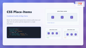
CSS Place-Items: Master Combined Justify and Align Items in One Property
The CSS place-items property is a powerful shorthand that combines justify-items and align-items into a single declaration. This property revolutionizes...
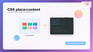
CSS Place-Content: Complete Guide to Combined Justify and Align Content Properties
The place-content property in CSS is a powerful shorthand that combines both justify-content and align-content properties into a single declaration....
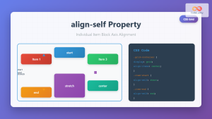
CSS Align-Self: Master Individual Grid Item Block Axis Alignment
The CSS align-self property provides granular control over individual grid items' alignment along the block axis (vertical direction in horizontal...
CSS Style alignItems Property: CSS Align Items
Understanding the CSS align-items Property The align-items property in CSS is a powerful tool that defines how items are aligned...
CSS align-self Property: Control Individual Flexbox/Grid Item Alignment
CSS align-self Property: Mastering Individual Item Alignment in Flexbox and Grid The CSS align-self property is a powerful tool for...

CSS Align-Items: Master Cross-Axis Alignment in Flexbox and Grid
The CSS align-items property is a fundamental tool for controlling cross-axis alignment in both flexbox and CSS Grid layouts. Understanding...

CSS Align-Content: Master Grid Container Block Axis Alignment
The CSS align-content property is a powerful tool for controlling how grid items are distributed along the block axis (typically...
CSS Align-Items: Complete Guide to Grid Item Block Axis Alignment
Understanding CSS Align-Items in Grid Context The CSS align-items property is a powerful tool for controlling how grid items align...
CSS Justify-Self: Master Individual Item Inline Axis Alignment
The justify-self property in CSS is a powerful alignment tool that allows you to control how individual items align themselves...
CSS Align-Content: Complete Guide to Cross-Axis Multi-Line Alignment
The align-content property is a powerful CSS tool that controls how multiple lines of content are distributed along the cross-axis...
CSS align-content Property: CSS Align Content
CSS align-content Property: Mastering Content Alignment in Flexbox and Grid Layouts The CSS align-content property is a powerful tool for...
CSS Justify-Items: Complete Guide to Grid Item Inline Axis Alignment
The justify-items property is a powerful CSS Grid feature that controls how grid items are aligned along the inline axis...


