
The CSS place-items property is a powerful shorthand that combines justify-items and align-items into a single declaration. This property revolutionizes how developers handle item alignment in both CSS Grid and Flexbox layouts, providing cleaner code and better maintainability.
What is CSS Place-Items?
The place-items property is a shorthand for setting both align-items (block axis) and justify-items (inline axis) properties simultaneously. It works with CSS Grid containers and affects how grid items are positioned within their grid areas.
place-items: <align-items> <justify-items>place-items: <align-items> (applies to both axes)
Browser Support and Compatibility
The place-items property enjoys excellent modern browser support:
- Chrome: 59+
- Firefox: 45+
- Safari: 11+
- Edge: 79+
Place-Items Values and Options
The place-items property accepts the same values as align-items and justify-items:
Common Values
start– Aligns items to the start of their grid areaend– Aligns items to the end of their grid areacenter– Centers items within their grid areastretch– Stretches items to fill their grid area (default)
Advanced Values
baseline– Aligns items along their baselinefirst baseline– Aligns to the first baselinelast baseline– Aligns to the last baseline
Basic Place-Items Examples
Example 1: Center Alignment
The most common use case is centering items both horizontally and vertically:
.grid-container {
  display: grid;
  grid-template-columns: repeat(3, 1fr);
  place-items: center;
  height: 200px;
}
Example 2: Start Alignment
Aligning items to the start of their grid areas:
.grid-container {
  display: grid;
  grid-template-columns: repeat(3, 1fr);
  place-items: start;
}
Example 3: End Alignment
Positioning items at the end of their grid areas:
.grid-container {
  display: grid;
  grid-template-columns: repeat(3, 1fr);
  place-items: end;
}
Two-Value Syntax
You can specify different values for each axis using the two-value syntax:
.grid-container {
  display: grid;
  grid-template-columns: repeat(3, 1fr);
  place-items: start center; /* align-items: start, justify-items: center */
}
Interactive Demo: Place-Items Values
Try different place-items values with this interactive demo:
Real-World Use Cases
Card Layout with Centered Content
Perfect for creating card layouts where content needs to be centered:
.card {
  display: grid;
  place-items: center;
  height: 150px;
  /* Other styling */
}
Icon Grid Layout
Ideal for creating consistent icon grids:
.icon-grid {
  display: grid;
  grid-template-columns: repeat(4, 1fr);
  place-items: center;
}

.icon-cell {
  display: grid;
  place-items: center;
  width: 60px;
  height: 60px;
}
Place-Items vs Individual Properties
Understanding when to use place-items versus individual properties:
Use place-items when:
- Both axes need the same alignment
- You want cleaner, more concise code
- Working with symmetric layouts
Use individual properties when:
- Different alignment is needed for each axis
- You need to override just one axis
- Working with complex responsive layouts
Common Pitfalls and Solutions
1. Stretch Behavior
By default, place-items has a value of stretch, which might not be what you expect:
Default (stretch):
With center:
/* Items stretch to fill grid area (default) */
.grid { place-items: stretch; }

/* Items maintain their natural size */
.grid { place-items: center; }
2. Overflow Issues
Be careful with content that might overflow its grid area:
Solution: Use minmax() or ensure content fits within grid areas.
Advanced Techniques
Responsive Place-Items
Combine place-items with media queries for responsive layouts:
.responsive-grid {
  display: grid;
  grid-template-columns: repeat(auto-fit, minmax(200px, 1fr));
  place-items: stretch; /* Default for mobile */
}

@media (min-width: 768px) {
  .responsive-grid {
    place-items: center; /* Center on larger screens */
  }
}
Place-Items with Grid Areas
Using place-items with named grid areas:
.layout {
  display: grid;
  grid-template-areas:
    "header header"
    "sidebar main"
    "footer footer";
  place-items: center; /* Centers content in each area */
}
Performance Considerations
The place-items property has minimal performance impact compared to individual properties. However, consider these optimization tips:
- Avoid frequent changes: Changing
place-itemstriggers layout recalculation - Use CSS transforms: For animations, prefer
transformover changingplace-items - Batch updates: When changing multiple grid properties, do it in a single operation
Accessibility Best Practices
When using place-items, keep accessibility in mind:
- Logical tab order: Ensure visual layout doesn’t conflict with DOM order
- Focus indicators: Make sure focused elements remain visible
- Screen readers: Test that content flows logically for screen reader users
- Reduced motion: Respect users’ motion preferences when animating layouts
Browser Testing and Fallbacks
For older browser support, provide fallbacks:
.grid-container {
  display: grid;

  /* Fallback for older browsers */
  align-items: center;
  justify-items: center;

  /* Modern browsers */
  place-items: center;
}
Conclusion
The CSS place-items property is a powerful tool that simplifies grid and flexbox layouts by combining two essential alignment properties. It reduces code verbosity, improves maintainability, and provides precise control over item positioning within grid containers.
Key takeaways:
place-itemscombinesalign-itemsandjustify-items- Works with both single and two-value syntax
- Excellent browser support in modern browsers
- Perfect for centering content and creating consistent layouts
- Consider accessibility and performance when implementing
Master place-items to write cleaner, more efficient CSS and create beautifully aligned layouts with minimal code. Whether you’re building card grids, icon layouts, or complex web applications, this property will become an essential part of your CSS toolkit.
Related Posts
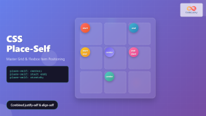
CSS Place-Self: Master Grid and Flexbox Item Positioning with One Property
The CSS place-self property is a powerful shorthand that combines justify-self and align-self into a single declaration, making it easier...
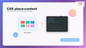
CSS Place-Content: Complete Guide to Combined Justify and Align Content Properties
The place-content property in CSS is a powerful shorthand that combines both justify-content and align-content properties into a single declaration....
CSS Style alignItems Property: CSS Align Items
Understanding the CSS align-items Property The align-items property in CSS is a powerful tool that defines how items are aligned...
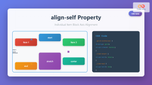
CSS Align-Self: Master Individual Grid Item Block Axis Alignment
The CSS align-self property provides granular control over individual grid items' alignment along the block axis (vertical direction in horizontal...
CSS Justify-Self: Master Individual Item Inline Axis Alignment
The justify-self property in CSS is a powerful alignment tool that allows you to control how individual items align themselves...

CSS Align-Items: Master Cross-Axis Alignment in Flexbox and Grid
The CSS align-items property is a fundamental tool for controlling cross-axis alignment in both flexbox and CSS Grid layouts. Understanding...
CSS Align-Items: Complete Guide to Grid Item Block Axis Alignment
Understanding CSS Align-Items in Grid Context The CSS align-items property is a powerful tool for controlling how grid items align...
CSS Justify-Items: Complete Guide to Grid Item Inline Axis Alignment
The justify-items property is a powerful CSS Grid feature that controls how grid items are aligned along the inline axis...
CSS align-self Property: Control Individual Flexbox/Grid Item Alignment
CSS align-self Property: Mastering Individual Item Alignment in Flexbox and Grid The CSS align-self property is a powerful tool for...

CSS Align-Content: Master Grid Container Block Axis Alignment
The CSS align-content property is a powerful tool for controlling how grid items are distributed along the block axis (typically...
CSS Justify-Content: Master Grid Container Inline Axis Alignment with Examples
The justify-content property is a powerful CSS tool for controlling how grid items are aligned along the inline axis (horizontal...
CSS align-content Property: CSS Align Content
CSS align-content Property: Mastering Content Alignment in Flexbox and Grid Layouts The CSS align-content property is a powerful tool for...


