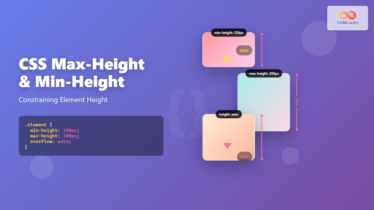
Understanding how to control element height is crucial for creating responsive and visually appealing web layouts. CSS provides powerful properties like max-height and min-height that allow developers to set boundaries for element dimensions while maintaining flexibility in design.
What Are Max-Height and Min-Height Properties?
The max-height and min-height properties in CSS define the maximum and minimum height constraints for elements. These properties work alongside the regular height property to create flexible layouts that adapt to different content sizes and screen dimensions.
- max-height: Sets the maximum height an element can reach
- min-height: Sets the minimum height an element must maintain
CSS Max-Height Property
The max-height property prevents an element from exceeding a specified height, even if the content would naturally make it taller. This is particularly useful for creating consistent layouts and preventing elements from breaking the design.
Max-Height Syntax
selector {
  max-height: value;
}
The max-height property accepts various value types:
- Length values: px, em, rem, vh, etc.
- Percentage values: Relative to the parent element’s height
- Keywords: none, max-content, min-content, fit-content
Max-Height Example
Example: Card with Max-Height
Card without Max-Height
This card has no max-height constraint, so it grows naturally with its content.
.card-constrained {
  max-height: 150px;
  overflow: hidden;
  border: 2px solid #007bff;
  padding: 15px;
  width: 200px;
}

.card-natural {
  border: 2px solid #28a745;
  padding: 15px;
  width: 200px;
}
CSS Min-Height Property
The min-height property ensures an element maintains a minimum height, even if the content is smaller. This is essential for creating consistent layouts and ensuring elements don’t become too small on different screen sizes.
Min-Height Syntax
selector {
  min-height: value;
}
Min-Height Example
Example: Cards with Min-Height
Short Content
Brief text.
No Min-Height
Brief text.
.card-min-height {
  min-height: 150px;
  border: 2px solid #dc3545;
  padding: 15px;
  width: 200px;
}

.card-no-min {
  border: 2px solid #ffc107;
  padding: 15px;
  width: 200px;
}
Combining Max-Height and Min-Height
Using both properties together creates a height range that elements can occupy, providing the perfect balance between flexibility and constraint.
Interactive Example: Dynamic Content Container
Dynamic Container
This container has min-height: 100px and max-height: 200px with scroll overflow.
.dynamic-container {
  min-height: 100px;
  max-height: 200px;
  overflow-y: auto;
  border: 2px solid #6f42c1;
  padding: 20px;
}
Practical Use Cases
1. Responsive Image Containers
Creating flexible image containers that maintain aspect ratios while constraining dimensions:
.image-container {
  max-height: 200px;
  overflow: hidden;
  border-radius: 8px;
}

.image-container img {
  width: 100%;
  height: auto;
}
2. Modal and Dialog Boxes
Ensuring modals don’t exceed screen boundaries while maintaining minimum usability:
Modal Dialog
This modal has constrained height to ensure it fits within viewport boundaries while maintaining minimum usability height.
.modal {
  min-height: 150px;
  max-height: 80vh;
  overflow-y: auto;
  padding: 20px;
  background: white;
  border-radius: 8px;
  box-shadow: 0 4px 12px rgba(0,0,0,0.15);
}
3. Card Layouts
Creating uniform card grids where cards maintain consistent heights:
Card 1
Short content
Card 2
Longer content that spans multiple lines to demonstrate consistent card heights
Card 3
Medium length content
.card-grid {
  display: grid;
  grid-template-columns: repeat(auto-fit, minmax(200px, 1fr));
  gap: 20px;
}

.card {
  min-height: 150px;
  padding: 20px;
  border: 1px solid #ddd;
  border-radius: 8px;
  background: white;
}
Browser Support and Compatibility
Both max-height and min-height properties have excellent browser support across all modern browsers:
- Chrome 1+
- Firefox 1+
- Safari 1.3+
- Internet Explorer 7+
- Edge (all versions)
Common Pitfalls and Solutions
1. Overflow Issues
When content exceeds max-height, consider how overflow should be handled:
/* Hide overflow */
.container {
  max-height: 200px;
  overflow: hidden;
}

/* Show scrollbar */
.container {
  max-height: 200px;
  overflow-y: auto;
}

/* Clip with fade effect */
.container {
  max-height: 200px;
  overflow: hidden;
  position: relative;
}

.container::after {
  content: '';
  position: absolute;
  bottom: 0;
  left: 0;
  right: 0;
  height: 20px;
  background: linear-gradient(transparent, white);
}
2. Percentage Values
When using percentage values, ensure the parent element has a defined height:
/* Parent must have defined height */
.parent {
  height: 400px;
}

.child {
  min-height: 50%; /* 200px */
  max-height: 75%; /* 300px */
}
3. Flexbox Interactions
In flexbox layouts, min-height and max-height interact with flex properties:
.flex-container {
  display: flex;
  flex-direction: column;
  height: 500px;
}

.flex-item {
  flex: 1;
  min-height: 100px;
  max-height: 200px;
}
Advanced Techniques
CSS Grid and Height Constraints
Combining height constraints with CSS Grid for complex layouts:
.grid-layout {
  display: grid;
  grid-template-rows: auto 1fr auto;
  height: 100vh;
}

.main-content {
  min-height: 200px;
  overflow-y: auto;
  padding: 20px;
}
Viewport-Based Height Constraints
Using viewport units for responsive height constraints:
/* Responsive hero section */
.hero {
  min-height: 50vh;
  max-height: 100vh;
  display: flex;
  align-items: center;
  justify-content: center;
}

/* Mobile-first approach */
.sidebar {
  min-height: 200px;
  max-height: 70vh;
}

@media (min-width: 768px) {
  .sidebar {
    min-height: 300px;
    max-height: 80vh;
  }
}
Performance Considerations
Height constraints can impact rendering performance, especially with dynamic content:
- Avoid frequent height changes: Minimize JavaScript-driven height modifications
- Use CSS transitions: Smooth height changes with CSS transitions instead of JavaScript
- Consider content-visibility: Use CSS content-visibility for off-screen content
/* Smooth height transitions */
.expandable {
  max-height: 0;
  overflow: hidden;
  transition: max-height 0.3s ease-out;
}

.expandable.expanded {
  max-height: 500px;
}
Accessibility Considerations
When implementing height constraints, consider accessibility implications:
- Ensure content remains accessible: Don’t hide critical content with overflow: hidden
- Provide alternative navigation: Include keyboard navigation for scrollable areas
- Respect user preferences: Consider prefers-reduced-motion for animations
/* Respect user motion preferences */
@media (prefers-reduced-motion: reduce) {
  .height-animated {
    transition: none;
  }
}

/* Ensure focusable elements remain visible */
.scrollable-container:focus-within {
  outline: 2px solid #007bff;
  outline-offset: 2px;
}
Conclusion
CSS max-height and min-height properties are essential tools for creating flexible, responsive layouts. They provide precise control over element dimensions while maintaining the adaptability needed for modern web design. By understanding their behavior, combining them effectively, and considering performance and accessibility implications, developers can create robust layouts that work across all devices and user scenarios.
Remember to test your implementations across different browsers and devices, and always consider the user experience when applying height constraints. These properties, when used thoughtfully, can significantly enhance both the visual appeal and functionality of your web applications.

