
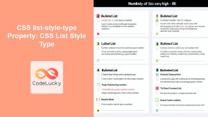
The list-style-type property in CSS is a powerful tool that allows developers to customize the appearance of list markers in ordered and unordered lists. Whether you want to change bullet points, numbering systems, or remove markers entirely, this property provides extensive control over list styling.
Understanding CSS List-Style-Type Property
The list-style-type property defines the type of marker displayed for list items. It applies to elements with display: list-item, which includes <li>, <ol>, and <ul> elements by default.
Basic Syntax
list-style-type: value;The property accepts various values including keywords, strings, and special functions that determine how list markers appear.
Unordered List Markers
For unordered lists (<ul>), you can choose from several built-in marker styles:
Example: Unordered List Markers
Disc (default):
- First item
- Second item
- Third item
Circle:
- First item
- Second item
- Third item
Square:
- First item
- Second item
- Third item
None:
- First item
- Second item
- Third item
/* CSS */
.disc-list { list-style-type: disc; }
.circle-list { list-style-type: circle; }
.square-list { list-style-type: square; }
.none-list { list-style-type: none; }
Ordered List Numbering Systems
Ordered lists (<ol>) offer numerous numbering and lettering systems:
Example: Numeric and Alphabetic Systems
Decimal:
- Item one
- Item two
- Item three
Leading Zero:
- Item one
- Item two
- Item three
Upper Alpha:
- Item one
- Item two
- Item three
Lower Alpha:
- Item one
- Item two
- Item three
Upper Roman:
- Item one
- Item two
- Item three
Lower Roman:
- Item one
- Item two
- Item three
/* CSS */
.decimal-list { list-style-type: decimal; }
.decimal-zero-list { list-style-type: decimal-leading-zero; }
.upper-alpha-list { list-style-type: upper-alpha; }
.lower-alpha-list { list-style-type: lower-alpha; }
.upper-roman-list { list-style-type: upper-roman; }
.lower-roman-list { list-style-type: lower-roman; }
International and Cultural Numbering Systems
CSS supports various international numbering systems for global web development:
Example: International Numbering Systems
CJK Decimal:
- First item
- Second item
- Third item
Hiragana:
- First item
- Second item
- Third item
Katakana:
- First item
- Second item
- Third item
Hebrew:
- First item
- Second item
- Third item
Armenian:
- First item
- Second item
- Third item
Georgian:
- First item
- Second item
- Third item
/* CSS */
.cjk-decimal-list { list-style-type: cjk-decimal; }
.hiragana-list { list-style-type: hiragana; }
.katakana-list { list-style-type: katakana; }
.hebrew-list { list-style-type: hebrew; }
.armenian-list { list-style-type: armenian; }
.georgian-list { list-style-type: georgian; }
Custom String Markers
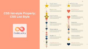
You can use custom strings as list markers by providing a string value:
Example: Custom String Markers
Arrow Markers:
- Navigate here
- Go to next section
- Follow this path
Star Markers:
- Featured item
- Important point
- Highlighted content
Checkmark Markers:
- Completed task
- Verified item
- Approved content
Emoji Markers:
- Target audience
- Focus area
- Key objective
/* CSS */
.arrow-list { list-style-type: "→ "; }
.star-list { list-style-type: "★ "; }
.checkmark-list { list-style-type: "✓ "; }
.emoji-list { list-style-type: "🎯 "; }
Advanced Customization with Pseudo-Elements
For maximum control over list styling, combine list-style-type: none with CSS pseudo-elements:
Example: Custom Styled Markers
Gradient Circle Bullets:
- Custom styled bullet
- Gradient background
- Perfectly rounded
Circular Number Badges:
- Step one process
- Step two action
- Step three completion
/* Custom Bullets */
.custom-bullets {
  list-style-type: none;
  padding-left: 0;
}

.custom-bullets li {
  position: relative;
  padding-left: 25px;
  margin-bottom: 8px;
}

.custom-bullets li::before {
  content: "";
  position: absolute;
  left: 0;
  top: 8px;
  width: 12px;
  height: 12px;
  background: linear-gradient(45deg, #ff6b6b, #4ecdc4);
  border-radius: 50%;
}

/* Custom Numbers */
.custom-numbers {
  list-style-type: none;
  counter-reset: custom-counter;
  padding-left: 0;
}

.custom-numbers li {
  position: relative;
  padding-left: 40px;
  margin-bottom: 10px;
  counter-increment: custom-counter;
}

.custom-numbers li::before {
  content: counter(custom-counter);
  position: absolute;
  left: 0;
  top: 0;
  width: 25px;
  height: 25px;
  background: #3498db;
  color: white;
  border-radius: 50%;
  display: flex;
  align-items: center;
  justify-content: center;
  font-weight: bold;
  font-size: 12px;
}
Interactive Demo: List Style Explorer
Try Different List Styles
Current Style: disc
- First list item
- Second list item
- Third list item
- Fourth list item
Click the buttons above to see different list-style-type values in action!
Best Practices and Accessibility
When customizing list styles, consider these important guidelines:
Accessibility Considerations
- Maintain semantic meaning: Don’t use
list-style-type: nonewithout providing alternative visual cues - Ensure sufficient contrast: Custom markers should meet WCAG contrast requirements
- Consider screen readers: Some custom markers may not be announced by assistive technologies
- Test with different font sizes: Ensure markers scale properly with text size changes
Performance Tips
- Use built-in values when possible: Browser-native list styles perform better than custom pseudo-elements
- Avoid complex custom markers: Simple shapes and symbols load faster than intricate designs
- Consider mobile devices: Ensure custom markers display correctly on various screen sizes
Browser Support and Fallbacks
The list-style-type property has excellent browser support across all modern browsers. However, some specific values may have limited support:
Browser Support Notes
- Basic values (disc, circle, square, decimal, etc.): Supported in all browsers
- String values: Supported in modern browsers (IE 11+)
- International numbering systems: Support varies by browser and system fonts
- CSS counters: Well supported but may need vendor prefixes for older browsers
/* Fallback example */
.international-list {
  list-style-type: decimal; /* Fallback */
  list-style-type: cjk-decimal; /* Preferred */
}
Common Use Cases and Examples
Here are practical scenarios where custom list styling enhances user experience:
Real-World Applications
FAQ Section:
- What is the default list-style-type for unordered lists?
- How can I create custom bullet points?
- Are international numbering systems widely supported?
Step-by-Step Process:
- Plan your list structure and determine the appropriate marker style
- Apply the list-style-type property with your chosen value
- Test across different browsers and devices for consistency
/* FAQ Styling */
.faq-list {
  list-style-type: none;
  counter-reset: faq-counter;
}

.faq-list li {
  counter-increment: faq-counter;
  position: relative;
  padding-left: 60px;
}

.faq-list li::before {
  content: "Q" counter(faq-counter);
  position: absolute;
  left: 15px;
  background: #007bff;
  color: white;
  width: 30px;
  height: 30px;
  border-radius: 50%;
  display: flex;
  align-items: center;
  justify-content: center;
}
Conclusion
The CSS list-style-type property offers extensive options for customizing list markers, from simple built-in styles to complex custom designs using pseudo-elements and counters. Understanding these techniques allows you to create visually appealing and accessible lists that enhance your website’s user experience.
Remember to balance creativity with usability, ensuring your custom list styles maintain semantic meaning and remain accessible to all users. With the examples and techniques covered in this guide, you’re well-equipped to implement effective list styling in your web projects.
Whether you’re building a simple blog, an e-commerce site, or a complex web application, mastering list styling will help you create more polished and professional interfaces that engage your users effectively.
Related Posts
CSS list-style-type Property: CSS List Style Type
CSS list-style-type Property: A Comprehensive Guide The list-style-type property in CSS allows you to control the appearance of the markers...
CSS list-style Property: CSS List Style
Understanding the CSS list-style Property The list-style property in CSS is a shorthand property used to set the appearance of...
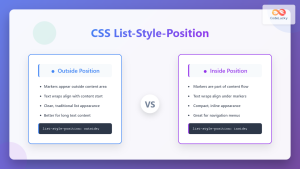
CSS List-Style-Position: Inside vs Outside List Marker Position
The list-style-position property in CSS determines where list markers (bullets, numbers, or custom markers) are positioned relative to the list...
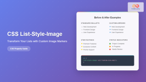
CSS List-Style-Image: Complete Guide to Custom List Markers with Images
The CSS list-style-image property allows you to replace the default bullet points or numbers in HTML lists with custom images....
CSS list-style-position Property: CSS List Style Position
CSS list-style-position Property: Controlling List Marker Placement The list-style-position property in CSS determines the position of the list marker (like...
CSS list-style-image Property: CSS List Style Image
CSS list-style-image Property: Styling Lists with Images The list-style-image property in CSS allows you to replace the standard list markers...
HTML Ol type Property: Ordered List Type
HTML <ol> type Property: Ordered List Type Explained The type attribute of the HTML <ol> (ordered list) element specifies the...
HTML List Item: The <li> Tag
HTML <li> Tag The <li> tag represents a list item. It is used to define individual items within an ordered...
HTML Unordered Lists: The `<ul>` Tag Explained
HTML <ul> Tag The <ul> tag in HTML defines an unordered list. An unordered list is a collection of items...
HTML Lists: Mastering Ordered, Unordered, and Description Lists
Introduction Lists are fundamental to organizing information on the web. Whether you're creating a navigation menu, displaying steps in a...
CSS Attribute Selectors: Master Targeting Elements by Attribute Values
What Are CSS Attribute Selectors? CSS attribute selectors allow you to target HTML elements based on their attributes and attribute...
HTML li value Property: List Item Value
HTML li value Property: Controlling List Item Numbering The value attribute of the HTML <li> element allows you to specify...


