
The grid-template-rows property is a fundamental building block of CSS Grid Layout that allows you to define the size of row tracks in your grid container. This powerful property gives you precise control over the height of each row, enabling you to create flexible and responsive layouts with ease.
Understanding CSS Grid-Template-Rows
The grid-template-rows property specifies the track sizes for the rows in a grid container. Each value in the property corresponds to a row track, defining its height. This property works in conjunction with grid-template-columns to create a complete grid layout structure.
Basic Syntax
.grid-container {
  display: grid;
  grid-template-rows: <track-size> <track-size> ...;
}
Track Size Values and Units
The grid-template-rows property accepts various types of values, each serving different layout purposes:
Fixed Units (px, em, rem)
Fixed units provide precise control over row heights, making them ideal for headers, footers, or any content with known dimensions.
Example: Fixed Row Heights
.grid-container {
  display: grid;
  grid-template-rows: 60px 200px 40px;
  grid-template-columns: 1fr;
  gap: 10px;
}
Flexible Units (fr)
The fr unit represents a fraction of the available space in the grid container. It’s perfect for creating responsive layouts that adapt to different screen sizes.
Example: Flexible Row Heights
.grid-container {
  display: grid;
  grid-template-rows: 1fr 2fr 1fr;
  height: 300px;
  gap: 10px;
}
Auto Keyword
The auto keyword sizes tracks based on their content, making it ideal for rows with varying content heights.
Example: Auto-Sized Rows
.grid-container {
  display: grid;
  grid-template-rows: auto auto auto;
  gap: 10px;
}
Advanced Sizing Functions
Minmax() Function
The minmax() function defines a size range with minimum and maximum values, providing flexibility while maintaining constraints.
Example: Minmax Row Sizing
.grid-container {
  display: grid;
  grid-template-rows: minmax(100px, auto) minmax(50px, 1fr) 60px;
  height: 350px;
  gap: 10px;
}
Repeat() Function
The repeat() function allows you to repeat track sizing patterns, reducing code repetition and improving maintainability.
Example: Repeating Row Patterns
.grid-container {
  display: grid;
  grid-template-rows: repeat(4, 80px);
  gap: 10px;
}
Practical Layout Examples
Holy Grail Layout
Create a classic web layout with header, main content, and footer using grid-template-rows.
Example: Complete Holy Grail Layout
.holy-grail {
  display: grid;
  grid-template-rows: auto 1fr auto;
  grid-template-columns: 200px 1fr 150px;
  height: 100vh;
  gap: 10px;
}

.header, .footer {
  grid-column: 1 / -1;
}
Card Grid Layout
Design a responsive card grid where each row can accommodate different card heights.
Example: Responsive Card Grid
Card 1
Short description
Card 2
This is a longer description that will make the card taller and demonstrate how minmax works with content.
Card 3
Medium length content
Card 4
Another card
Card 5
This card has even more content to show how the grid adapts to different content heights automatically.
Card 6
Final card
.card-grid {
  display: grid;
  grid-template-rows: repeat(2, minmax(150px, auto));
  grid-template-columns: repeat(3, 1fr);
  gap: 15px;
}
Interactive Example
Try adjusting the row template values in this interactive example to see how different settings affect the layout:
Interactive Grid Template Rows
.interactive-grid {
  display: grid;
  grid-template-rows: 100px 200px 100px;
  height: 400px;
  gap: 10px;
}
Browser Support and Fallbacks
CSS Grid has excellent browser support across modern browsers. However, for older browsers, consider providing fallbacks using flexbox or float-based layouts.
@supports to provide progressive enhancement:
@supports (display: grid) {
  .container {
    display: grid;
    grid-template-rows: auto 1fr auto;
  }
}
Common Pitfalls and Solutions
Overflow Issues
When using fixed heights, content might overflow. Use minmax() or auto to prevent this:
/* Instead of */
grid-template-rows: 100px 100px 100px;

/* Use */
grid-template-rows: minmax(100px, auto) minmax(100px, auto) minmax(100px, auto);
Responsive Considerations
Combine grid-template-rows with media queries for responsive designs:
@media (max-width: 768px) {
  .grid-container {
    grid-template-rows: auto auto auto;
  }
}

@media (min-width: 769px) {
  .grid-container {
    grid-template-rows: 100px 1fr 80px;
  }
}
Performance Considerations
CSS Grid is highly optimized, but keep these performance tips in mind:
- Avoid excessive use of
autosizing in large grids as it requires content measurement - Use
frunits for better performance than percentage-based sizing - Consider using
subgridfor nested grid layouts (where supported)
Conclusion
The grid-template-rows property is essential for creating flexible, responsive layouts with CSS Grid. By understanding the different sizing options—from fixed units to flexible fractions and advanced functions like minmax() and repeat()—you can build sophisticated layouts that adapt to various content and screen sizes.
Master these concepts through practice, and you’ll find CSS Grid becomes an indispensable tool for modern web development. Remember to test your layouts across different devices and browsers to ensure consistent behavior and optimal user experience.
Related Posts
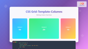
CSS Grid-Template-Columns: Complete Guide to Defining Column Track Sizes
The grid-template-columns property is one of the most fundamental aspects of CSS Grid Layout, allowing developers to define the size...

CSS Grid Auto Rows: Master Implicit Row Track Sizing for Dynamic Layouts
CSS Grid revolutionized web layout design, offering unprecedented control over both rows and columns. While you explicitly define grid tracks...
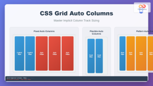
CSS Grid Auto Columns: Master Implicit Column Track Sizing for Dynamic Layouts
CSS Grid Layout revolutionized web design by providing a powerful two-dimensional layout system. While explicit grid tracks defined with grid-template-columns...

CSS Align-Content: Master Grid Container Block Axis Alignment
The CSS align-content property is a powerful tool for controlling how grid items are distributed along the block axis (typically...

CSS Grid Functions: Complete Guide to repeat(), minmax(), and fit-content()
CSS Grid has revolutionized web layout design, offering developers unprecedented control over two-dimensional layouts. Among its most powerful features are...
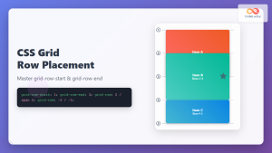
CSS Grid-Row-Start and Grid-Row-End: Complete Guide to Item Row Placement
Understanding CSS Grid Row Placement CSS Grid provides powerful tools for controlling the placement of grid items within your layout....
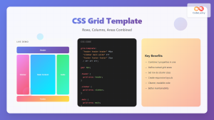
CSS Grid Template Shorthand: Master Rows, Columns, and Areas in One Property
The CSS grid-template shorthand property is a powerful tool that allows you to define your grid's structure in a single...

CSS Grid-Column-Gap and Grid-Row-Gap: Complete Guide to Track Spacing
CSS Grid has revolutionized how we create layouts on the web, and one of its most powerful features is the...
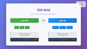
CSS Grid auto-fit vs auto-fill: Master Dynamic Responsive Layouts
CSS Grid's auto-fit and auto-fill are two powerful keywords that enable dynamic track creation in grid layouts. While they might...

CSS Subgrid: Complete Guide to Inheriting Parent Grid Lines
CSS Subgrid is a powerful feature that extends CSS Grid Layout by allowing child grids to inherit the track sizing...

CSS Grid Template Areas: Master Named Grid Layouts with Visual Examples
CSS Grid revolutionized web layout design, and one of its most powerful features is grid-template-areas. This property allows you to...

CSS Grid-Area: Master Item Placement in Named Grid Areas
What is CSS Grid-Area? The grid-area property in CSS is a powerful shorthand that allows you to place grid items...


