
The grid-template-columns property is one of the most fundamental aspects of CSS Grid Layout, allowing developers to define the size and structure of column tracks in a grid container. This powerful property provides precise control over how content is distributed horizontally across your grid layout.
Understanding Grid-Template-Columns Basics
The grid-template-columns property defines the line names and track sizing functions of the grid columns. It creates an explicit grid by specifying the size of each column track, giving you complete control over your grid’s horizontal structure.
Basic Syntax
.grid-container {
  display: grid;
  grid-template-columns: <track-size> ... | <line-name> <track-size> ...;
}
Track Size Units and Values
CSS Grid offers multiple units for defining column sizes, each serving different purposes and providing various levels of flexibility.
Fixed Units (px, em, rem)
Fixed units create columns with absolute sizes that don’t change based on available space. These are perfect when you need precise control over column dimensions.
Example: Fixed Pixel Columns
.fixed-grid {
  display: grid;
  grid-template-columns: 200px 150px 100px;
  gap: 15px;
}
Percentage Units
Percentage units create responsive columns that scale with the container width, making them ideal for fluid layouts that adapt to different screen sizes.
Example: Percentage-Based Columns
.percentage-grid {
  display: grid;
  grid-template-columns: 50% 30% 20%;
  gap: 10px;
}
Fractional Units (fr)
The fr unit represents a fraction of the available space in the grid container. It’s particularly powerful for creating flexible, responsive layouts that distribute space proportionally.
Example: Fractional Units
.fractional-grid {
  display: grid;
  grid-template-columns: 1fr 2fr 1fr;
  gap: 15px;
}
The middle column takes twice as much space as the outer columns.
Advanced Sizing Functions
The minmax() Function
The minmax() function defines a size range for tracks, specifying minimum and maximum values. This creates responsive columns that adapt within defined constraints.
Example: Using minmax() for Responsive Columns
.minmax-grid {
  display: grid;
  grid-template-columns: minmax(200px, 1fr) minmax(150px, 2fr) minmax(100px, 1fr);
  gap: 15px;
}
The repeat() Function
The repeat() function allows you to repeat track patterns, making it easier to create grids with multiple similar columns without writing repetitive code.
Example: Creating Equal Columns with repeat()
.repeat-grid {
display: grid;
grid-template-columns: repeat(4, 1fr);
gap: 15px;
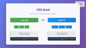
}Auto-Fit and Auto-Fill
These special keywords work with repeat() to create responsive grids that automatically adjust the number of columns based on available space.
Example: Auto-Fit Responsive Grid
.auto-fit-grid {
  display: grid;
  grid-template-columns: repeat(auto-fit, minmax(150px, 1fr));
  gap: 15px;
}
Columns automatically adjust based on container width.
Practical Real-World Examples
Card Layout with Mixed Column Sizes
This example demonstrates a practical card layout using different column sizing techniques combined for optimal responsive behavior.
Featured Article
This main content area takes up twice the space of the sidebar items, creating a clear visual hierarchy.
Sidebar 1
Related content or widgets can be placed in these smaller columns.
Sidebar 2
Additional content with equal width to maintain balance.
.card-layout {
  display: grid;
  grid-template-columns: 2fr 1fr 1fr;
  gap: 20px;
}

.featured-card {
  background: linear-gradient(135deg, #667eea 0%, #764ba2 100%);
  padding: 25px;
  border-radius: 8px;
}

.sidebar-card {
  padding: 25px;
  border-radius: 8px;
}
E-commerce Product Grid
An auto-responsive product grid that adapts to different screen sizes while maintaining consistent item sizing.
.product-grid {
  display: grid;
  grid-template-columns: repeat(auto-fill, minmax(200px, 1fr));
  gap: 20px;
}

.product-card {
  background: white;
  border: 1px solid #e2e8f0;
  border-radius: 8px;
  overflow: hidden;
  box-shadow: 0 2px 4px rgba(0,0,0,0.1);
}
Responsive Design Strategies
Mobile-First Approach
Implementing responsive grid layouts that work seamlessly across all device sizes using media queries and flexible column definitions.
/* Mobile First - Single Column */
.responsive-grid {
  display: grid;
  grid-template-columns: 1fr;
  gap: 15px;
}

/* Tablet - Two Columns */
@media (min-width: 768px) {
  .responsive-grid {
    grid-template-columns: repeat(2, 1fr);
    gap: 20px;
  }
}

/* Desktop - Three Columns */
@media (min-width: 1024px) {
  .responsive-grid {
    grid-template-columns: repeat(3, 1fr);
    gap: 25px;
  }
}

/* Large Desktop - Four Columns */
@media (min-width: 1280px) {
  .responsive-grid {
    grid-template-columns: repeat(4, 1fr);
    gap: 30px;
  }
}
Container Query Approach
Using modern container queries for more precise responsive control based on the grid container’s size rather than viewport size.
.container-responsive {
  container-type: inline-size;
  display: grid;
  grid-template-columns: repeat(auto-fit, minmax(250px, 1fr));
  gap: 20px;
}

@container (max-width: 600px) {
  .container-responsive {
    grid-template-columns: 1fr;
  }
}

@container (min-width: 900px) {
  .container-responsive {
    grid-template-columns: repeat(3, 1fr);
  }
}
Common Patterns and Best Practices
Named Grid Lines
Using named grid lines can make your grid layouts more maintainable and semantic, especially in complex layouts.
.named-grid {
  display: grid;
  grid-template-columns:
    [sidebar-start] 250px
    [sidebar-end main-start] 1fr
    [main-end aside-start] 200px
    [aside-end];
  gap: 20px;
}

.sidebar {
  grid-column: sidebar-start / sidebar-end;
}

.main-content {
  grid-column: main-start / main-end;
}

.aside {
  grid-column: aside-start / aside-end;
}
Performance Considerations
When working with grid-template-columns, consider these performance optimization strategies:
- Use fr units instead of percentages when possible for better performance
- Minimize complex calculations in minmax() functions
- Avoid excessive nesting of grid containers
- Use auto-fit/auto-fill judiciously with appropriate minmax() constraints
- Test on low-end devices to ensure smooth performance
Browser Support and Fallbacks
CSS Grid enjoys excellent modern browser support, but it’s important to consider fallback strategies for older browsers when necessary.
/* Fallback for older browsers */
.grid-container {
  display: flex; /* Flexbox fallback */
  flex-wrap: wrap;
}

.grid-item {
  flex: 1 1 300px; /* Flexible base width */
}

/* Modern grid enhancement */
@supports (display: grid) {
  .grid-container {
    display: grid;
    grid-template-columns: repeat(auto-fit, minmax(300px, 1fr));
    gap: 20px;
  }

  .grid-item {
    flex: none; /* Reset flex properties */
  }
}
Debugging Grid Layouts
Modern browser developer tools provide excellent support for debugging CSS Grid layouts. Here are some helpful techniques:
- Use Firefox Grid Inspector for visual grid line overlay
- Chrome DevTools Grid overlay shows grid tracks and gaps
- Add temporary borders to grid items during development
- Use CSS Grid debugging tools and online generators
/* Debug styles for development */
.debug-grid {
  grid-template-columns: repeat(auto-fit, minmax(200px, 1fr));
  gap: 1px; /* Minimal gap to see grid structure */
  background: #ff0000; /* Red background shows through gaps */
}

.debug-grid > * {
  background: #ffffff; /* White background for items */
  border: 1px solid #000000; /* Black border for visibility */
}
Conclusion
The grid-template-columns property is a powerful tool for creating flexible, responsive layouts. By mastering its various syntax options, from basic fixed units to advanced functions like repeat(), minmax(), and auto-fit, you can create sophisticated grid layouts that adapt beautifully to different screen sizes and content requirements.
Remember to always test your grid layouts across different devices and browsers, utilize browser developer tools for debugging, and consider performance implications when designing complex grid systems. With these techniques and best practices, you’ll be well-equipped to create modern, responsive web layouts using CSS Grid.
Related Posts
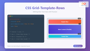
CSS Grid-Template-Rows: Master Row Track Sizing with Complete Examples
The grid-template-rows property is a fundamental building block of CSS Grid Layout that allows you to define the size of...
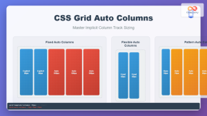
CSS Grid Auto Columns: Master Implicit Column Track Sizing for Dynamic Layouts
CSS Grid Layout revolutionized web design by providing a powerful two-dimensional layout system. While explicit grid tracks defined with grid-template-columns...
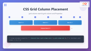
CSS Grid-Column-Start and Grid-Column-End: Complete Guide to Precise Item Column Placement
CSS Grid revolutionized web layout by providing precise control over both rows and columns. Among its most powerful features are...
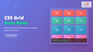
CSS Grid Auto Rows: Master Implicit Row Track Sizing for Dynamic Layouts
CSS Grid revolutionized web layout design, offering unprecedented control over both rows and columns. While you explicitly define grid tracks...
CSS Grid Functions: Complete Guide to repeat(), minmax(), and fit-content()
CSS Grid has revolutionized web layout design, offering developers unprecedented control over two-dimensional layouts. Among its most powerful features are...
CSS Subgrid: Complete Guide to Inheriting Parent Grid Lines
CSS Subgrid is a powerful feature that extends CSS Grid Layout by allowing child grids to inherit the track sizing...

CSS Grid-Column-Gap and Grid-Row-Gap: Complete Guide to Track Spacing
CSS Grid has revolutionized how we create layouts on the web, and one of its most powerful features is the...
CSS Grid-Row-Start and Grid-Row-End: Complete Guide to Item Row Placement
Understanding CSS Grid Row Placement CSS Grid provides powerful tools for controlling the placement of grid items within your layout....

CSS Align-Content: Master Grid Container Block Axis Alignment
The CSS align-content property is a powerful tool for controlling how grid items are distributed along the block axis (typically...
CSS Grid Template Areas: Master Named Grid Layouts with Visual Examples
CSS Grid revolutionized web layout design, and one of its most powerful features is grid-template-areas. This property allows you to...
CSS Grid auto-fit vs auto-fill: Master Dynamic Responsive Layouts
CSS Grid's auto-fit and auto-fill are two powerful keywords that enable dynamic track creation in grid layouts. While they might...

CSS Style grid Property: CSS Grid Layout
CSS grid Property: Mastering CSS Grid Layout The CSS grid property is a powerful tool for creating two-dimensional layouts on...


