CSS Grid has revolutionized how we create layouts on the web, and one of its most useful features is the ability to control spacing between grid items using the grid-gap property. This comprehensive guide will teach you everything you need to know about CSS Grid-Gap shorthand, including how to combine row and column gaps effectively.
What is CSS Grid-Gap?
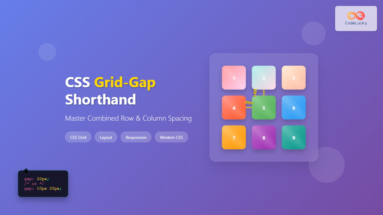
The grid-gap property (also known as gap in modern CSS) is a shorthand that allows you to set both row and column gaps in a CSS Grid container simultaneously. It controls the spacing between grid items, making your layouts more visually appealing and organized.
grid-gap is still supported, the modern standard is to use the gap property, which works with both CSS Grid and Flexbox.
Grid-Gap Syntax and Values
The grid-gap property accepts one or two values:
/* Single value - applies to both rows and columns */
grid-gap: 20px;
gap: 20px;

/* Two values - first for rows, second for columns */
grid-gap: 10px 20px;
gap: 10px 20px;
Accepted Value Types
- Length units: px, em, rem, vh, vw, etc.
- Percentage: Relative to the container size
- calc(): For dynamic calculations
Basic Grid-Gap Examples
Example 1: Equal Row and Column Gaps
CSS:
.grid-container-1 {
  display: grid;
  grid-template-columns: repeat(3, 1fr);
  grid-template-rows: repeat(2, 100px);
  gap: 20px;
  background-color: #e9ecef;
  padding: 20px;
}

.grid-item {
  background-color: #007bff;
  color: white;
  display: flex;
  align-items: center;
  justify-content: center;
  border-radius: 5px;
}
HTML:
<div class="grid-container-1">
  <div class="grid-item">Item 1</div>
  <div class="grid-item">Item 2</div>
  <div class="grid-item">Item 3</div>
  <div class="grid-item">Item 4</div>
  <div class="grid-item">Item 5</div>
  <div class="grid-item">Item 6</div>
</div>
Result:
Example 2: Different Row and Column Gaps
CSS:
.grid-container-2 {
  display: grid;
  grid-template-columns: repeat(3, 1fr);
  grid-template-rows: repeat(2, 100px);
  gap: 10px 30px; /* 10px for rows, 30px for columns */
  background-color: #e9ecef;
  padding: 20px;
}
Result:
Individual Gap Properties
You can also control row and column gaps separately using individual properties:
/* Individual properties */
row-gap: 15px;
column-gap: 25px;

/* Legacy properties (still supported) */
grid-row-gap: 15px;
grid-column-gap: 25px;
Advanced Grid-Gap Techniques
Using Percentage Values
CSS:
.grid-container-3 {
  display: grid;
  grid-template-columns: repeat(2, 1fr);
  grid-template-rows: repeat(2, 120px);
  gap: 2% 5%; /* Percentage-based gaps */
  background-color: #e9ecef;
  padding: 20px;
  width: 100%;
  max-width: 500px;
}
Result:
Using calc() for Dynamic Gaps
.dynamic-gap {
  display: grid;
  grid-template-columns: repeat(3, 1fr);
  gap: calc(1em + 10px) calc(2vw + 5px);
}
Interactive Demo: Grid-Gap Playground
Adjust the Gap Values:
20px
20px
Practical Use Cases
Card Layout with Grid-Gap
CSS:
.card-grid {
  display: grid;
  grid-template-columns: repeat(auto-fit, minmax(250px, 1fr));
  gap: 20px 15px;
  padding: 20px;
}

.card {
  background: white;
  border-radius: 8px;
  box-shadow: 0 2px 10px rgba(0,0,0,0.1);
  padding: 20px;
  transition: transform 0.2s;
}

.card:hover {
  transform: translateY(-5px);
}
Result:
Card 1
This is a sample card with some content to demonstrate grid-gap spacing.
Card 2
Another card showing how gaps create visual separation between elements.
Card 3
Grid-gap makes it easy to maintain consistent spacing across different screen sizes.
Browser Support and Fallbacks
CSS Grid and grid-gap have excellent browser support in modern browsers. However, for older browsers, you can provide fallbacks:
/* Fallback for older browsers */
.grid-container {
  display: grid;
  grid-template-columns: repeat(3, 1fr);

  /* Modern browsers */
  gap: 20px;

  /* Fallback using margins (less ideal) */
}

.grid-container > * {
  margin: 10px;
}

/* Remove margins when gap is supported */
@supports (gap: 20px) {
  .grid-container > * {
    margin: 0;
  }
}
Common Mistakes to Avoid
⚠️ Common Pitfalls:
- Using margins instead of gap: Margins can create layout issues and don’t work consistently with grid.
- Forgetting responsive design: Fixed pixel values might not work well on all screen sizes.
- Over-complicating with individual properties: Use the shorthand when possible for cleaner code.
- Not considering content flow: Large gaps can break the visual connection between related content.
Best Practices
- Use relative units: Consider using em, rem, or percentage values for better scalability.
- Keep it consistent: Maintain consistent gap values throughout your design system.
- Consider accessibility: Ensure gaps don’t make it difficult for users to understand content relationships.
- Test on different screen sizes: Use responsive design techniques to adjust gaps for different devices.
- Use CSS custom properties: Define gap values as CSS variables for easier maintenance.
CSS Custom Properties Example
:root {
  --grid-gap-small: 10px;
  --grid-gap-medium: 20px;
  --grid-gap-large: 30px;
}

.grid-container {
  display: grid;
  grid-template-columns: repeat(3, 1fr);
  gap: var(--grid-gap-medium);
}

@media (max-width: 768px) {
  .grid-container {
    gap: var(--grid-gap-small);
  }
}
Responsive Grid-Gap
Make your grid gaps responsive using media queries and relative units:
.responsive-grid {
  display: grid;
  grid-template-columns: repeat(auto-fit, minmax(200px, 1fr));
  gap: clamp(10px, 3vw, 30px); /* Responsive gap using clamp() */
}

/* Alternative approach with media queries */
@media (max-width: 480px) {
  .responsive-grid {
    gap: 10px;
  }
}

@media (min-width: 481px) and (max-width: 768px) {
  .responsive-grid {
    gap: 20px;
  }
}

@media (min-width: 769px) {
  .responsive-grid {
    gap: 30px;
  }
}
Conclusion
CSS Grid-Gap is a powerful tool for creating well-spaced, visually appealing layouts. By understanding how to use the shorthand property effectively, you can create consistent spacing between grid items while maintaining clean, maintainable code. Remember to consider responsive design, browser support, and accessibility when implementing grid gaps in your projects.
The key to mastering grid-gap is practice and experimentation. Start with simple layouts and gradually incorporate more complex spacing patterns as you become comfortable with the property. With the techniques and examples covered in this guide, you’ll be able to create professional, well-spaced grid layouts that work across all modern browsers.

